Periodic retrospective reassessments of some favourite albums from my record collection.
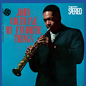 John Coltrane
My Favorite Things
Atlantic, 1961
While not technically a Christmas album (side two includes “Summertime”), this is a record I play often this time of year. Released in 1961, the LP takes its name from the title track, a modal rendition of the song from Rodgers and Hammerstein’s The Sound of Music. At the time of recording the musical was just a year old, and though the lyrics make no mention of Christmas, the song quickly became something of a holiday standard. Coltrane’s version is a showcase for his new band and a preview of the innovative musical paths he would take in the sixties. McCoy Tyner’s piano prances over a simmering rhythm section comprised of Steve Davis on bass and Elvin Jones on drums, while Coltrane leads on a soprano sax whose sound is at once familiar and eerie. The key of E minor lends the material mystery and nuance — there are moments when the music takes on an almost byzantine quality. Even the song’s traditionally upbeat ending is left ambiguous and unresolved. Coltrane had only begun to play soprano the previous spring, after receiving the instrument as a gift from Miles Davis while on tour in Europe. After leaving Davis’ quintet, Coltrane formed his own quartet with whom he spent the summer playing Village sets and developing the sound that would be debuted on this album. Sessions took place over three days in October 1960 at Atlantic Studios at 1841 Broadway, and included Cole Porter’s “Ev’ry Time We Say Goodbye,” plus fresh treatments of the popular Gershwin tunes “Summertime” and “But Not For Me.” But it’s the title track that has compelled me to return to this LP year after year, ever since I first heard it as a teenager. Clocking in at nearly fourteen minutes, “My Favorite Things” is a brooding, hypnotic masterpiece, and without doubt one of my favourite jazz recordings. There’s a line in the Elvis Costello song “This Is Hell” that goes, “My Favorite Things are playing again and again/But it’s by Julie Andrews and not by John Coltrane.” I always think of that whenever I give this record a spin. If you have this album (or failing that, a Spotify account) make sure to put it on this Christmas. I guarantee you won’t feel so bad.
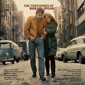 Bob Dylan
The Freewheelin’ Bob Dylan
Columbia, 1963
The Freewheelin’ Bob Dylan was released just three days after the young artist had turned 22. Only 14 months had passed since the release of Dylan’s eponymous debut, but the distance between the two LPs is better measured in light years. Unlike its predecessor, Freewheelin’ was a record of all-original material, and established Dylan not only as the most exciting songwriter on the New York folk scene, but also a performer of a skill and intensity that belied his young age and boyish appearance. Drawing from current events for inspiration — as well as his romance with a young activist named Suze Rotolo — his subjects were both political and personal, his lyrics both scathing and absurdist. This recognition led to Dylan being lumbered with the unenviable label of “spokesman of a generation,” a tag he was keen to repudiate. His 2004 memoir, Chronicles, Vol. 1, recalls a headline from this period: “Spokesman Denies He’s A Spokesman.” Rotolo (and her very left-wing family) has often been credited with influencing Dylan’s more topical output. The couple had met at a folk concert at Riverside Church and had been living together (much to her family’s disapproval) in an apartment on West 4th Street for six months when (at her mother’s suggestion) Suze left to study art at the University of Perugia. She postponed her return several times, and this extended separation left Dylan pining: he wrote “Don’t Think Twice, It’s All Right” upon learning she was considering staying in Italy indefinitely. Rotolo finally did return to New York in January 1963, and a few weeks later Columbia photographer Don Hunstein snapped her and Dylan arm in arm as they trudged through a snow-covered Jones Street, as part of a wider shoot around Greenwich Village. The image was used for the cover of Dylan’s upcoming LP which, along with Abbey Road, is probably the most replicated album photo of all time. Dylan and Rotolo broke up in 1964. For decades she refused to discuss their relationship, which continued to overshadow her own work as a visual artist, until 2008 when she published her own memoir called A Freewheelin’ Time. She died in 2011 aged 67.
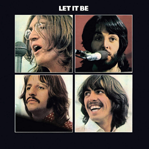 The Beatles
Let It Be
Apple, 1970
This afternoon I finally got around to finishing Get Back, Peter Jackson’s epic three-part Beatles documentary. The series meticulously chronicles sessions for the band’s next album (eventually released in 1970 as Let It Be) and aborted TV special, before culminating in the surprise performance on the rooftop of Apple Studios on 30th January 1969 (I always remember the date because it was ten years to the day before I was born). Edited from 60 hours of film footage and over 150 hours of audio material originally intended for Michael Lindsay-Hogg’s film (also entitled Let It Be), Jackson’s project was conceived as a standalone feature with a theatrical release, but Covid delays and pandemic viewing trends prompted Disney to re-purpose it into a binge-worthy streaming event. Now, nobody loves a rockumentary more than me, and the prospect of indulging in hours of unseen Fab Four footage filled me with glee. Yet even this Beatle obsessive found the experience of watching the series less than riveting at times, mainly because of the bloated format. The suggestion of urgency through on-screen captions and calendar graphics seems like an afterthought designed to mask the lack of a narrative structure. During a debate in the third episode Lindsay-Hogg comes to the discovery that he’s spent three weeks shooting footage but still has no story, a problem neither he nor Jackson quite managed to overcome. Naturally, there are moments both priceless and hilarious, but rarely are these genuinely revealing and they mostly fail to convey the individual band members in any new light. But the documentary is utterly absorbing as a window into a hyper-specific place and time, capturing the detailed dynamics of the group and their nebulous inner circle, while hinting at the band’s impending and unavoidable dissolution. Anyway, the series compelled me to revisit Let It Be, an oft-maligned album and maybe the Beatles LP I’m least fond of. The record confirms what the documentary shows, which is that Paul was really the only creative Beatle still fully on board by this point (the most realised compositions are all McCartney’s). But at least it clocks in at a brisk thirty-five minutes…
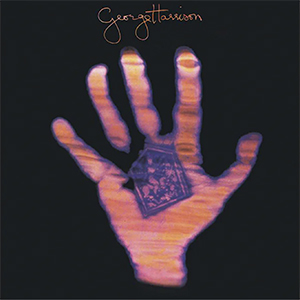
 George Harrison
All Things Must Pass
Apple, 1970
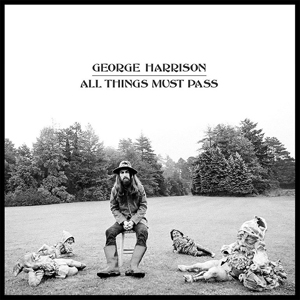
George Harrison’s epic solo debut arrived just seven months after the Beatles’ split, and only six after the release of the band’s final LP, Let It Be. Harrison, always “the quiet one,“ had emerged as an able songwriter, but remained a victim of band inequality: typically he only saw one of his compositions on each side of a Beatles release. After the break-up he found himself sitting on dozens of unreleased songs, some of which dated back to 1966 and had already been overlooked by Lennon and McCartney. There was enough material for several albums, but for commercial reasons the recordings were contained onto an eighteen-track, double LP, which also included a bonus disc of somewhat indulgent studio outtakes entitled “Apple Jam.” The whole thing came packaged in a large box, the kind typically used for operas, which wasn’t wholly inappropriate: many have described the record as sounding “Wagnerian” in its scope and bluster. Much of this sonic grandeur was the influence of Phil Spector, who initially acted as producer on the sessions before removing himself from the project due to “health reasons” (Harrison once said Spector needed “eighteen cherry brandies” before he could start work). Spector’s trademark “Wall of Sound” technique is evidenced throughout the album’s four sides even though Harrison completed production duties himself — he later admitted he got carried away with excessive multi-track layering and heavy reverb overdubs. In that sense the album is perhaps a harbinger for some of the bloated, grandiose albums that would come to define a lot of rock music in the seventies. Stunning for its musical variety and emotional range, the record is both a celebration of Harrison’s creative individuality and an emphatic liberation from the highly rewarding yet spiritually stifling phenomenon that was Beatlemania. Even the cover art, featuring four broken gnomes, was designed to indicate the end of that particular and unrepeatable era. I think this album is best enjoyed in its entirety on an autumn afternoon with a cup of tea.
 Carole King
Tapestry
Ode, 1971
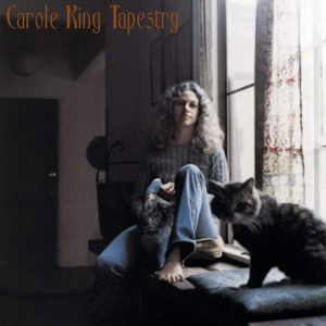
While making coffee this morning I put on Carole King’s second solo album, Tapestry, for the first time in years. Aside from the quality of her songs I always liked King’s voice, straight and unadorned. Her earnest sound — and relatable look — pioneered a quintessentially New York brand of feminist ethnic soul which could not have emerged from any other city (see also Laura Nyro). By the late sixties King had left for California (the first track describes a romantic infatuation in terms of an earthquake) but this album still exudes an East Coast urgency. It’s pitched somewhere between the Brill Building and Laurel Canyon, weaving the sophisticated piano-led pop hooks of one with the personal introspection and intimacy of the other. Tapestry was recorded in the same studio and at the same time as Mud Slide Slim by James Taylor — inevitably the two albums share much of the same personnel and even a song. In one of my previous design studio jobs one of our clients was named Carol King (without the E) and so every time we visited her office the “You’ve Got A Friend” jokes would fly. Two other songs on Tapestry had already been hits for the Shirelles and Aretha Franklin, but with the exception of “Smackwater Jack” (which probably sounded dated even in 1971), every track has a sort of timeless purity, as all great pop songs tend to do. It’s also my favourite album with a cat on the cover, though to be honest I can’t think of many others.
 The Rolling Stones
Sticky Fingers
Rolling Stones Records, 1971
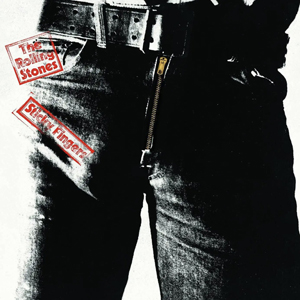
Sticky Fingers was the Rolling Stones’ first studio album of the seventies, the first since Altamont, the first without founding member Brian Jones, and the first to showcase the talents of new lead guitarist Mick Taylor. But perhaps most significantly, it was also the first release on the band’s new label, Rolling Stones Records. Like the Beatles, the Stones had fallen victim to Allen Klein’s financial (mis)management and dubious contracts, and were thus compelled to form their own company to control their recordings and publishing rights. Mick Jagger (always the most image-savvy Stone) commissioned John Pasche, a British junior art director working at the New York advertising agency of Benton & Bowles, to create a logo for the eponymous brand. The idea for the now ubiquitous “tongue and lips” design came about after Jagger spotted an image of the Hindu goddess Kali inside a corner shop. For the album artwork, Pasche’s logo was modified by Craig Braun and included on the inner sleeve and centre labels of the LP. The cover concept was devised by Andy Warhol, whose Coronet signature can be seen on the pair of white briefs visible behind the working zipper. The identity of the crotch on the cover has never been confirmed, but it is assumed to be either a lover of Warhol’s or else a member of his Factory circle. Later releases of the album dispensed entirely with the zipper gimmick, which proved costly to manufacture and also tended to damage the vinyl itself during transit. I have an American version; my parents’ British copy has a different type treatment on the cover. Due to the censorship of the Franco era, in Spain the cover was replaced by a more literal (and disturbing) image of a pair of fingers emerging from a tin of treacle. The iconic logo has now appeared on every Rolling Stones release for half a century, not to mention countless items of merchandise. Pasche received £50 for his design upon completion, and a further £200 in 1972, before selling his copyright to the Stones for a much higher sum in 1984. His original artwork now belongs to the Victoria & Albert Museum.
 Marvin Gaye
What’s Going On
Motown, 1971
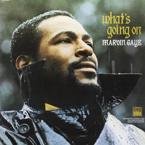
Perhaps more than any other, Marvin Gaye’s What’s Going On is the record that altered soul music’s course, and one that even half a century later still resonates on every level. At first listen, the album is a reaction to the all too familiar struggles affecting Black America, but it was also fueled by Gaye’s personal depression, brought on by the collapse of his marriage, cocaine addiction, and the death of his singing partner, Tammi Terrell. Gaye had scored seven top forty hits with Terrell before she was diagnosed with a brain tumor; she died in 1970 aged just twenty-four. Though Gaye was a commercial certainty, for the hit-making factory that was the Tamla label the record represented a risky departure, as the smoothest singer in their stable now embarked on what was essentially a protest album. Gaye’s mood of disillusionment is apparent immediately on the record’s iconic cover. Gone is the smiling, clean-cut young man to whom millions had become acquainted. Instead a bearded Gaye appears by a deserted set of swings, weary and lost in thought, seemingly indifferent to the rain that drenches him. Side one begins with snippets of street chatter before the opening saxophone bounces in like a mellow breeze, belying the despairing lyrics of the title track. The record continues in this vein, with each song flowing into the next to create a slightly eerie, almost dreamlike suite whose singular collective tone helped define the sound of progressive soul in the early 1970s. What’s Going On may represent the first major personal statement by a Black solo pop artist, and subsequent albums by Gaye’s contemporaries — Stevie Wonder, Isaac Hayes, Curtis Mayfield — began to lean in similarly socially-conscious directions. Despite Motown founder Berry Gordy’s initial concerns, the record peaked at number six, charting again after Gaye’s death in 1984. In 2020 Rolling Stone magazine placed What’s Going On at number one in its list of the 500 greatest albums of all time. Though such accolades are purely futile and entirely subjective, such recognition is testament to the music’s quality and also a timely reminder, were it needed, that the record’s message is no less urgent or relevant today.
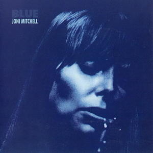 Joni Mitchell
Blue
Reprise, 1971
Blue was the first Joni Mitchell album I ever heard, but such was its status as a defining artifact of the seventies (not to mention its iconic cover art) I was aware of it before I’d ever put it on. Though more rhythmic and varied than her previous records — Joni accompanies herself on most tracks with guitar, piano or Appalachian dulcimer — Blue is still relatively spare compared to the lush jazz-rock arrangements of her mid-seventies albums. I always like to listen to it very loudly late at night, especially in summer. Blue was the record with which Joni’s star shifted from Canadian folk songstress and would-be painter to international rock and roll icon, confirming her to be a musician, vocalist, songwriter and lyricist of singular style and talent. Poetic and almost painfully personal, the album made Mitchell the archetype of the confessional singer-songwriter that became inexorably associated with Southern California in the first half of the decade. The record is almost a concept album in that it traces an arc in the artist’s life in which Joni goes through two break-ups: her relationships with Graham Nash and James Taylor are said to have inspired half the songs on Blue (JT even shows up on guitar, though not on the tracks about him). Trading in Laurel Canyon domesticity she then takes us on several entertaining and evocative jaunts around Europe, a travelogue that’s both carefree and bittersweet, as Joni faces the necessary prospect of overcoming her own pessimistic worldview. Indeed, Blue introduced what would become a continuing theme in Mitchell’s work: travel, both real and metaphorical, as an essential tool for one’s own development and enlightenment. Side one’s opening line, “I am on a lonely road and I am traveling, traveling, traveling, traveling…” immediately explains her emotional state, but could also be an apt description for her entire career. Joni has spent a lifetime forging her own path in an industry that more readily celebrates mediocre men than brilliant women, and she has always seemed more than content to go it alone. Then again, who could keep up with her?
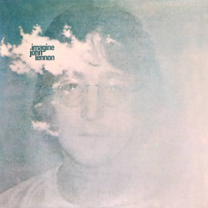 John Lennon
Imagine
Apple, 1971
Unlike most records I’ve written about here, Imagine isn’t one I’m especially fond of. To me it is quite weighed down by a series of plodding mid-tempo numbers over which Lennon’s bitter rants do little but highlight his sour state of mind in the early seventies. Not that he didn’t have plenty reason to be angry: “Gimme Some Truth” is as lyrically relevant today as it ever was. But the infamous “How Do You Sleep?”, a five-and-a-half-minute diatribe against Paul McCartney, only reveals the gracelessness with which Lennon handled his lingering animosity towards his former songwriting partner after the pair’s acrimonious split. The song is only really interesting at this point for its hyper-specific lyrical content in the context of rock non-controversies. Other tracks seem ahead of their time. “I Don’t Want To Be A Soldier” is a loose, hypnotic jam that sounds more like 1991 than 1971. But “Crippled Inside” and “It’s So Hard” feel like folky (or jokey) genre exercises, while “Oh Yoko!” is an early example of Lennon’s gratuitous habit of laying down odes to his domestic bliss on wax. Lennon comes off better when he’s at his most vulnerable. The two ballads, “Jealous Guy” and “How?”, each showcase his talent for combining gorgeous melodies with raw moments of honest introspection. The same technique is of course used to greatest effect on the title cut. Inspired by Yoko Ono’s poem “Grapefruit” (a passage of which is reproduced on the record’s back cover), Lennon later theorized that the only reason the anti-religious, anti-nationalistic, anti-capitalistic anthem was so universally accepted was because it was “sugarcoated.” After all, it’s practically a socialist manifesto. The irony, of course, is that like other protest songs with a straightforward lyric, “Imagine” has been embraced most frequently and fervently by precisely the people towards whom its criticism is directed — politicians, corporations, churches, even celebrities — in other words, those with little imagination at all.
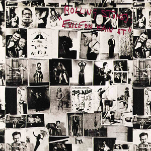 The Rolling Stones
Exile On Main St.
Rolling Stones Records, 1972
Exile on Main St. was the Rolling Stones’ tenth studio album, and is still considered by many to be their best work. High praise considering the bulk of the half-written tracks were captured by the band’s mobile recording truck during a loose series of nightly “sessions” in the damp and sprawling basement at Villa Nellcôte, a Belle Époque mansion on the Côte d’Azur that Keith Richards was renting having absconded (along with the rest of the Stones) to France to avoid paying British taxes (hence the album’s title). Built by an English banker in the 1890s, the property was said to have served as a Gestapo headquarters during the war — the arrival of the world’s most notorious rock and roll outlaws (and a revolving coterie of guests) only added insult to infamy. Overdubs were added later in Los Angeles, but most of the record’s sixteen original songs draw inspiration from the Stones’ hedonistic life on the road and substance-fueled escapades on the French Riviera. That said, Mick Jagger’s languid drawl is often buried so deep in the final mix that the vocals can feel fragmented or even unintelligible. One track, “Casino Boogie,” was actually composed by cutting up random phrases and assembling them into verses, a technique borrowed from William Burroughs. Another, “Sweet Black Angel,” about Angela Davis, is one of the few overtly political songs in the band’s entire catalogue. Musically speaking, no Stones release before or since is so heavily saturated by Mick and Keith’s adventures in (and fixation with) America’s deep south. The album is a murky, simmering stew of early rock and roll, blues, country, gospel and soul, but these songs aren’t mere genre exercises: there is a lived-in, hard-fought truth to them, that combined with a lyrical weariness makes for a record of rare (and raw) depth and honesty. Several numbers have since become part of the Stones’ live repertoire, but despite being a double LP the album didn’t produce the usual handful of hit singles. Though as my parents often recalled, “Tumbling Dice” received repeated punches on the jukebox at their wedding in August 1972.
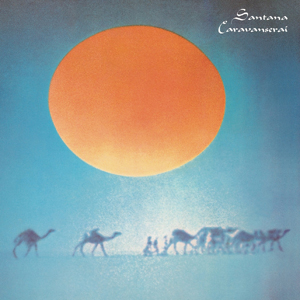 Santana
Caravanserai
Columbia, 1972
Santana’s fourth album, Caravanserai, was released in October 1972. That same night the band performed at Spokane Coliseum, having just embarked on an epic world tour that would span five continents and last an entire year (the recording from the show in Fukuoka was released in Europe as the live triple LP, Lotus). In November 1973, my parents saw Santana at the start of their next tour at the Rainbow in London, a show I heard a lot about growing up (in 2004 I saw Santana with my parents in a piazza in Pistoia). Anyway, this was the album on which Santana broke free of the artistic restraints imposed by the narrow confines of commercially viable pop music. The result was a predominantly instrumental LP reflecting Carlos Santana’s blossoming interest in the spiritual jazz pioneered by Alice Coltrane and Pharaoh Sanders. Upon hearing the finished record, CBS executive Clive Davis accused Santana of committing “career suicide.” Indeed, Caravanserai produced no hit singles and only reached number 8 on the Billboard chart. But it’s my favourite Santana album up to that point precisely because it abandons any attempt to conform to radio or record company expectations. To me, some of Santana’s early hits feel firmly rooted in their era, while their English lyrics forced them towards “American rock band” territory, undermining their musical ambitions and spiritual worldliness. In every sense, Santana was always a band without borders, whose compositions and live performances transcended background or language. It’s no surprise that in 1986 the BBC chose nine-minute closer “Every Step Of The Way” for their closing World Cup montage (it’s on YouTube), acknowledging Santana’s Mexican roots while encapsulating the sun-drenched drama of that international event. I can’t talk about this album without mentioning “Song Of The Wind,” a genuine highlight and one of my mum’s all-time favourite tracks. Just as some of the band’s more conventional rock numbers haven’t aged well, this six-minute instrumental — while showcasing Santana’s effortlessly emotive guitar playing — is evidence that he could produce a work of timeless beauty simply by doing what came naturally.
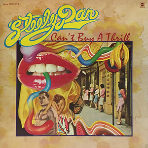 Steely Dan
Can’t Buy A Thrill
ABC, 1972
Can’t Buy A Thrill, Steely Dan’s debut album, was released in November 1972. I don’t know the exact date and it seems the internet doesn’t either. To recap: Walter Becker and Donald Fagen had met at Bard College in 1967, and were working in Los Angeles as staff songwriters for ABC/Dunhill Records when they were encouraged to form a band by producer Gary Katz. He suggested guitarist Jeff “Skunk” Baxter and drummer Jim Hodder, and in 1970 they placed an ad in the Village Voice: “Looking for keyboardist and bassist. Must have jazz chops! Assholes need not apply.” Long Island native and guitarist Denny Dias responded and moved out west, before short-lived vocalist David Palmer (he only sang lead on two tracks) was added to compensate for Fagen’s initial stage fright. Though it introduced trademarks of Becker and Fagen’s partnership — unconventional chord structures, cryptic lyrical concerns and a wry, sardonic wit (as evidenced by the original liner notes credited to Tristan Fabriani, a Becker/Fagen alias) — “CBAT” (to use its social media shorthand) is probably my least favourite album by my favourite band. Having said that, this catchy LP was a hit in 1972 and includes three of the five Steely Dan tracks that can still frequently be heard at your local CVS. After two more albums Becker and Fagen grew tired of the road and fired the rest of the group in 1974. Future recordings used the cream of L.A.’s session musicians (Steely Dan didn’t tour again until 1993). This practice however had already started on their first record, which features English jazz percussionist Victor Feldman and New York guitarist Elliott Randall, whose solo on “Reelin’ In The Years” remains a highlight of the Dan’s oeuvre. Fast forward half a century and David Palmer now works as a landscape photographer in South Carolina, while Denny Dias helms an eponymous band based in Boston. Jeff Baxter enjoyed success with the Doobie Brothers, though these days he’s best known for his work as a missile defense consultant. Jim Hodder drowned in his swimming pool in 1990.
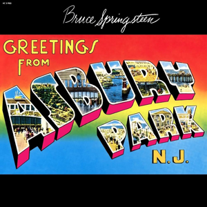 Bruce Springsteen
Greetings from Asbury Park, N.J.
Columbia, 1973
When Bruce Springsteen’s debut album was released in January 1973, only seven months had passed since Springsteen’s audition for John Hammond at Columbia Records on East 52nd Street (a set of acoustic demos that emerged on the Tracks boxset in 1998). Hammond — who had also discovered Billie Holiday, Aretha Franklin and Bob Dylan — knew unique talent when he heard it, and wasted no time in signing the 22-year-old to a record deal. The album was cut that summer at 914 Sound Studios, a low-budget facility in Blauvelt, NY. But when the acetate was submitted that August, Columbia president Clive Davis said he didn’t hear a hit single. So Springsteen quickly wrote two extra songs, the first of which was “Blinded By The Light.” The track showcased the young songwriter’s penchant for frantic verbosity bordering on the absurd, inviting the inevitable “New Dylan” comparisons that persisted in the early part of Springsteen’s career. The single failed to chart, but Manfred Mann’s version reached number one in August 1976 — still the only Springsteen-penned song to top the Billboard Hot 100. The second late addition was “Spirit In The Night,” a soulful number that became a staple of the Springsteen’s early live shows. The line-up on this album included Garry Tallent on bass and Clarence Clemons on saxophone, drummer Vini “Mad Dog” Lopez and pianist David Sancious, whose mother lived on E Street in Belmar, NJ. The band used her garage as a rehearsal space and eventually took their name from the address. Though it introduced a prolific and daring artist, as well as some of the lyrical motifs central to his early work — teenage romance, Catholic imagery, the circus, street life, gang violence, and of course, the automobile — this is perhaps my least favourite Springsteen LP. But I have always loved “Growin’ Up,” which would have ideally opened side one. I remember my dad put it on the third compilation tape he made for me not long after I got my first Walkman around 1985. In 2018 I saw Springsteen perform it solo at the Walter Kerr Theatre as part of his Broadway show, to which I wore a T-shirt with art director John Berg’s iconic album artwork.
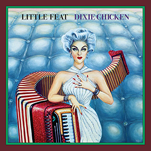 Little Feat
Dixie Chicken
Warner Bros., 1973
Little Feat’s third album, Dixie Chicken, was their second to feature a front cover by Neon Park, whose somewhat surreal illustration style became the band’s visual signature (this one was inspired by a 1954 Revlon ad starring Carmen Dell’Orefice). As a child I remember seeing Little Feat’s LPs at home and being amused by the artwork, which more than hinted at the eccentric humour in the music. This slightly zany sensibility seemed to be a common thread among similarly-inclined West Coast acts in the early seventies, such as Dan Hicks & His Hot Licks, Commander Cody & His Lost Planet Airmen, and even Ry Cooder. Though their sound was hard to define, on this record Little Feat landed on what would become their trademark melting pot of swampy, Southern-fried funk and New Orleans rhythm and blues (the album even includes a version of Allen Toussaint’s “On Your Way Down”). Former Mothers of Invention guitarist and vocalist Lowell George had emerged as the band’s major songwriting talent, and the next two Little Feat records — Feats Don’t Fail Me Now (1974) and The Last Record Album (1975) followed in a similar vein. The 1978 live double album Waiting For Columbus was the band’s best-selling release, but by the end of the decade directions within the group had begun to diverge. In 1979 George issued a solo album entitled Thanks, I’ll Eat It Here, a title that may have been a reference to his rapid weight gain, the result of an overindulgent lifestyle characterized by binge eating, alcoholism and speed balls. In June of that year, while on tour in support of the record, George collapsed and died of a heart attack in his room at the Twin Bridges Marriott hotel in Arlington, VA. He was 34. Little Feat’s seventh LP, Down On The Farm, was released soon afterwards, then between 1988 and 2012 the remaining members of the band put out nine more albums. The 1980 Jackson Browne song, “Of Missing Persons” (the title of which is a reference to the opening line of the Little Feat song “Long Distance Love”), was written for George’s surviving five-year-old daughter, Inara, who today is one half of the indie pop duo, The Bird and the Bee.
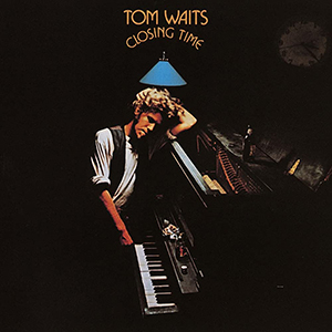 Tom Waits
Closing Time
Asylum, 1973
Without even hearing the record, the title and cover photograph alone of Tom Waits’ debut album, Closing Time, were enough to introduce the young artist as a sort of late-night beatnik balladeer. Though Waits would persist with this identity for the rest of the decade, sometimes to the point of self-parody, it was initially developed during solo sets supporting Frank Zappa on tour and at The Troubadour on Santa Monica Boulevard. It was here that Waits’ performances caught the attention of David Geffen, who signed him to his new Asylum label. Despite the album’s nocturnal atmosphere, recording sessions took place during daylight hours since there were no evening slots available at Hollywood’s Sunset Sound Recorders. Most tracks feature acoustic guitar, upright piano and stand-up bass, though disagreements in the studio between Waits and producer Jerry Yester (formerly of The Lovin’ Spoonful) still ensued over the direction of the record: Waits wanted to make a jazz album but Yester insisted on a more folk-oriented sound. Waits’ lyrics were perhaps never more unabashedly romantic than on this record, but the production sometimes renders them perhaps more earnest compared to later releases (The Eagles even covered “Ol’ ’55” on their next LP). This is undoubtedly a record of extreme warmth and beauty that instantly evokes its place and period, even for those of us who weren’t there. The slight echo on “Lonely” expertly suggests the emptiness of a rehearsal space above a bar at 4PM (or 4AM), while “Midnight Lullaby” is probably the only song in history to mention “the British Isles” and “West Virginia” in the same line, something I’ve always enjoyed given that my wife hails from Morgantown, WV. The gorgeous after-hours arrangement of the instrumental title track that closes the album is the closest thing Waits ever made to a wordless manifesto. Waits got Bones Howe to produce his next seven releases (Yester was jailed in 2019 on child pornography charges). By the early eighties Waits’ voice had become more gravel-soaked and his work more experimental, but the line between person and persona has always remained a bit hazy.
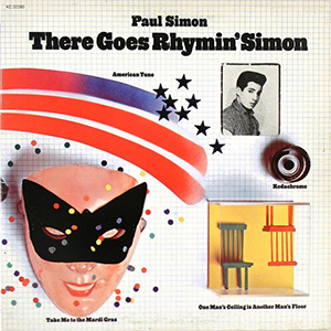 Paul Simon
There Goes Rhymin’ Simon
Columbia, 1973
There Goes Rhymin’ Simon was technically Paul Simon’s third solo album if you count The Paul Simon Songbook (a 1965 UK-only release), though only his second since he and Art Garfunkel had parted ways. His eponymous LP from the previous year had shown he could make more varied and personal music without his partner, but this album established Simon not just as a great pop songwriter, but also a great record maker. It’s perhaps the warmest, most accessible album in Simon’s entire discography. Though no stranger to gospel, blues and jazz, after the success of Bridge Over Troubled Water Simon began to immerse himself in the sound of the American south. Half the LP was recorded at Alabama’s Muscle Shoals studio, whose in-house rhythm section provided much of its charm. The Dixie Hummingbirds appear on two tracks, while the falsetto on “Take Me To The Mardi Gras” is by the Reverend Claude Jeter. Additional backing vocals were provided by the Roche sisters, whom Simon had met in 1971 while teaching a songwriting class at NYU. But like all of Paul Simon’s work it’s his clever songs and unexpected juxtapositions that elevate this album to another level. Though the opening track, “Kodachrome,” caused a headache when Kodak insisted a trademark symbol appear wherever its title appeared in print. For the same reason the song wasn’t released as a single in the UK since laws regarding brand names prevented it being played on BBC radio. My favourite track is probably “Something So Right,” which I’ve always loved for its deceptively simple lyrics and chord structure, but especially the odd middle eight in 3/4 time. Based on a 17th century Lutheran hymn, “American Tune” is a song my dad used to play a lot (he even recorded it). Written immediately following Nixon’s 1972 reelection, it’s perhaps the only note of despair on the entire LP, anticipating the cooler, more defeated tone of Simon’s next album, and cementing his persona as the Upper West Side’s preeminent neurotic intellectual. Appropriately enough each track was visually illustrated on the gatefold cover by another artist inexorably tied to music and Manhattan: Milton Glaser.
 George Harrison
Living In The Material World
Apple, 1973
Living In The Material World was George Harrison’s fifth studio album and the long-awaited studio follow-up to 1970’s triple LP opus, All Things Must Pass (Harrison had released a live album documenting the Concert For Bangladesh in 1971, but back then three years was a long time in music). The new record eschewed his previous album’s sonic bombast for a more understated production, perhaps a reflection of Harrison’s interest in Hindu spirituality, which by 1973 had reached new heights of devotion. Though his devotion to other things — namely cocaine and cars — meant he was also prone at times to veering from his chosen path, sometimes literally. Harrison and then-wife Pattie Boyd were lucky to survive when he crashed his Mercedes-Benz into a roundabout while doing ninety on the M4 in February 1972. Aside from his spiritual musings, the album also revealed Harrison’s contempt for consumer culture and an increasingly corporate music industry (especially in the wake of having organized benefit concerts), as well as the expected dose of residual post-Beatles bitterness. The recording featured the usual crew of Harrison associates — Nicky Hopkins, Klaus Voorman, Jim Keltner, Ringo Starr — though notably, no Eric Clapton. This was likely due to his infatuation with Boyd and descent into heroin addiction (the guitarist had passed out mid-performance at the Concert For Bangladesh). Anyway, LITMW remains a record that’s a bit underrated and forgotten compared to ATMP, whose size and scope cast a long shadow over the rest of Harrison’s output in the seventies. Though it did provide an appropriate title for Martin Scorsese’s epic 2011 documentary on the musician’s life. Like its predecessor, the LP is also impressive for its lavish packaging: the front and back cover uses electro-photography and the interior sleeve incorporates artwork from the Bhagavad-Gītā. Living In The Material World peaked at number 2 on the UK album chart. Ironically it was kept off the top spot by the soundtrack album to That’ll Be The Day, a British rock ’n’ roll nostalgia movie starring… Ringo Starr.
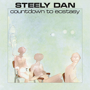 Steely Dan
Countdown To Ecstasy
ABC, 1973
I first heard Countdown To Ecstasy as a teenager — before that the only Steely Dan track I was consciously aware of was “Reelin’ In The Years.” My parents had seen Steely Dan at the Rainbow in London on the band’s only visit to the UK back in 1974, an evening they often referred to as though it were a religious experience. Countdown To Ecstasy was always my dad’s favourite Steely Dan record, and one year for his birthday somebody gifted him a copy of the album on CD, back when the convenience and sonic perfection of a compact disc was still considered infinitely preferable to a worn and dusty LP. This must have been around 1994, and our CD player at the time was the kind used for deejaying, that lays flat with all the controls on top. (We had a friend who worked in the hi-fi business and he always hooked us up with stereo equipment — he’d given my dad the first model Walkman back in 1979). Anyway, this meant that when a CD reached its end, instead of stopping it simply started playing from the beginning again. I remember one afternoon listening to Countdown To Ecstasy on a continuous loop in shuffle mode, by the end of which every guitar solo and horn chart had seared into my brain. More significantly, I’d discovered my new favourite band. Steely Dan may have skewed the conventions of California rock with their clever jazz chord structures and obscure, erudite lyrics, but Becker and Fagen’s experience as Brill Building songwriters had imbued them with a pure pop sensibility. Their songs tended towards wry East Coast critiques of the contemporary L.A. scene, but their compositions were also catchy, memorable, and never indulgent — even when the band got to “stretch out” or trade fours like a bebop combo. These peculiar qualities, combined with an uncluttered studio production style, made every track Steely Dan ever recorded sound ready-made for radio, and essentially timeless. I’d heard and loved a lot of different music up to that point, but this album — though already two decades old — jolted me upright in a way that few others ever have.
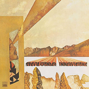 Stevie Wonder
Innervisions
Tamla, 1973
Stevie Wonder was still only 23 when he released Innervsisions, but it was already his sixteenth studio album, having signed with Motown when he was just eleven. For much of the sixties, the Tamla label had churned out LPs that cashed in on the musical and vocal talents of “Little Stevie Wonder.” But by the start of the seventies the “boy genius” had emerged as a progressive, singular artist that merited absolute creative control.The resulting sequence of five albums Wonder made between 1972 and 1976 are widely considered as constituting his “classic period.” Innervisions has always been my favourite of these, though thematically the record might also be the bleakest. Wonder was intent on addressing topics central to the black American experience during the turbulent days of 1973 (and 2023, for that matter): drug abuse, inequality, systemic racism, political disillusionment, even spiritual transcendence. In doing so he became both an establishment-friendly representative of the black community and, for white America, a benign messenger of its plight. Only rarely did gritty realism get the better of Wonder’s hope for social idealism, such as on the epic, cinematic “Living For The City,” whose dramatic interlude is impossible to hear without mentally directing the accompanying movie visuals. I must have quoted the line, “New York City… just like I pictured it,” out loud a dozen times during my first visit to Manhattan. The sound of Innervisions was dominated by Wonder’s innovative use of synthesizers, but he played almost every other instrument on the album as well, confirming his status as the decade’s foremost one-man-band. It perhaps also reinforced the theory that his extraordinary musical vision was directly related to the fact that he had lived his entire life without the ability of sight. Ironically, three days after Innervisions was released, Wonder was involved in a near fatal car crash in North Carolina, when a log flew off the back of a truck and struck him in the head. He lay in a coma for ten days but when he awoke his extrasensory perception only became heightened.
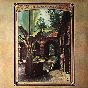 Jackson Browne
For Everyman
Asylum, 1973
For Everyman, Jackson Browne’s self-produced second album, came out fifty years ago this month. The record’s opening track was “Take It Easy,” a song Browne had been struggling with until Glenn Frey (who happened to live in the same Echo Park apartment building) offered to help finish it. Frey apparently came up with the now-iconic line about the girl in a flatbed Ford. The Eagles’ rendition appeared on their debut album in 1972 before Browne recorded his own version. Side one closed with “These Days,” another old composition that Browne had written for a music publishing company while living in New York. The song was first recorded in 1967 as a string-laden track by German model-turned-singer and Velvet Underground associate, Nico, on her Chelsea Girl LP. Several other versions (including those by Jennifer Warnes and Gregg Allman) were released before Browne finally cut his own. The title track was written as a sort of response to the Crosby, Stills & Nash song, “Wooden Ships.” Despite the So-Cal arrangements and soaring vocals, Browne’s music was always a repudiation of sixties idealism. His songs were drenched in apocalyptic imagery and steeped in the paranoia and dread of the early seventies. With its broader social and environmental implications, “For Everyman” was at odds with the so-called “me decade,” and set the tone for Browne’s more consciously political work of the eighties. This album was the first Jackson Browne record to feature David Lindley, whose guitar and fiddle provided new texture to the music, and came to help define Browne’s sound for the rest of the seventies. Joining the aforementioned Frey are precisely the guest musicians you’d expect to find listed on a Los Angeles recording from 1973: Don Henley, David Crosby, Bonnie Raitt, Joni Mitchell… Even the honky tonk piano of Elton John (credited as “Rockaday Johnnie”) pops up on side two. The original die-cut LP cover featured a photo of the artist sitting in the courtyard of his childhood home, Abbey San Encino, in Highland Park. Using rocks from the Arroyo Seco, it was completed by hand in 1921 by Browne’s grandfather, Clyde, and is still owned to this day by his brother, Edward.
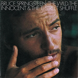 Bruce Springsteen
The Wild, The Innocent & The E Street Shuffle
Columbia, 1973
Bruce Springsteen’s second album, The Wild, The Innocent & E Street Shuffle, was released fifty years ago today. It arrived just eleven months after his debut LP, but in terms of ambition and execution, the distance between the two records is better measured in light years. Some observers have suggested that Springsteen borrowed the title from The Wild and The Innocent, a 1959 romantic western starring Audie Murphy and Sandra Dee. Certainly, in their scope and imagery, these poetic tales of boardwalk life and urban romance are nothing short of cinematic. There are just seven tracks on the record, four of which stretch out over seven minutes. The album moved beyond the acoustic folk-rock of Springsteen’s first record, incorporating elements of R&B and jazz into a Jersey soul stew, while wringing every eccentricity out of a carnivalesque band whose sound is as expansive as it is hyperactive. This change in direction is reflected in the band photo on the back cover, taken by David Gahr in the doorway of an antique store in Long Branch, NJ. This line-up still included David Sancious on keyboards and Vini “Mad Dog” Lopez on drums. Aside from his extraordinary piano intro to “New York City Serenade,” Sancious’ other indirect contribution to Springsteen folklore is the fact that his mother’s Belmar home was located on E Street — the band had used her garage as a rehearsal space. This album (and its title track) was the first official mention of the now-mythical address, though the band only became known as The E Street Band in September 1974, by which time Sancious had left the group with Lopez’s replacement, Ernest “Boom” Carter, to form a jazz-fusion band called Tone. Springsteen never sounded like this again: as the lives of his characters got harder and leaner, so did his songs. Following his next album, 1975’s Born To Run, his star entered the stratosphere, never to return. To this day this record remains by far his most musical, but perhaps also his most overlooked. I don’t have a favourite Springsteen album (this and the six that came after it are all essential) but I still think side two of this LP is the finest suite of music he ever recorded.
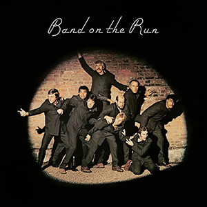 Paul McCartney & Wings
Band On The Run
Apple, 1973
Band On The Run was Paul McCartney’s fifth solo album, and the third credited to Wings, though by the time recording began the band’s line-up had been reduced to just three people: McCartney, wife Linda, and loyal sideman Denny Laine. Lead guitarist Henry McCullough quit after an argument with McCartney during rehearsals for the album on his farm in Scotland; drummer Denny Seiwell followed him a week later. Perhaps inspired by the title track’s themes of freedom and escape, McCartney asked EMI to send him a list of their overseas recording facilities, from which he chose their studio in Lagos. But the exotic setting was not quite the creative idyll McCartney had anticipated. Still under military dictatorship following the end of the civil war, Nigeria was hardly a safe haven. One night Paul and Linda lost a bag of demo cassettes and notebooks of lyrics when they were robbed at knifepoint after ignoring local advice and going for an evening walk. The group only received EMI’s warning about an outbreak of cholera once they’d returned home, but during one session McCartney did suffer a bronchial spasm brought on by heavy smoking. Located in the port suburb of Apapa, the ramshackle studio had a faulty control desk and was prone to losing power, but somehow the band got enough basic tracks down to finish overdubs back in London. McCartney’s solo career had yet to reach the critical or commercial heights he’d enjoyed as a Beatle, but Band On The Run was an international success. It’s probably still McCartney’s best-known post-Beatles record, thanks also to Clive Arrowsmith’s cover photograph, which, in addition to the band, featured various notables such as Clement Freud, Christopher Lee and Michael Parkinson. My copy is actually a 1978 Dutch pressing, picked up at my go-to LP emporium Academy Records back in 2017. It’s missing the large poster included with the original version, but the opaque lilac vinyl more than makes up for it!
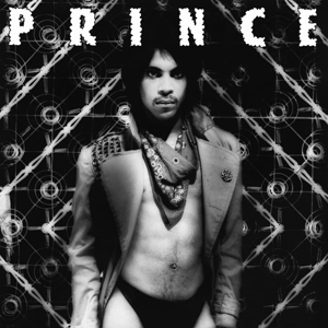 Prince
Dirty Mind
Warner Bros., 1980
Recorded mostly alone at his home studio and clocking in at just thirty minutes, Dirty Mind is the closest Prince ever came to making a punk record. But it’s not punk, it’s Prince, which by 1980 was already something unique but quite indefinable. “Don’t make me black,” the young musician requested of Warner Bros. vice president Lenny Waronker, shortly after signing a three-record deal with the label. At a time when the divergence between black and white music was perhaps never wider, Prince was starting to bridge that gap. His sound — a raw, spare, new wave funk characterized by intricate keyboards, clean guitar and limber falsetto — questioned the stifling definition of black music, while his androgynous image and explicit lyrics challenged ideas of black masculinity. The album’s title may have hinted at the nature of its content, but few were prepared for “Head” and “Sister,” the LP’s most notorious tracks, which packed a one-two sucker punch of unprecedented lewdness. The former led to original keyboardist Gayle Chapman walking out of Prince’s band; she was replaced by Lisa Coleman, who delivers the lines of the song’s virgin bride with deadpan detachment. Dirty Mind positioned Prince as a sexually ambiguous provocateur par excellence, which for years would prove an obstacle for conservative critics. The album’s accompanying tour — on which Prince performed in bikini briefs and “played” an ejaculating Telecaster — unsurprisingly failed to win them over. In 1981, not long after the Village Voice’s Robert Christgau had suggested Mick Jagger “fold up his penis and go home,” Prince and band were pelted off the stage while opening for the Rolling Stones at Los Angeles Coliseum (a quart of Jack Daniels reportedly missed his head by a matter of inches). Had they looked past his erotic exuberance, they may have also recognized Prince as an artist of singular talent already evidenced by Dirty Mind. Every track on here could have been a hit — that is, had the radio stations been allowed to play them…
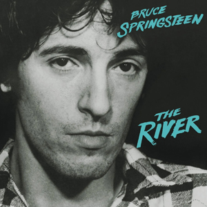 Bruce Springsteen
The River
Columbia, 1980
Bruce Springsteen’s fifth album, The River was the culmination of a prolific and productive period: no less than fifty new songs were recorded during the live sessions at the Power Station (a former ConEd plant) on 53rd Street. Twenty of these ended up on the album, resulting in Springsteen’s first double LP (I believe all the discarded tracks have since shown up on various box sets and expanded editions). By 1980 Springsteen’s epic live shows were already the stuff of legend — I always think of this album as harnessing some of that performance energy and encapsulating what I’d consider to be the classic E Street sound and spirit. The River is cleaner, brighter and funnier than its predecessor, and was Springsteen’s first album to reach number one. But it’s still often overshadowed by his more celebrated work, perhaps because it’s harder to define. If his previous two albums, Born To Run (1975) and Darkness on the Edge of Town (1978) were clearly the artistic statements of a neurotic perfectionist, The River felt like the contents of Bruce’s brain scattered over four sides. The extended running time provided space to switch between a range of musical moods and complex emotional concerns with the ease and breeze of a radio dial, from goofy garage rock to boardwalk soul and even solemn introspection. Amid the depressed national psyche of the post-Vietnam years Springsteen had developed into a writer of rare social consciousness. The lives of working Americans (including that of his own brother-in-law on the title track) became a rich subject, and he’d sometimes even inhabit his characters in the first person. It was the shift towards this type of material in the eighties that led to Bruce becoming a highly misunderstood artist. To this day conservatives consistently reduce him to a patriotic champion of old-fashioned blue collar values, while I’ve heard him dismissed by snobbier liberals as a purveyor of mindless rock, a jingoistic simpleton. But clearly neither party was ever really listening, because musically and otherwise, Springsteen was always everything but simple.
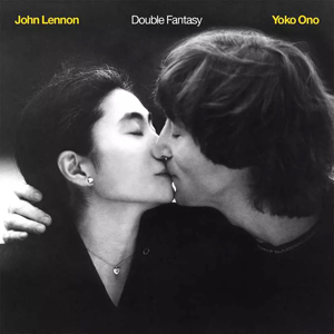 John Lennon/Yoko Ono
Double Fantasy
Geffen, 1980
Credited to John Lennon and Yoko Ono, Double Fantasy is subtitled “A Heart Play” and packaged as a celebration of the couple’s union. But if the record’s theme was love, its timing — or rather, the timing of Lennon’s assassination exactly three weeks later — resulted in it forever being associated with his death. Lennon’s return to the studio announced the end of a five-year, self-imposed exile from the music industry, during which the former Beatle holed up at the Dakota and assumed the role of kimono-wearing, bread-baking, diaper-changing house husband. His songs here are paeans to that domestic bliss, or at least the version of it he’d like us to believe. Notably, for the first time in his solo career Lennon sounds content. No longer troubled by the past, he’s embracing middle age and looking forward, but the material, while sentimental, is never syrupy. Aside from its showcasing Lennon as the master song crafter that he was, what I’ve always liked most about this album is its production and arrangements, which still sound warm, tight and essentially timeless. In contrast, Ono’s contributions feel more rooted in time, as if she was striving too hard to sound like 1980. In what would amount to little more than a futile attempt to rewrite (music) history, I sometimes imagine re-sequencing the Lennon tracks from Double Fantasy together with those from Milk & Honey, the album of outtakes from the same Hit Factory sessions released a few years after his murder. Even after all these years it’s impossible to separate Double Fantasy from the thought of what could have been.
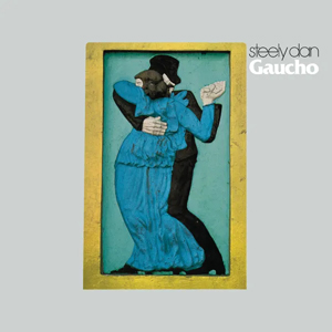 Steely Dan
Gaucho
MCA, 1980
Gaucho was Steely Dan’s seventh album and the final release of the band’s original run (until 2000’s Grammy-winning Two Against Nature). The hiatus that Walter Becker and Donald Fagen imposed following this record was perhaps inevitable given that it represents an almost absurd zenith of the jazz-rock hipster duo’s obsessive studio perfectionism. For instance, Jeff Porcaro’s drums on the title track were assembled from forty-six different takes, while a satisfactory mix of the fade-out on “Babylon Sisters” was only achieved on the fifty-fifth attempt. Notoriously, a recording of “The Second Arrangement” was accidentally erased by an assistant engineer; rather than spend weeks re-recording the track, the song was simply shelved (a demo surfaced years later). Some say the resulting album is more sterile than its predecessors, but its immaculate production is tempered by its undeniable grooves and disreputable lyrical concerns (an alternative title might have been “More Songs About Hookers And Coke Dealers”). In 2014 while strolling the Caminito in La Boca neighbourhood of Buenos Aires, I came across this relief by Argentine sculptor Israel Hoffman, on which the LP’s artwork is based. Sadly I was not wearing my spangled leather poncho at the time…
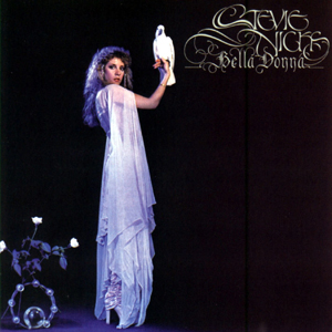 Stevie Nicks
Bella Donna
Modern, 1981
Stevie Nicks’ first solo album, Bella Donna, has a lovely, late summer feeling. I was late discovering this album at all — I’d never heard it in full until I picked up the LP from Academy Records around 2009. But I always liked Stevie Nicks’ contributions to Fleetwood Mac. By comparison Christine McVie’s songs often seemed slight to me and lacking in lyrical or emotional complexity, while by the end of the seventies Lindsey Buckingham was beginning to buckle under the weight of his own frantic new wave aspirations. In contrast, Nicks’ material was poetic, personal, steeped in mystical symbolism and rooted in a timeless radio rock sound that is more evident than ever on Bella Donna. The title track — inspired by Nicks’ boyfriend’s mother — is probably my favourite song of hers, though the album is best remembered for the single “Edge Of Seventeen,” the odd title of which came about after Nicks misheard Tom Petty’s first wife, Jane, recall how she’d met her husband at “the age of seventeen” (evidently Jane had a strong southern accent). Petty himself shares the lead vocal on “Stop Draggin’ My Heart Around,” a track left off his Heartbreakers album Hard Promises, and most of that band plays on this record. The rest of the personnel is a who’s who of the era’s top session players and Stevie’s biz pals, whose playing melds cohesively thanks to Jimmy Iovine’s unaffected production. Perhaps because I only heard it after we were living together and married, this album — maybe more than any other — always reminds me of my wife, Hillary. I remember “Leather And Lace” (a duet with the Eagles’ Don Henley) coming on the radio one grey afternoon as her dad drove us down to D.C. not long before he died. Some years later Hillary put this album on late one night as we drove through country roads in Mallorca with just our headlights to guide the way. Those moments don’t happen that often, but when they do it can be the best way to listen to music: in near darkness and without distraction, far from home but alongside the person you love.
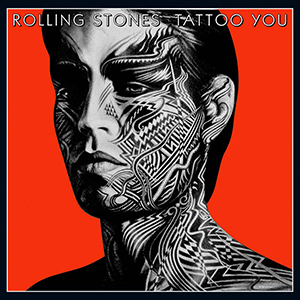 The Rolling Stones
Tattoo You
Rolling Stones Records, 1981
Tattoo You was the Rolling Stones’ sixteenth studio album, though unusually this one was comprised of outtakes and discarded material from previous sessions, with some basic tracks dating back as far as 1972. This was borne of necessity: Mick Jagger and Keith Richards were in the midst of a feud that would last (on-and-off) for most of the decade. Missing lyrics were completed and new parts recorded separately, before Bob Clearmountain mixed the ten tracks into a cohesive final product. Like many great Stones hits, side one opener “Start Me Up” hangs on a simple Keith riff, though the song was originally conceived with a reggae tempo. I’ve always loved the open, economical arrangement of the finished cut, and how Charlie Watts’ drumming really makes it swing (he was always a jazz man at heart). If “Start Me Up” was a number to which Mick could strut his stuff to the point of self-parody, its flip-side (in every sense) is side two closer “Waiting On A Friend,” whose lyrics reveal an age-appropriate maturity towards relationships, the kind you might expect from men on the cusp of forty — with the possible exception of the Rolling Stones. The memorable sax solo was performed by an uncredited Sonny Rollins, while the single’s accompanying video was famously shot on St. Mark’s Place in the East Village. Production on some of the Stones’ seventies records could be damp and murky, with vocals buried deep in the mix, but this album really cemented the cleaner, taught style that has come to epitomise their sound ever since. I love this record and some of the band’s subsequent releases, but as good as Tattoo You still is, it was also the album on which the Stones essentially settled on a successful formula for the rest of their career. In the mid-seventies they were being written off as irrelevant has-beens; by 1981 they’d adapted to a shifting scene without ever betraying their roots or not sounding like themselves. Tattoo You was the album on which the Rolling Stones finally recognised and embraced their greatest strengths, as well as their own mortality. It’s no surprise they’ve been riding out middle-age for forty years.
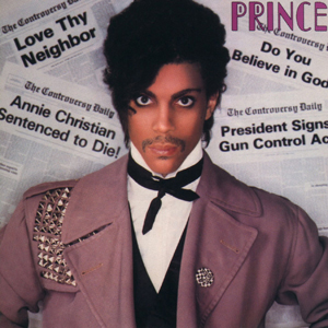 Prince
Controversy
Warner Bros., 1981
Falling between the new wave R’n’B breakthrough of the previous year’s release, Dirty Mind, and the drum machine textures of his 1982 double LP, 1999, Prince’s fourth studio album, Controversy, is sometimes overlooked. A sonic continuation of its predecessor that also hints at the innovative sounds Prince was already developing, Controversy is probably best remembered for its uncharacteristic lyrical exploration of political themes. The album opens with the title cut, a seven-minute slab of synth-funk inspired by conservatives’ curiosity surrounding Prince’s public persona. Rather than ease their confusion or discomfort about his race, religion, or sexuality, Prince transcends such concerns by continuing to defy easy categorization on every front — the track is merely further provocation. He even pauses halfway through to recite the Lord’s Prayer before entering into a repeated refrain: “People call me rude/I wish we all were nude/I wish there were no black or white/I wish there were no rules.” It’s a startlingly confident manifesto for the then twenty-three-year-old’s philosophy towards music, sex, and society in general, and the most important statement of his career up to that point. Prince’s socially-conscious mood continues on “Sexuality” (“Don’t let your children watch television until they know how to read”), while on side two he tackles such hot topics of the day as Cold War relations (“Ronnie, Talk To Russia”) and gun violence (“Annie Christian”). Those two oddities are often cited as among the most curious entries in Prince’s vast canon, but they are a quaint document of America’s anxieties in the early eighties. Elsewhere, Prince still finds room for his most reliable subject, as “Private Joy,” “Let’s Work,” and “Do Me, Baby” perhaps suggest from their titles alone. The album closes with a hilarious and brazen dose of Minneapolis rockabilly entitled “Jack U Off.” It’s the only track on the album to feature additional personnel, but maybe most significant for introducing Prince’s trademark preference for minimalist spelling. Though proper words were no longer always necessary, the message was only getting clearer.
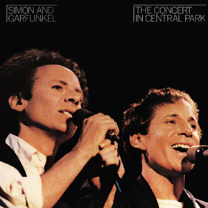 Simon & Garfunkel
The Concert in Central Park
Warner Bros., 1982
On September 19, 1981, 500,000 people gathered on the Great Lawn for a reunion concert by Paul Simon and Art Garfunkel. The free event was organized to raise money for the restoration and maintenance of Central Park, which by the early eighties had, like much of New York, fallen on hard times. Why not call on the city’s greatest pop songwriter and his one-time singing partner? Despite an enduring cultural significance the duo had been apart for over a decade, and old tensions between them quickly resurfaced, due in part to opposing ideas for the music’s direction. Garfunkel wanted to keep it acoustic, Simon wanted to use a full band. Rather than split the show into two separate sets, the pair performed almost entirely together, with Garfunkel having to learn the newer songs from Simon’s solo catalogue. In the end the concert was a success, though ironically Simon’s debut live performance of “The Late Great Johnny Ace” (which referenced the recent murder of John Lennon) was interrupted by a deranged fan. That track was left off the live double LP that was released in February 1982, which was followed by a film of the concert broadcast on HBO. Later that year Simon & Garfunkel completed a world tour and began recording a new studio album. But their working relationship had once again deteriorated, and the sessions become so acrimonious that the project was abandoned (instead Simon released the solo album, Hearts And Bones, in 1983). In 1991 Simon played another concert in Central Park on a similar scale to that of ten years earlier, but this time refused Garfunkel’s offer to participate. Incidentally, as I prepared to vacate my East Village apartment of twelve years last February, this album was the last record I played before I packed up the turntable. That wasn’t a conscious decision, but the thing about live albums is that the audience forms an extra layer of separation between you and the performer, creating a very specific sense of occasion and place in the imagination of the listener. In this case the very existence of this record owes everything to nostalgia: a document of another time that’s already remembering another time. And what a time it was.
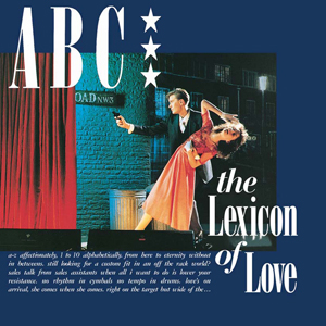 ABC
ABC
The Lexicon of Love
Neutron, 1982
These days the Sheffield band ABC are routinely lumped in with other British acts on the rise in the early eighties, but neither Spandau Ballet nor Duran Duran ever came close to making a record as good as this. It probably ranks as the finest British pop recording of the decade and certainly one of the greatest debut LPs of all time. ABC were formed when Martin Fry was asked to join Vice Versa after interviewing the band for the fanzine “Modern Drugs,” of which he was editor. In 1980 the foursome evolved into ABC and the blond, debonair Fry had emerged as its lead singer, probably thanks to his literary leanings and penchant for gold lamé suits. Practically a concept album, the record’s lyrical concerns revolve around matters of the heart, as its title suggests. Each song is a romantic melodrama, lended extra panache by the swooning Fry’s affected yet effective delivery. The band hired progressive studiosmith Trevor Horn to produce the LP. The resulting album is loud, camp and immaculate, and packed with what would become trademarks of Horn’s glossy production style. Laden with lush strings, brassy horns and irresistible bass lines, the record’s energy and club-friendly beats have more in common with the polished post-disco sounds emanating from the American R’n’B charts in 1982 than the sterile synth-pop that cluttered the UK Top 40. Though essentially a dance record, the song craft on display elevates the album above soulless anglodisco, making it a funkier early example of the sophisti-pop that would dominate British charts by the middle of the decade. “The Lexicon of Love” entered the UK chart at number one and produced four top twenty singles, though every one of its tracks could have feasibly been a hit. ABC made five more albums before disbanding in 1991. They reformed in 1997 but now basically existed as a Fry solo project. By 2007 his new band were a headline act on the eighties nostalgia circuit, an experience that inspired Fry to release a follow-up album, The Lexicon of Love II, in 2016. It reached number five but sadly it’s not on Spotify so I’ve never even heard it…
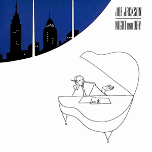 Joe Jackson
Night and Day
A&M, 1982
Though it was his fifth album, Jackson himself has said that Night and Day felt more like a debut, given that it was a product of the creative inspiration and freedom he’d discovered since relocating to New York. He’d already made a jump blues record in 1981, but Night and Day was further rejection of the “angry young man” tag with which he’d been lumbered in his homeland. Jackson was no punk — he’d been trained at the Royal Academy of Music — and had more musical ideas to explore than new wave male posturing. While his themes and lyrics were based on observations of contemporary Manhattan culture, Jackson clearly aspired to write songs that were sophisticated in the Tin Pan Alley tradition — even the album’s title is a famous Cole Porter tune. The LP cover art may have suggested a midtown penthouse, but the music contained within had more to do with the tenements of Spanish Harlem or Alphabet City (Jackson’s next album even included an instrumental track entitled “Loisaida”). The guitarless record shimmers with Manhattan-centric sounds: cosmopolitan rhythms, salsa-tinged piano and percolating Latin percussion. This distinct sense of place is accentuated by the deep crossfade applied to the tracks on side one, an effect reminiscent of hearing music come and go from a passing car radio or open storefront, or even the familiar New York sensation of stumbling on an unknown world simply by turning a corner on a city block. Today Night and Day is remembered mostly for the hit “Steppin’ Out,” which reached number six on both sides of the Atlantic. Coincidentally, like the ABC record I posted the other day, Jackson also released a follow-up concept album in 2000 entitled Night And Day II, on which he revisits the ideas of the original. About ten years ago I found myself sitting two stools down from Jackson at Eisenberg’s lunch counter. I’d heard he could be a prickly character, so I was a little nervous to speak to him. But as he perused the menu I extended my hand and introduced myself as a fan. Jackson whipped his head in my direction, and without saying a word, told me he was in absolutely no mood to chat…
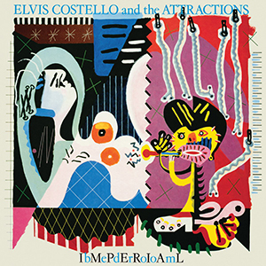 Elvis Costello & The Attractions
Imperial Bedroom
F-Beat, 1982
Imperial Bedroom was Elvis Costello’s seventh album, his sixth with his band The Attractions, and his third LP in eighteen months, consecrating the 27-year-old as the UK’s most prolific and ambitious pop songwriter. The record also emphatically confirmed Costello’s status as a lyricist of staggering eloquence, whose endlessly clever wordplay perhaps served to disassociate himself from these songs’ frequent themes of marital stress and political disgust. While his personal observations lay hidden beneath layers of rich metaphor, Costello continued to defy basic pop industry conventions. Imperial Bedroom included a ballad called “Almost Blue” (memorably covered by Chet Baker in 1987 and Costello’s own wife, Diana Krall, in 2004) which shared a title with his previous album, while the would-be title track of this one only appeared as the B-side to the single, “Man Out Of Time.” The LP also highlighted what a tremendously tight and tour-weary band the Attractions were by that point despite — or maybe due to — their much-documented fondness for the bottle. Imperial Bedroom was Costello’s first album of original material that wasn’t produced by Nick Lowe. Instead he enlisted the expertise of former Beatles engineer Geoff Emerick to help create the sonic drama and baroque flourishes these adult songs warranted. Yet like Sgt. Pepper, for all its pop mastery and orchestral bluster Imperial Bedroom didn’t include an obvious hit single. Perhaps that’s why it only reached number 6 in the UK and barely cracked the top 30 on the Billboard chart. But it topped the Village Voice’s annual Pazz & Jop Critics Poll, which is probably a more reliable barometer with which to measure quality. The Picasso pastiche on the front cover, titled “Snakecharmer & Reclining Octopus,” was painted by graphic designer Barney Bubbles, though credited to “Sal Forlenza, 1941.” It was the artist’s final collaboration with Costello before his suicide in 1983. According to Costello’s 2015 autobiography, the original canvas now hangs on the wall of his Greenwich Village apartment.
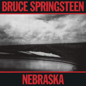 Bruce Springsteen
Nebraska
Columbia, 1982
By the early-eighties Bruce Springsteen had already gained notoriety as a prolific studio perfectionist and indefatigable showman, but in stark contrast to the Spector-esque bombast of Born To Run, Nebraska was essentially a DIY solo album, and the closest thing he ever made to a lo-fi punk record. Using a TEAC Tascam Series 144 four-track cassette recorder mixed through an Echoplex, Springsteen began preparing demos of new songs at his home in Colts Neck, New Jersey, during the winter of 1981-82 (most of the tracks are said to date from January 3rd, 1982). In April 1982 Springsteen took the rough recordings to the E Street Band to flesh out in the studio, but after laying down tracks with the full band decided that the spare, unpolished original versions better suited the dark themes of the material (however, eight songs from the same sessions ended up on Born In The U.S.A. in 1984). So the tape that Bruce had been carrying around for weeks without a case in the pocket of his jeans became his next LP, though only after the application of sophisticated noise reduction techniques. The original tape recording was so raw and distorted that the album almost had to be released on cassette only since a record needle would barely track in the wax. If Nebraska was a sonic departure, thematically the record honed in on some of the bleaker subjects — primarily criminal behaviour and blue collar hardships — that Springsteen had begun to tackle on his previous two albums. Springsteen claimed some of these character stories were inspired by Howard Zinn’s book, A People’s History of the United States. The title track is about 19-year-old Charles Starkweather, whose killing spree in January 1958 gained national prominence. The fact that Badlands, the 1973 movie loosely based on the case, is also the title of a Springsteen song can’t be a coincidence. Nebraska also boasts one of the decade’s great record covers, designed by Andrea Klein. Its use of an all caps, red-on-black Franklin Gothic condensed typeface says more about the quintessentially American music contained within than any elaborate artwork ever could.
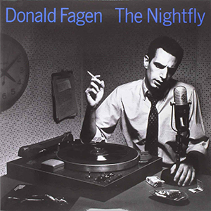 Donald Fagen
The Nightfly
Warner Bros., 1982
I love this album so much that I bought it before I even had a record player, from the East Village Thrift Shop on Second Avenue, just a couple of blocks up from my first New York apartment. I think it only cost a dollar. I already knew it backwards by that point, which was true also of the music Fagen made as one half of Steely Dan. Like those records, The Nightfly was the product of meticulous studio perfectionism, allied by the usual cream of session players from which to pluck on a song-by-song basis (“I.G.Y” actually uses two different drummers). This tendency was compounded by the decision to record instruments separately (as opposed to performing live) and to use digital recorders (instead of conventional magnetic tape), making The Nightfly one of the first fully digital mainstream pop recordings. To understand the nascent technology three studio engineers were sent to take classes at 3M’s headquarters in St. Paul, Minnesota. But to this day it is considered one of the best-recorded LPs of all time, and still a popular choice among audiophiles when testing hi-fi components. Of course, The Nightfly sounded great — more surprising was its content, which is free of the jaded sardonicism that typified Steely Dan’s lyrics. Without Walter Becker, his longtime songwriting partner, Fagen wrote a sophisticated set of semi-autobiographical songs from the viewpoint of a young person stuck in East Coast suburbia during the Kennedy years — the album’s one cover is Leiber & Stoller’s “Ruby Baby.” The result is an album that’s jazzy and urbane, and imbued with a nostalgia for the forward-looking optimism of the period. This may be why I connect with the record so deeply: the line in “New Frontier” about moving to the city, learning design, and studying overseas spoke specifically to my own teenage aspirations. Fagen never toured with The Nightfly — he spent the bulk of the eighties suffering from depression and writer’s block. But I did see him perform the album in its entirety at the Beacon Theatre in 2019, a memorable show that was released in 2021 as The Nightly: Live.
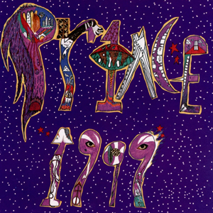 Prince
1999
Warner Bros., 1982
“Don’t worry, I won’t hurt you. I only want you to have some fun.” With that robotic, half-speed spoken intro — part reassurance, part declaration of intent — I became exposed to Prince. Released forty years ago today, 1999 was Prince’s fifth album but the first I ever heard. Yet before the needle even dropped I was drawn to the double LP’s packaging, which provided an intriguing introduction to the little man’s universe. The artwork became iconic, but it was the inner sleeve photography that encapsulated both Prince’s mysterious otherness and undeniable sense of humour. No matter his one-man-band studio innovations or blatant sexual metaphors, it was immediately clear to me that Prince was also a bit silly. It was the appeal of this persona that helped make his music incredibly fun and utterly accessible, especially to a child. I remember hearing 1999’s title track — a dance anthem set against the backdrop of an apocalyptic vision of the new millennium — one summer night in the garden of my childhood best friend, Joe, whose parents were throwing a party. “1999” glided into “Little Red Corvette,” a crossover hit readymade for FM radio (or, by late ’82, MTV) with lyrics that recalled Dylan or Lennon. I loved it instantly because it was about a car (even if it was really about a woman). Only when I saw Prince open a show in 2011 by performing the two songs back-to-back did I realise how deeply the first side of 1999 is connected to my childhood. To this day, whenever I hear the cooing baby at the end of “Delirious” (the album’s third track and single) I recall drifting asleep in the dark, the same song unspooling on my Walkman. Few albums can match 1999’s triple opening punch, but the remaining three sides’ panoply of funky sonic textures became the blueprint for what was soon dubbed “the Minneapolis sound.” Ironically, given his lyrical concerns regarding the encroachment of technology, it was Prince’s creative command of the Linn LM-1 drum machine that made this album truly revolutionary, and perhaps his most influential. I’m convinced that even had it been released in 1999 (the year), 1999 (the album) would have still sounded decades ahead of its time.
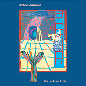 Aztec Camera
High Land, High Rain
Rough Trade, 1983
The ten songs that comprise Aztec Camera’s first album, High Land, Hard Rain, would be impressive by any standard. What makes them remarkable is that their composer, Roddy Frame, had only just turned nineteen. The record’s most epic and yearning track, “We Could Send Letters,” actually dated back to 1979! Despite (or maybe because of) his tender age, Frame exudes confidence on his debut, revealing a stunning mastery of melody, clever chord structures, and poetic, wistful lyrics that make you question what you’ve been doing with your life. Hailing from East Kilbride (a sort of Scottish equivalent of Milton Keynes), Aztec Camera’s wide-eyed, floppy-haired frontman soon drew comparisons with other highly-regarded songsmiths such as Elvis Costello, though Frame claimed he wanted to sound like a cross between his two idols: Joe Strummer and Wes Montgomery. Indeed, Frame’s guitar work on the album is extraordinary (apparently he used a different instrument on every track), and aside from a couple of synthetic drum fills, the production is acoustic and organic. Propelled by the flamenco-tinged opener, “Oblivious” (the sleeve of the UK single even featured a photo of a woman in a Cordovan hat), this warm, shimmering record was a welcome change from the brittle synth-pop cluttering British charts and airwaves in 1983. Though initially a band, Aztec Camera were always in essence Frame’s personal project. His next album, produced by Mark Knopfler, includes perhaps my favourite Aztec Camera song, “All I Need Is Everything.” Between 1984 and 1995 Frame released five more albums as Aztec Camera, scoring a massive hit in 1988 with “Somewhere In My Heart.” In 1998 he began using his own name, and since then he’s put out four more “solo” records. Over four decades Frame has developed his own unique brand of soulful indie pop, and remains in my opinion one of Britain’s most underrated songwriters and guitarists. Perhaps there’s yet time to change that — he’s still only 59. Incidentally, the artwork for this LP is by the late Glaswegian painter David Band, who also created covers for Altered Images and Spandau Ballet.
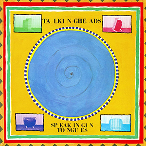 Talking Heads
Speaking In Tongues
Sire, 1983
David Byrne claimed the title of Talking Heads’ fifth album, Speaking In Tongues, was a reference to his lyrics, which at times seem like a verbal stream-of-consciousness. But it also reflected his increasing focus on rhythm over meaning, as well as a fixation with the music and culture of the American south. It was Talking Heads’ first record since their 1977 debut that wasn’t produced by Brian Eno — the result is an album that’s danceable, accessible and ultimately commercial: it was the band’s highest charting LP. The album is best-described as a sort of art-funk, and contains some of the band’s most popular and enduring songs, such as “Burning Down The House,” “Girlfriend Is Better,” and “This Must Be The Place” (which in recent years has become something of an unofficial millennial hipster anthem). The recording features Talking Heads’ expanded line-up — including Bernie Worrell, Steve Scales and Alex Weir — several of whom had performed on the Remain In Light tour of 1980-81. As you’d expect, the band is undeniably tight, yet I have always found the production on this record to be quite brittle, almost stifled. This is especially apparent when I compare it to the warm, supple grooves of Stop Making Sense. Six of the album’s nine tracks were performed in Jonathan Demme’s concert movie (recorded in December 1983) and I prefer the live versions of all of them. I have listened to Speaking In Tongues on LP, CD, and via Spotify, and every time I put it on I expect to hear it differently, but I always have the same reaction. Is it just me? Byrne himself designed the standard release artwork, though there was also a limited edition version created by none other than Robert Rauschenberg. This clam-shell package earned the artist a Grammy, and contained a clear vinyl LP plus three disc collages that could be spun to produce different effects. I’ve never seen one in the flesh but there are several right now on eBay.
 Wham!
Wham!
Fantastic
Innervision, 1983
This is the U.S. release of Wham!’s debut album, Fantastic, which is why it says “Wham! U.K.” on the sleeve, so as to not cause confusion with a short-lived Nashville-based outfit of the same name. The name of the British group had nothing to do with the 1963 Lonnie Mack song or the Roy Lichtenstein painting hanging in the Tate Gallery. Rather it derived from Andrew Ridgeley’s improvised lyric on what became the duo’s debut single, “Wham Rap (Enjoy What You Do).” Ridgeley had taken the chubby, bespectacled Georgios Panayiotou under his wing at school, where they had met almost a decade earlier. They were not yet out of their teens when they emerged as Wham! in late 1982, appearing as a couple of leather-clad tough guys (though any macho posturing was softened by their rolled-up jeans and espadrilles). Wham!’s initial look, carefree attitude and catchy disco-funk made them an instant easy target for the notorious British press, to the extent that many critics chose to ignore (or failed to notice) the social satire of George Michael’s lyrics. Wham!’s first four singles were essentially tongue-in-cheek celebrations of the fun-loving lifestyle of the unemployed and unattached young suburban male. George rapped with admirable confidence for a white teenager from Hertfordshire, but his extraordinary voice and gift for crafting horn-laden pop-soul hits was only revealed on the fourth single, “Club Tropicana,” the video for which also established Wham!’s enduring image as a pair of perma-tanned playboys. Despite its memorable hooks, the album only occasionally hinted at the heights Michael (both as part of Wham! and on his own) would soon reach. Fantastic contained two of the three Wham! songs for which both members are given equal writing credits. Indeed, Ridgeley was rapidly consigned to the role of best pal and silent partner once Wham! entered the studio to cut the LP. Years later George said that the album’s title was Ridgeley’s idea, conceding that Andrew’s greatest contribution to Wham! was “his sense of humour.”
 Madonna
Madonna
Sire, 1983
Though Madonna’s eponymous debut LP introduced arguably the biggest global pop star of the eighties, its genesis was rooted in Manhattan’s downtown club scene. But Ms. Ciccone was no disco diva, and her first record came about thanks to the undeniable qualities she exuded as both a young woman and a fledgling artist. In public, Madonna oozed confidence and ambition, whether it was sartorial, social or sexual. Madonna had arrived in New York in 1978 with just $35 in her pocket. She found an apartment in Alphabet City, served coffee at Dunkin’ Donuts and worked as a coat-check girl at the Russian Tea Room. These jobs funded her pursuit of dance, for which she took lessons at Alvin Ailey and studied under Martha Graham. Following the break-up of her first band, The Breakfast Club, Madonna began writing songs with Stephen Bray, an old boyfriend from her native Michigan. They called themselves Emmy and the Emmys until Madonna decided to promote herself as a solo artist. She foisted her demo tape into the hands of Mark Kamins — a DJ at Danceteria on West 21st Street — and when the dancefloor responded positively to the early version of “Everybody,” he helped get her a deal with Sire Records. By now Madonna was dating painter Jean-Michel Basquiat, who introduced her to producer Reggie Lucas. Lucas programmed the Linn drum machine tracks but was unreceptive to Madonna’s input, so she hired John “Jellybean” Benitez to finish the album. The record established a new kind of synth-driven post-disco, setting a template for white dance-pop that remained for the rest of the decade. Three of the album’s five singles — “Holiday,” “Lucky Star,” and “Borderline” — are radio staples to this day, though one critic described Madonna’s vocals as sounding like “Minnie Mouse on helium,” a label that stuck for years. But to note Madonna’s shortcomings was to miss the point, and misunderstand her innate appeal. She was never just about the music, making her the perfect pop star for the MTV generation. If anything, Madonna’s initial boho-punk image — bleached hair, crop-tops, fishnet gloves and bangles — had a greater impact than the album itself.
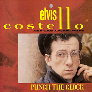 Elvis Costello & The Attractions
Punch The Clock
F-Beat, 1983
Punch The Clock was Elvis Costello’s eighth album but the first that didn’t receive universal acclaim, with many critics and fans taking issue with the glossy production. Costello had engaged former Beatles engineer Geoff Emerick on his previous album — the baroque pop masterpiece Imperial Bedroom — but following that LP’s disappointing sales he recruited British hitmakers Clive Langer and Alan Winstanley, best known for their work with Madness and Dexys Midnight Runners. The duo brought in a four-piece horn section, dubbed The TKO Horns, plus session backing vocalists Claudia Fontaine and Caron Wheeler, collectively known as Afrodiziak. The album’s artwork also suggested a change in direction: Costello is barely recognisable in a Lennonesque cap and wire-framed glasses. The title itself might acknowledge a surrender to 1983’s commercial tastes, as the artist compromises his creative vision for professional survival. Either way, it worked: “Everyday I Write The Book,” a pop-soul tune wrapped in literary metaphor, was his first single to crack the US Top 40. If anything, the bright and shiny sound actually provides a disarming juxtaposition to Costello’s tales of stale romance, social ennui, and political disgust. Among typically dazzling wordplay are perhaps his two most blatant anti-Thatcher protest songs up to that point. An eloquent critique of the war in the Falkland Islands, “Shipbuilding” was originally written for Robert Wyatt, who released it as a single in 1982. Costello’s own version features a memorable trumpet solo by Chet Baker (who later covered Costello’s “Almost Blue”). In contrast, the scathing “Pills and Soap” is almost a pseudo-rap (Costello said the track’s relentless beat was influenced by Grandmaster Flash). The single was credited to The Imposter, a pseudonym Costello used periodically until it eventually inspired the name of his backing band in 2002. I saw Costello perform both of these songs at the Beacon Theatre last month, and can confirm that after four decades they have lost none of their potency. Further proof (were it needed) that the pen is always mightier than the sword.
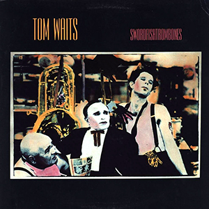 Tom Waits
Swordfishtrombones
Island, 1983
Swordfishtrombones was Tom Waits’ eighth studio album but represented a stylistic reinvention. By the end of the seventies Waits’ after-hours barfly raconteur schtick was bordering on self-parody. In 1980 he met Kathleen Brennan on the set of Francis Ford Coppola’s One From The Heart — within a week the pair were engaged. Through his new wife Waits discovered the music of Captain Beefheart, which greatly influenced the new direction of his own sound for the rest of the eighties. Waits’ records had, up to that point, their roots in some form of nocturnal jazz, but Swordfishtrombones was a sonic departure — it was his first album not to feature any saxophone. Instead the self-produced record was dominated by acoustic bass, marimba, unconventional percussion instruments and odd time signatures. Waits’ gravel-soaked voice meanwhile was now stripped of its former caramel warmth, fluctuating from a menacing howl to a raspy whisper. The songs themselves are a tenuously-connected suite of obscure tales, meandering from the Hong Kong waterfront to the Hollywood freeway and several locations in between. Though the album slips by and feels slight, it is cinematic in its lyrical and musical evocations (there are three instrumentals and one spoken-word track), almost like a soundtrack album to a film that never was. Waits’ label, Asylum, refused to release the finished LP, deeming it too experimental, so he signed with Island Records. In keeping with the record’s peculiar themes, Waits appeared on the album’s front cover with wrestler Lee Kolima and three-foot tall actor Angelo Rossitto. The artwork was by Berlin-born photographer Michael Russ, who used a unique proprietary hand-colouring process that he called “TinTone.” Russ also directed and choreographed the video for the only single taken from the album, “In The Neighborhood.” In December 1983 Waits was a guest on NBC’s Late Night, performing “Frank’s Wild Years” — the first of many regular and memorable appearances on the show (he was also a guest on Letterman’s last ever Late Show on CBS in 2015).
 Huey Lewis & The News
Sports
Chrysalis, 1983
Huey Lewis & The News were my favourite band as a child, and the first band I saw in concert. This was in no small part thanks to Back To The Future, for which they wrote two songs (Huey even made a cameo in the film as a schoolteacher). A poster for the band’s third album, Sports, can be glimpsed in two near-identical scenes that take place in Marty McFly’s bedroom, bookending the main action of the movie. Anyway, Sports turns forty today. I listened to it yesterday for the first time in ages, and unlike a lot of music from 1983, this record sounds very much rooted in the Reagan era. Some of the production (especially on side 2) has aged about as well as an episode of Knight Rider. The album is probably best-known these days for being the subject of yuppie serial killer Patrick Bateman’s critique in American Psycho (both the book and the movie). As anyone who recalls the band’s videos will attest, Huey Lewis & The News never took themselves too seriously, but for many they exist solely through a postmodern lens of glib irony, which inevitably precludes any genuine contextual assessment of their music. Either way Sports produced four top ten singles and was the band’s biggest selling album, shifting seven million copies in the U.S. alone, where in 1984 it was outsold only by Thriller. Later that year Huey Lewis issued a lawsuit against Ray Parker Jr., accusing him of ripping off “I Want A New Drug” for his hit song, “Ghostbusters.” Ironically, Lewis himself had been approached initially to write a theme for the supernatural comedy but declined due to his involvement in the aforementioned time travel comedy. The case was settled out of court. Huey Lewis & The News were always at their best when they leaned into the qualities that make a great bar band. So it’s perhaps appropriate that the album’s front cover was shot inside a bar, specifically the 2AM Club in Mill Valley, California (which is only one letter away from “Hill Valley”).
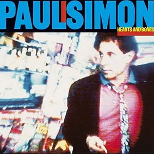 Paul Simon
Hearts and Bones
Warner Bros., 1983
Paul Simon’s sixth solo LP, Hearts and Bones is probably my favourite of his solo records, though perhaps also the most overlooked. It had initially started out as an all-new Simon & Garfunkel studio album, but that plan was derailed when the same old tensions that had caused the duo’s initial split resurfaced during their 1982-83 world tour. Simon also felt the new work was too personal to be performed with his singing partner. Eventually Warner Bros. reluctantly agreed to release it as a solo album; Garfunkel left the project and Simon erased the tracks with his vocals. The album had initially been titled “Think Too Much” until label president Mo Ostin suggested Simon change it. Much of the material deals with the mind’s tendency to get in the way of adult life and relationships, and includes two completely different songs with this original title (Simon’s idea of a self-deprecating joke, perhaps). The new title track’s “one and one-half wandering Jews” are Simon and Carrie Fisher, whom he married in August ’83. Side two contains, in my opinion, three of Simon’s best songs: “Train In The Distance,” “Rene And Georgette Magritte With Their Dog After The War,” and “The Late Great Johnny Ace” (the Beatlesesque coda to which was composed by Philip Glass). The latter was debuted live in September 1981 during Simon’s reunion concert with Garfunkel in Central Park. But when he got to the final verse about the death of John Lennon, a distressed fan stormed the stage. After a barely perceptible pause, Simon proceeded to finish his performance. In May 1982 he played it during an appearance on Late Night with David Letterman — this time a problem with a guitar fret led Simon to conclude that the song was jinxed. He finished it after a commercial break and then played part of an incomplete composition called “Citizen Of The Planet.” I’m not sure if a studio version exists, but a live rendition was included on the live album Old Friends, documenting Simon & Garfunkel’s 2003 reunion tour. The words are also included in a book of Paul Simon lyrics given to me by my dad. In 2023 their sentiment could not be more pertinent.
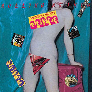 The Rolling Stones
Undercover
Rolling Stones Records, 1983
Undercover, the Rolling Stones’ 17th studio album, was released forty years ago today. This underrated LP — whose original artwork included removable stickers — sold well initially, but is often maligned due to the graphic imagery of its lyrics and general toxicity surrounding its creation. At this point Mick Jagger and Keith Richards had been working together for two decades so it was perhaps inevitable that by 1983 they were sick of the sight of each other. Keith would arrive at the studio around midnight, as his songwriting partner left for the club. Mick had long kept a close ear to what he’d heard in the discos of Paris and New York. Whether it was a reflection of his eclectic taste or a shrewd bid for chart relevance, the result was some of the Stones’ best dance records. A somewhat cleaned-up Keith insisted the band stick to its roots, but Mick was now reluctant to relinquish creative control. Plus ça change… Meanwhile, Mick’s career ambitions were becoming more suited to screen than stage. He embraced the concept of MTV and even positioned himself for acting roles, while hatching out in secret a solo deal with Columbia. Keith refers to this as “LVS” (Lead Vocalist Syndrome); it was around this time that he and Ronnie Wood began referring to Mick as “Brenda” behind the singer’s back. The rift was even played out to a dramatic conclusion in Julian Temple’s elaborate video for the politically-charged lead single, “Undercover Of The Night,” in which Richards shoots Jagger dead. Elsewhere the record lurches between unadorned rock ’n’ roll, hard grooves and self-parody. Side two opener “Too Much Blood” — on which a rambling Mick ad libs a deadpan monologue critiquing the violence of contemporary culture — is as disturbing as it hilarious. Given Mick and Keith’s diverging visions for the project, Undercover still sounds fantastic, and nothing like the well-received but otherwise tepid new album they released last month. Never again would the Stones sound this catchy, angry, lurid, menacing or… well, Stones-y. I wouldn’t expect Mick and Keith to be making the same music at 80 that they did at 40, but I definitely know which I prefer.
 England/New Order
“World In Motion”
Factory 12”, 1990
To fully appreciate the significance of this single one need only look up World Cup songs of the seventies and eighties, which routinely found British squads bellowing off-key while swaying awkwardly to belie their general discomfort. But in 1990, England enlisted one of the UK’s most critically-acclaimed bands, lending instant credibility to a sub-genre that up to that point had been a subject of ridicule. Of course, the track sounded great (the bar had been set low), but lyrically it was a revelation. Previous World Cup songs had invariably taken the form of tired pub sing-alongs, full of empty promises about learning from past failures and bringing the cup home. As its very title suggested, “World In Motion” had a broader concern beyond England’s results on the pitch. Its lyrics were more abstract and ambitious — at its heart lay the possibility of love and international harmony, using football as a metaphor for self-expression. Then, as if things couldn’t get any better, up pops John Barnes, a victim of merciless racist abuse throughout his career, to silence haters with a thirty-second rap: “We ain’t no hooligans/This ain’t a football song…” This lyric not only further elevated the track above its mediocre predecessors, but it also made a blatant distinction between itself and the hotbed of fragile masculinity that was English football in the eighties. The twin successes of “World In Motion” and “Nessun Dorma” (used as the BBC’s theme for Italia ’90) shifted the sport’s cultural domain in the UK towards a liberal middle class, signaling a turning point in the way the game was perceived and marketed over the next decade. “World In Motion” stayed at number one on the British singles chart for two weeks, but surprisingly, it did not pave the way for equally memorable tournament songs (1996’s “Three Lions,” while a ready-made terrace chant, felt like a musical regression). So today “World In Motion” exists as a football and pop music cross-cultural landmark, not just for how it sounded, but for what it meant. “When something’s good it’s never gone…”
 Massive Attack
Blue Lines
Wild Bunch, 1991
Massive Attack’s debut album, Blue Lines, was the archetype for a peculiar sub-genre of British music initially referred to as the “Bristol sound.” Massive Attack were the first major act to emerge from Bristol’s soundsystem scene: its core members — DJs Grant “Daddy G” Marshall and Andrew “Mushroom” Vowles, and graffiti artist-turned-rapper Robert “3D” Del Naja — had been working as a loose collective known as The Wild Bunch since the mid-eighties. When they finally got together the motivation and funds to cut an album (a large chunk of which was recorded at Neneh Cherry’s house) they were joined by Tricky Kid, whose anxious monotone was offset elsewhere by the warm vocals of Jamaican singer Horace Andy and British soul siren Shara Nelson. The album is perhaps best remembered for its stirring first single “Unfinished Sympathy” and the accompanying video, in which a carefree Nelson paces Los Angeles’ West Pico Boulevard. Released in the midst of the Gulf War air strikes, the group had to drop the second word from their name to ensure radio airplay, but the track still reached number 13 and still ranks highly on critics’ lists. Today, Blue Lines’ odd textures, nocturnal atmosphere and cinematic samples perfectly suit its lyrical themes: the significance of love, positivity and selfhood in the face of general disillusionment. By the mid-nineties other acts had followed this lead, around which point this lucrative new category was dubbed “trip-hop.” I loved Massive Attack’s second official release, Protection (1994), featuring Tracey Thorn from Everything But The Girl, and Tricky’s first solo album, Maxinquaye (1995), featuring Martina Topley-Bird, which is arguably the movement’s zenith. I never really got into Massive Attack’s 1998 album, Mezzanine, though it included guest vocals by Liz Fraser of the Cocteau Twins and was the group’s most commercially successful release. But I’ve played Blue Lines consistently since I was a teenager — it might be my favourite album of the nineties, and is certainly one of the most evocative of that decade. I even remember it playing in my high school art class, but then my dad was the teacher…
 Prince & The New Power Generation
Diamonds and Pearls
Paisley Park, 1992
Diamonds and Pearls was Prince’s thirteenth album in as many years and his fourth (!) double LP, though incidentally the first of his that I don’t own on vinyl (there were two versions of the CD; for some reason I have both). This was also the first studio album to be credited to the New Power Generation. The live band swings hard with a sound that’s warm and jazzy, though the record hints at a heavier production style that typified Prince’s work by the mid-nineties. The result was an album that felt rooted in some version of contemporary urban life, as Prince suddenly appeared to be looking outward — or at least onto the street. No longer operating solely in his own orbit, his insecurities concerning chart trends were perhaps exposed by a distinct influence of new jack swing and hip-hop. Evidently Prince had softened his stance on rap music since previously disparaging the genre, even deploying an MC, Tony M, on a handful of tracks. (I remember hearing “Gett Off” in the school playground, suggesting the ploy had worked.) But for all his innovation in the studio, Prince’s songwriting is refreshingly straightforward and his vocal performances unaffected. The most memorable songs on the album are devoid of excessive production flourishes and played totally straight, revealing their honest beauty and craft. On the title track, a gorgeous baroque rock (barock?) ballad, Prince takes a backseat to the considerable vocal talents of Rosie Gaines. It’s the kind of song that few artists would dare tackle and probably the last truly great single of Prince’s career. In contrast, “Cream” feels almost throwaway: a Bolan-esque ditty that bounces along on such an effortless groove you can’t believe it had to be written. Legend has it Prince composed the whole thing while looking at his reflection in the mirror. When he wasn’t fixing his eyeliner he was penning adult socio-political critiques like “Money Don’t Matter 2 Night,” a mid-tempo number whose message both timeless and prescient was given visual life by Spike Lee in a video that could have been made yesterday. Sadly it was deemed unsuitable for MTV. “And u think u got it bad…”.
 Prince & The New Power Generation
Love Symbol
Paisley Park, 1992
Prince’s fourteenth studio album also introduced the unpronounceable symbol that would soon become his stage name. This gender-blending glyph was stamped directly onto the plastic CD case; today the album tends to be referred to as “Love Symbol.” Ironically, its lead single and opening track was called “My Name Is Prince,” a suggestion that the little man hadn’t entirely lost his sense of humour (or his ego). Indeed, the record was originally intended to weave a loose but elaborate narrative about an Egyptian princess played by Prince’s future wife Mayte Garcia. But most of these dramatic segues had to be cut to allow the album to fit on a standard-length CD (it still maxes out at a hefty 75 minutes). The concept was resurrected for a direct-to-video film called 3 Chains o’ Gold that eventually emerged in 1994 (I’ve never seen it). The three spoken-word interludes that made it to the finished album all feature Kirstie Alley in the role of dogged reporter Vanessa Bartholomew, following her vain attempts to secure an exclusive interview with the elusive purple genius (apparently Prince was a big fan of Cheers and befriended the actress on set). If you can put aside those quaint indulgences, the rest of the album divides itself between heavy slabs of danceable R&B and refreshingly unaffected mid-tempo ballads. It became Prince’s best-selling album since Purple Rain, and is evidence of the increasing influence of hip hop on his sound, packed with examples of the joking-not-joking sexually explicit bravado he’d appeared to have outgrown. Nevertheless, the record’s undoubted highlight is “Sexy M.F.,” a spiritual successor to “Sex Machine” that showcases the NPG as the tightest jazz-funk combo since James Brown hung up his cape. Inevitably, the single version had to be cleaned up for radio, but the incriminating refrain is repeated so many times on the original that by song’s end it essentially becomes benign, its power to offend lost beneath the track’s chunky horns and incessant, undeniable groove. The album’s other hit single was entitled “7,” which is also where it peaked on the chart.
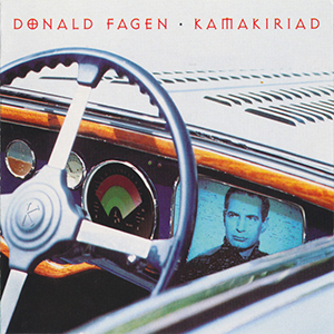 Donald Fagen
Kamakiriad
Reprise, 1993
Thirty years ago today Donald Fagen released his second solo album, Kamakiriad, over a decade after his first one. Following the success of The Nightfly in 1982, Fagen had spent the bulk of the eighties suffering from depression and writer’s block. Instead he focused on session work and composing music for films, most notably the adaptation of Bright Lights, Big City (though unfortunately, Fagen’s version of Jimmy Reed’s song from which the novel took its name is not included on the movie’s LP soundtrack). He also penned a regular column in Premiere magazine. Steely Dan’s old website even lists the year’s 1988-1992 as “The Dark Ages.” Kamakiriad is a concept album of sorts, an eight-song cycle about an unnamed narrator’s steam-powered odyssey aboard the titular vehicle of the very near future (it even has a hydroponic farm in the back). Fagen’s retro-nostalgic vision is further brought to life by his fixations with Cold War era jazz and science-fiction, safe havens warmed by sun or fire, and alluring beauties that may or may not be out of this world. Though nominally a solo record, Kamakiriad was produced by Fagen’s Steely Dan co-founder, Walter Becker — by that point a resident of Maui — who also contributes bass and lead guitar. Not counting their involvement on Zazu, a record by model-turned singer Rosie Vela, in 1986, it was the first time the pair had collaborated since the last Steely Dan record, Gaucho, in 1980. In 1994, Fagen returned the favour, playing keyboards and co-producing Becker’s own solo debut, 11 Tracks of Whack. Later in 1993, Steely Dan began touring again for the first time in nineteen years, and didn’t really stop until Becker’s death in 2017. Today Fagen continues to tour as “Steely Dan” at the behest of promoters.
 Oasis
Oasis
(What’s The Story) Morning Glory
Creation, 1995
This record defined 1995: I remember hearing it at home, at school, at parties… In the end it came to define mid-nineties culture in the UK in a way that today seems quaint. Imagine if 2020’s major headlines concerned the CD sales, supposed rivalries and off-stage antics of a rock band. This period will always be referred to as peak “Britpop.” I always hated that label, mainly because it lumped bands together that otherwise had no connection besides having formed in the UK, as if nationality were a musical genre and all British groups — whether from London, Liverpool, or even Manchester — sought the same sound. It also meant that many mediocre imitation bands got to bask in the glow of fame earned by the more talented ones, resulting in clogged airwaves and an increasingly tiresome scene (I felt British music became notably looser and more varied once the media frenzy had faded by the end of the decade). Morning Glory is not my favourite Oasis album (that distinction still belongs to Be Here Now, much to the disbelief of most). But a quarter-century later it still sounds great and I still know every word, though I cannot disassociate it from endless days of cloud and drizzle. Noel Gallagher’s lyrics were always self-aware but vague, as if he was recalling a dream from a few nights before but also looking ahead a couple of decades, imagining a nostalgia for something that had yet to happen. Like a professional athlete, he seemed conscious of the fact that success would be fleeting, that the giant wave his band rode by nature could not last, and that this was his personal moment in pop history. I think that slight urgency gave Oasis an edge over their contemporaries, whose clever posturing and arch humour perhaps had less direct appeal. They also simply wrote better songs (though they still never really “cracked” America).
 Oasis
Oasis
Be Here Now
Creation, 1997
Oasis’ third album, Be Here Now, came out 25 years ago today. I didn’t have to look that up: the date was included prominently on the CD artwork, no doubt as a reminder to fans that in purchasing the record they were contributing to a moment of historic cultural significance. This wasn’t a case of hubris: 424,000 people bought copies of Be Here Now on its day of release, making it the fastest-selling album in UK history. I was one of them, and it immediately became my favourite Oasis album, though this preference is still routinely scoffed at by those who took part in the “Great BHN Backlash” of late ’97. Though I enjoyed a lot of the music I never liked the term “Britpop,” and always considered it a political movement more than a musical one. At its height I found the hype-driven, tabloid-fueled frenzy quite tiresome, even provincial. Thankfully by 1997 there were signs that the flag-strewn hysteria had begun to subside. In February, Blur released an eponymous “lo-fi” record, a clear rejection of the media circus in their native country that, notably, proved to be their best-performing album in America. Few imagined Oasis could surpass the colossal success of their second album… except Oasis. Rather than tone down their aspirations for global domination, the brothers Gallagher (and those three other blokes) — still riding a high of unwavering self-confidence that only a seemingly endless stream of cocaine and adulation can provide — defiantly turned up their already grandiose sonic approach to Wagnerian proportions. I remember seeing the video for epic album opener and lead single “D’You Know What I Mean?” on MTV (in Germany, appropriately enough). It made the “Ride of the Valkyries” sequence from Apocalypse Now look like a low-budget indie film. Despite record-breaking sales and gushing initial reviews, critics, fans — and even Noel Gallagher himself — soon changed their tune on the album. Today it’s still frequently dismissed as an indulgent, bloated collection of over-produced, meaningless songs. But I also remember reading somewhere that Oasis “didn’t need to have a message because their message was the very act of being Oasis.” This is precisely why, love it or hate it, Be Here Now is the most Oasis album Oasis ever made.
 Lauryn Hill
The Miseducation of Lauryn Hill
Ruffhouse, 1998
The Miseducation of Lauryn Hill was by far my favourite album of 1998, and certainly one of the decade’s most influential. Hill was already well-known as the voice (and face) of The Fugees, but her solo debut exceeded expectations. Though tinged by the warm sounds of the past (the lead single was called “Doo Wop”), this catchy record felt like both a celebration of black music and a critique of its broader culture, making its crossover appeal not only inevitable but also important. Hill was praised for her ability to sing and rap with equal authority, but her varied and honest songwriting was the album’s greatest revelation. Her confessional lyrics delved into the complexities of womanhood, motherhood and every other kind of ’hood, offering refreshing perspective on her struggles as a black female musician seeking to scythe through the lazy misogyny that blighted commercial hip-hop in the nineties (and beyond). Despite the consistent strength of Hill’s material, Miseducation wasn’t impervious to the industry trends of the period. The album featured A-list guest appearances from the likes of Mary J. Blige, D’Angelo and even Carlos Santana. Luckily these studio drop-ins didn’t distract, unlike the pointless spoken interludes inserted between songs (an irritating R&B tendency in the CD era). As a result the album clocks in at a bloated 78 minutes (that’s including the two hidden tracks). After Miseducation won five awards at the Grammys, Hill was the undisputed queen of neo-soul and perfectly primed for a long and successful solo career. But as of 2023 it remains her only studio album. By the turn of the millennium Hill had retreated from the spotlight, citing understandable disillusionment with fame and the music industry. In the past quarter-century she has performed and recorded only sporadically, prompting periodic and misinformed speculation as to the status of her professional and personal lives. Then this week she announced a 25th anniversary tour in celebration of the album, suggesting that even she recognizes Miseducation as her greatest statement and most lasting legacy.
 Daft Punk
Discovery
Virgin, 2001
By the time Parisian disco duo Thomas Bangalter and Guy-Manuel de Homem-Christo, better known as Daft Punk, released their second album, Discovery, the record’s lead single and opening track “One More Time” had already become ubiquitous, both on the radio and in the club. I was a student in Italy at the time and must have heard that song every day and every night for months; I remember my roommate and I used to mimic with glee the overly annunciated vocals (“tonigh-tah!”). I’d enjoyed Daft Punk’s first album, Homework, so when the new disc came out I picked it up immediately, probably from Ricordi Mediastore or Messagerie Musicali (Milan’s equivalent of Virgin Megastore or Tower Records). Furthering Daft Punk’s reputation as technological innovators, the CD came with instructions how to join Daft Club, an online community for accessing exclusive bonus material. Prior to launching the new record, Daft Punk had begun wearing shiny robot helmets in public: a visual metaphor for the merging of man and machine, but also a means for hiding behind their synth-heavy retro sound. Though it’s an electronic album, much of the “samples” use live instrumentation, resulting in the warm sensation of believing you’re hearing an older soul tune even when you’re not, and providing the record surprising emotional resonance. The album’s unapologetic earnestness and hook-laden pop sheen almost comes off as faux-naivety, but that’s balanced by a trademark humour (clocking in at ten minutes, the album’s final track is titled “Too Long”). I played this CD to death for a year or two, but notably hardly at all since. Daft Punk announced their break-up last month, though such a formal statement hardly seemed necessary given their less than prolific output and faceless personas. Ultimately, I felt Daft Punk became a bit of a parody, a clever idea taken to its absolute zenith. Like an electro-house version of another perfectionist twosome, Steely Dan, they were perhaps too smart for their own good. At times their act felt like an inside joke at the audience’s expense, but it did remind us to take nothing seriously — except the music.
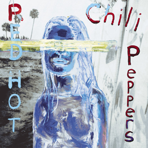 Red Hot Chili Peppers
By The Way
Warner Bros., 2002
By The Way, the Red Hot Chili Peppers’ eighth album, was released during the same summer I finished university. I always loved this band, both for their unique sound but also their mystique and pervading sense of place. Not since the Beach Boys has a band’s music been so inexorably connected to southern California, and to me RHCP have always represented a distant and exotic version of Los Angeles life that to this day feels entirely foreign. I bought all the band’s albums in the nineties and like those, this one was also produced by Rick Rubin. But it marked something of a change in direction. Less funky, but more mature, melodic and textured than their previous releases, the record is characterized by John Frusciante’s extraordinary guitar work and multi-layered backing vocals. (Apparently bass player Flea felt so left out of the creative process on this record that he considered quitting the band.) The album almost feels like a distillation of California rock up to that point, laden with radio-friendly hooks, Wilson-esque harmonies, and even some lush string arrangements, all shot through a vague filter of sun-drenched psychedelia. Anthony Kiedis’ lyrics at times resemble a stream of consciousness, but still manage to convey a certain jaded optimism and a new self-reflective perspective on common subjects: love, drugs, and the wild contradictions of modern Angeleno culture. Ironically the artwork was painted by a New Yorker, Julian Schnabel, whose daughter Stella happened to be dating Frusciante at the time. I still have a poster of the cover that came free with an issue of Kerrang! magazine (which I never usually bought). If I have a criticism of this album it’s that at 69 minutes it’s probably a bit long, but it flies by in comparison to the band’s next album, a sprawling and somewhat indulgent double CD entitled Stadium Arcadium. By that point my obsessive interest in pop music had already begun to wane, and by the time I moved to New York I no longer had the time or energy to keep up with every new release. I like to think that says as much about the music (and the decline of record shops) as it does about me.
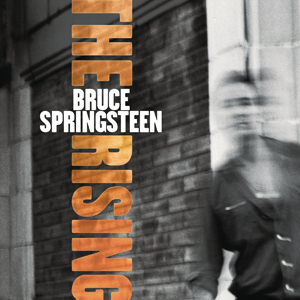 Bruce Springsteen
The Rising
Columbia, 2002
Bruce Springsteen’s twelfth studio album, The Rising, was a significant and highly-anticipated release for two reasons. Firstly, it was Springsteen’s first studio album with the E Street Band since Born in the U.S.A. in 1984, making it something of a comeback record. Secondly, it was the first CD by a major artist to address directly the events of September 11th, 2001, or at least the grief and paranoia of its aftermath, and in my mind will always be connected to that very uncertain period. The first new material I heard from the record was “My City Of Ruins.” Originally written about the dilapidation of Asbury Park, it acquired a different association when Springsteen opened the America: A Tribute To Heroes telethon by previewing a pared-down version of the song without introduction, a mere ten days after 9/11. Produced by Brendan O’Brien (best known for his work with grunge acts like Pearl Jam and Soundgarden), “The Rising” album presented some fresh textures that subtly updated the familiar E Street sound without ever diminishing it. The band had already reunited for a live tour in 1999, a series of epic shows that at times began to resemble a rock and soul sermon, with Springsteen in the role of Telecaster-wielding pastor. He sometimes assumed a similar role on this album, which provided a degree of comfort and reassurance during some of the most turbulent months in this nation’s history. Far be it from a musician’s responsibility to steer a country forward in a time of crisis, but in 2002 who else was going to do it? The opening track’s organ and chugging horn refrain (“It’s alright, it’s alright… Yeah!”) could have been applied to any roadside bar singalong in Springsteen’s catalogue, but in this context took on an unexpected meaning that still packs a surprise emotional punch two decades later. This uplifting affirmation of survival set the tone for the entire record, which bravely grappled with the question of how to continue living (and even have a party) in the face of such despair and fear. Springsteen’s answer was a vital and timely reminder that like it or not, for better or worse, life, one way or another, does go on.
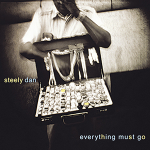 Steely Dan
Everything Must Go
Reprise, 2003
Steely Dan’s ninth and final studio album, Everything Must Go, was the follow-up to 2000’s Grammy-winning Two Against Nature. That album had appeared after a hiatus of twenty years, so unsurprisingly EMG (as the kids on Twitter call it) uses most of the same personnel as 2AN, though it’s not quite a companion piece. For starters it’s warmer and looser — even Walter Becker sings lead vocals on “Slang Of Ages.” My favourite track has always been “Godwhacker,” about a band of assassins on a mission to take out the man upstairs. The other songs cover the Manhattan-centric themes you might expect of late-era Steely Dan — material excess, divorce, internet noir, digital entertainment product, a date with a stalker, a folding business — and the general tone is one of defeat and resignation. To me this album represents two middle-aged men recoiling from contemporary culture, opting to bow out and take no further part, rather than risk sliding towards humiliation, depression, or worst of all, mediocrity. Judging from the title (and the title track that closes the album), Becker and Fagen had little intention of making another Steely Dan record. They never did: both released solo albums before Becker died from esophageal cancer in 2017.