Progress Report and accompanying poster highlighting Amazon Fresh’s sustainability goals and achievements.
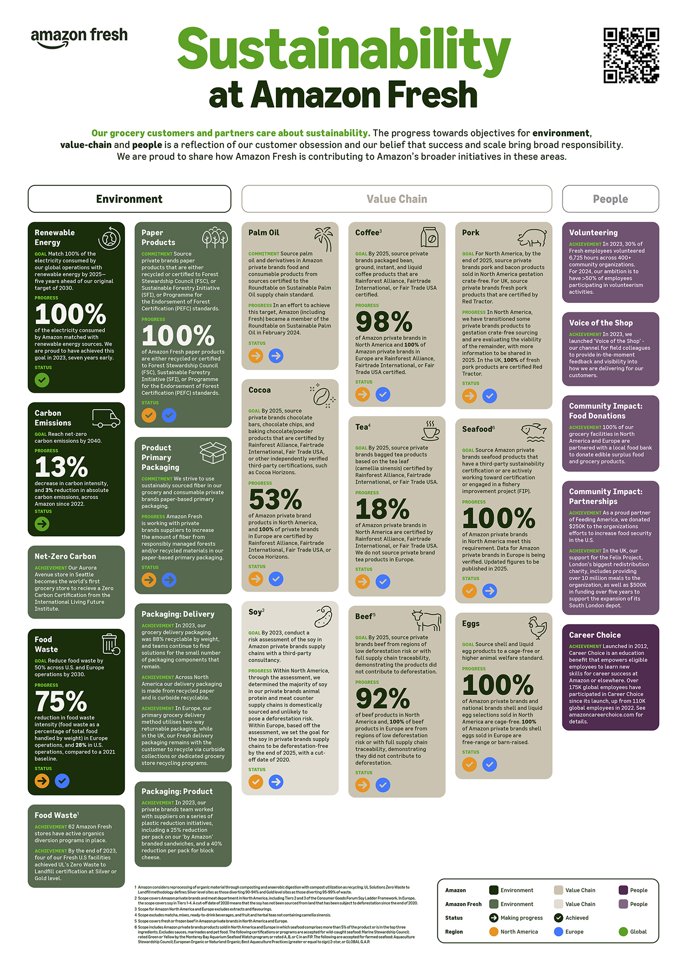

Progress Report and accompanying poster highlighting Amazon Fresh’s sustainability goals and achievements.

As a leader in sustainable packaging solutions, International Paper required its thorough reporting to serve as a complete sustainability package that communicated both transparency and performance. The brief was to design a suite of five reports that could function as both stand-alone documents and a cohesive set. I devised two distinct concepts for the front covers.
Making use of the brand’s broad yet subtle color palette — centering on earth tones and other hues found in nature — the first of these played with the scale of IP’s elegant logo.
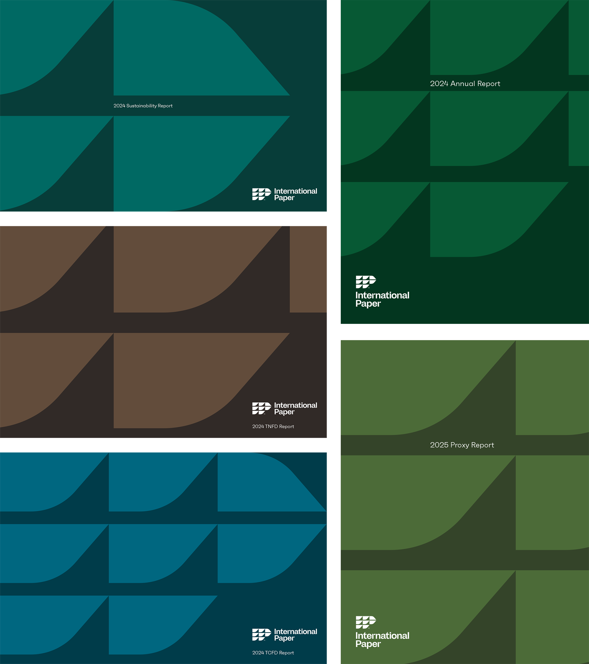
The second concept was more literal, borrowing graphic elements from IP’s existing set of graphic icons.
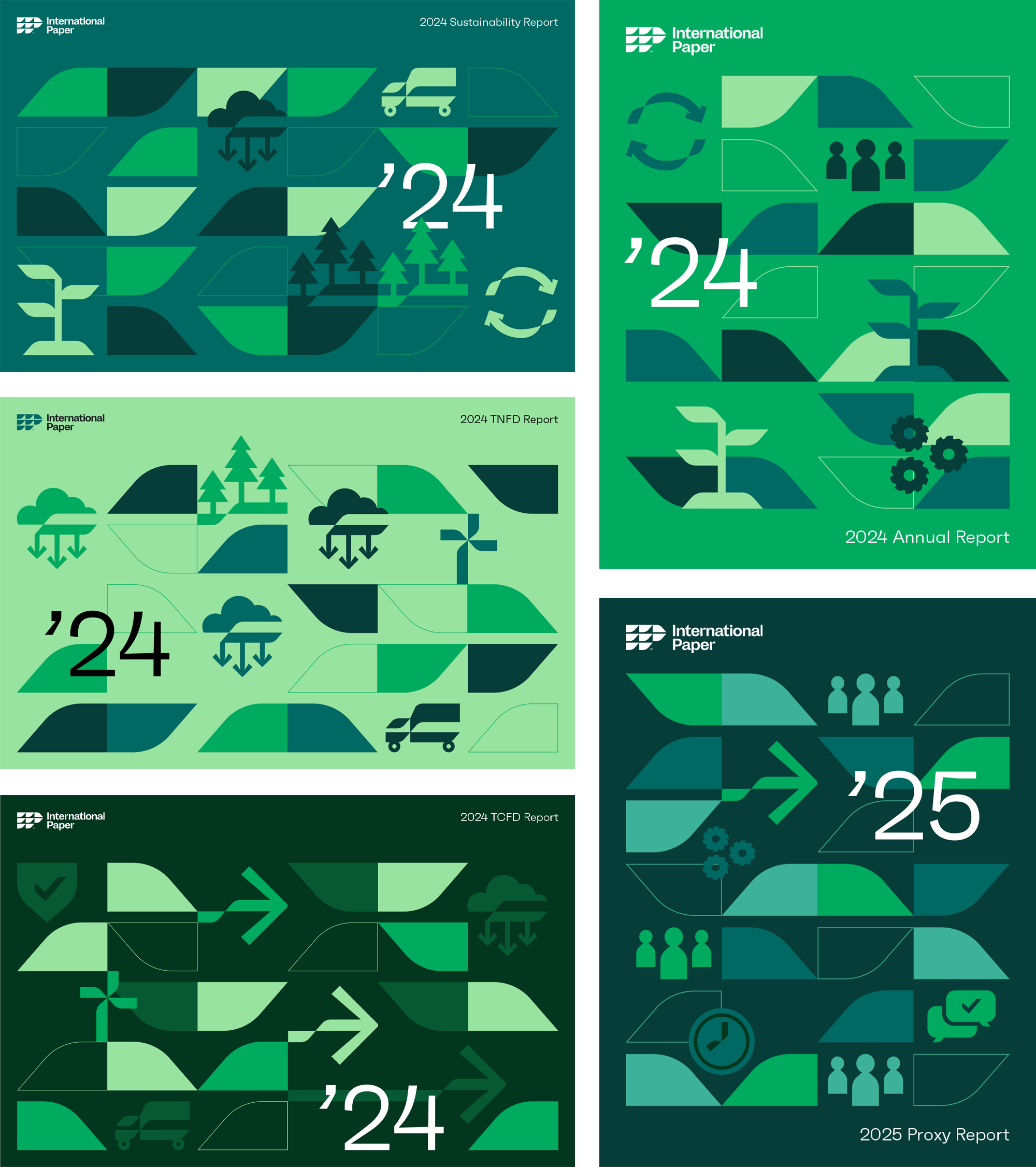
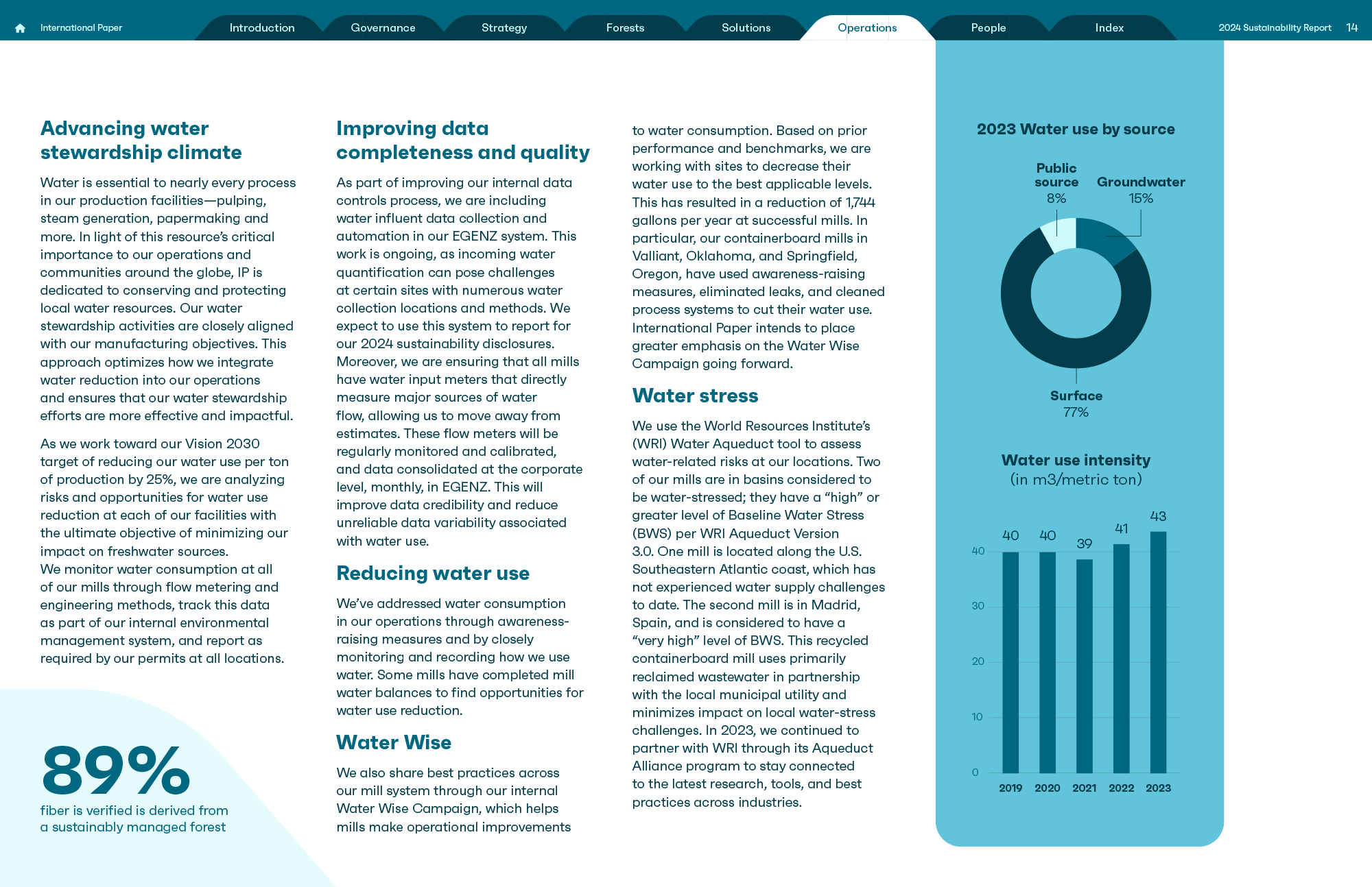
For the interiors, the flexible “leaf” shape acted as both a brand identifier and a useful graphic device that extended to the reports’ navigation systems.
Check out the complete suite of reports here.

Founded in Osaka in 1781, Takeda is a global Japanese biopharmaceutical company — now the third largest company of its kind in Asia. It focuses on oncology, rare diseases, neuroscience, gastroenterology, Plasma-Derived Therapies and vaccines.
For its Annual Integrated Report, Takeda wanted to articulate its long-term value creation model, much of which concerns PDTs, their dengue vaccine, and leading-edge oncology treatments. The client also wished to bring together diverse global organizations by showing regional impact by talking about their work not just in Japan, but also Brazil, Austria and the United States. The primary target audience for this report is stakeholders and investors, but another focus was employees, in order to build trust from within but also further differentiate Takeda’s positioning in the industry.
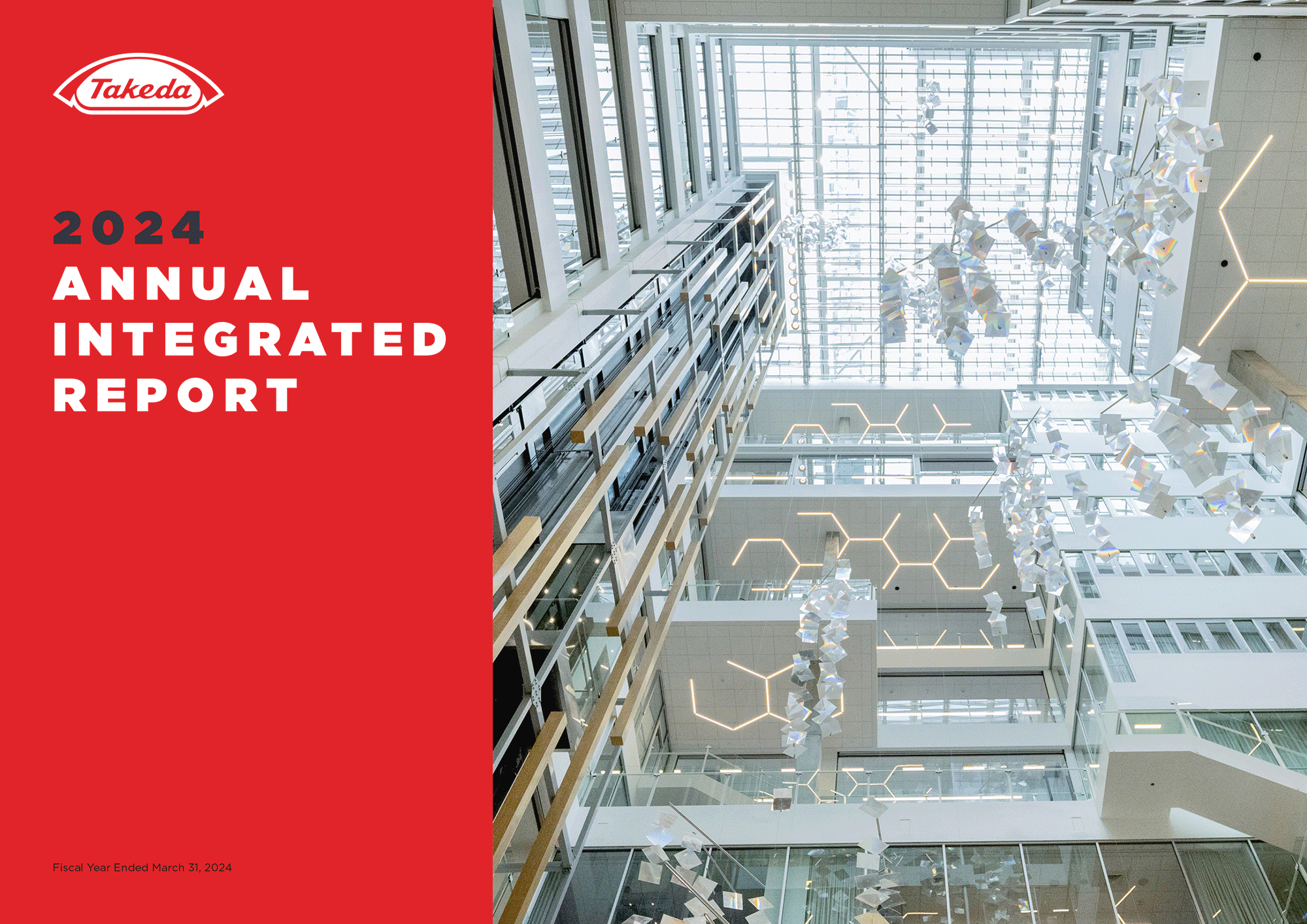
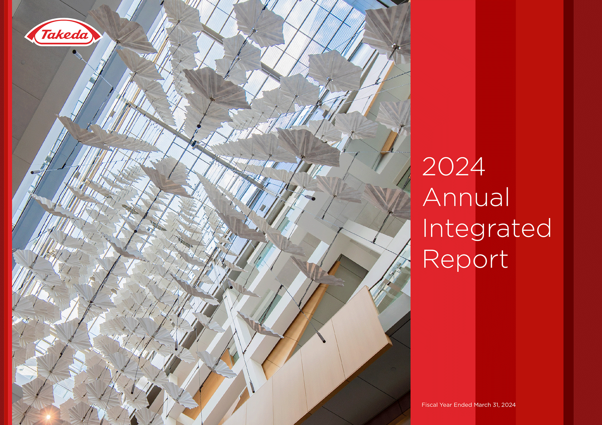
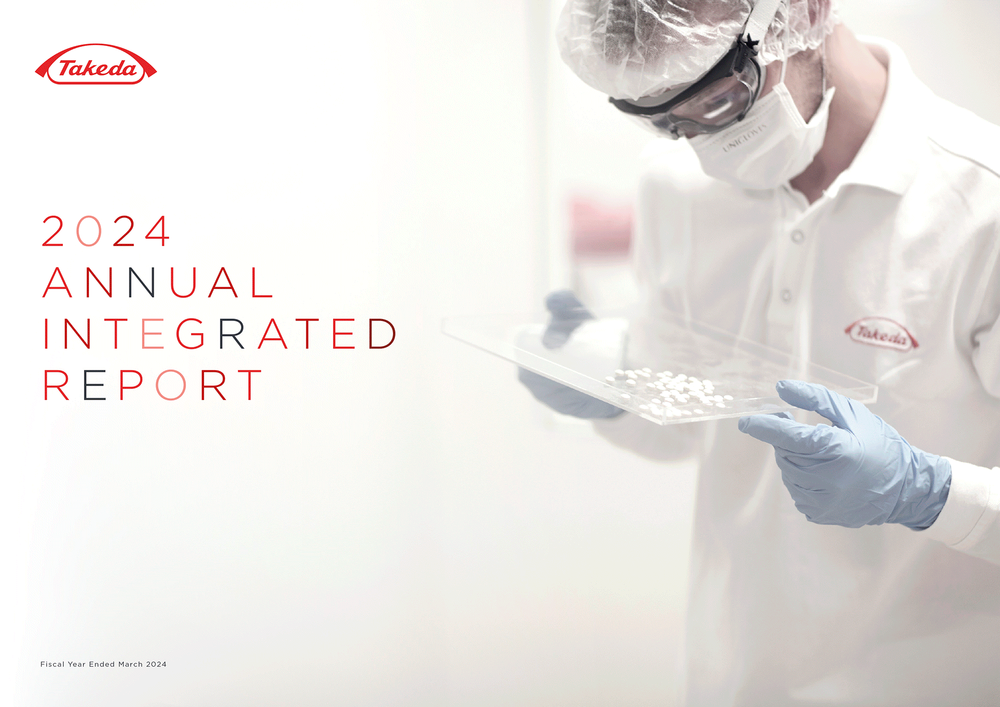
For the 2024 report I devised four distinct concepts that drew inspiration from both the meticulous precision of the company’s research and the quiet elegance of Japanese design and culture. The brand’s unusual primary color palette incorporates three different shades of red —— I was initially hesitant to use them together until I developed a dynamic motif of overlapping stripes that served as a visual anchor for the third concept. This was the one I eventually expanded upon for the finished report.
Another aspect that visually strengthened this report was its photography. Takeda conducted a series of new photoshoots in Japan and Brazil and I was able to leverage the beautiful results of those to produce full-page, full-bleed layouts with thoughtfully overlaid type. This not only broke up the repetition of the more text-heavy pages but also provided a certain magazine-like sophistication, something the client had specifically requested.
View the finished report here.
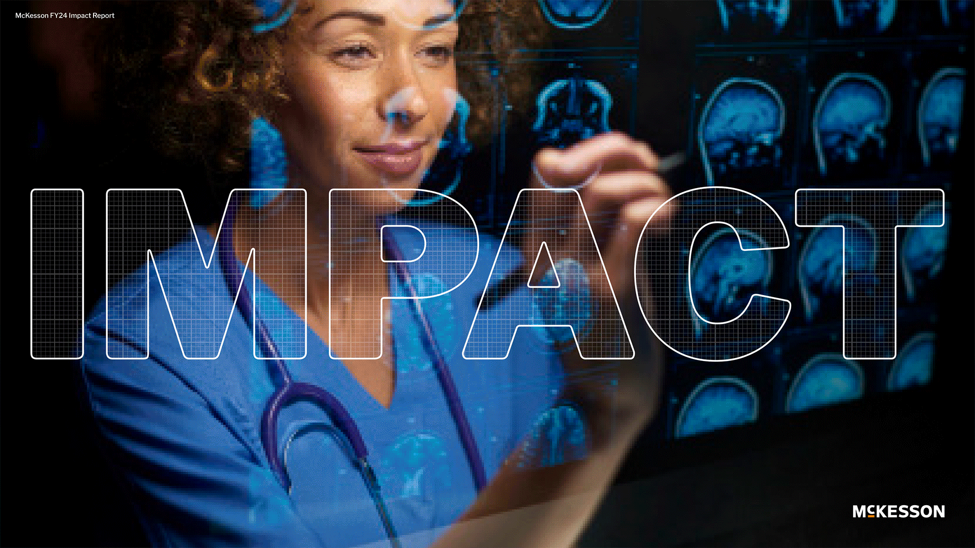
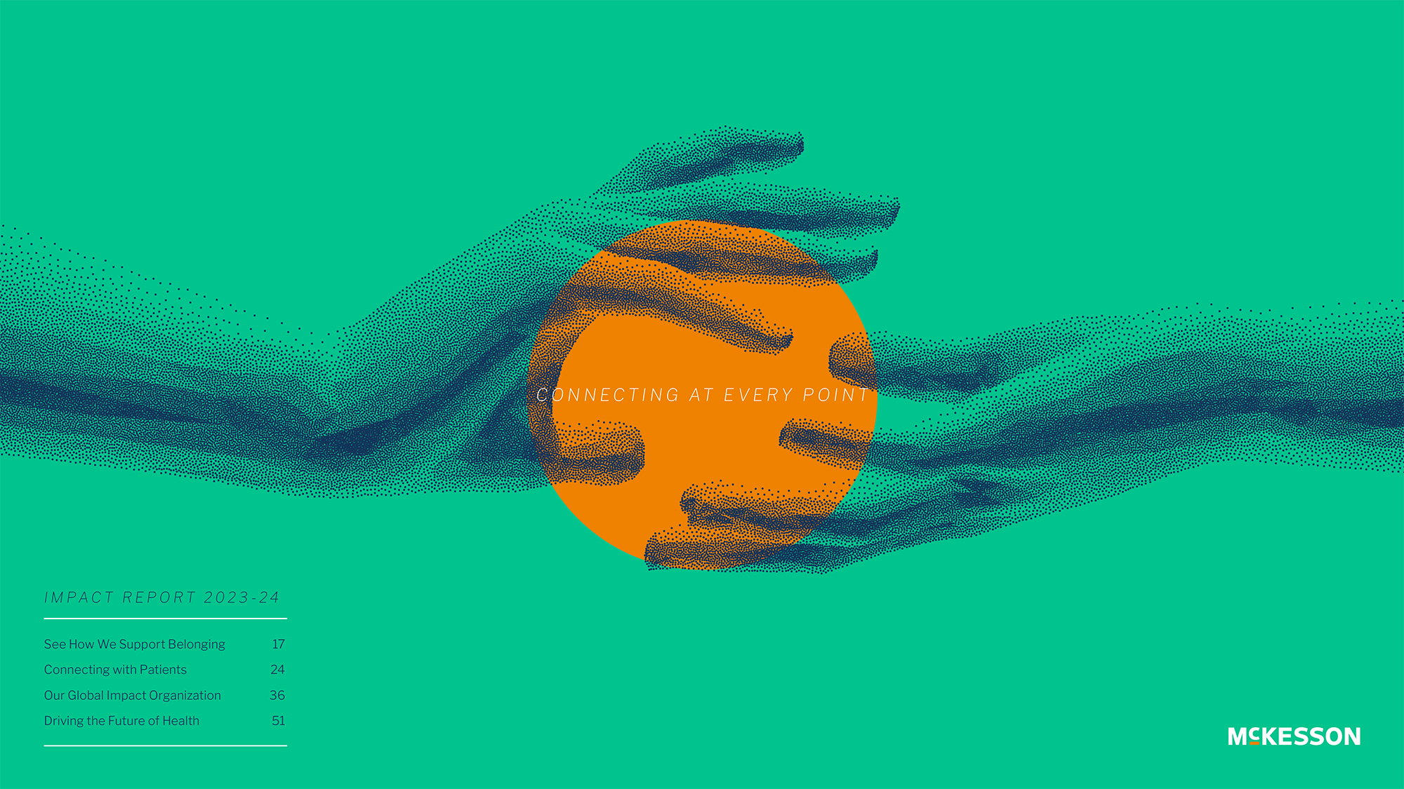
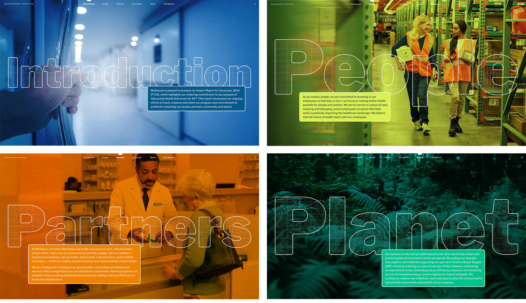
As one of the top ten largest companies in America, McKesson is an industry leader in healthcare with a single company purpose: Advancing Health Outcomes for All. With this mission comes a responsibility towards excellence and transparency in its reporting. In my role as Design Director at Sia/Addison I was tasked with producing McKesson’s progress report for two consecutive fiscal years.
In the second year the client asked to be “pushed out of their comfort zone,” in an effort to differentiate themselves within the healthcare/pharmaceutical sector. I devised three distinct concepts and layout approaches (plus a fourth that wasn’t executed) that might satisfy this request.
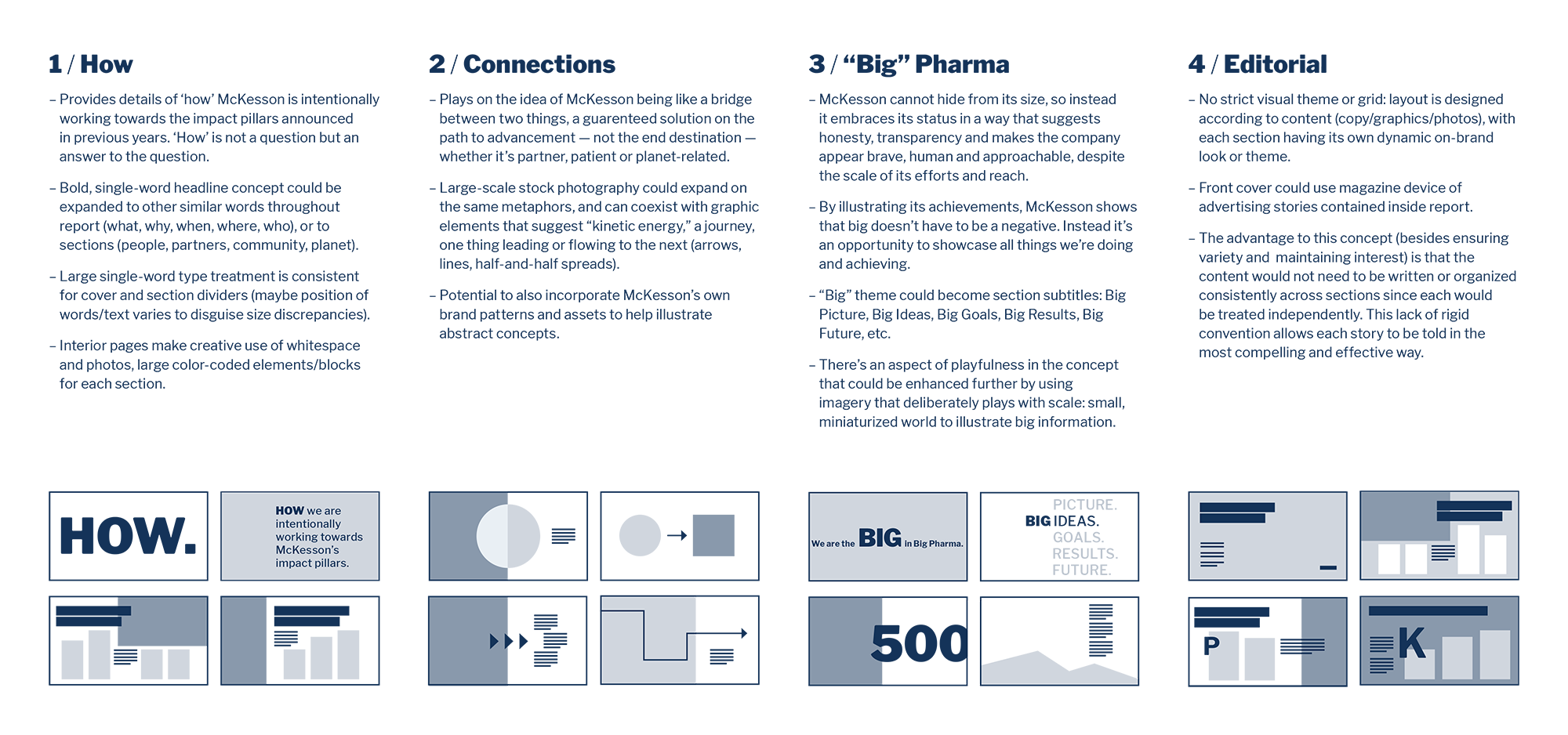
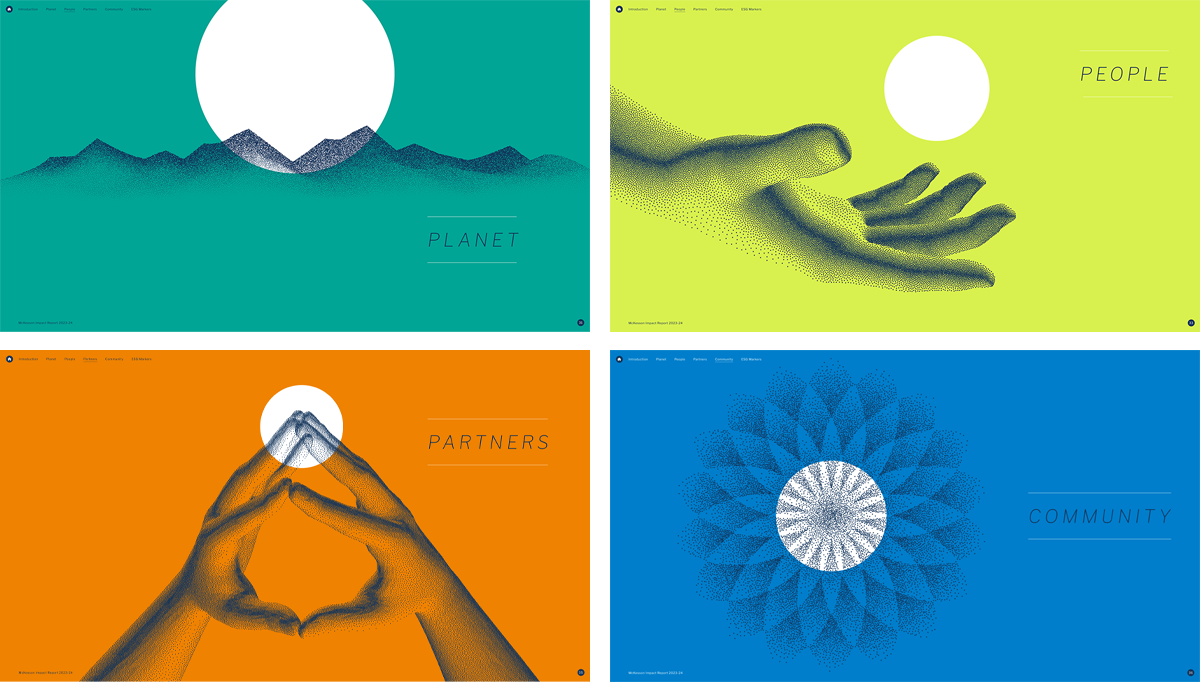
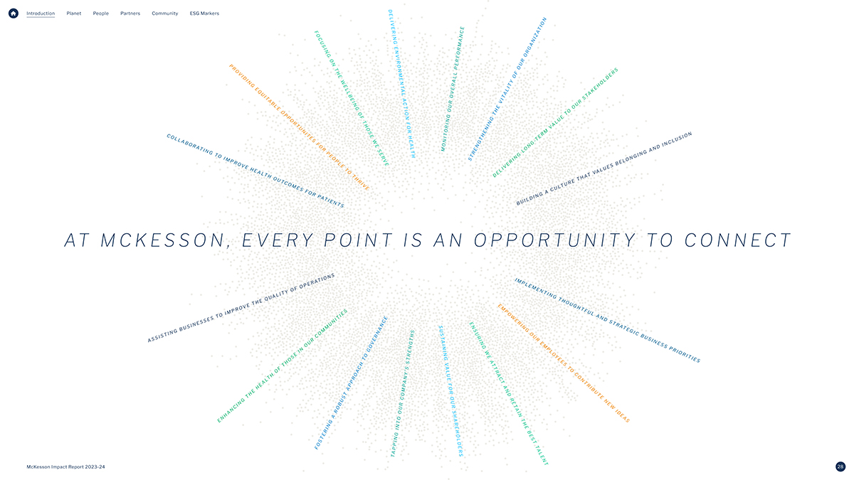
Naturally, each approach maintained certain consistencies. The report was divided into four sections representing McKesson’s impact pillars which were color-coded with McKesson’s vibrant palette. I also harnessed the strongest elements of McKesson’s existing brand assets and found fresh ways in which they could be applied. Regardless of the direction, the goal of the report was to showcase the human impact of the company’s commitment to shape the future of health.
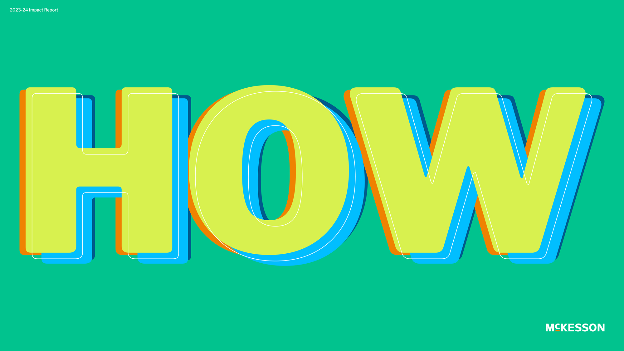
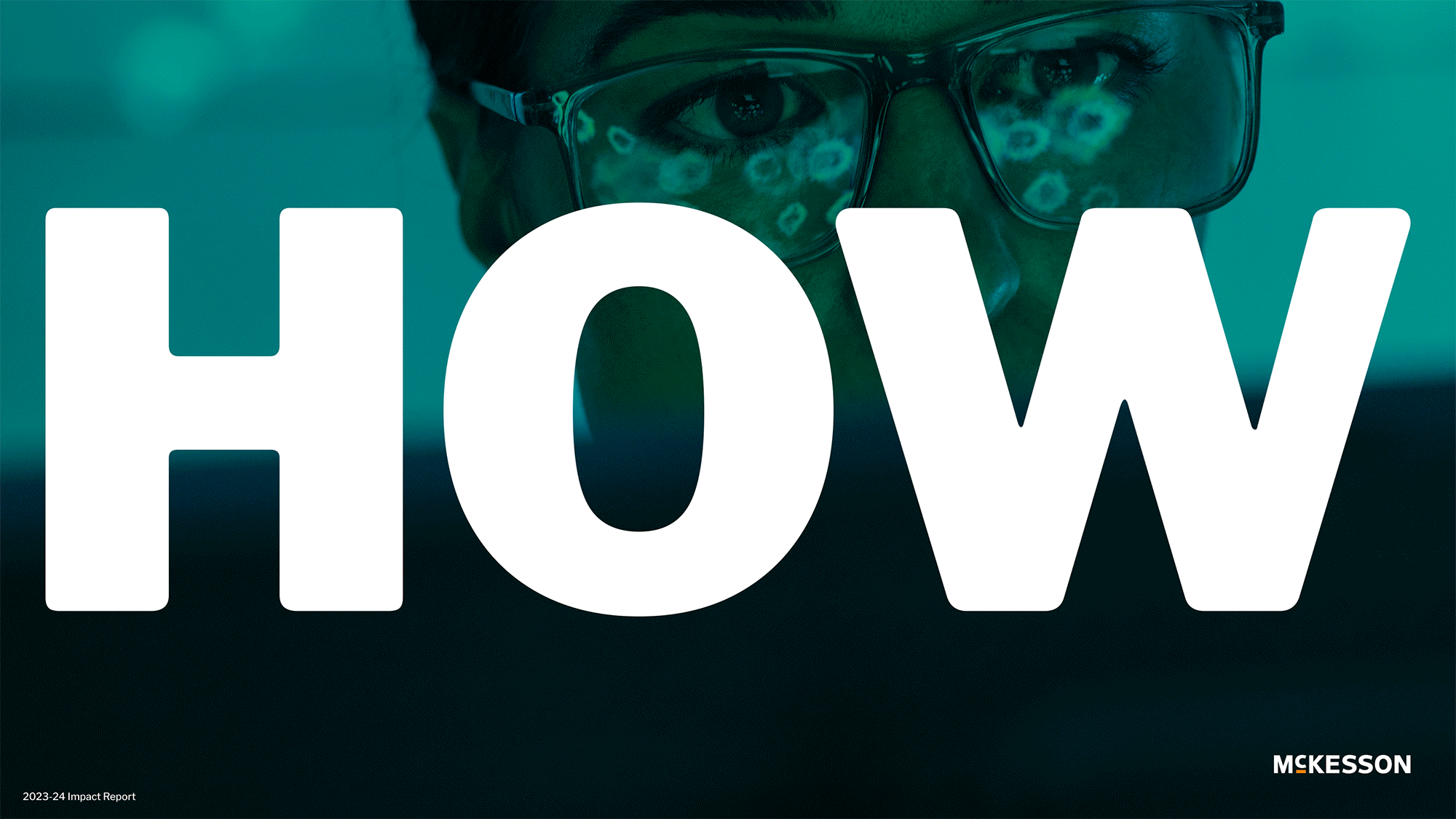
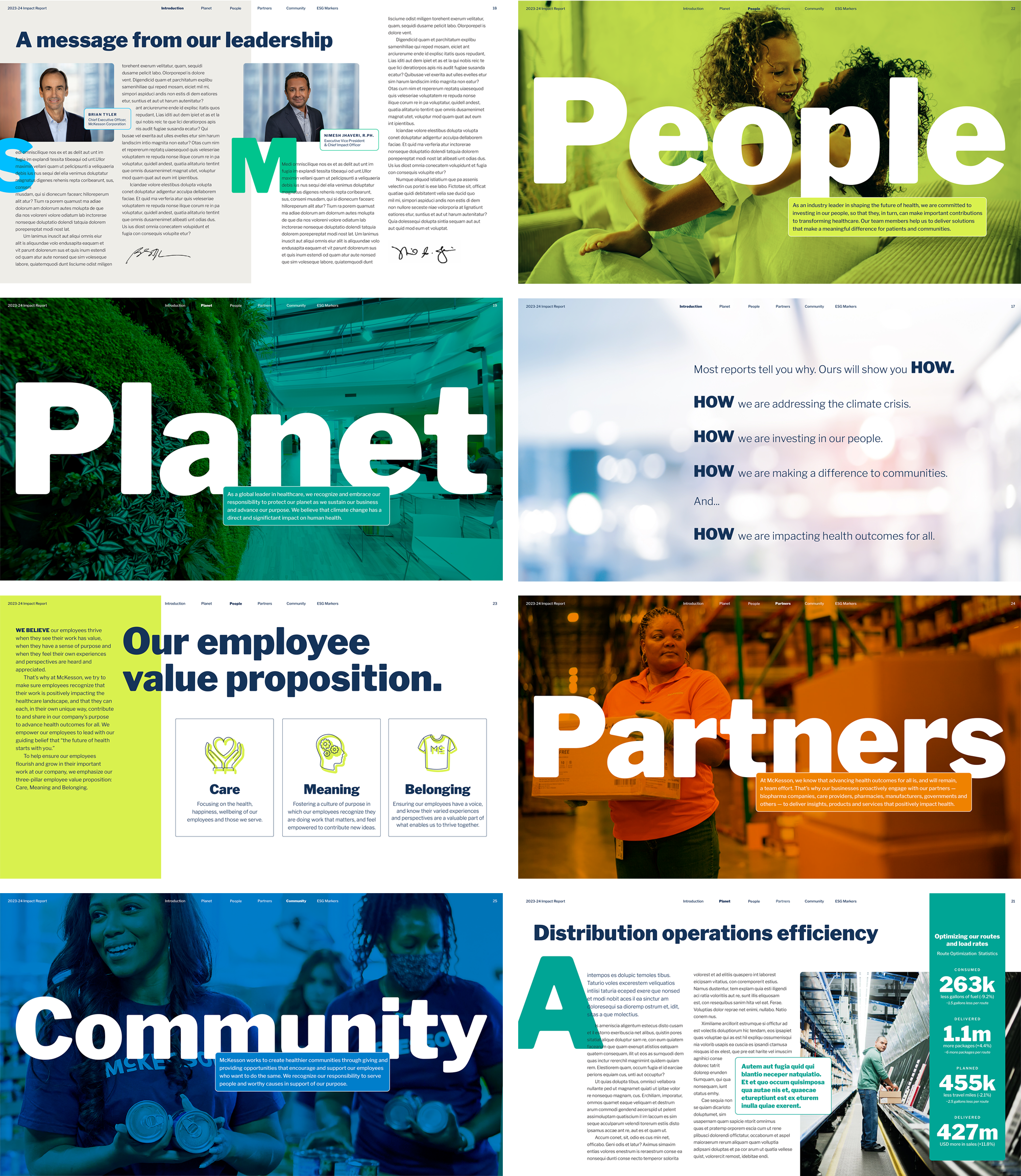
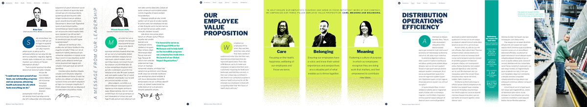
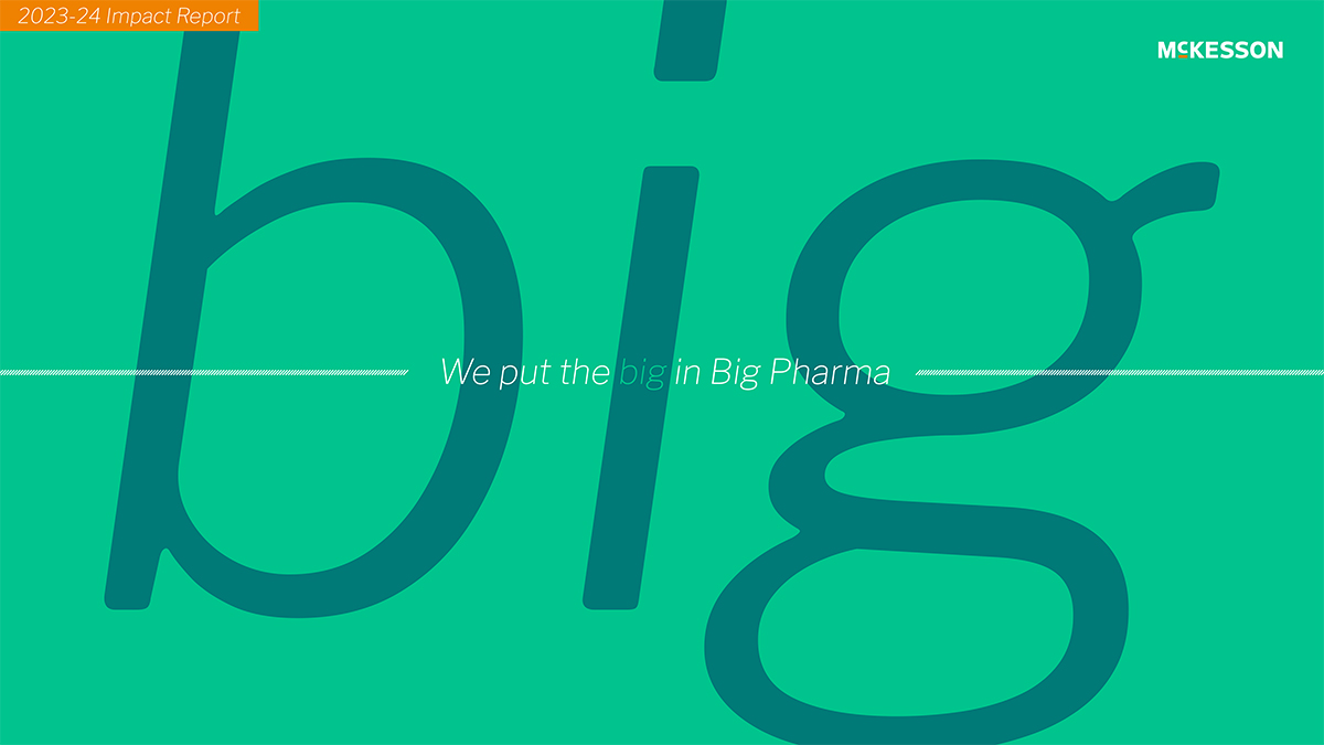
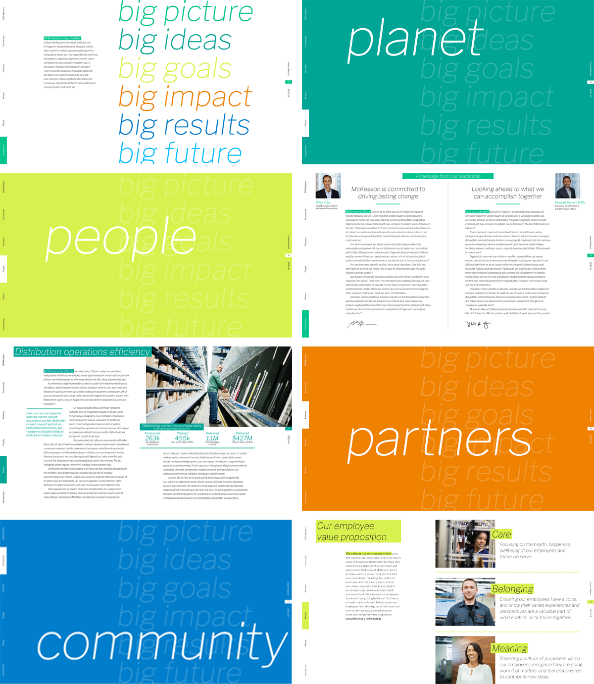
After presenting the initial ideas and honing the layouts, we finally settled on leveraging the word IMPACT as a title of the report, while adapting some of the original elements from the first concept. Despite proposing dozens of cover photos the client remained undecided, eventually reverting to a text-only solution on a plain white background.
Discover the final Impact Report here.

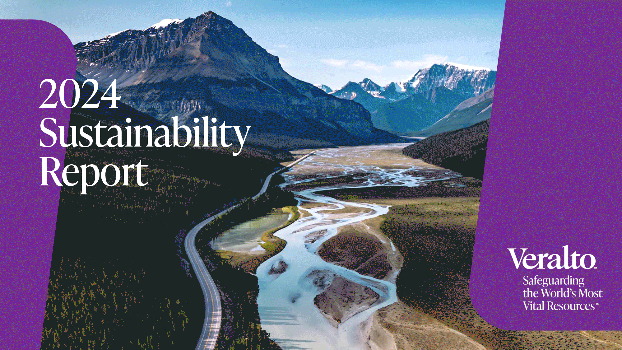
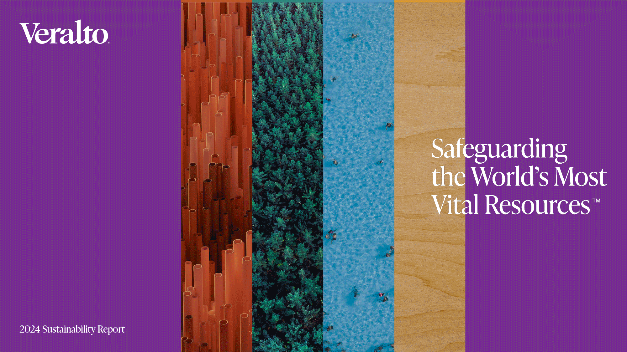
Veralto has two areas of focus: Water Quality and Product Quality & Innovation. But its unifying purpose is to safeguard the world’s most vital resources. Veralto’s 2024 Sustainability Report was divided into three main distinct color-coded sections — Products, Plant and People. The design of the 96-page report incorporated the brand’s “impact block” shape device, while many of the chosen images were the result of a photography contest opened to the company’s associates around the world.
View the complete report here.
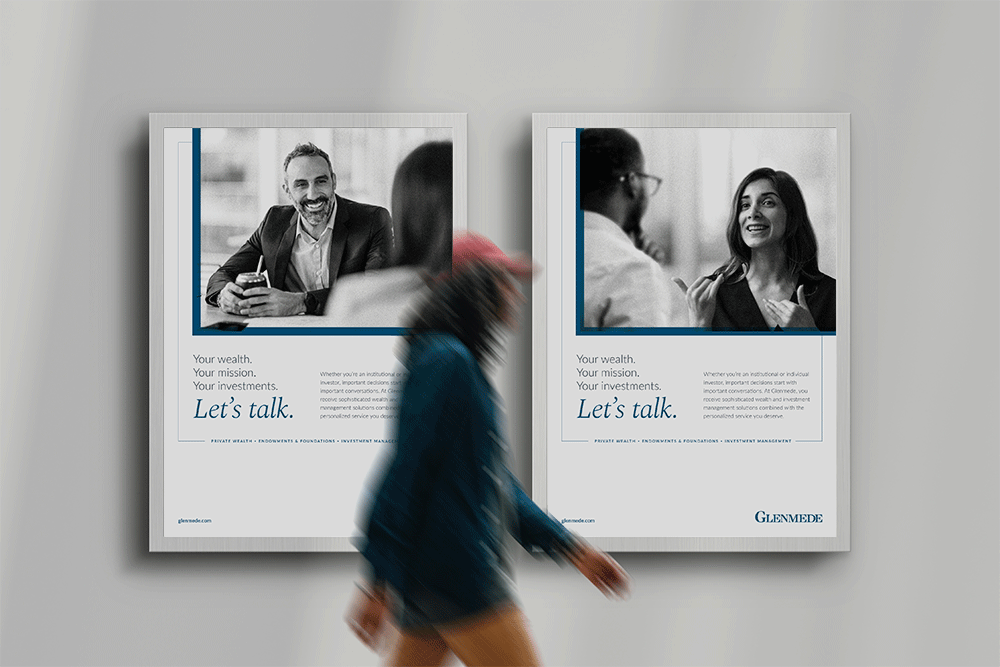
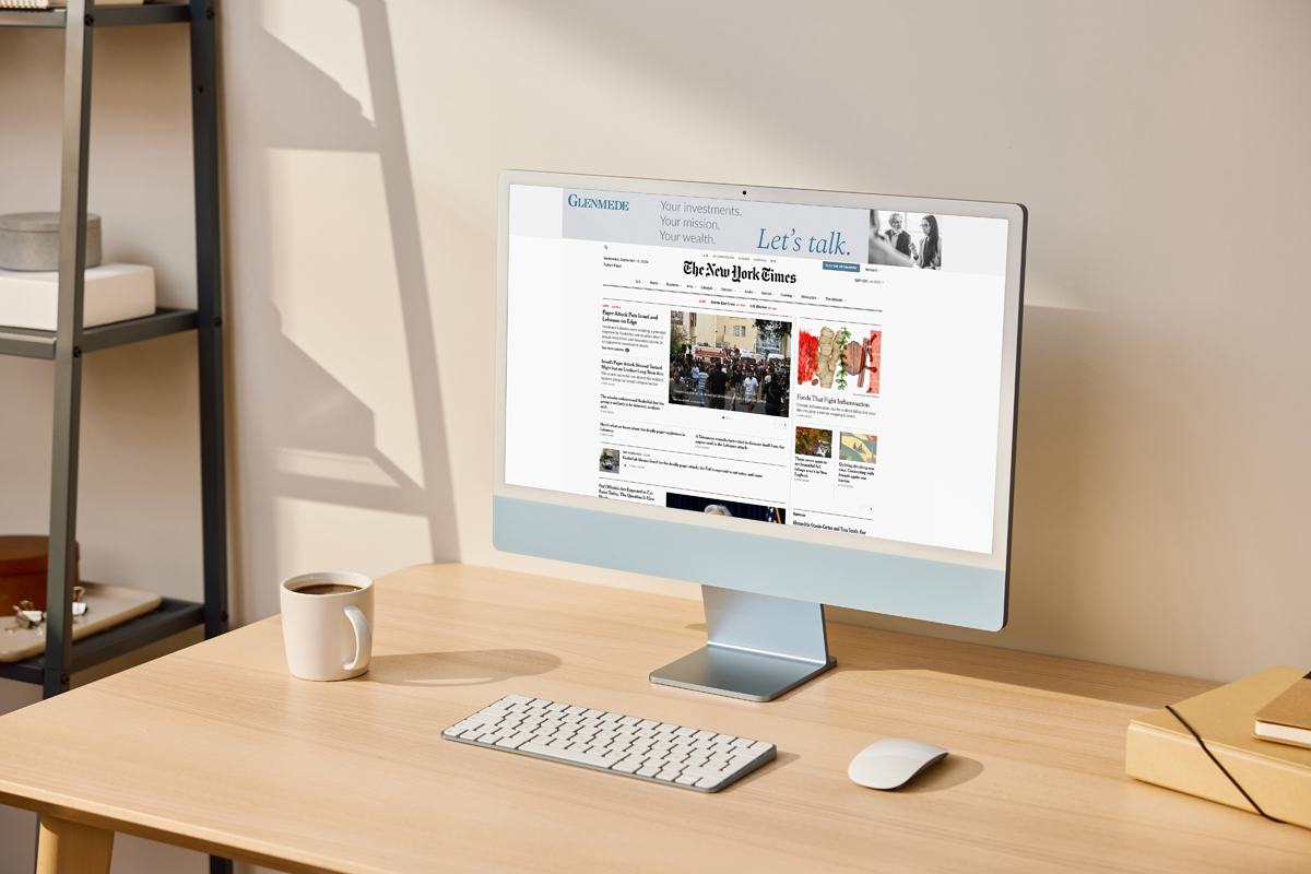
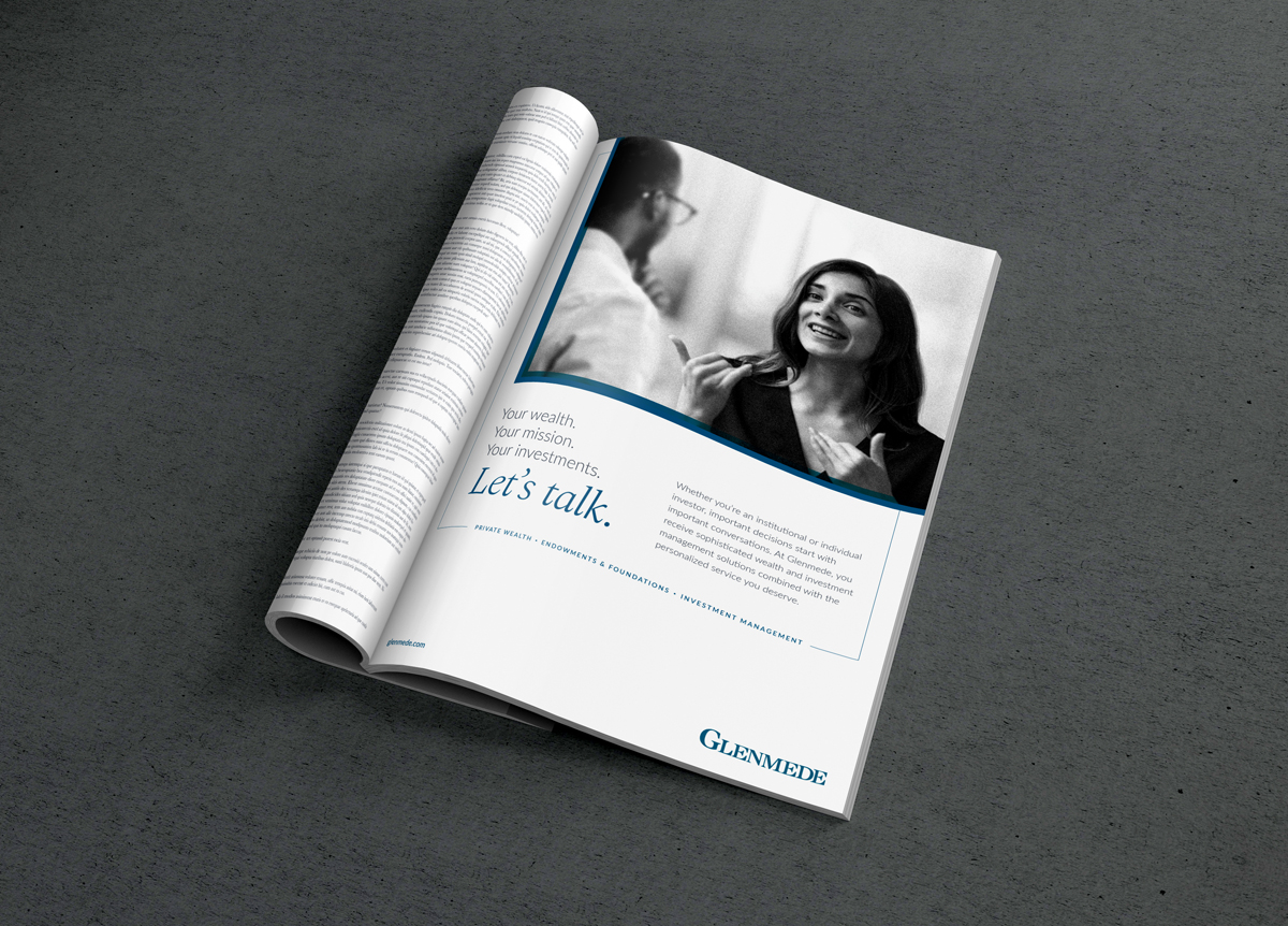
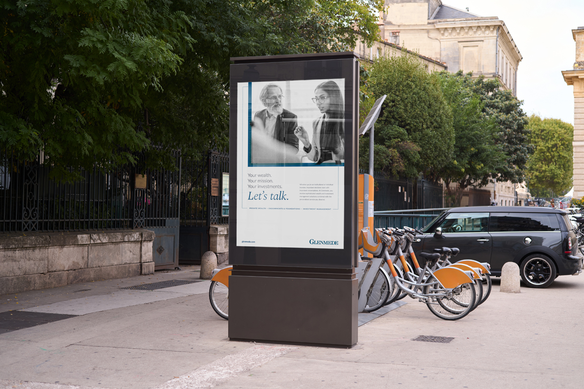
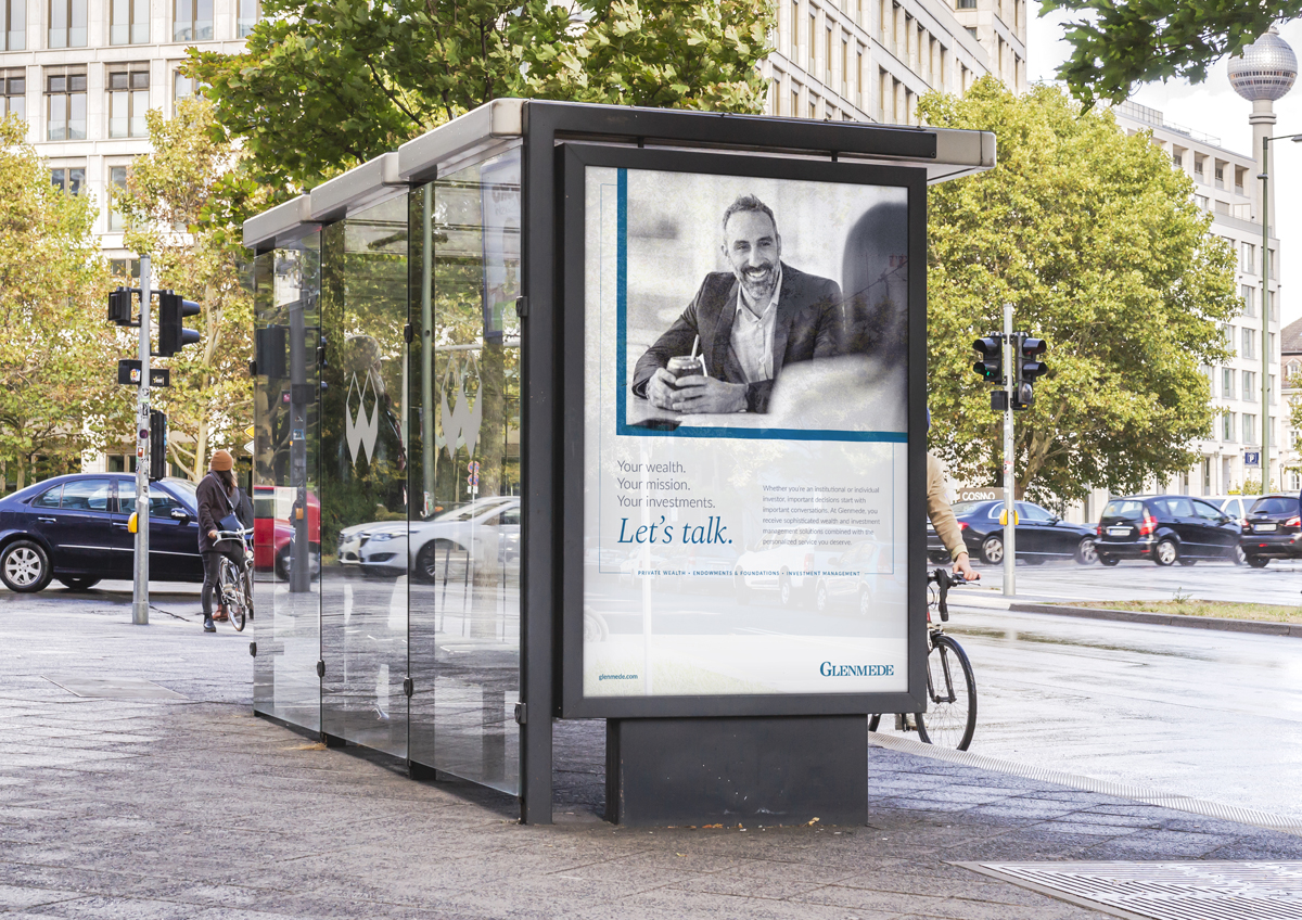
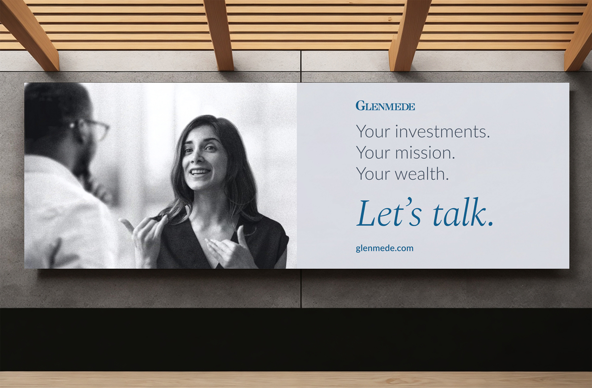
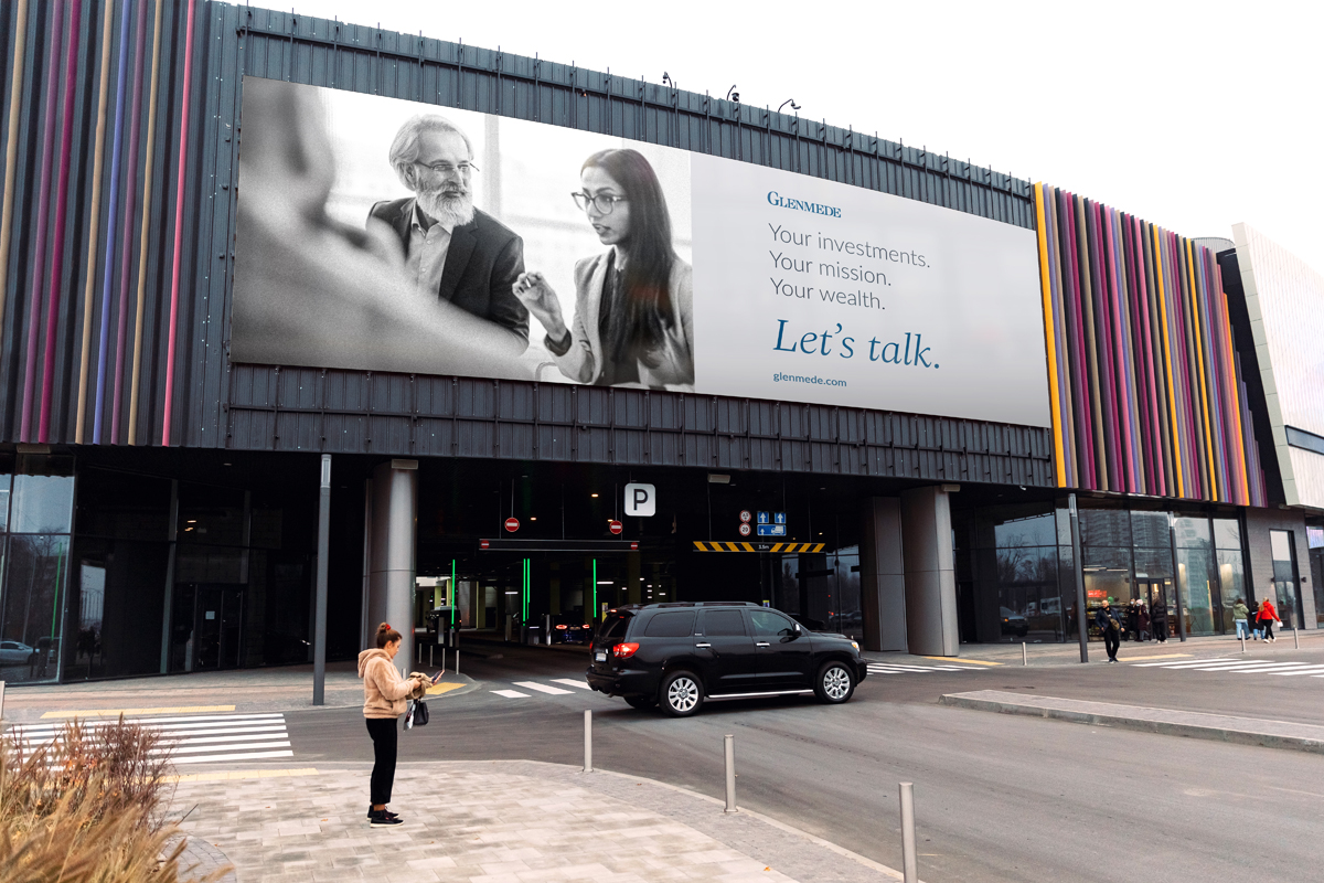
Even the biggest decisions start with a conversation. That was the guiding truth behind this advertising campaign for Glenmede, a Philadelphia-based financial management company that specializes in private equity and investments. Glenmede was looking to boost awareness around their brand, particularly among a younger demographic, whose attitude and approach towards wealth and investments is quite different from those of previous generations. Together with the strategy team at Sia Addison, I devised the “Let’s Talk” tagline and designed print and digital assets. The campaign appeared in targeted media outlets including The New York Times, The New York Times Magazine, T Magazine, How To Spend It, Hamptons Magazine, Palm Beach Daily News, Dan’s Papers, the alumni magazines of Columbia, Princeton and Yale universities, websites of The New York Times and The Wall Street Journal, and at high profile cultural events including Frieze New York, Tanglewood Festival, Aspen Music Festival, and Art Basel Miami Beach.

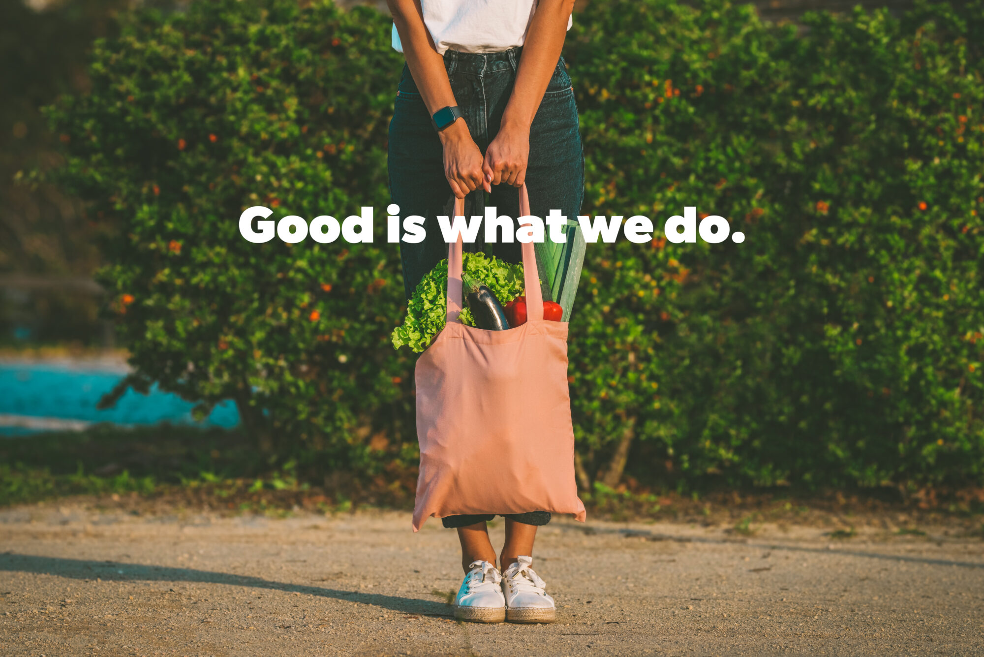
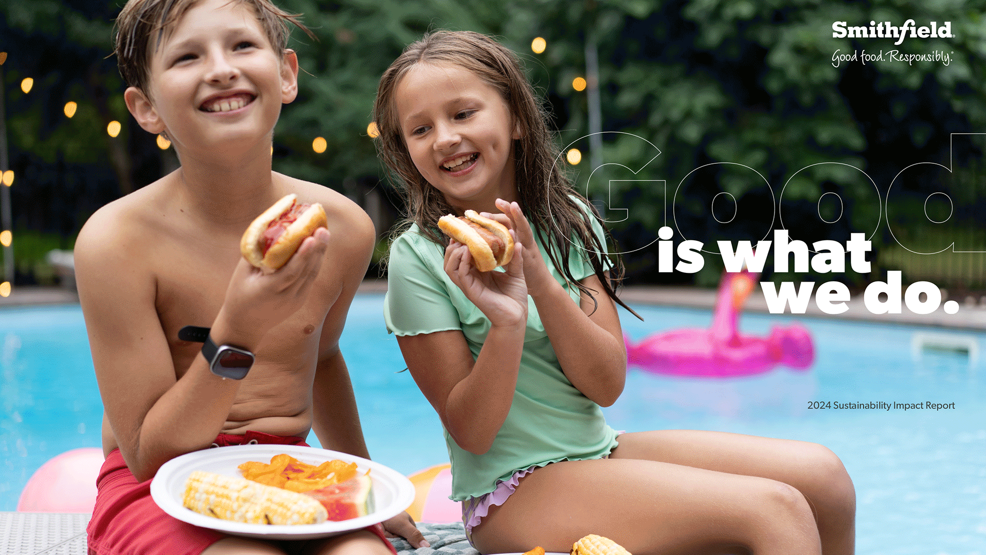
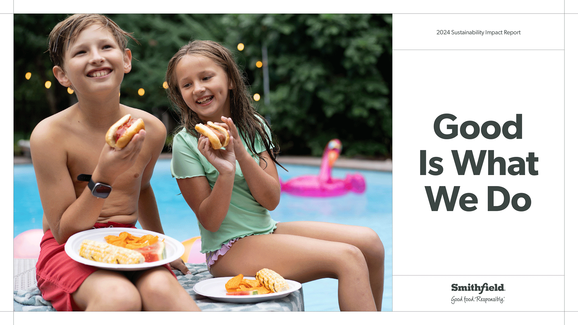
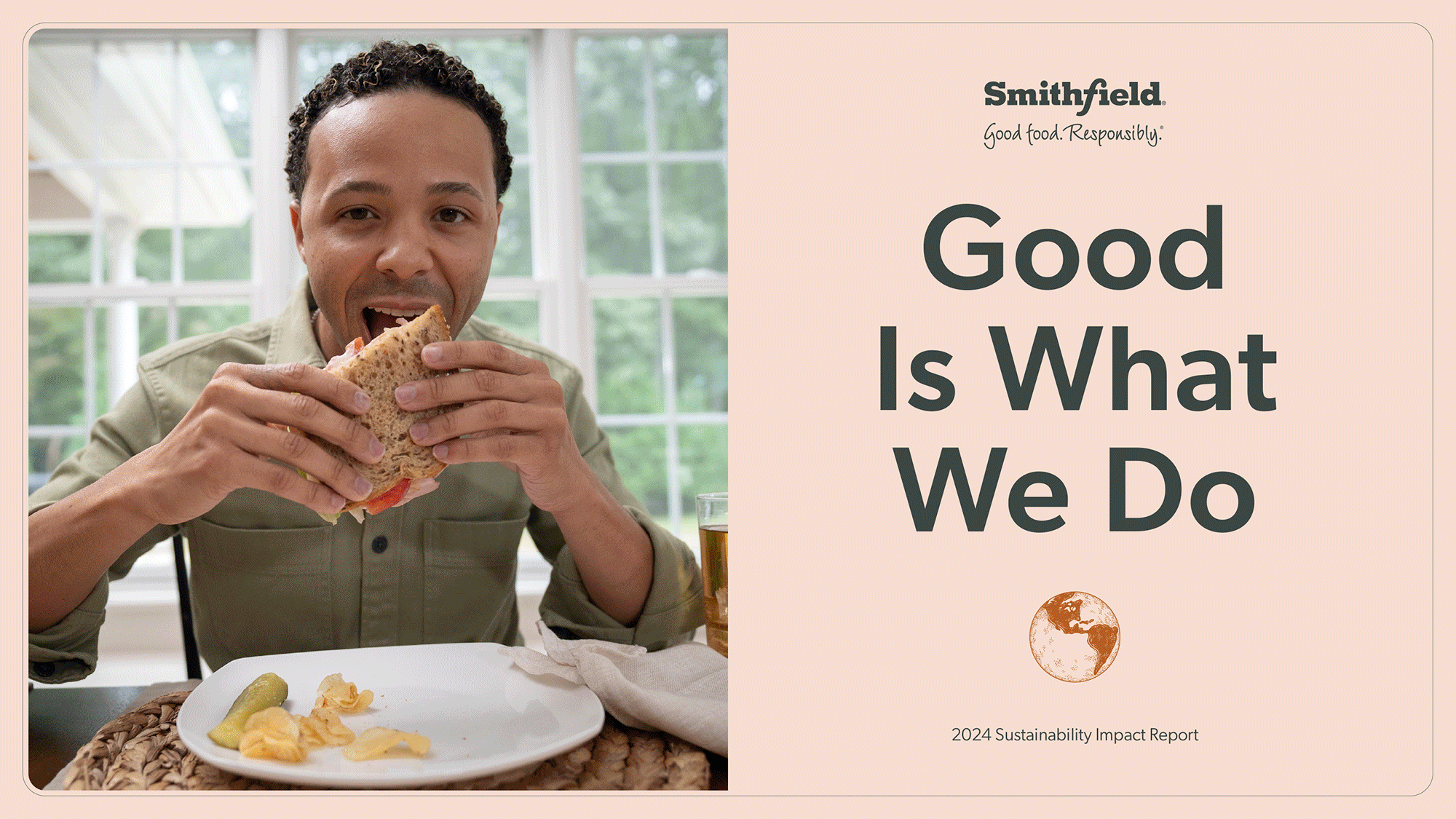
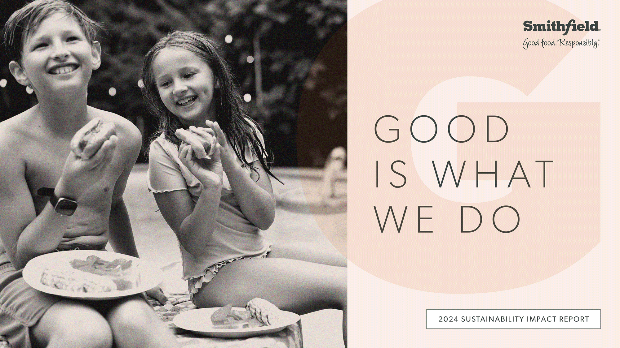
Smithfield is the largest pig and pork producer in the world. Guided by their overarching strategy, Good is what we do, I designed four concepts for the company’s annual sustainability report. By amplifying their sustainability storytelling and contributing to their transparency and accountability, the final report exemplified Smithfield’s ESG targets and progress across the organization. Through bespoke photography and numerous infographics I was able to visually communicate complex processes and systems, illustrating how Smithfield operates a vertically integrated business that encompasses the entire food production process, while showcasing their steadfast commitment to sustainability.
Concept 1
Concept 2
Concept 3
Concept 4
View the final report here.
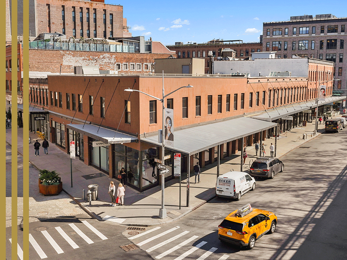
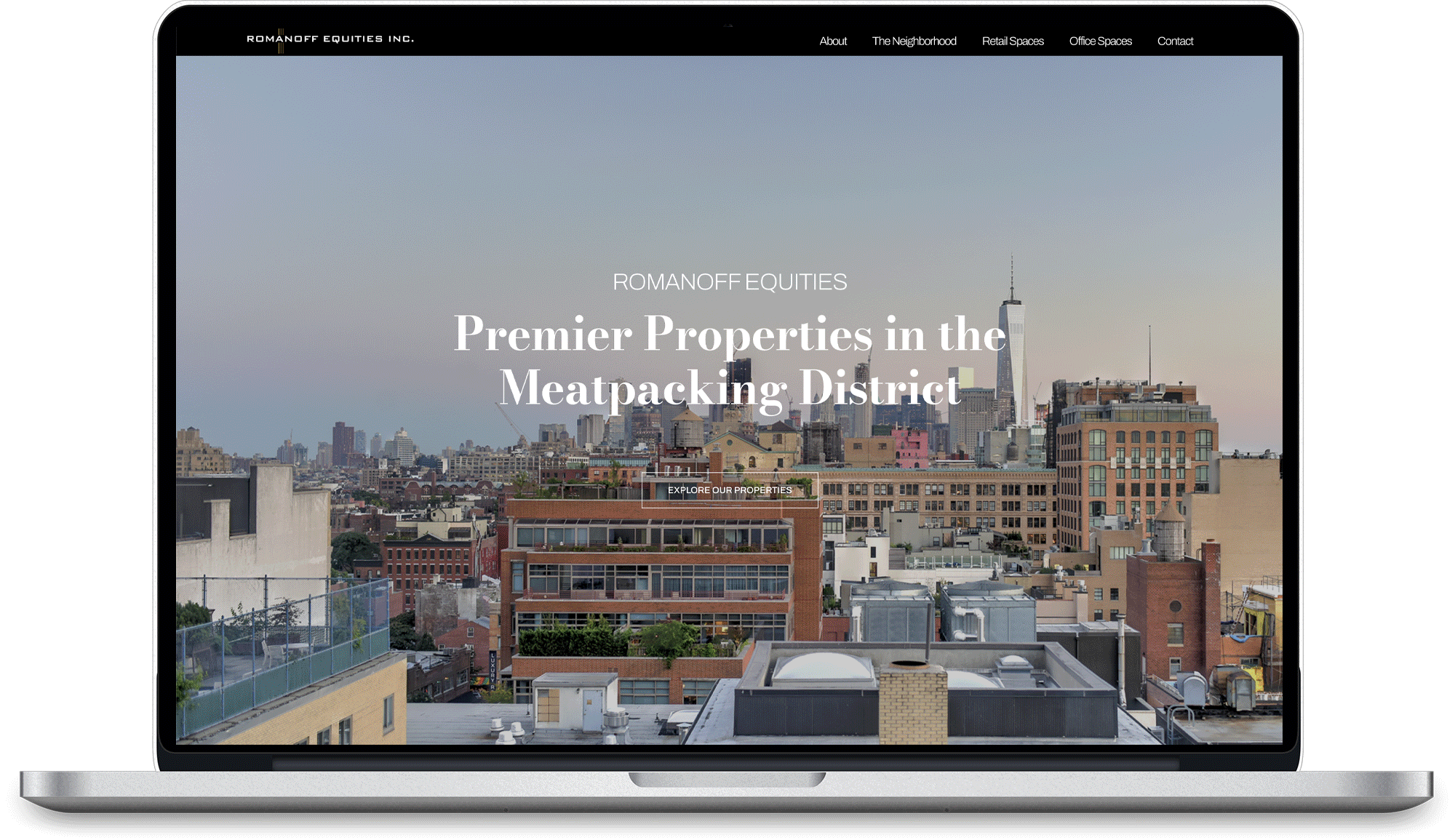
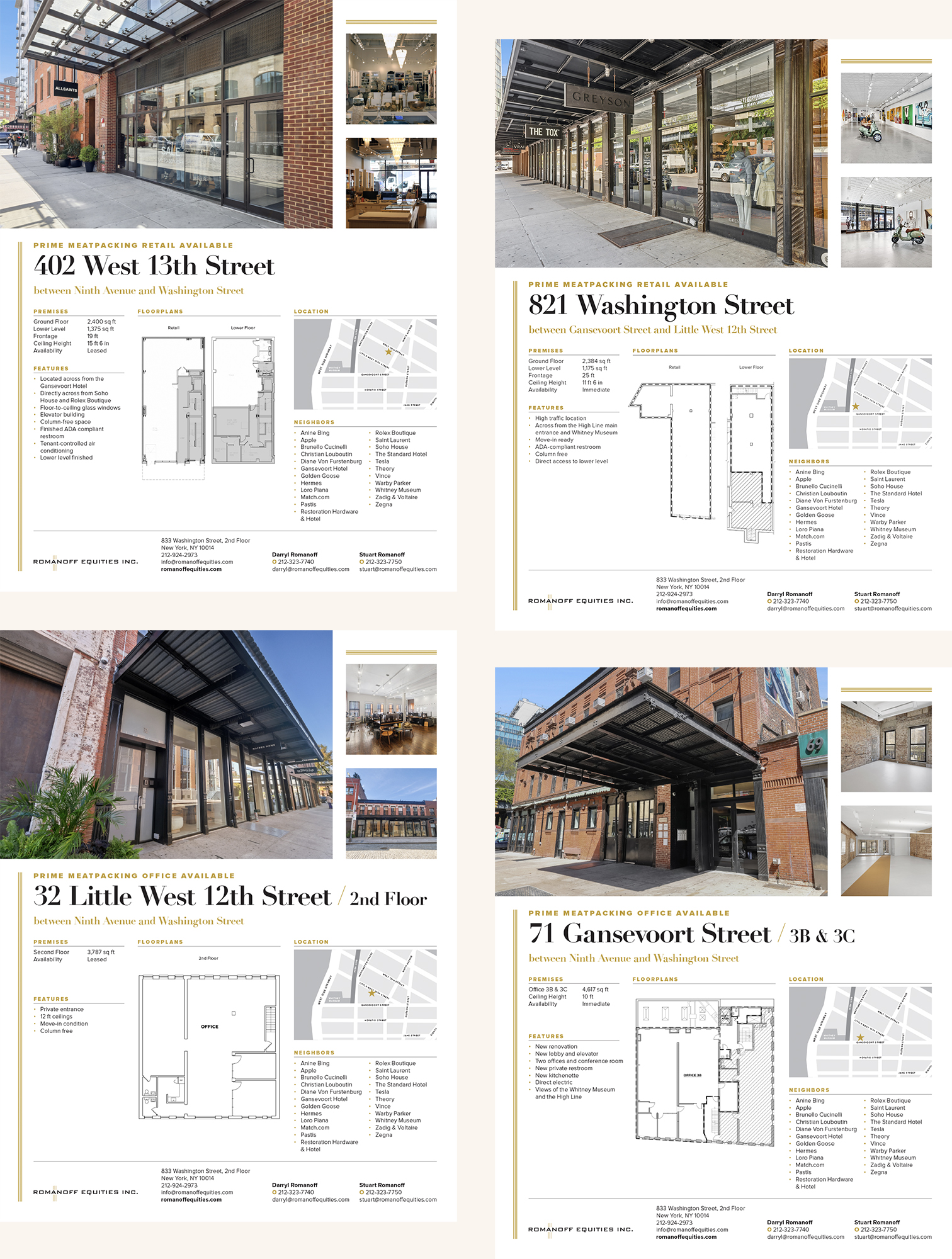
Romanoff Equities is a New York real estate enterprise specializing in commercial and residential properties in Manhattan’s Meatpacking District. The company has been owned and operated by the Romanoff family for more than 80 years, but its marketing materials had not kept pace with the recent transformation of the area. I was tasked with creating a brand new website and redesigning property flyers that served to showcase the retail and office spaces in Romanoff Equities’ portfolio, while also highlighting the variety or vibrancy of the neighborhood. Visit the site here.
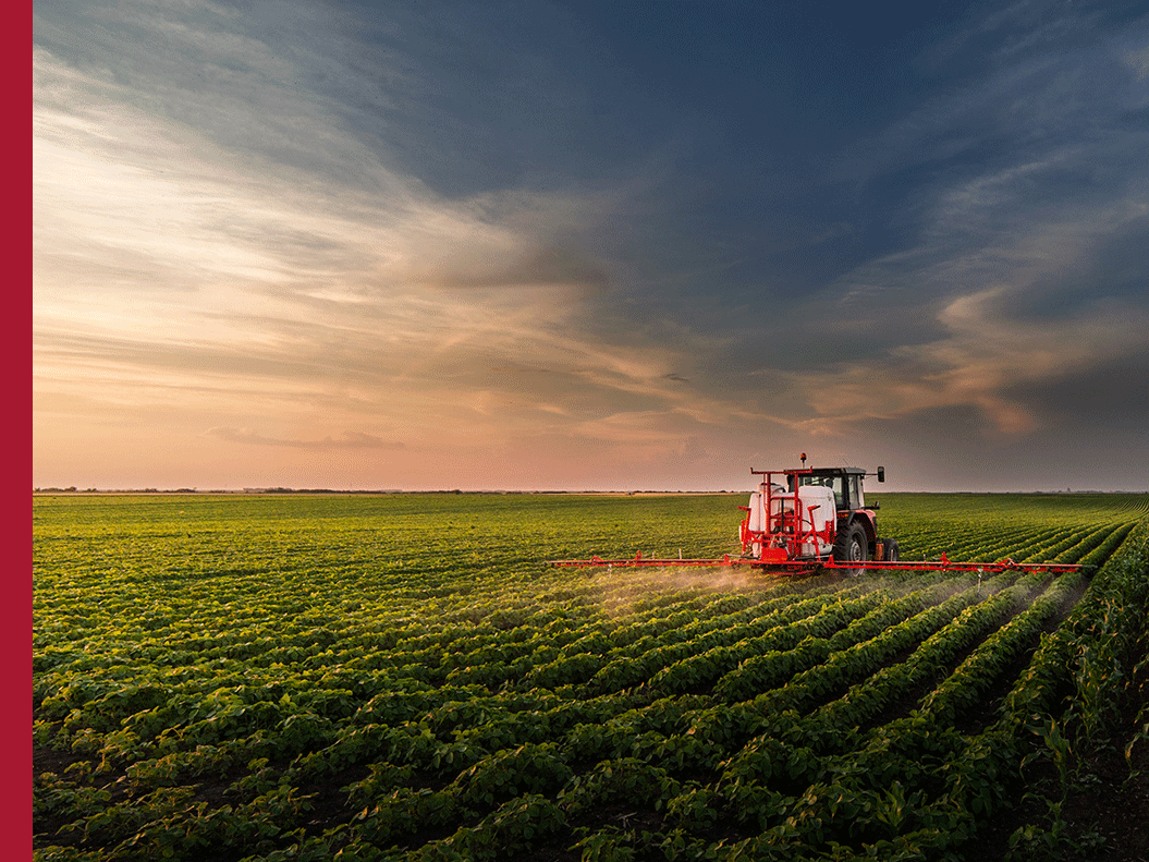
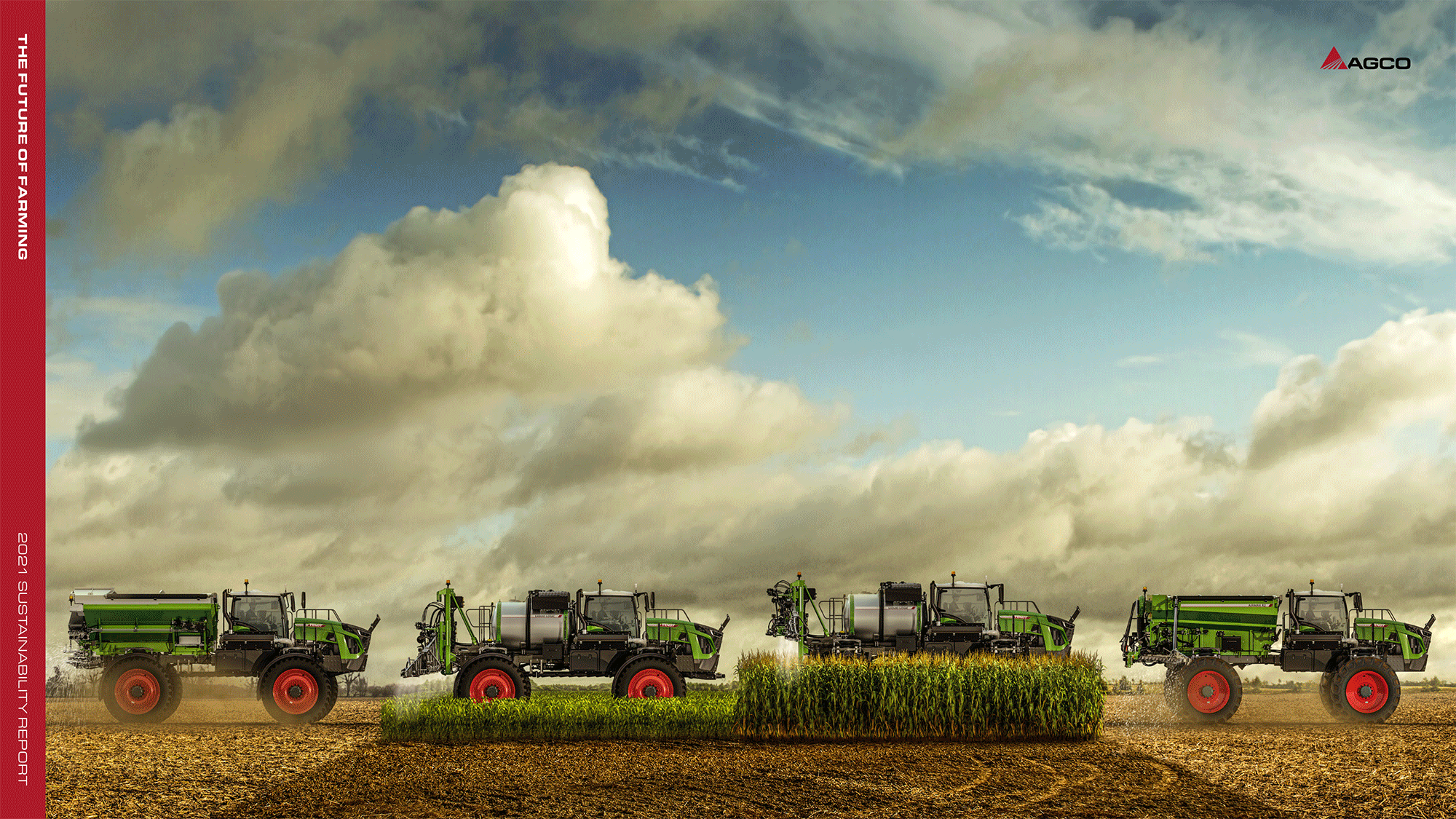
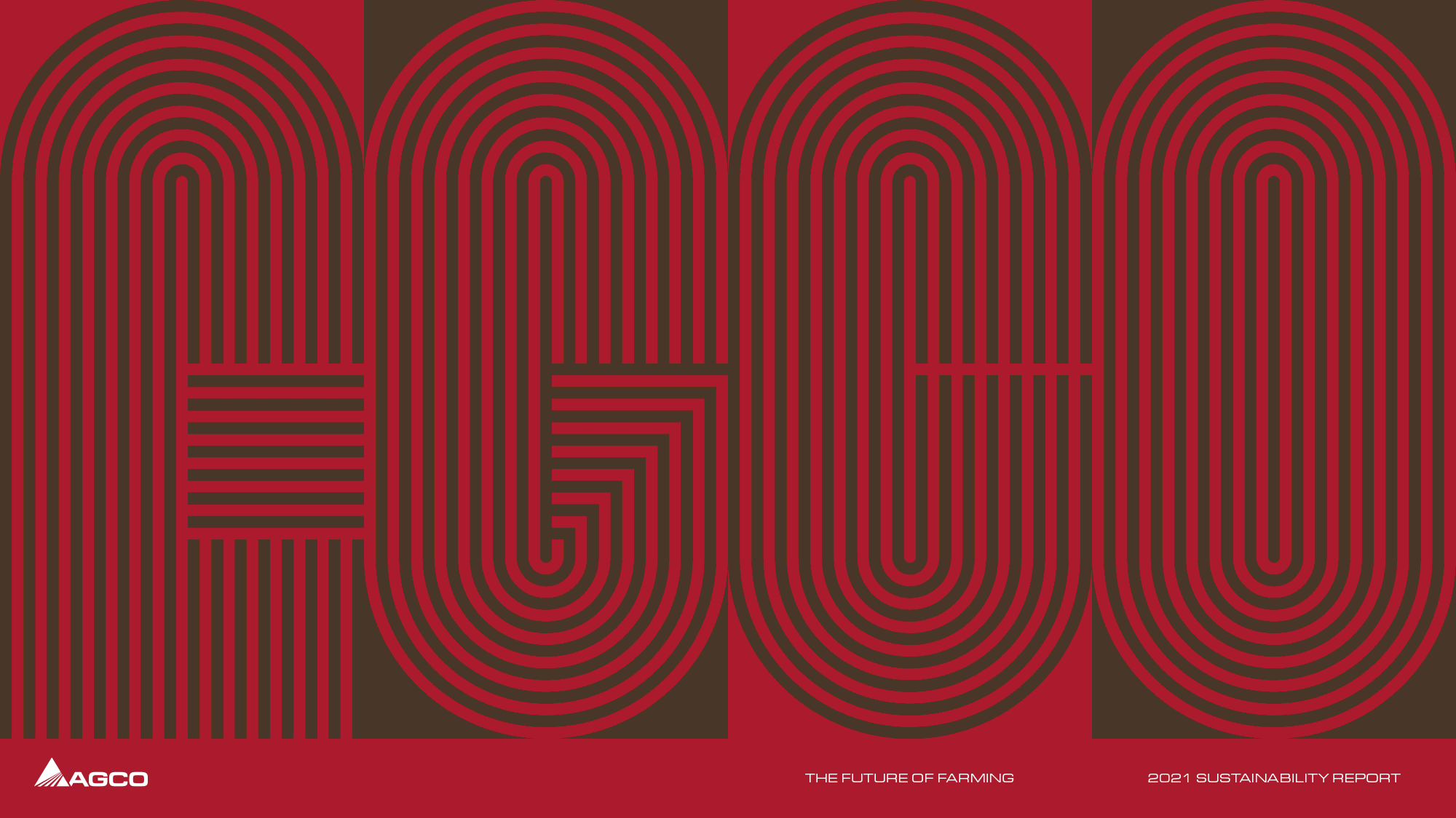
AGCO Corporation is a leader in global agriculture. Through its range of well-known brands, AGCO delivers agricultural solutions to farmers worldwide through a full line of tractors, combine harvesters, hay and forage equipment, seeding and tillage implements, grain storage and protein production systems, as well as replacement parts. Today AGCO is at the forefront of developing sustainable agricultural practices, a fundamental priority of the organization that deserves to be showcased. The goal of AGCO’s Corporate Sustainability Report was to do just that. Below are the three initial concepts I presented to the client, the first of which was expanded on to produce the finished report, which broke AGCO’s areas of focus into six color-coded sections, identified by a vertical navigation bar on every page.
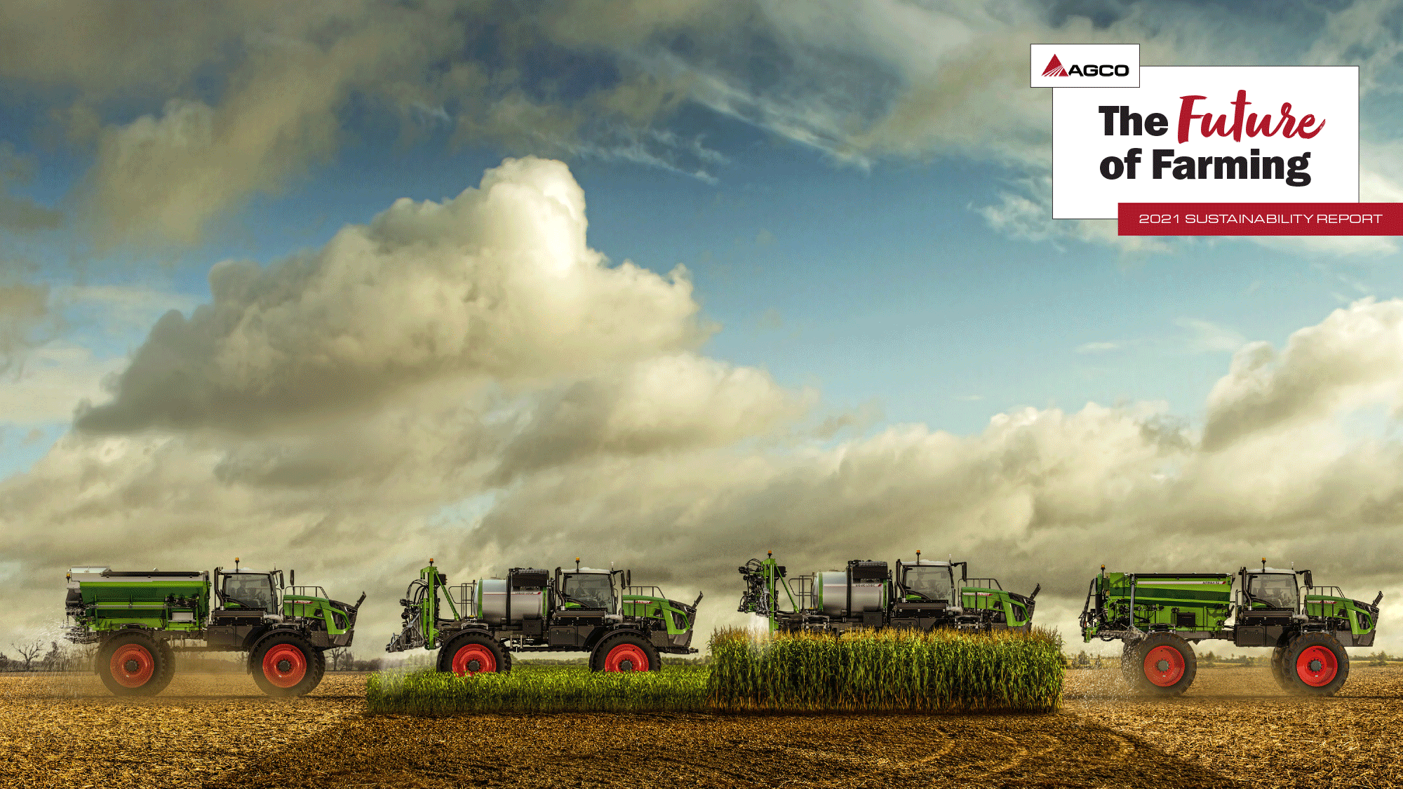
To learn more about AGCO’s sustainability efforts and to view the complete report, click here. I also designed AGCO’s Annual Report and 10-K, a printed piece to which I extended design elements from the Sustainability Report. To view the full report, click here.
In August 2022 this project received a Silver Award from Graphis, Inc.
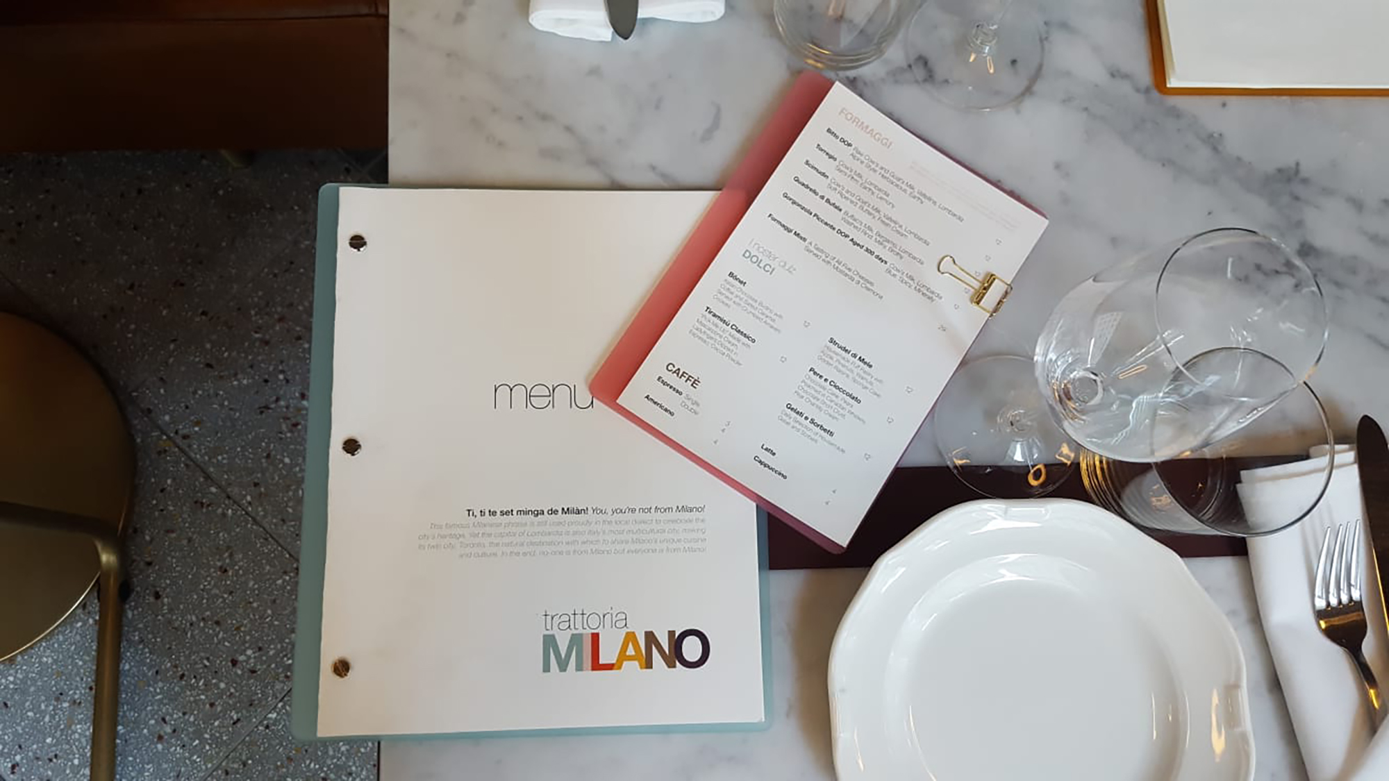
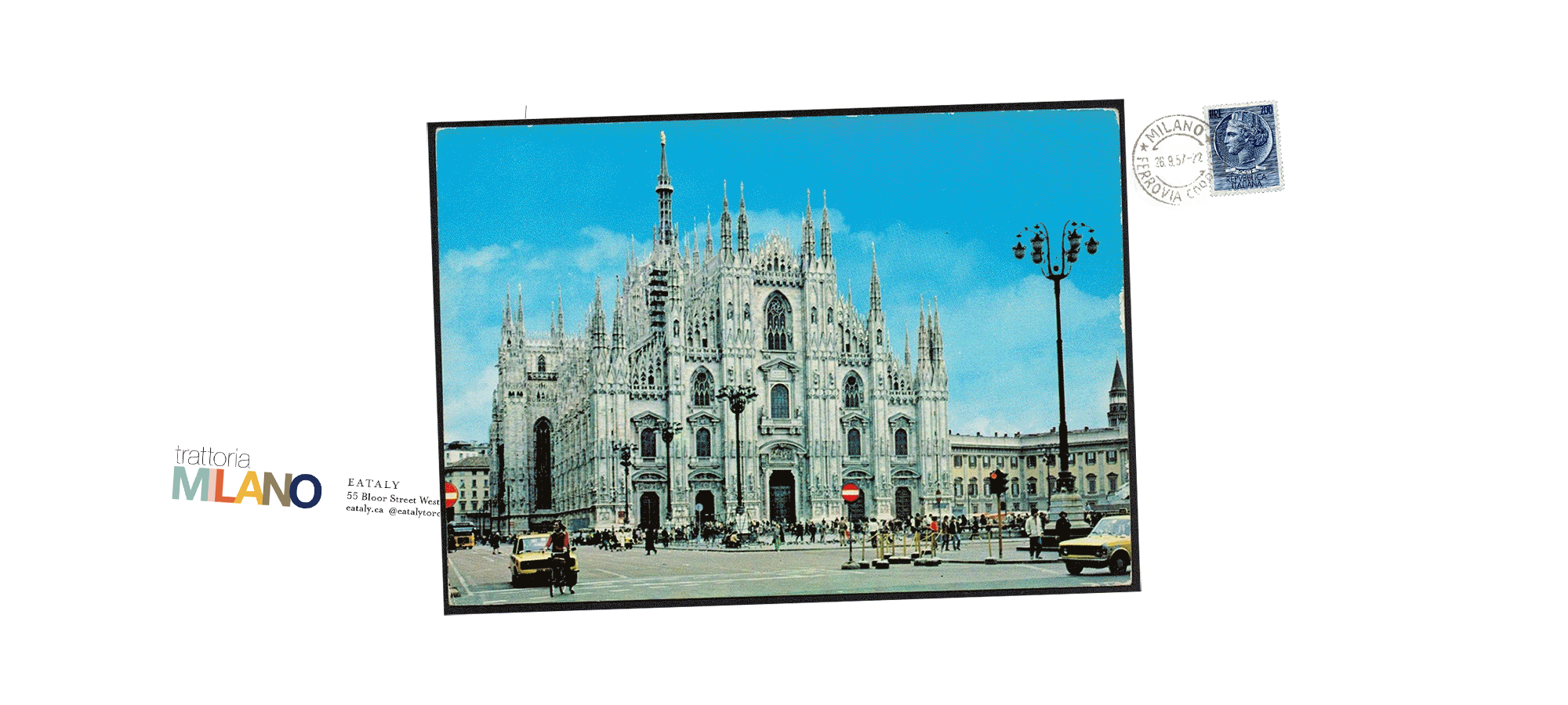
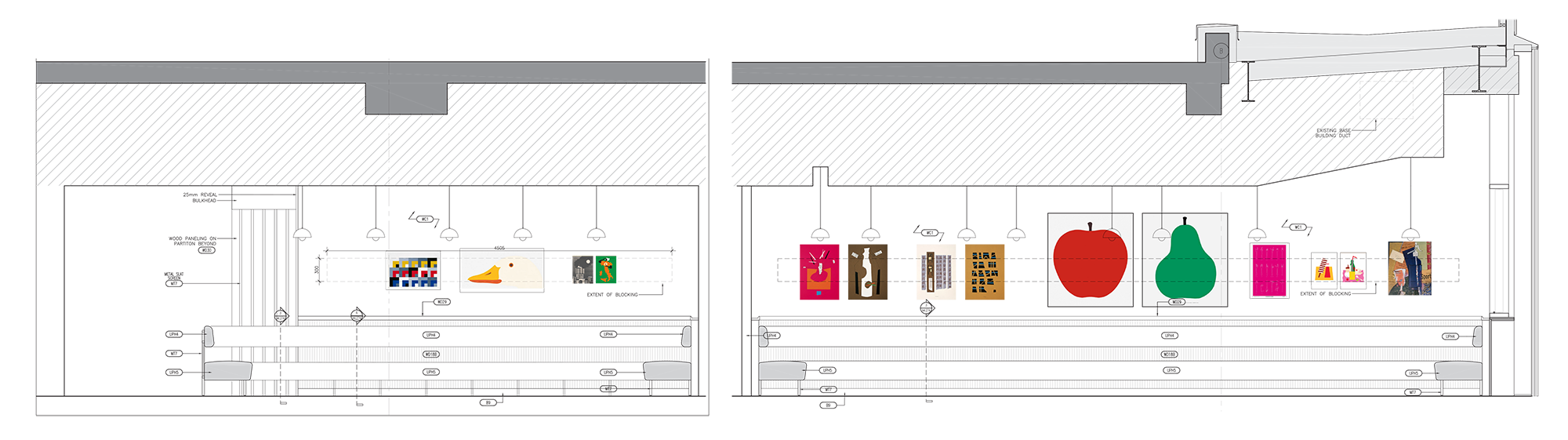
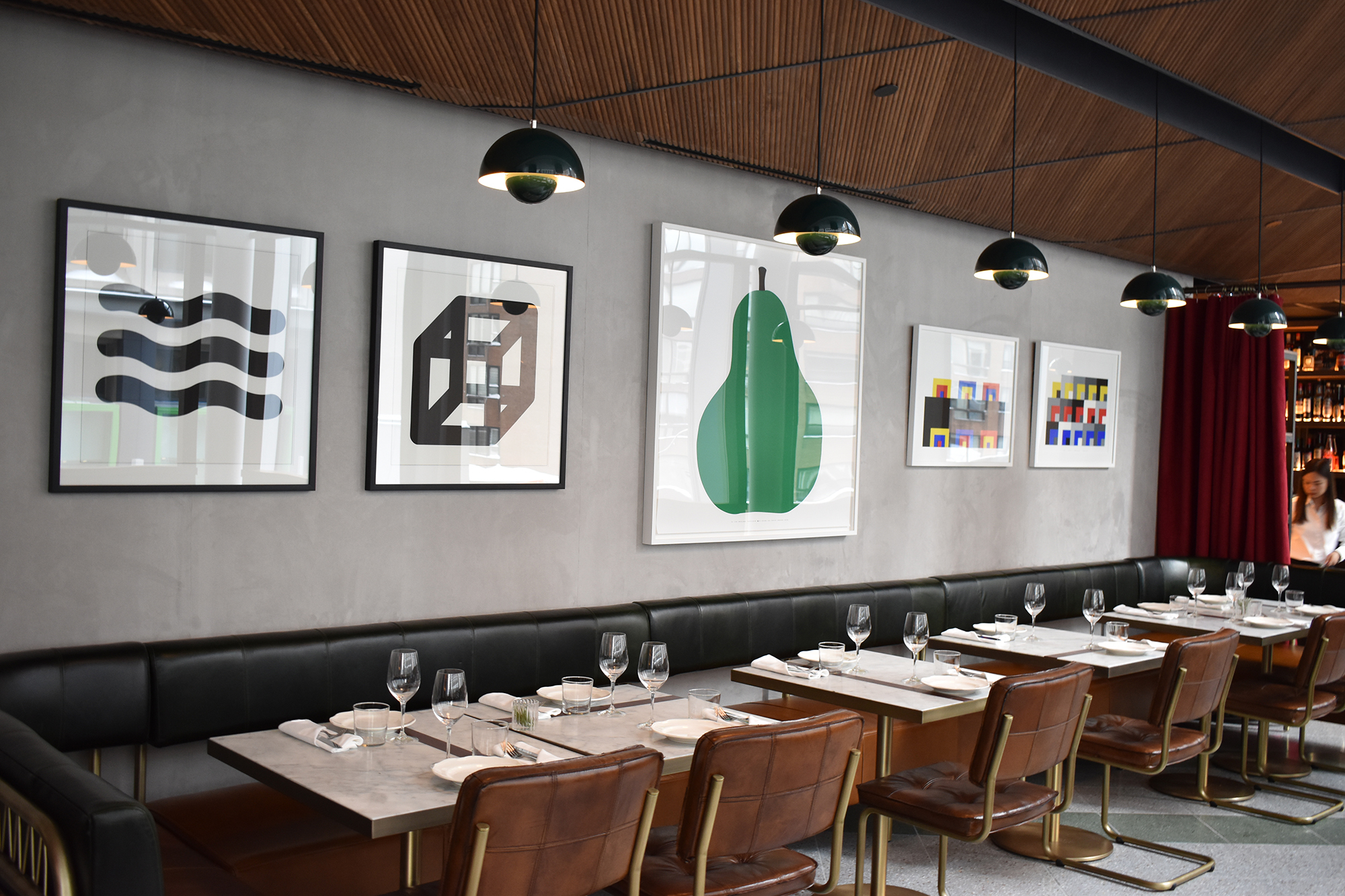
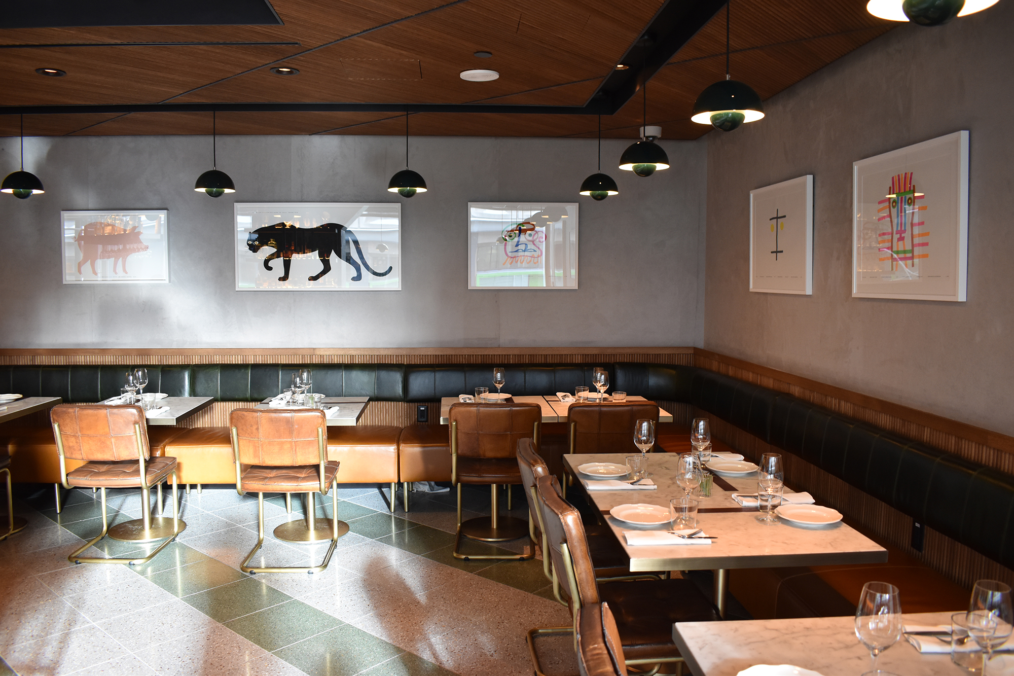
As Head of Creative & Storytelling at Eataly, I was involved at the beginning of conversations regarding Trattoria Milano, a new fine dining concept at the company’s first Canadian store in Toronto. But this was much more than a standard restaurant branding project. Inspired by Milan’s status as a capital of design and by the modern eclecticism of the city’s food scene, Trattoria Milano was conceived as a multi-sensory experience, that intended to meld a traditional Milanese menu with art and performance, in a single and unique salon space.
Unsurprisingly, given its ambitious scope, the project’s direction — and even its name — were the subject of much internal debate. What started out as “Trattoria Milano” became Casa Milano, which became the abbreviated Ca’ Milano before reverting to the more conventional name. Though I spent much time studying traditional Italian storefronts and restaurant façades, I was drawn to classic midcentury typefaces such as Bodoni, Futura, Helvetica — as still seen throughout in the unmistakeable work of graphic designers Massimo Vignelli and Bob Noorda.
![]()
![]()
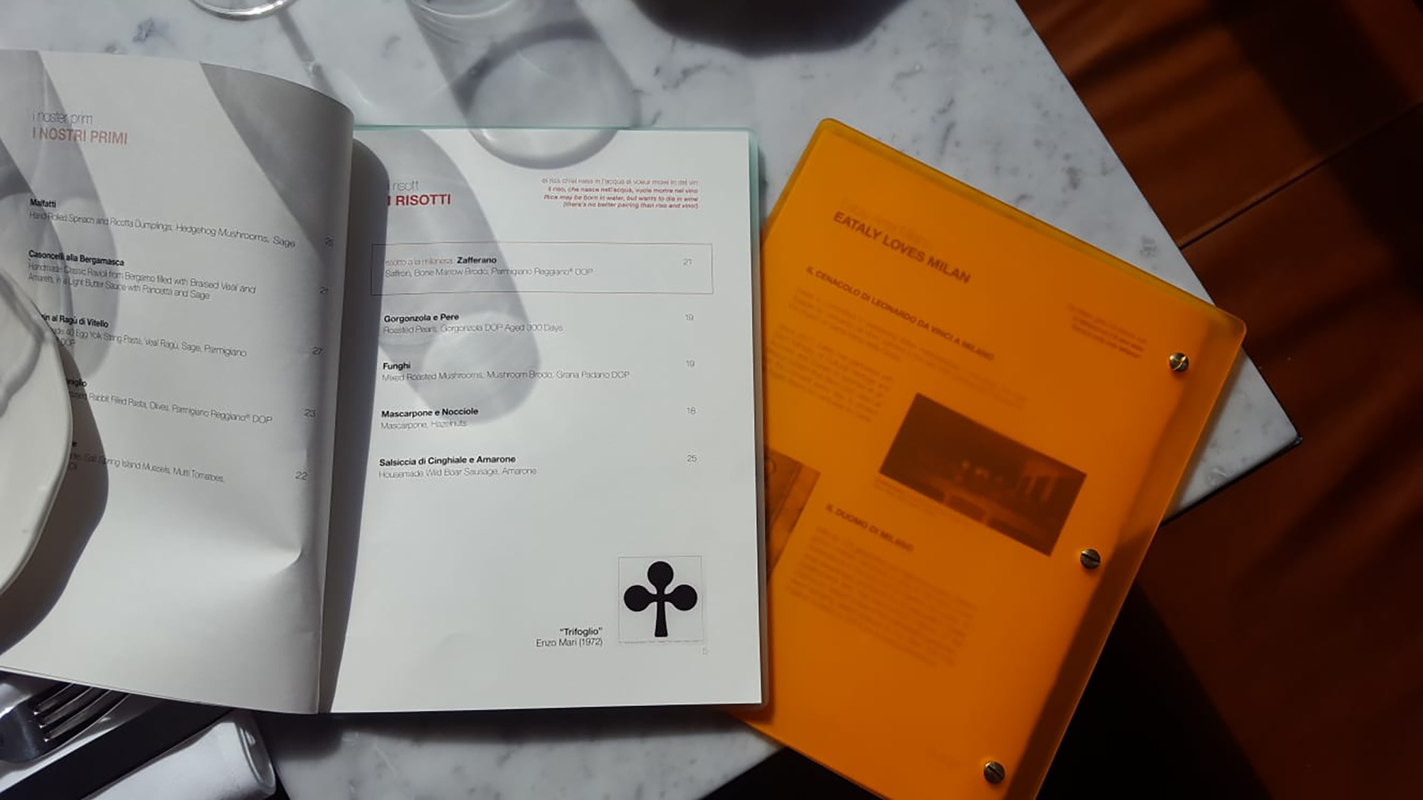
The restaurant’s menu showcased classic Milanese dishes — risotto, cotoletta and ossobuco — and included descriptions in three languages: English, Italian, and Milanese dialect.
For the guest check presenters I created a series of postcards with historical photos of Milan’s landmarks, from La Scala to the Pirelli tower, and even the stadium at San Siro.
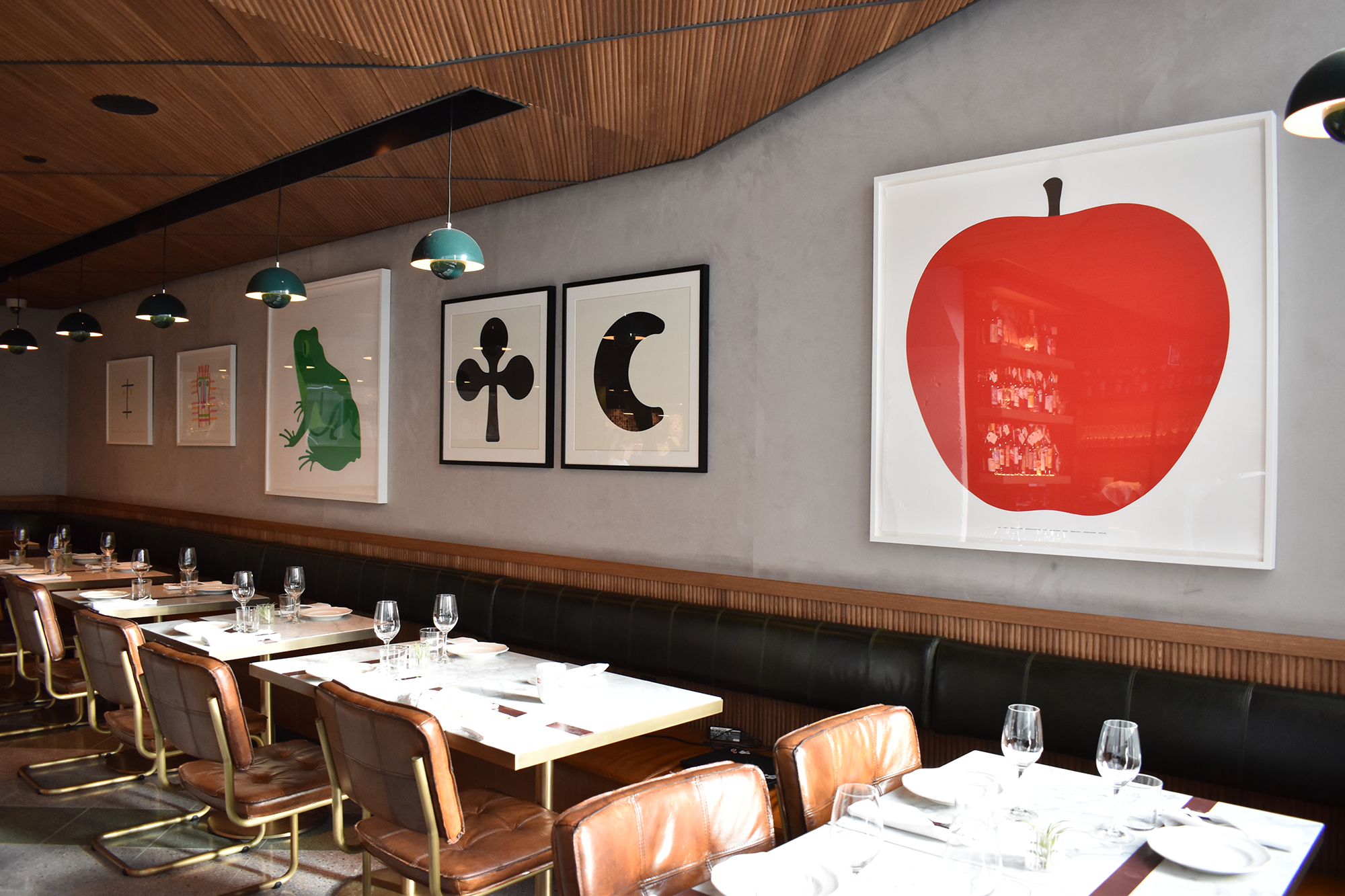
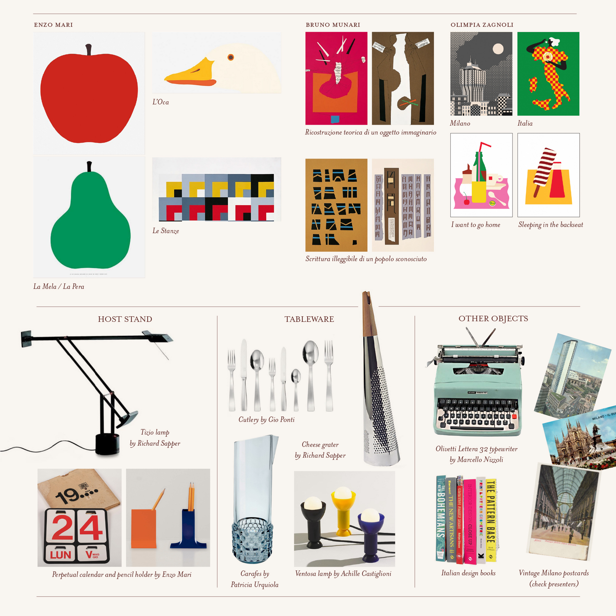
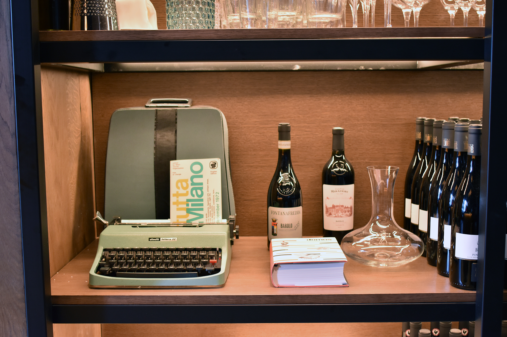
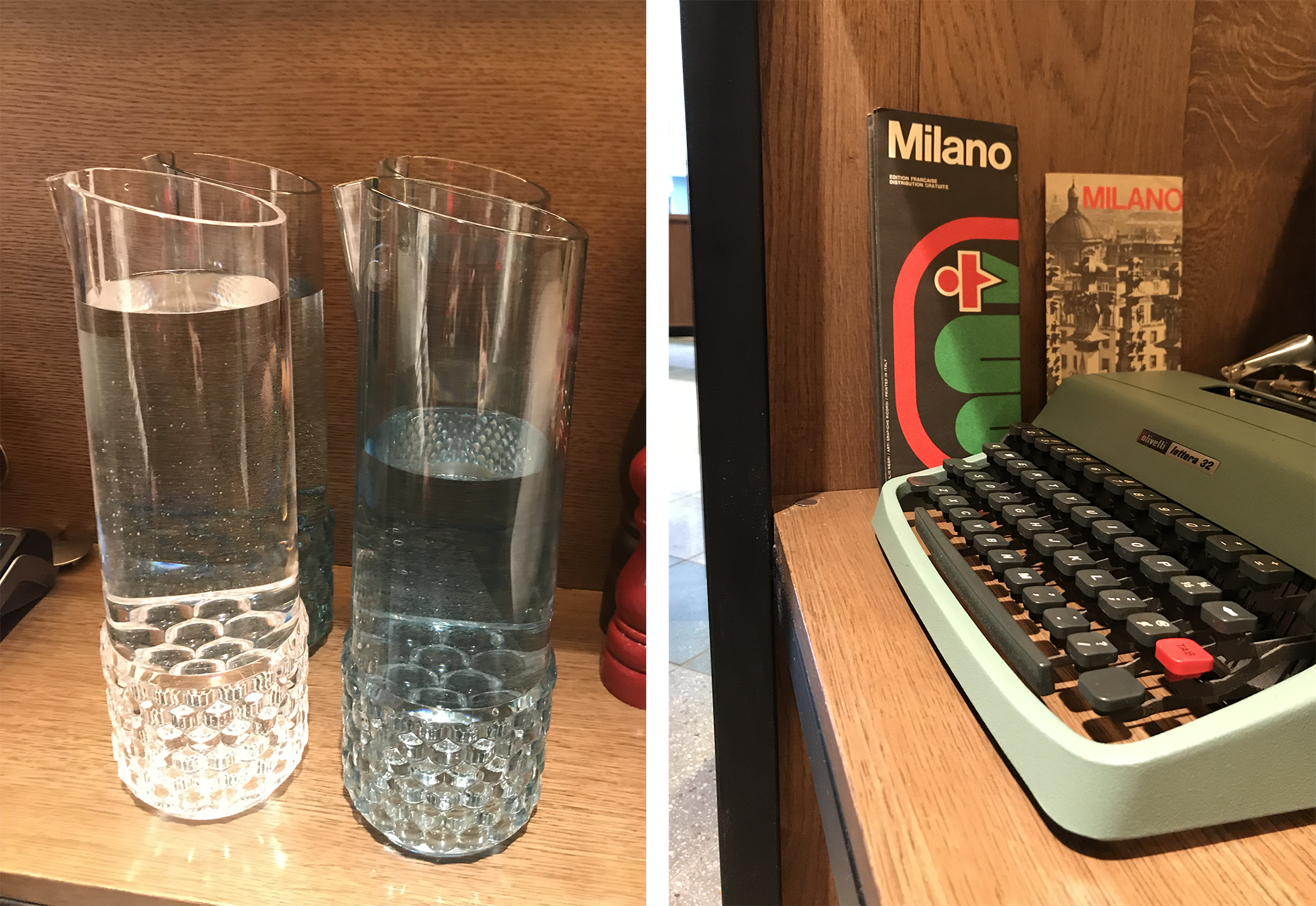
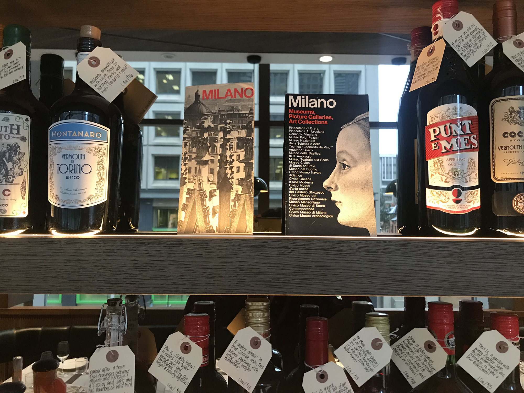
In addition to the branding, I was also responsible for shaping the restaurant’s decor. I dove headfirst into my research, drawing on my background in Italian postwar design and knowledge of Milanese cultural references to produce a detailed inspiration look-book, from which I began the task of procuring items from high-end design stores and, in the case of vintage ephemera, Italian eBay sellers and the deepest corners of the internet.
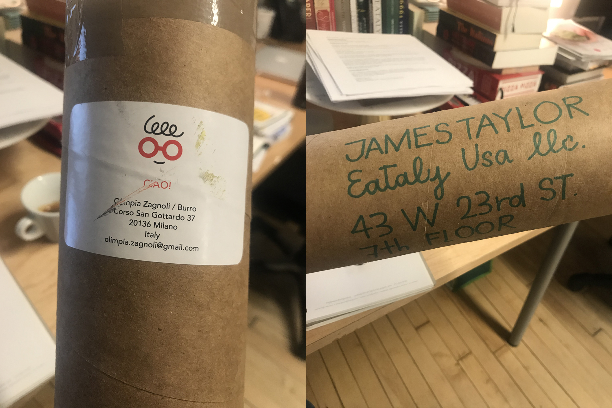
For the walls I curated a series of prints by Enzo Mari, Bruno Munari, Mimmo Paladino and Olimpia Zagnoli (whom I had worked with before and was kind enough to send her artwork directly to my office). I also obtained a variety of iconic pieces by celebrated Milanese designers — including Gio Ponti, Achille Castiglioni and Richard Sapper — but only on the condition that they would also provide a function within a working restaurant. The mid-century vibe was confirmed with used LPs, hefty volumes on design, old issues of Domus, and even vintage brochures from Milan’s tourism board. Naturally, the space was incomplete without an original Olivetti Lettera 32 typewriter.
I spent a few days in Toronto overseeing the framing and hanging of artwork and visual merchandising. Trattoria Milano opened to great success — both with the Toronto public and with internal leadership — to the extent that the concept was replicated as “Bar Milano” at Eataly’s flagship location in New York’s Flatiron district.
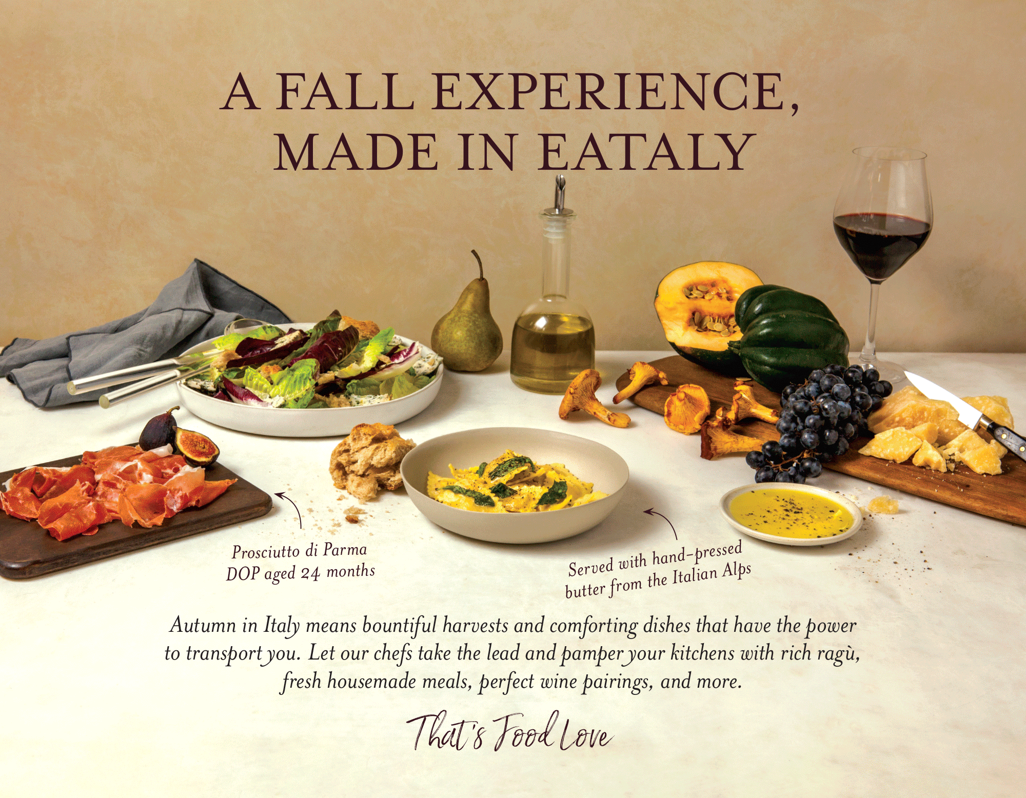
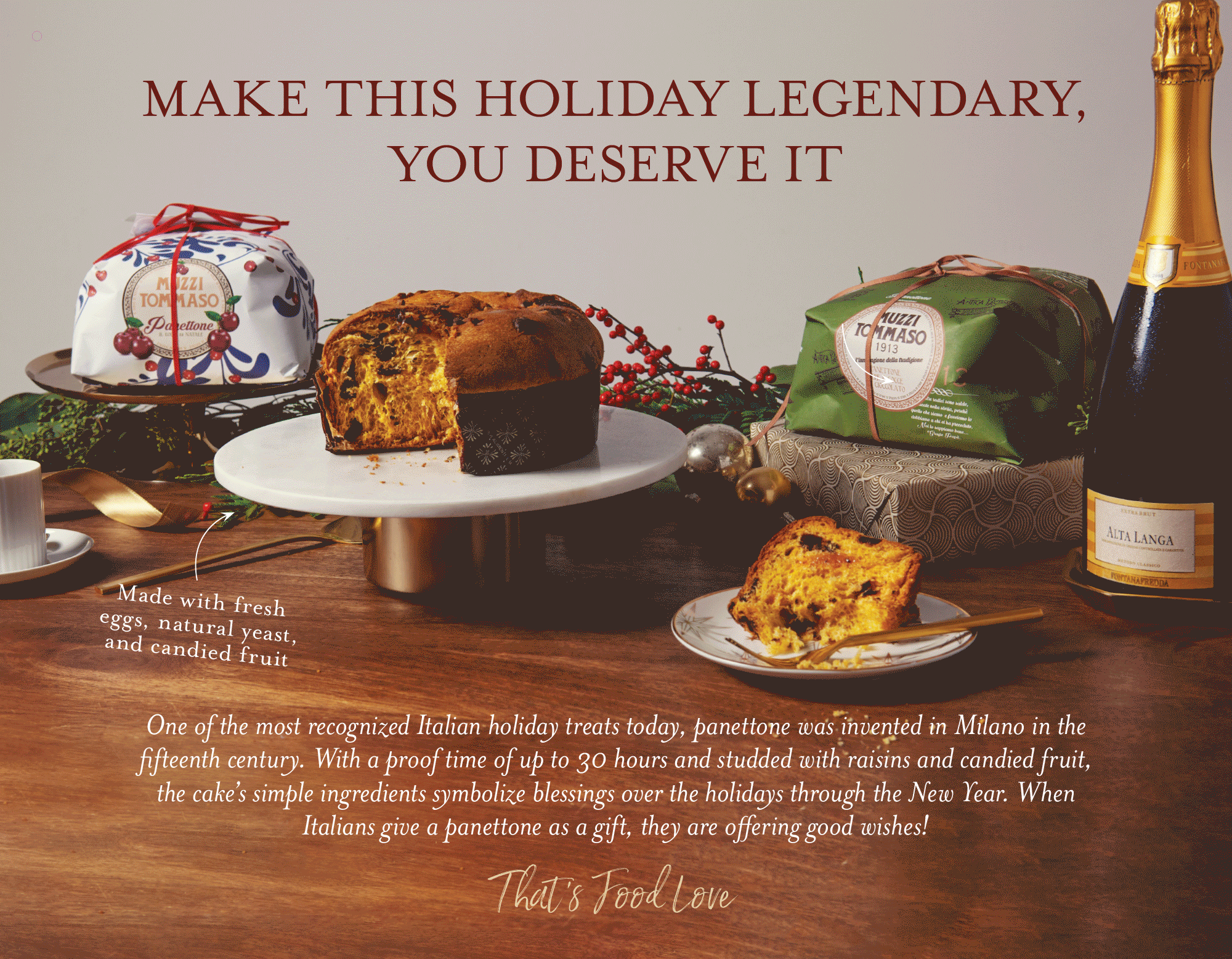
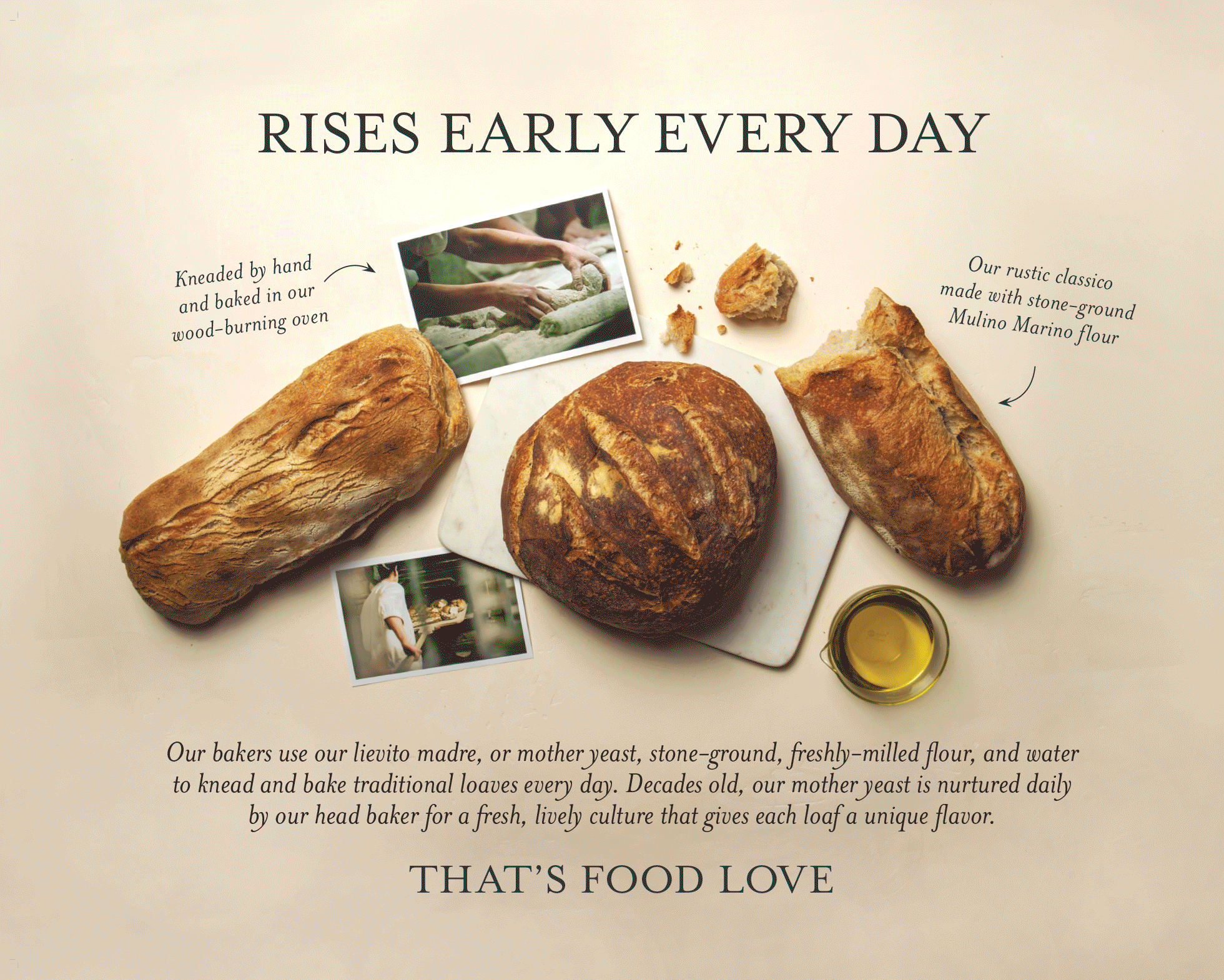
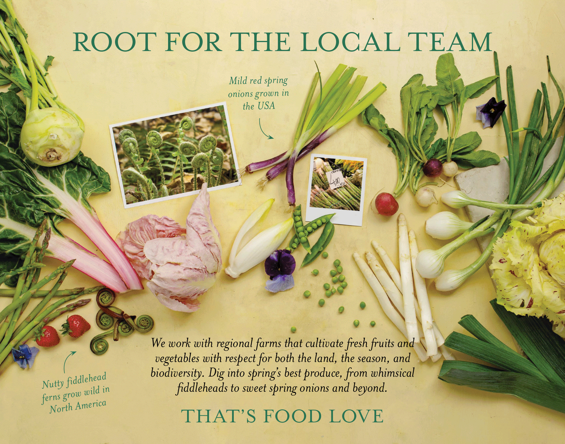
As part of my role as Head of Creative & Storytelling at Eataly’s corporate New York office, I was responsible for devising seasonal campaigns that could be used at each of the company’s locations across North America.
Much of my work at Eataly was tailored to the nuances of each U.S. market, but since these campaigns had to function on a national level the subjects focused on classic Italian staples in accordance with the time of year. The backdrops, staging, lighting and photography also changed to reflect the colors and atmosphere of each season.
The umbrella tagline “That’s Food Love” captured the pillars of the Eataly brand: quality, authenticity, humor, and also a careful attention to storytelling. With the help of my talented creative team I wrote copy, managed photoshoots, and oversaw the production of store signage (a fraction of which is presented below). This was truly a 360 campaign, extending beyond Eataly’s physical spaces to its email marketing, social media, and almost all other customer-facing communications.
This project was not without its challenges: each photoshoot was carried out over three days at Eataly’s seventh-floor office on East 23rd Street. There were five campaigns a year (four seasons plus the holidays), and by the time one was completed it was time to begin work on the next. Fortunately, the essence of the idea was flexible, and as we navigated through the pandemic we managed to successfully adapt the tone of the campaign to the country’s shifting priorities and mood.
Special thanks to Rachel Goodman, Billie Winter, Madeleine Reidy, Grace Henderson, Tracey Bachman, Emily Hirsch and Erick Steinberg.
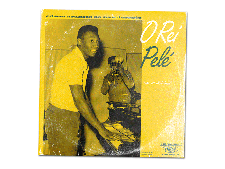
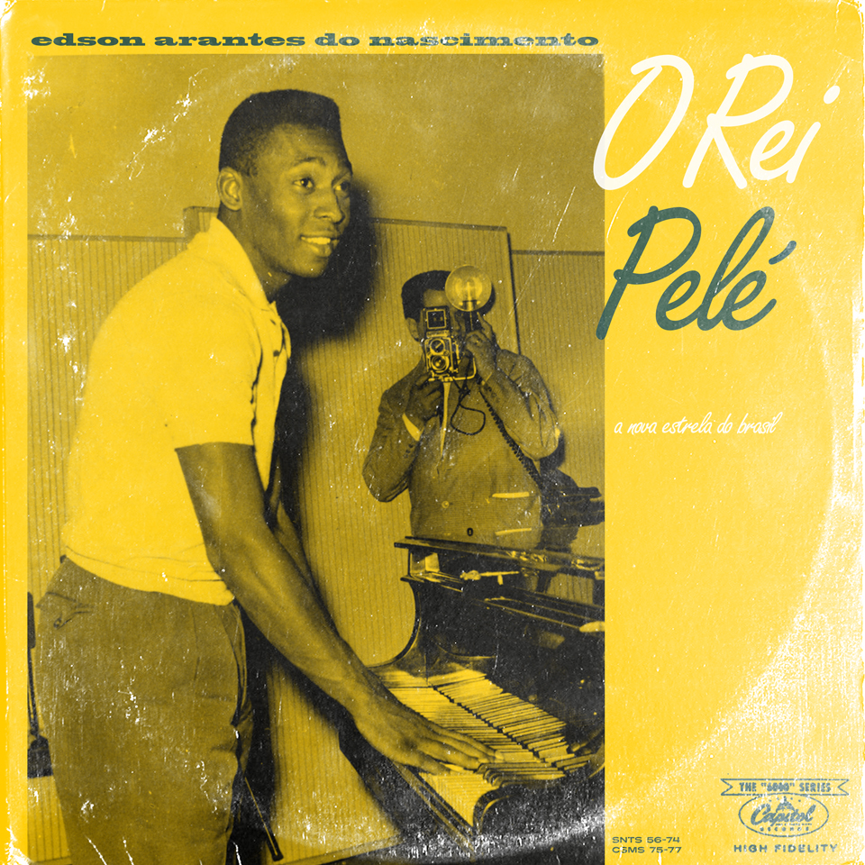
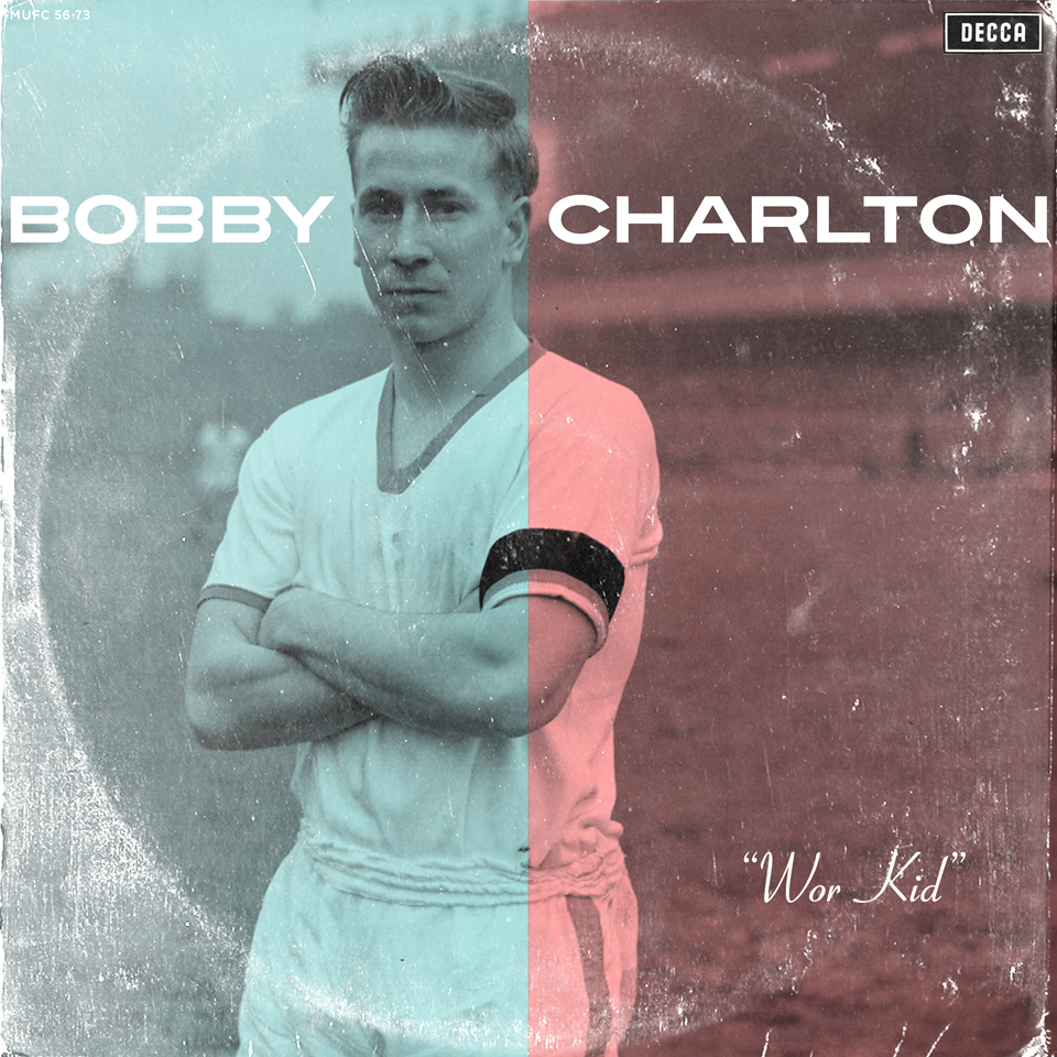
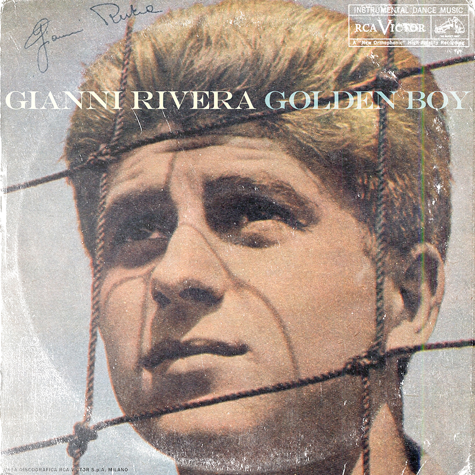
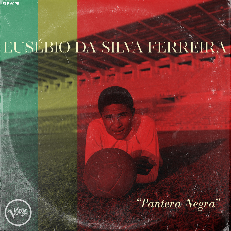
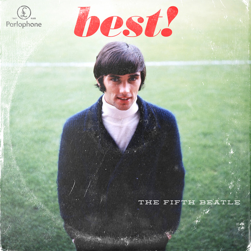
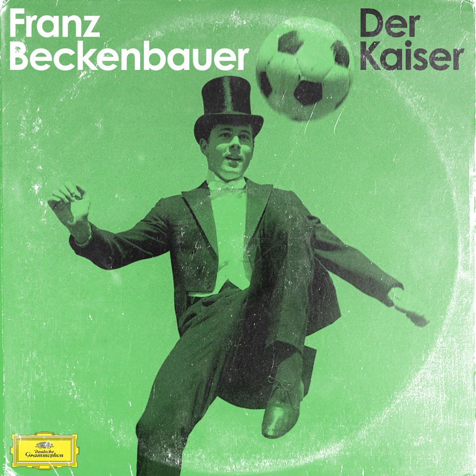
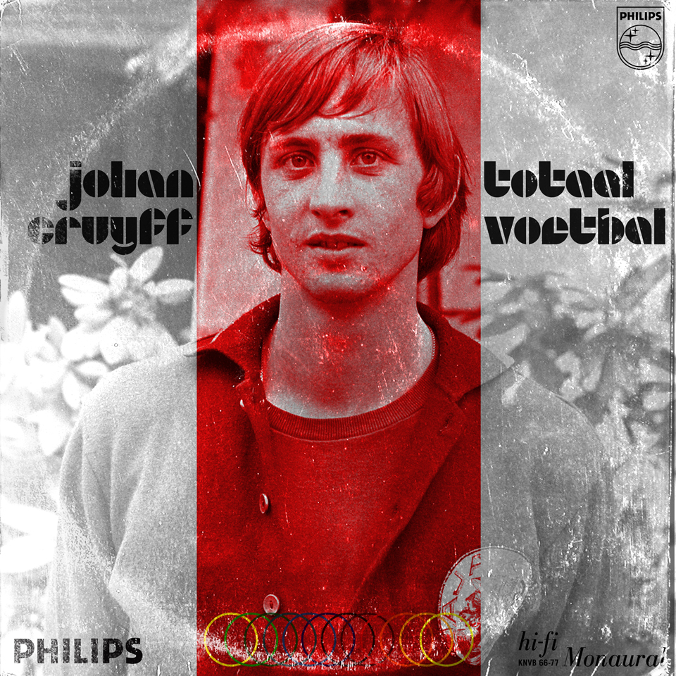
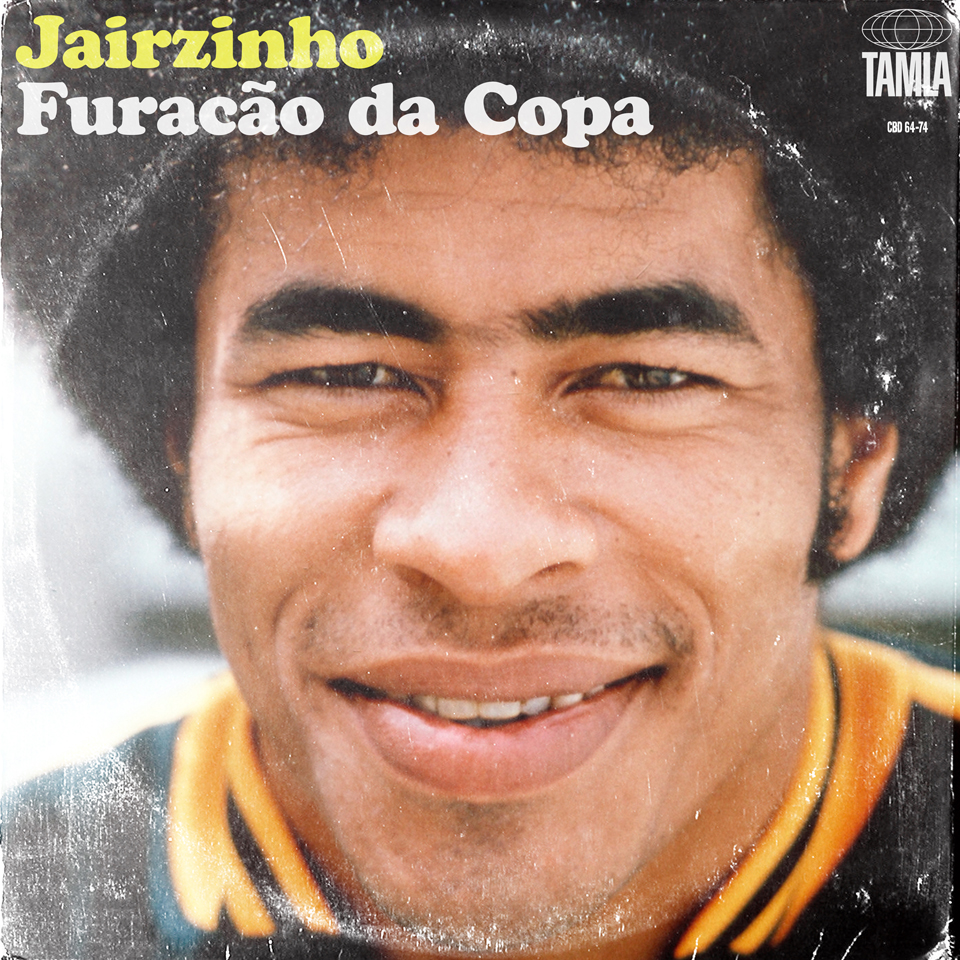
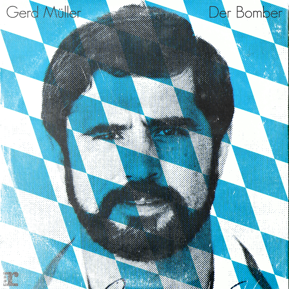
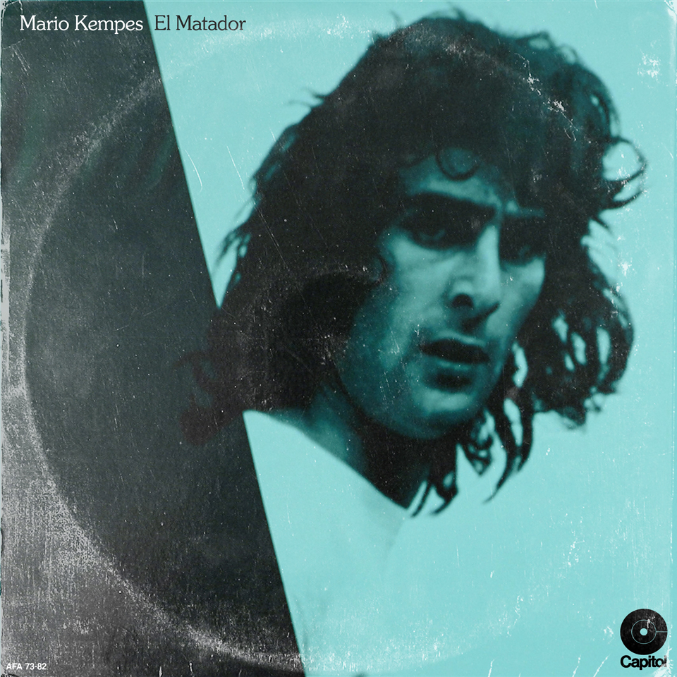
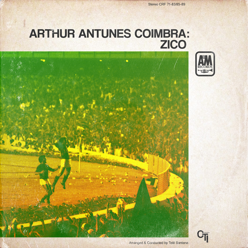
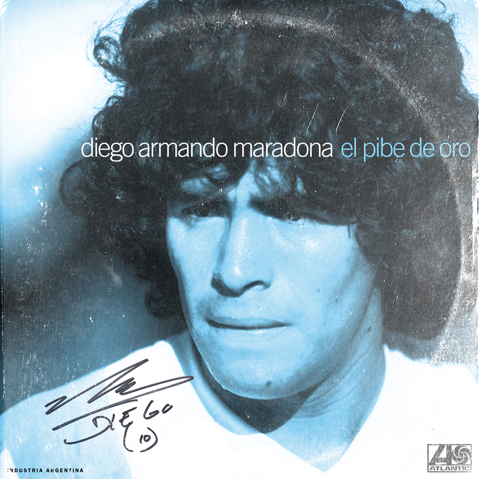
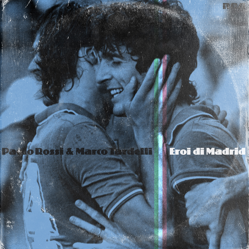
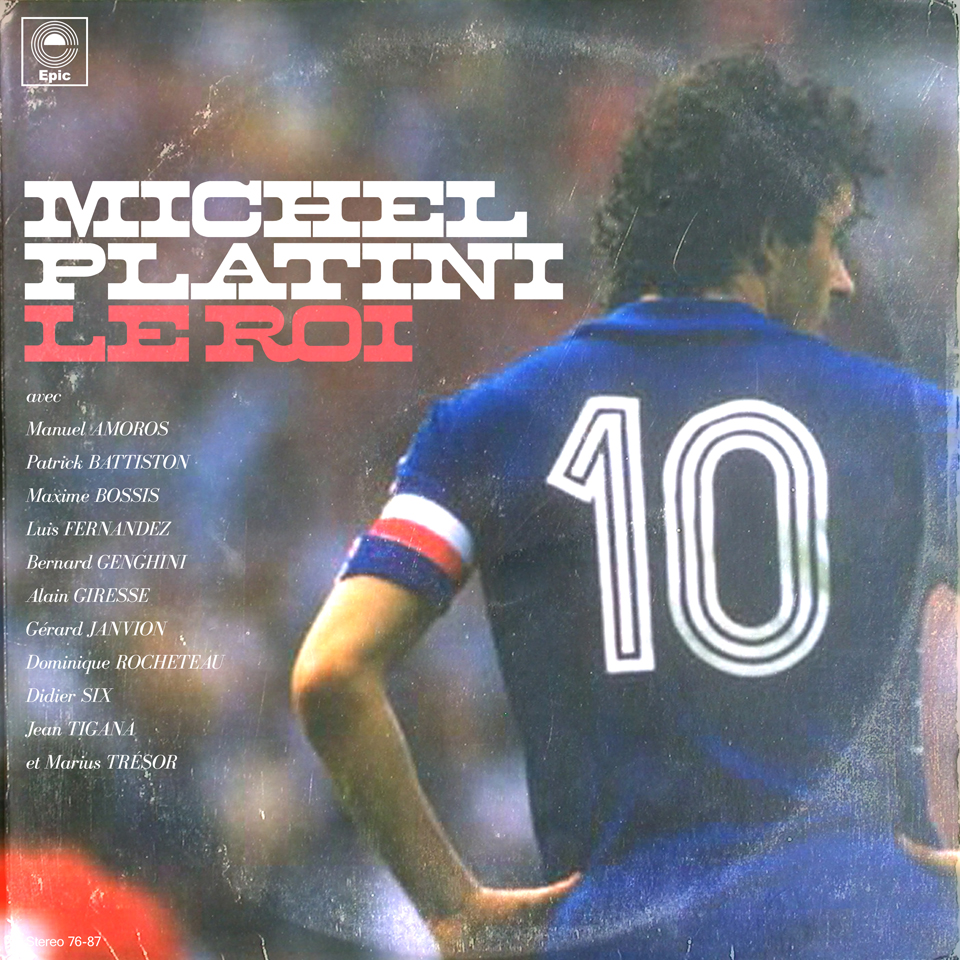
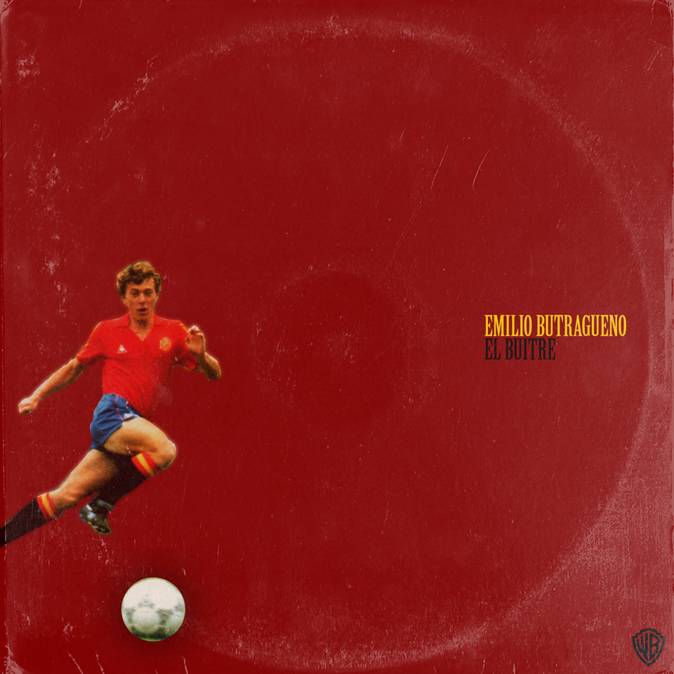
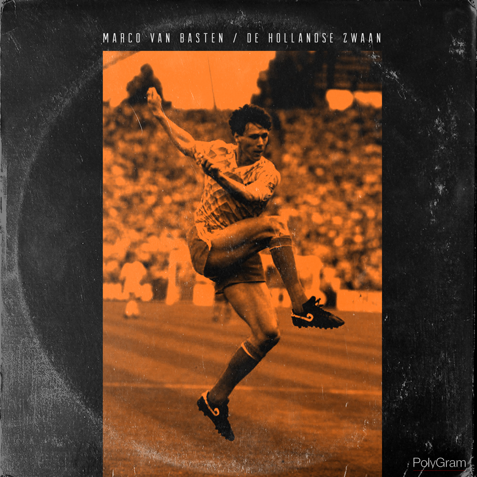
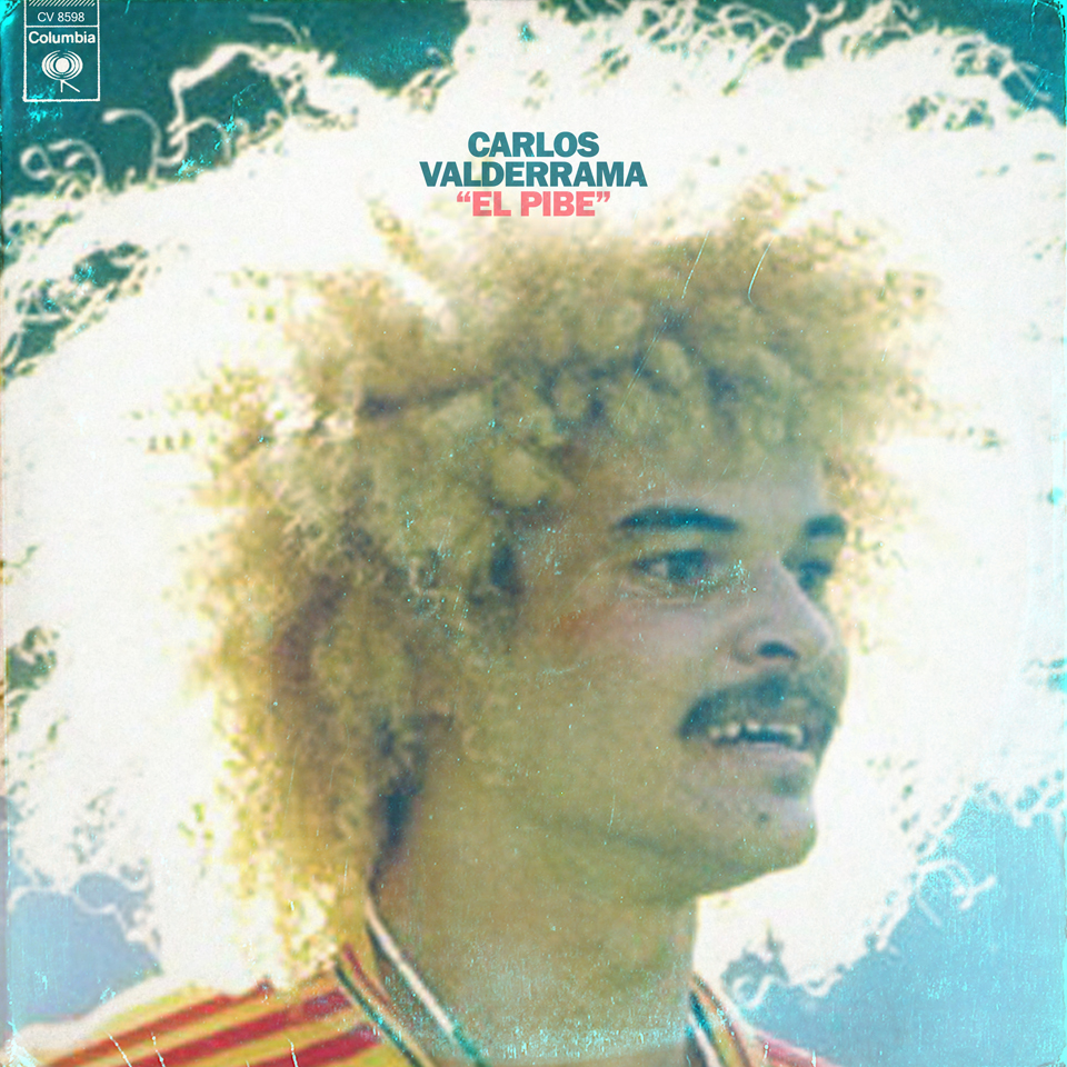
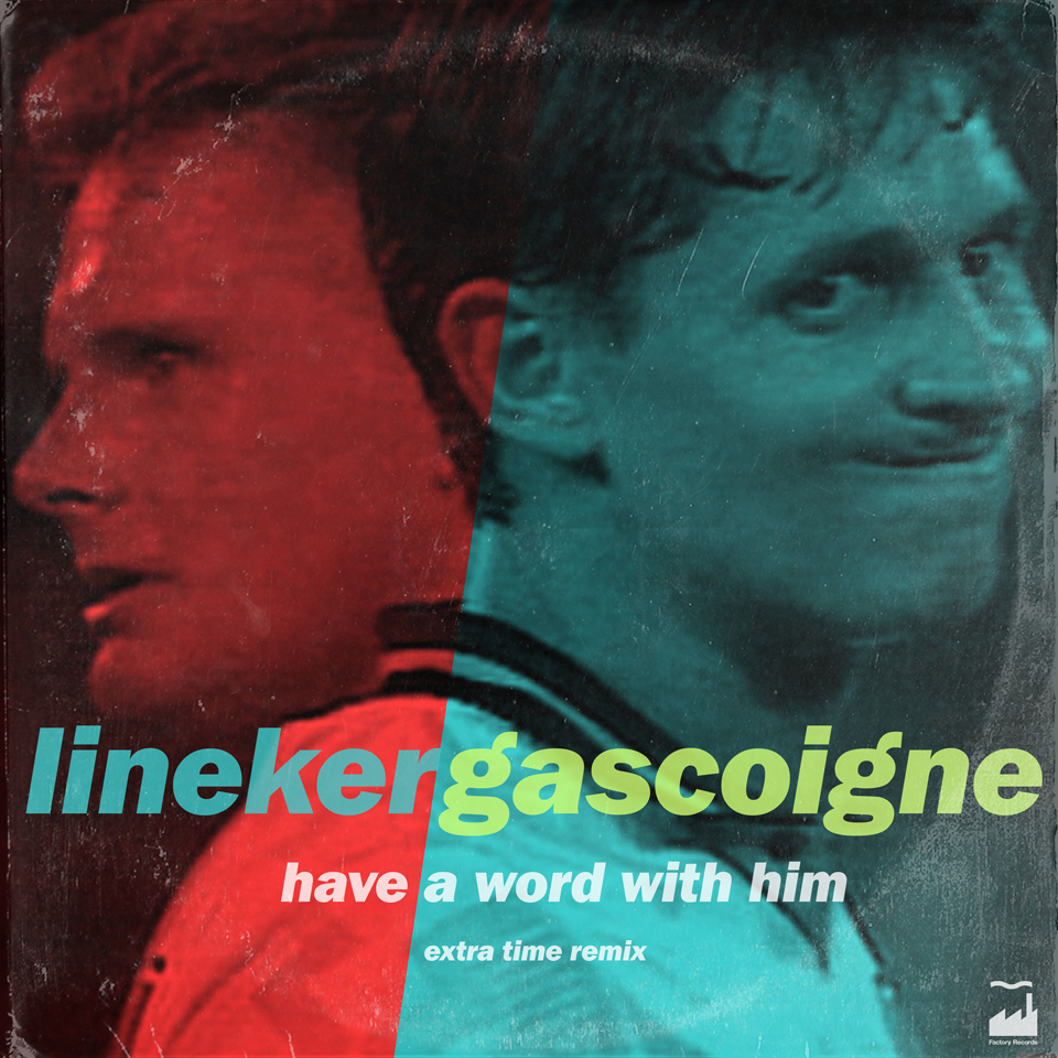
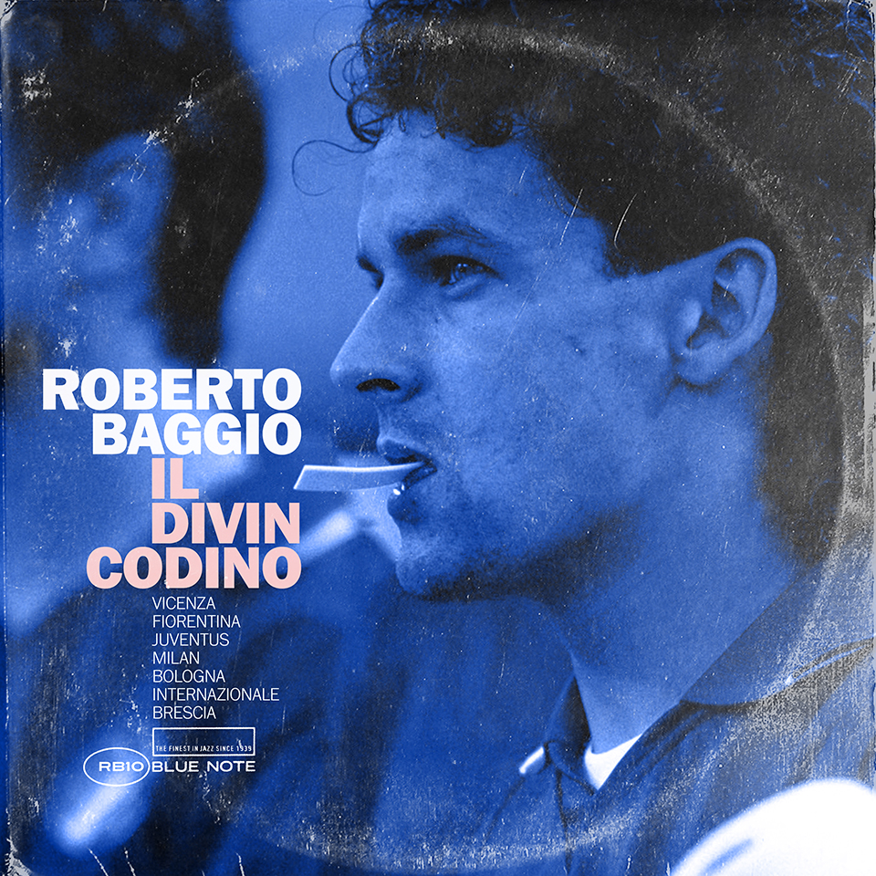
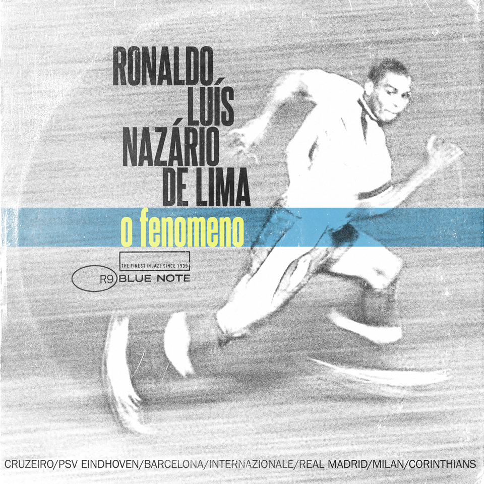
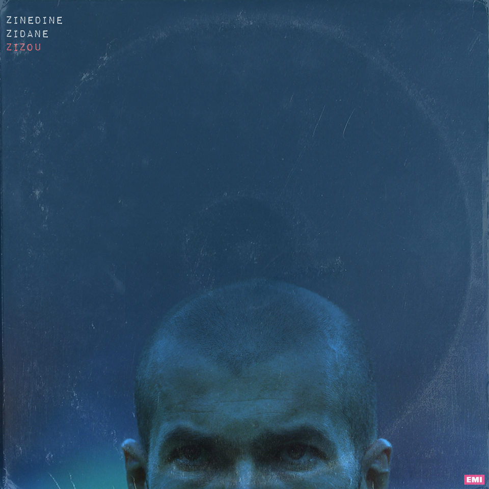
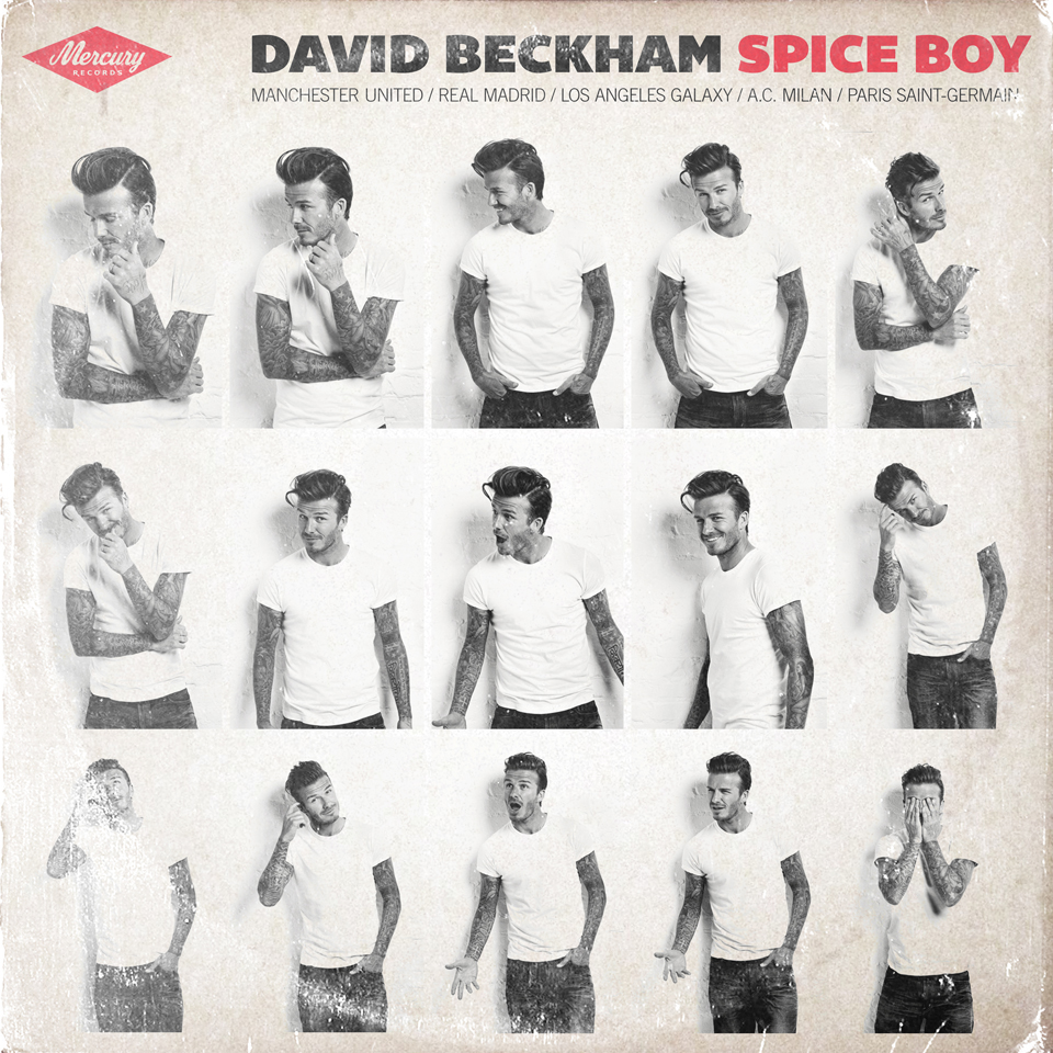
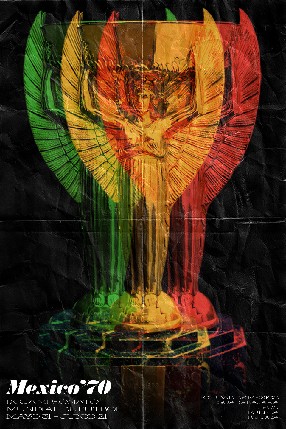
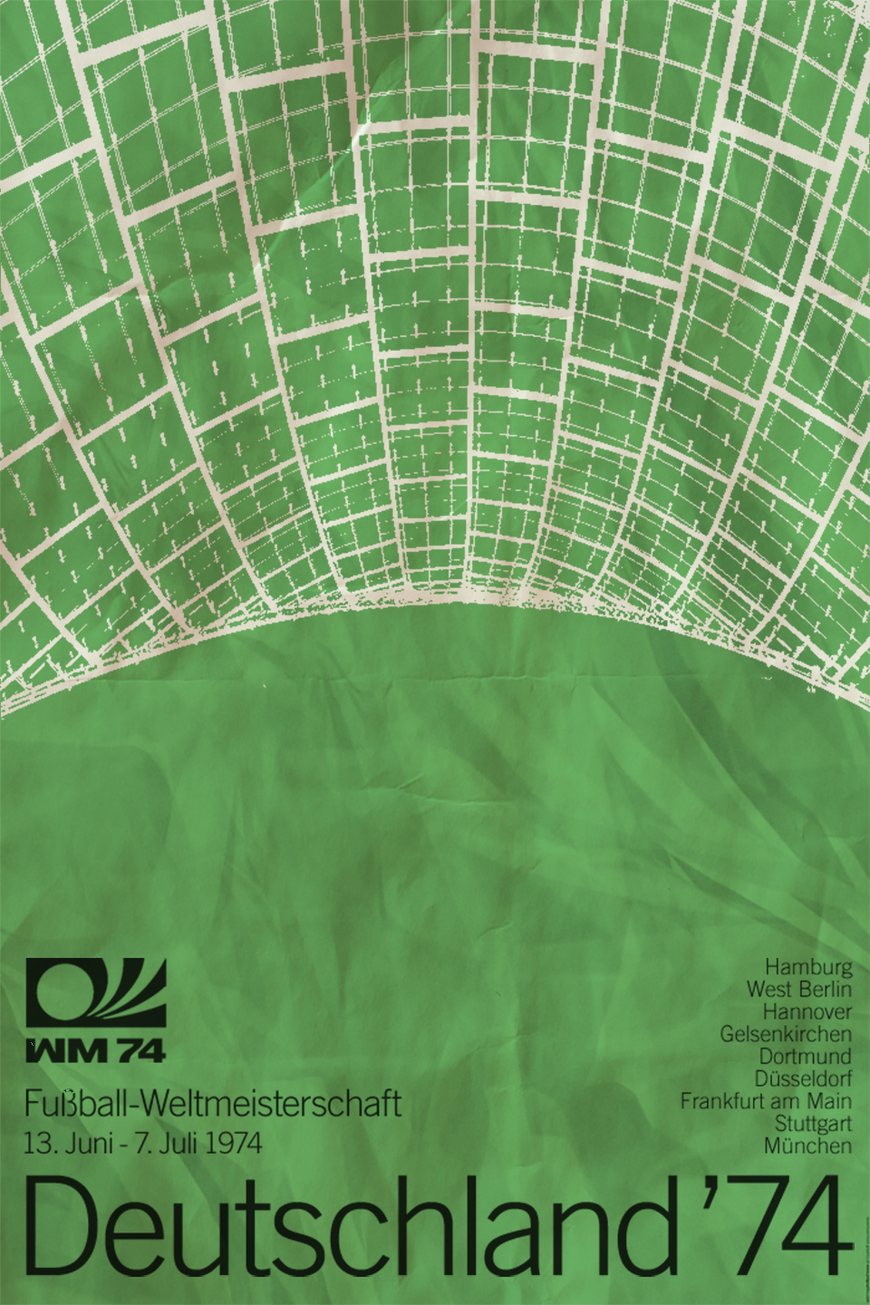
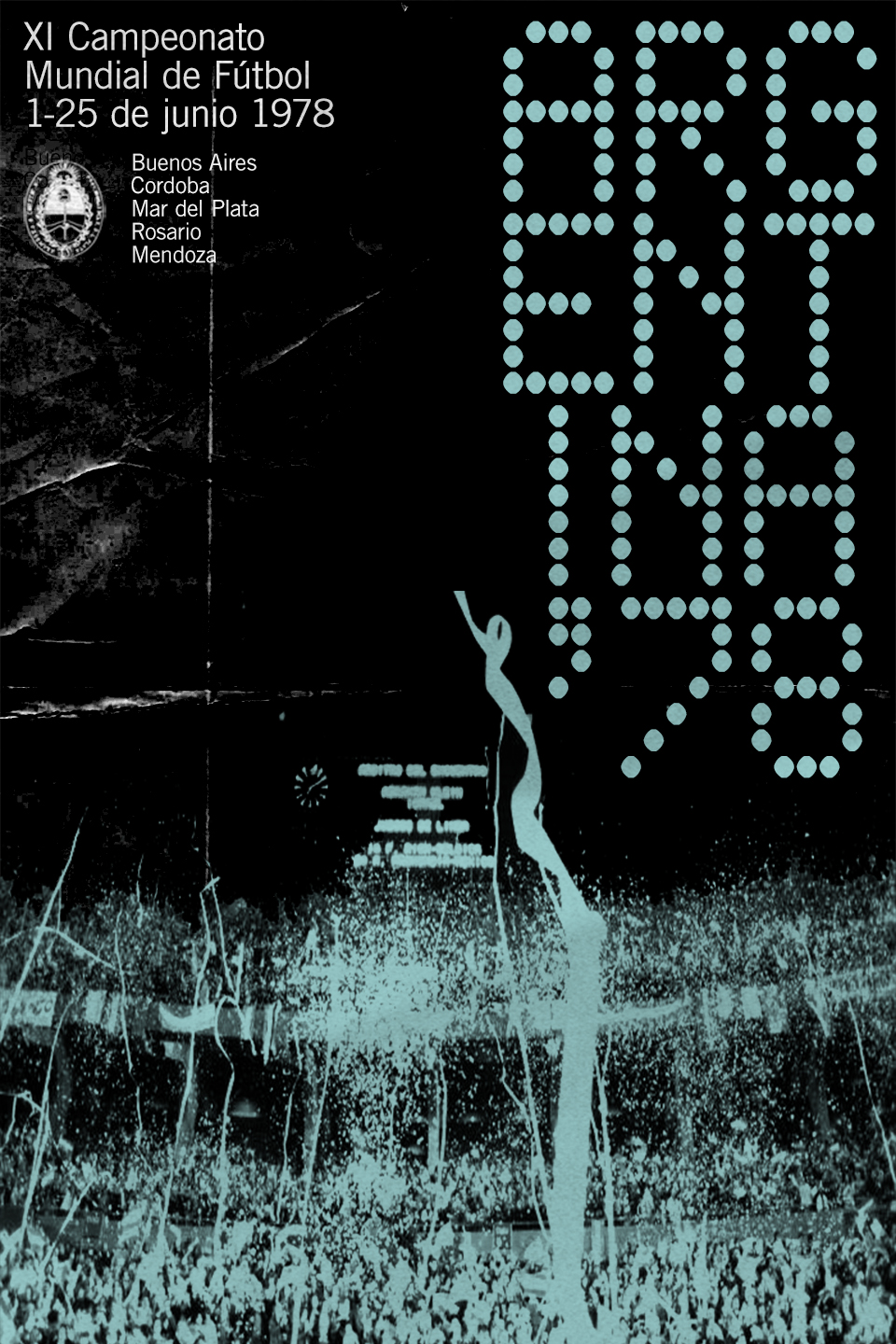
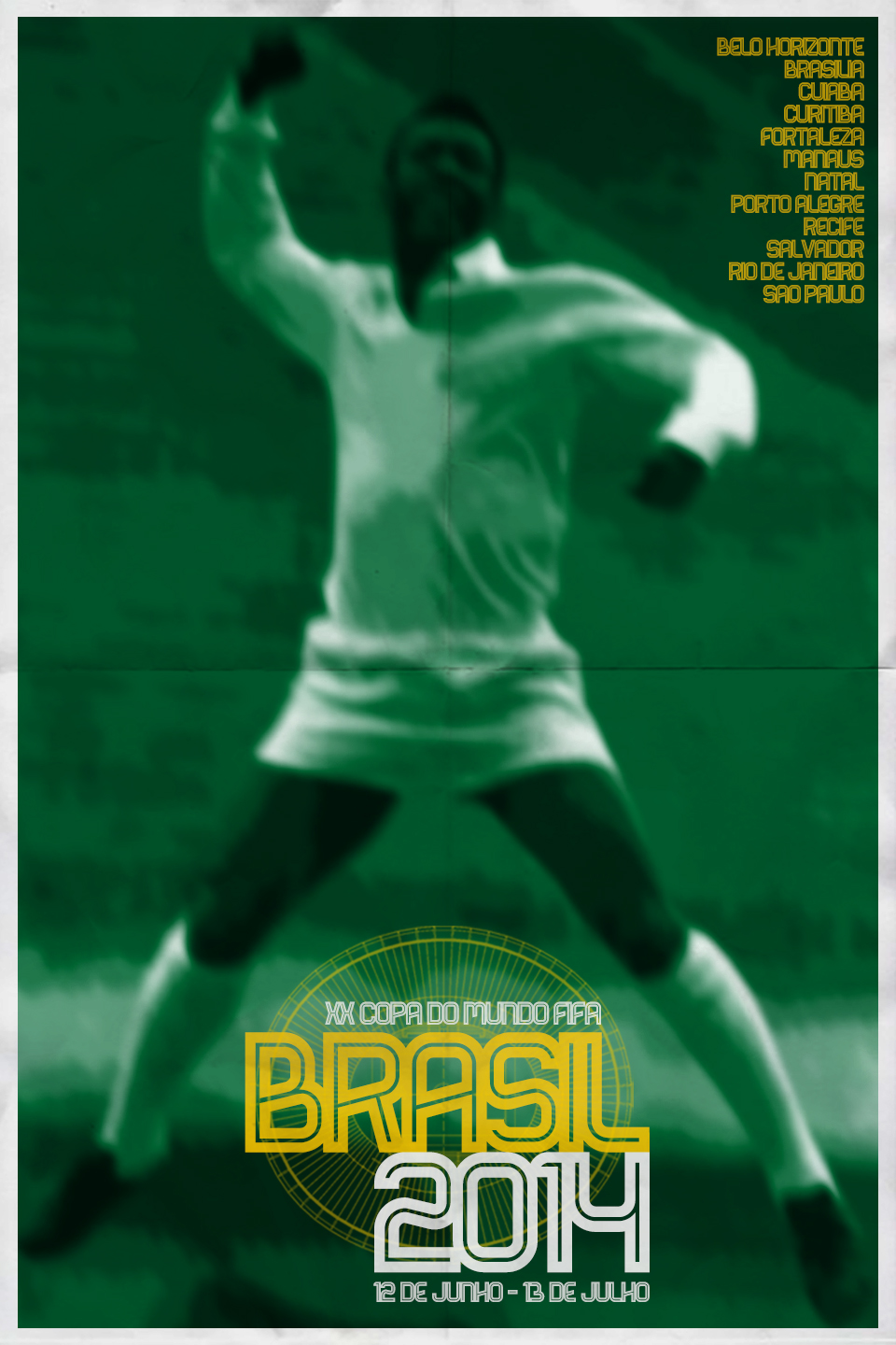
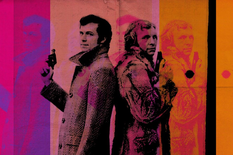
The LPFC project came to me one day as I was walking home from work. The idea to combine two of my biggest interests, football and music, seemed so obvious I was actually surprised it hadn’t occured to me sooner. I started working on it after dinner that evening and I completed it in about two weeks. I’ve always been a keen observer of the nuances of graphic design history: for example, how a typeface choice on a record cover can immediately reveal something about when and where it comes from, and even say something about the music contained on the record. So this project was really a personal exercise to try and evoke a period and place through graphic design, without resorting to easy short-cuts which would render the project a big cliché. I tried to find less-famous images of the most famous players: either shots of them in unusual settings (Pelé at the piano, Beckenbauer in a top hat and tails), or more familiar photos that I could make feel fresh in this design context. So the footballers were really just the subject matter, which helped make the design connections clearer but also allowed for a fun juxtaposition that could be appreciated cross-culturally. A couple of the finished designs directly evoke existing album artwork: Zico’s echoes the covers of Tide and Wave by Antonio Carlos Jobim, while Baggio’s is a twist on Dexter Gordon’s Our Man In Paris. Much to my surprise, and with no extra effort on my part, within a week this project had gone viral. It was featured in dozens of newspapers and magazines and suddenly I was fielding requests for interviews from around the world. Proof that you can’t always predict what’s going to be a hit…
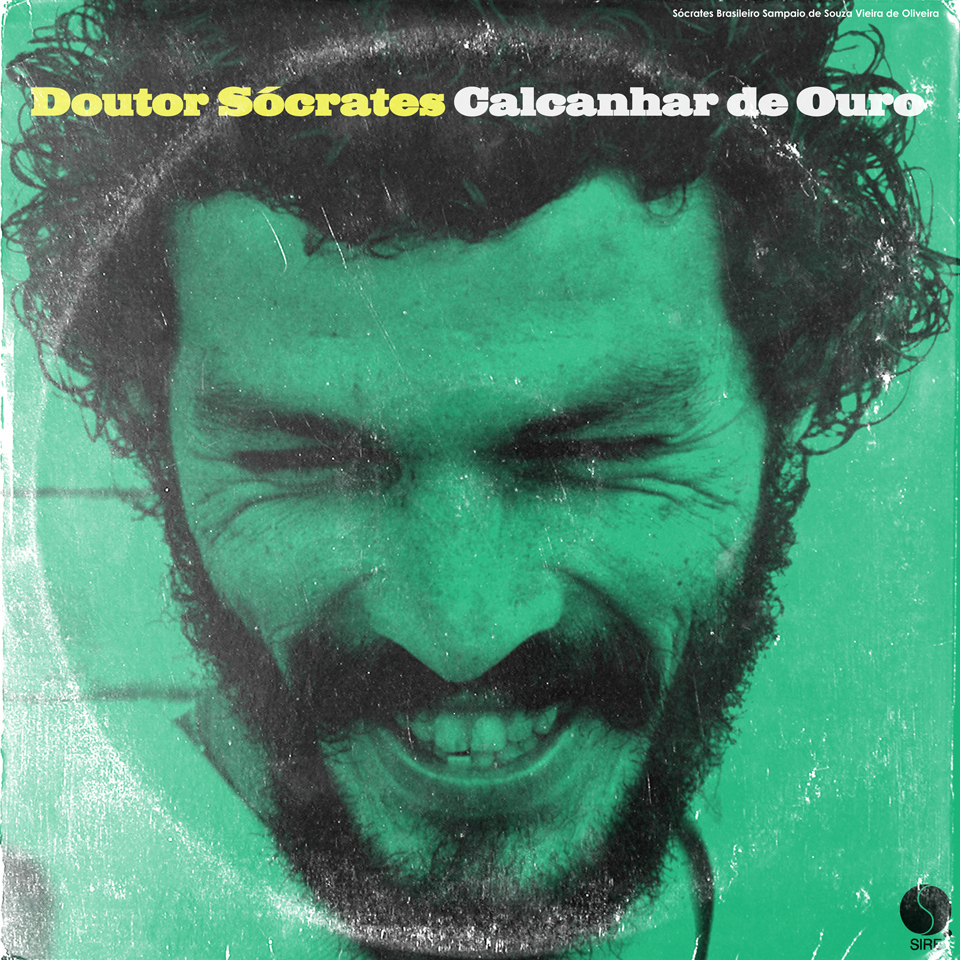

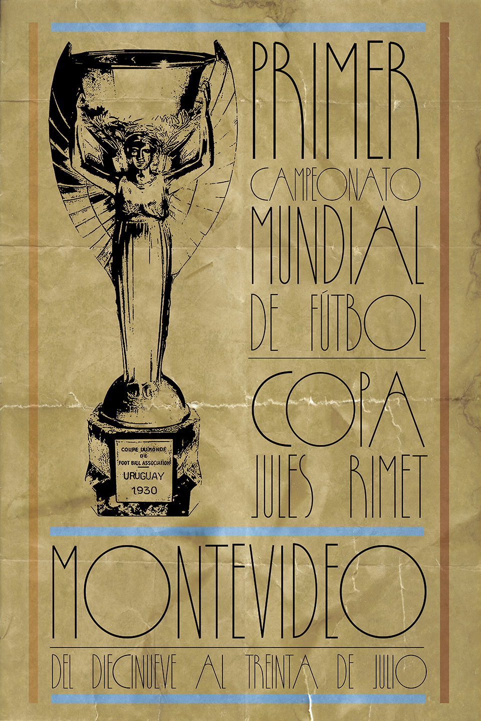
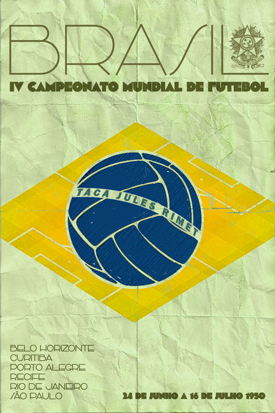
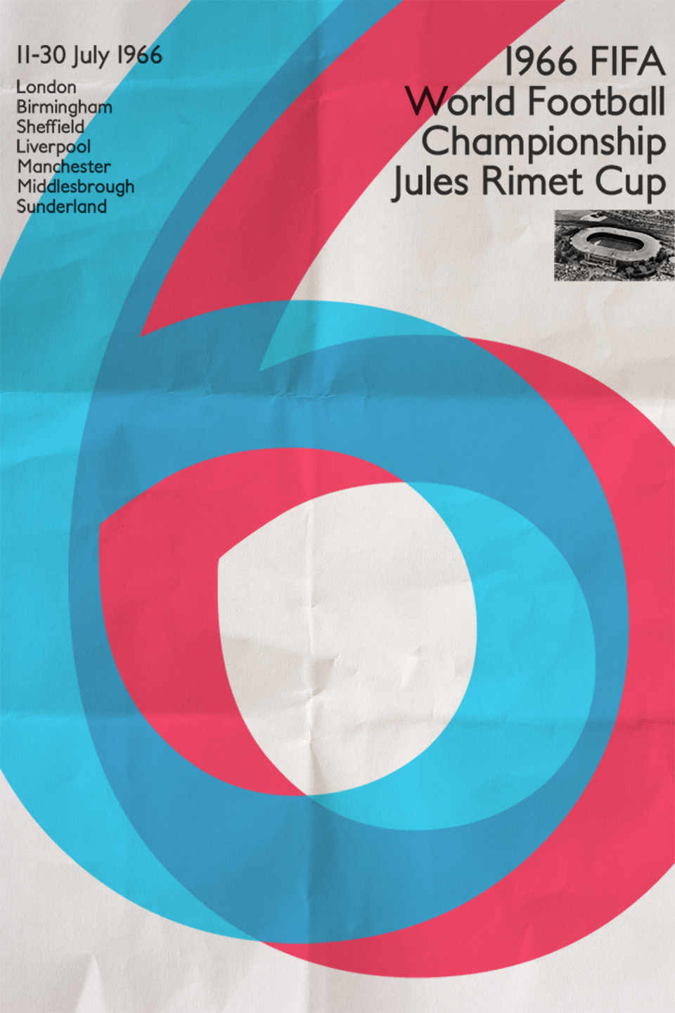
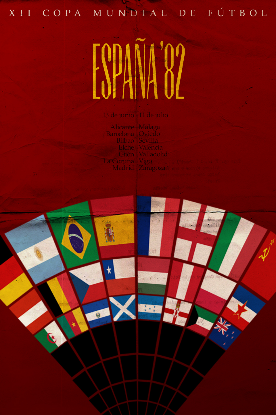
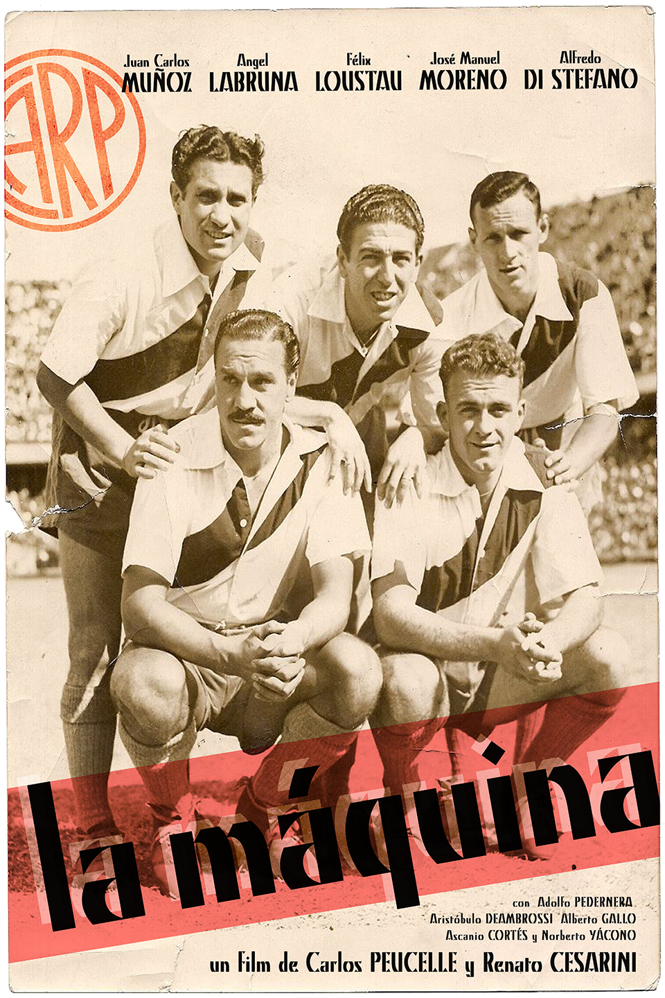
La Máquina (1947)
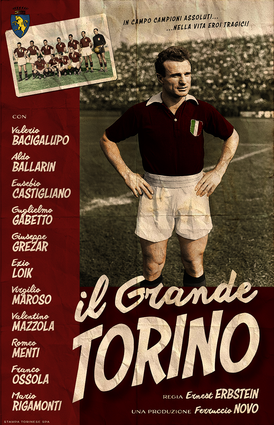
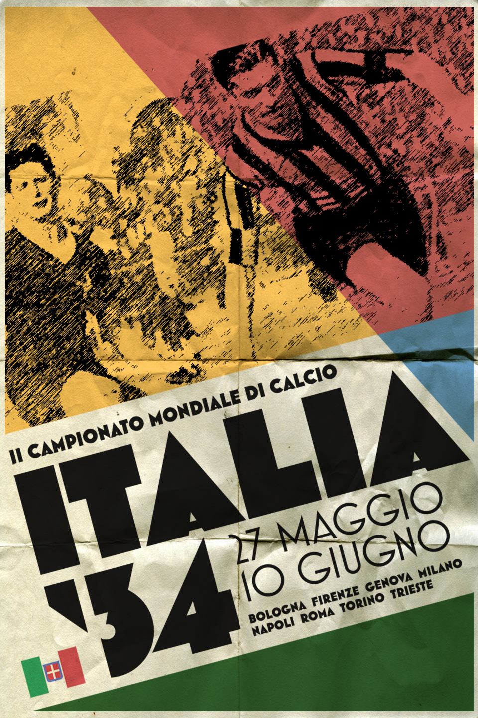
Il Grande Torino (1949)
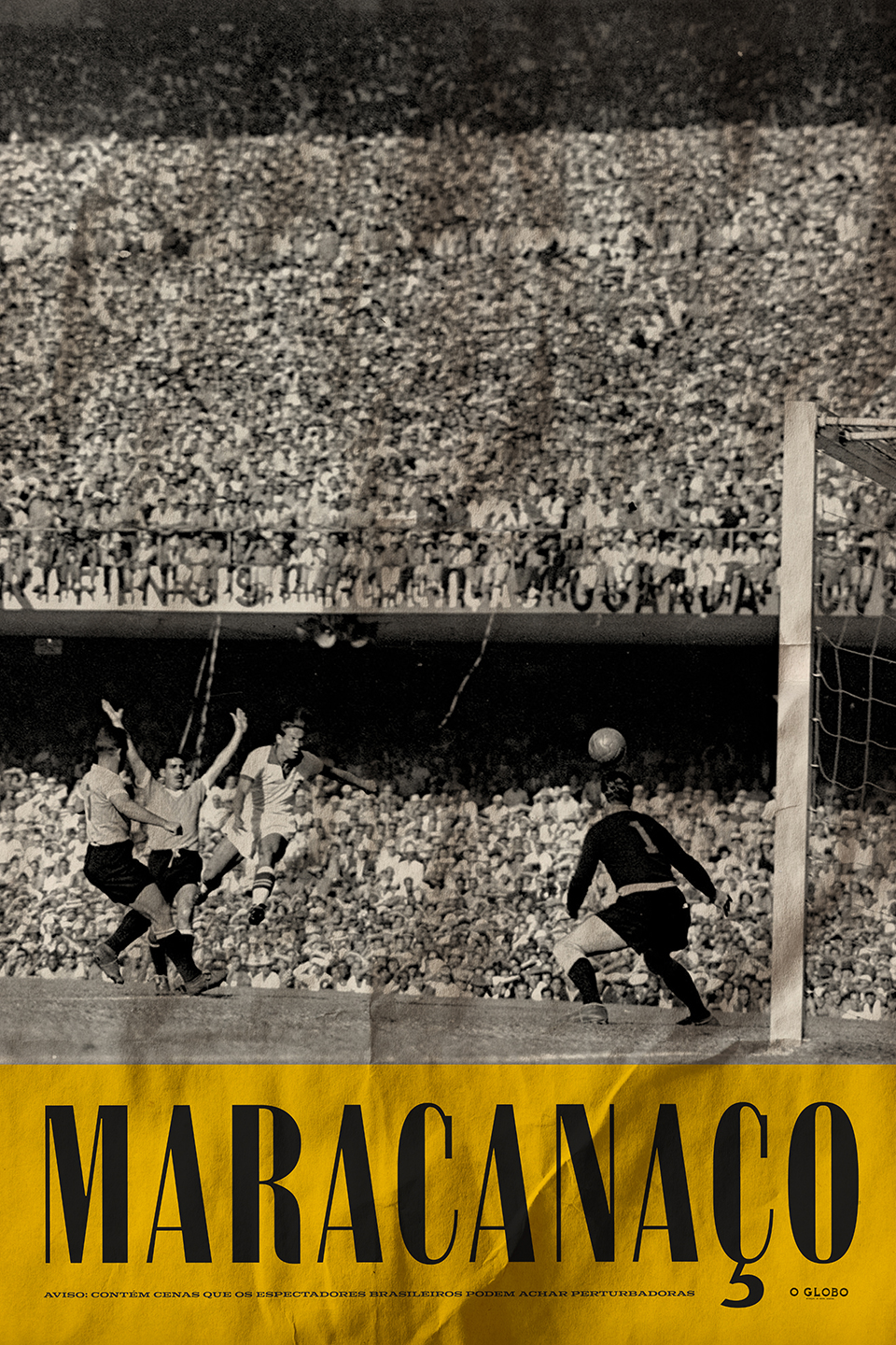
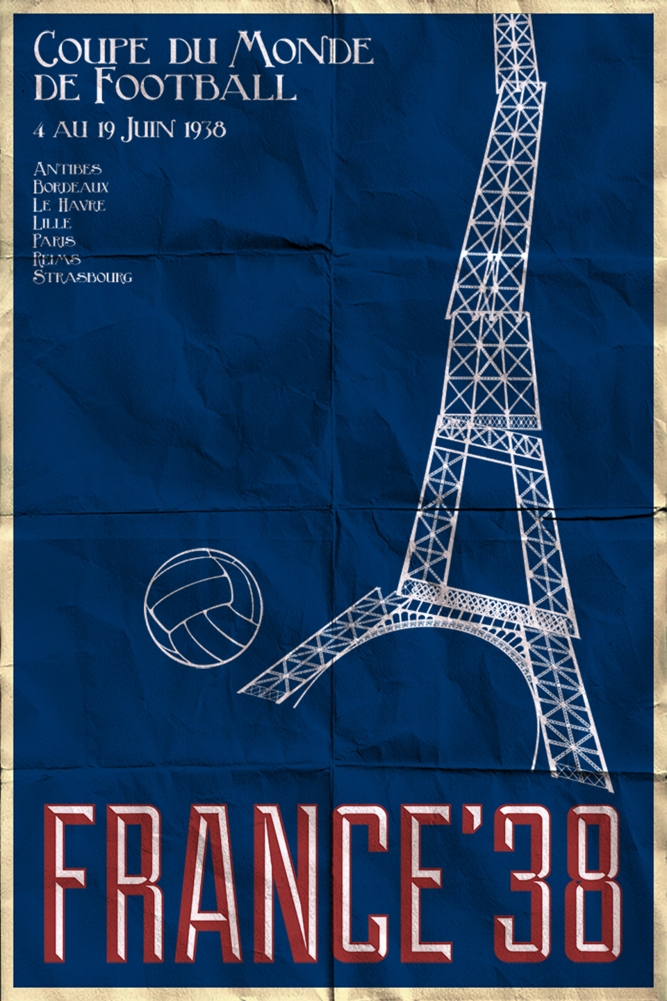
Maracanaço (1950)
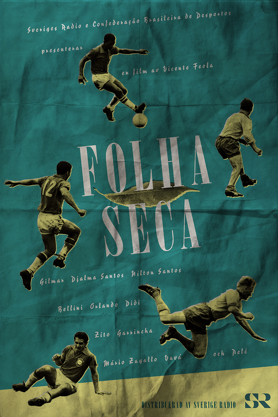
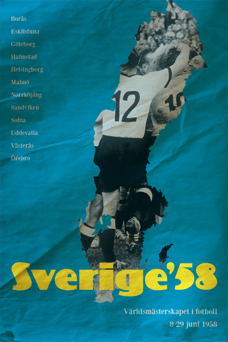
Folha Seca (1958)
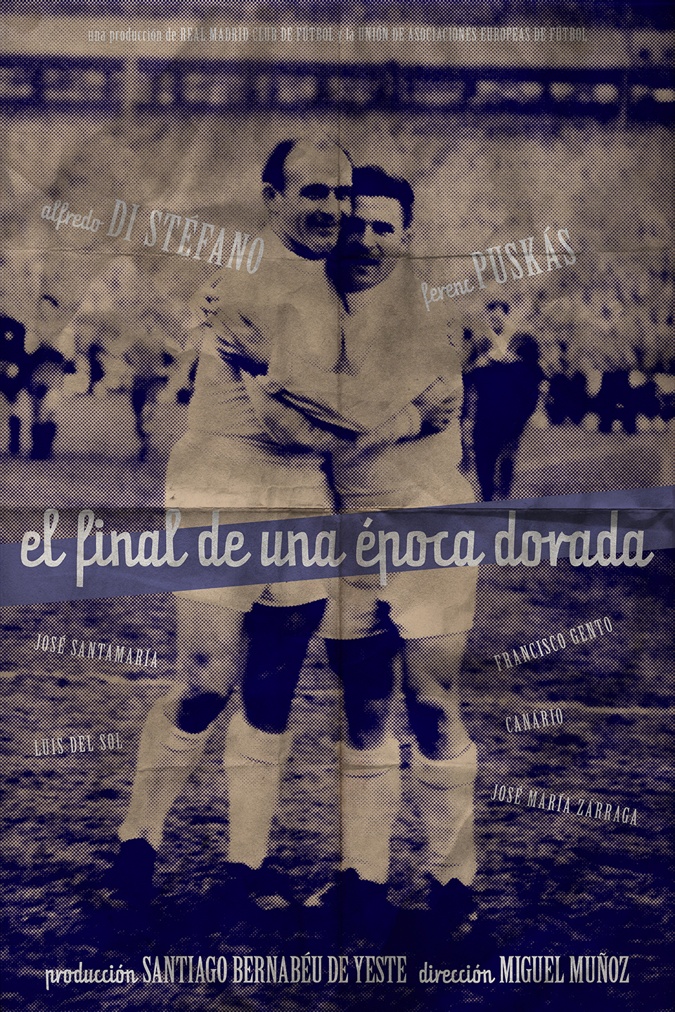
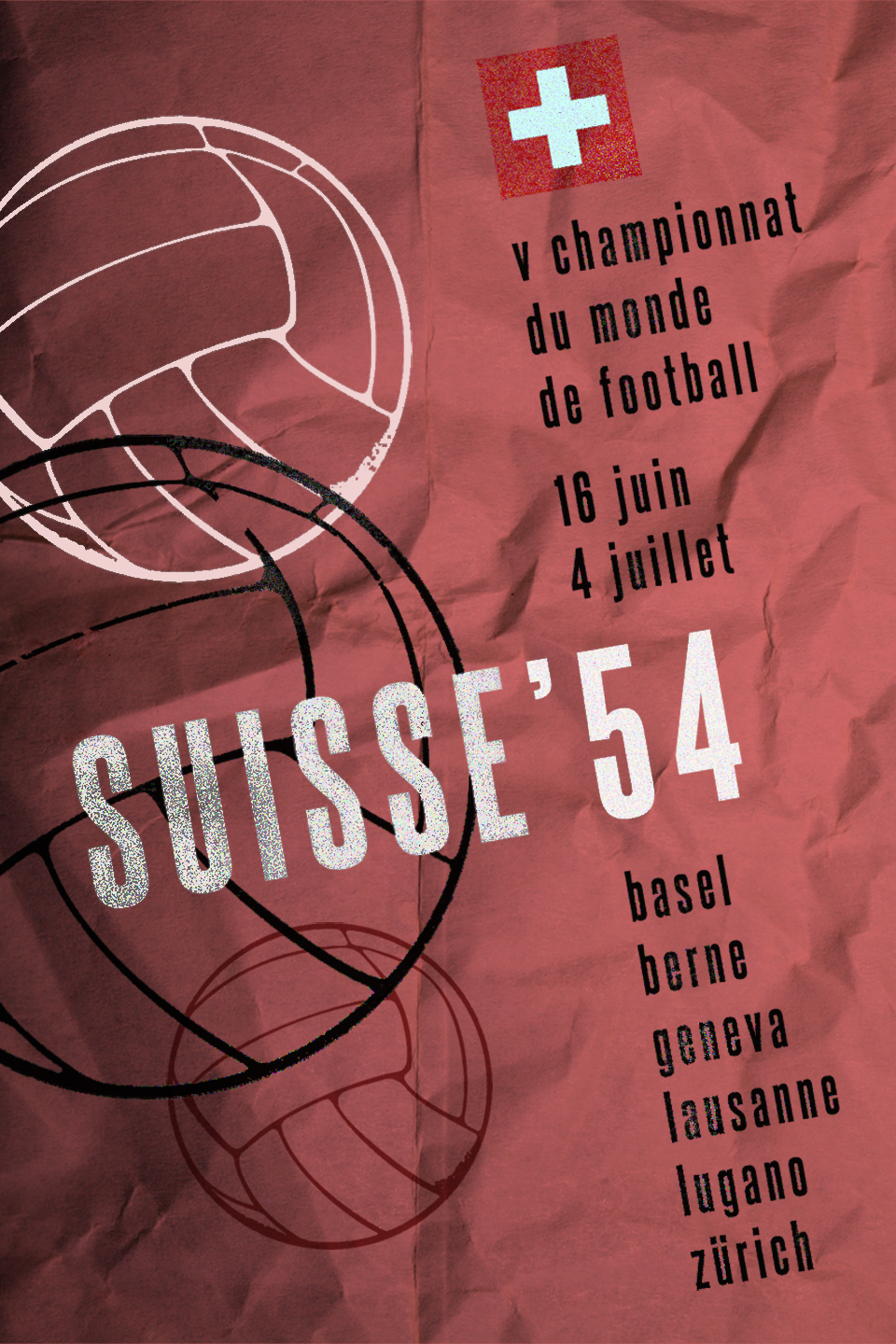
El Final de una Época Dorada (1960)
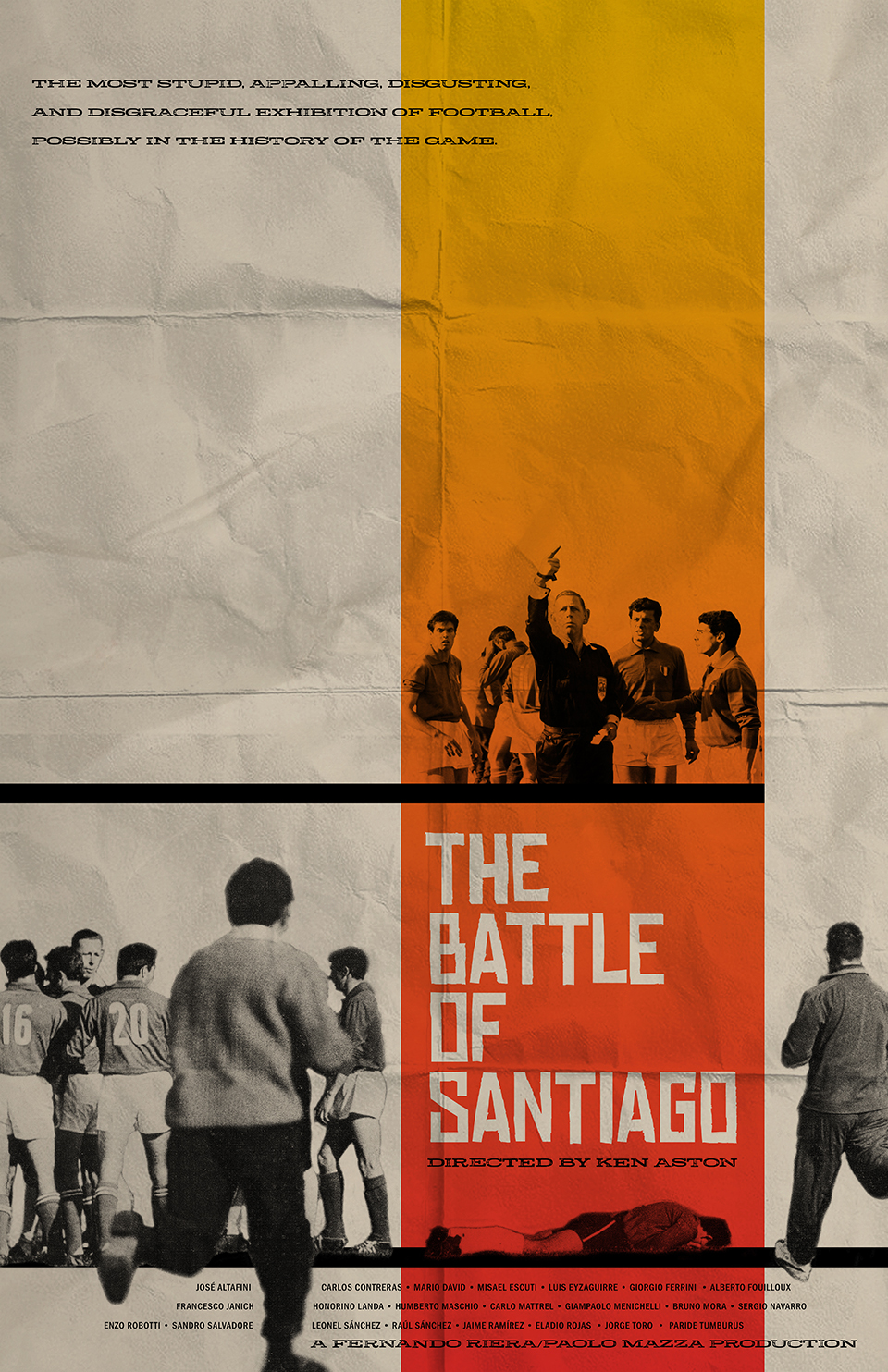
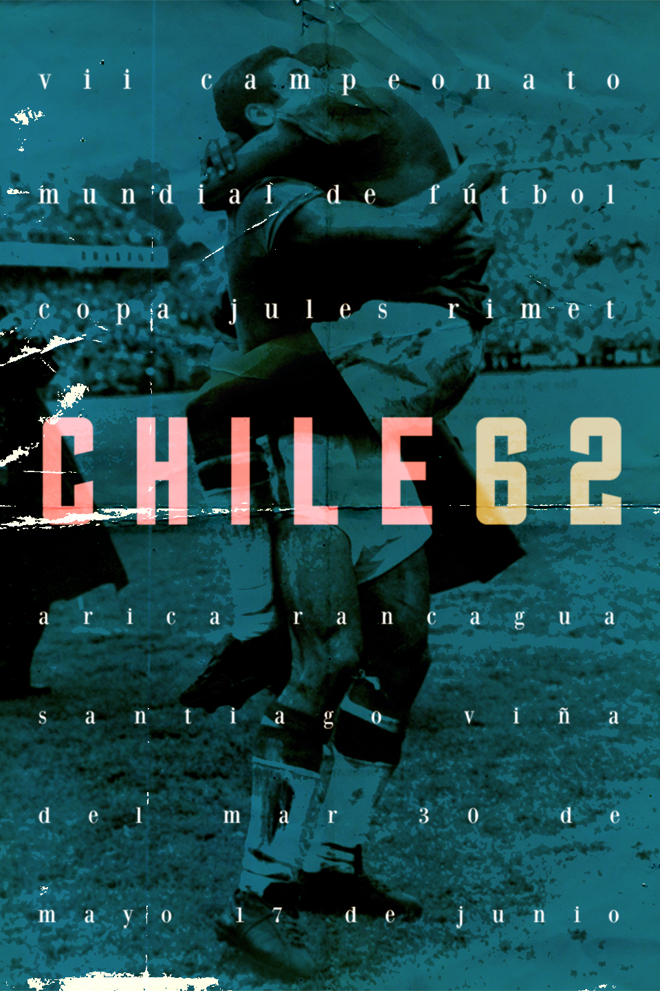
The Battle of Santiago (1962)
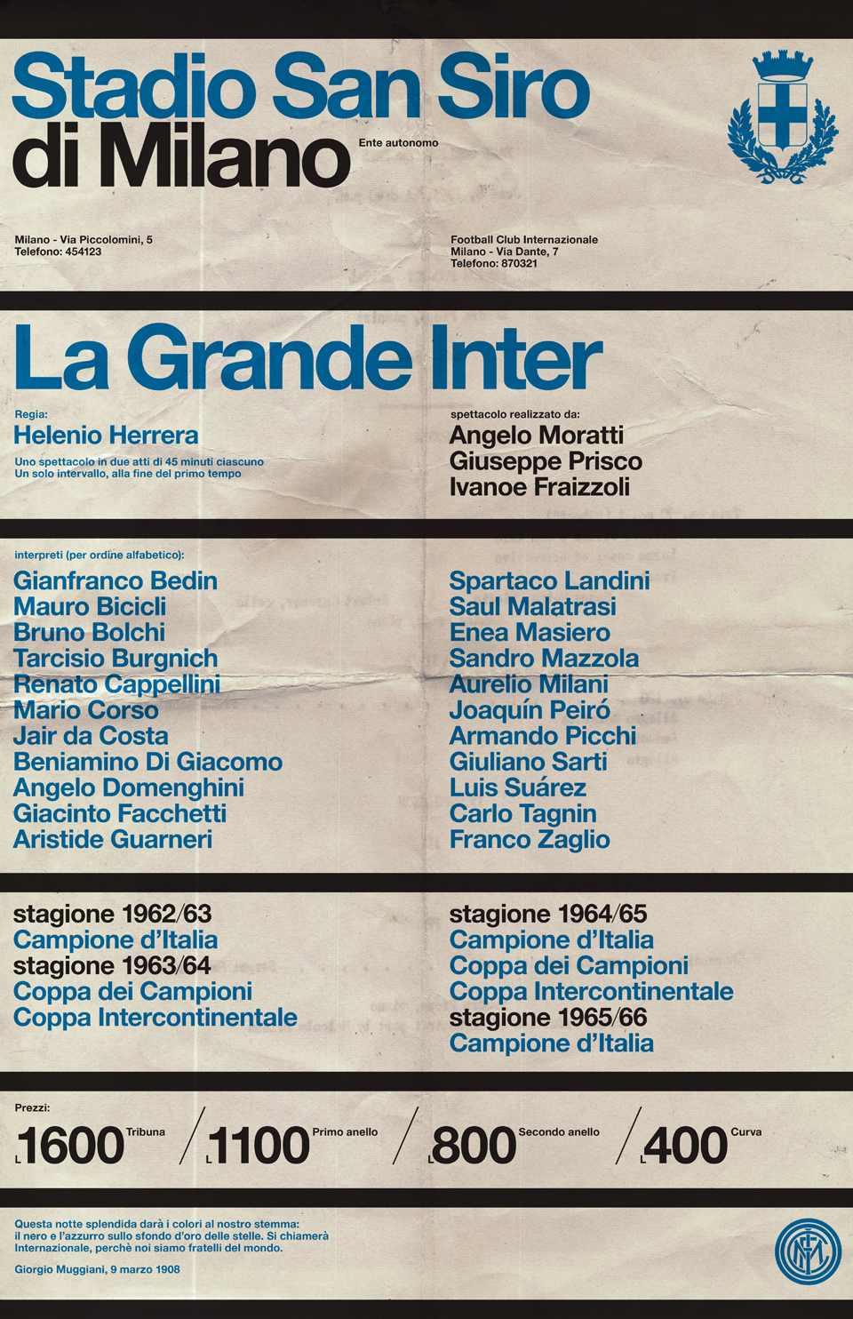
La Grande Inter (1965)
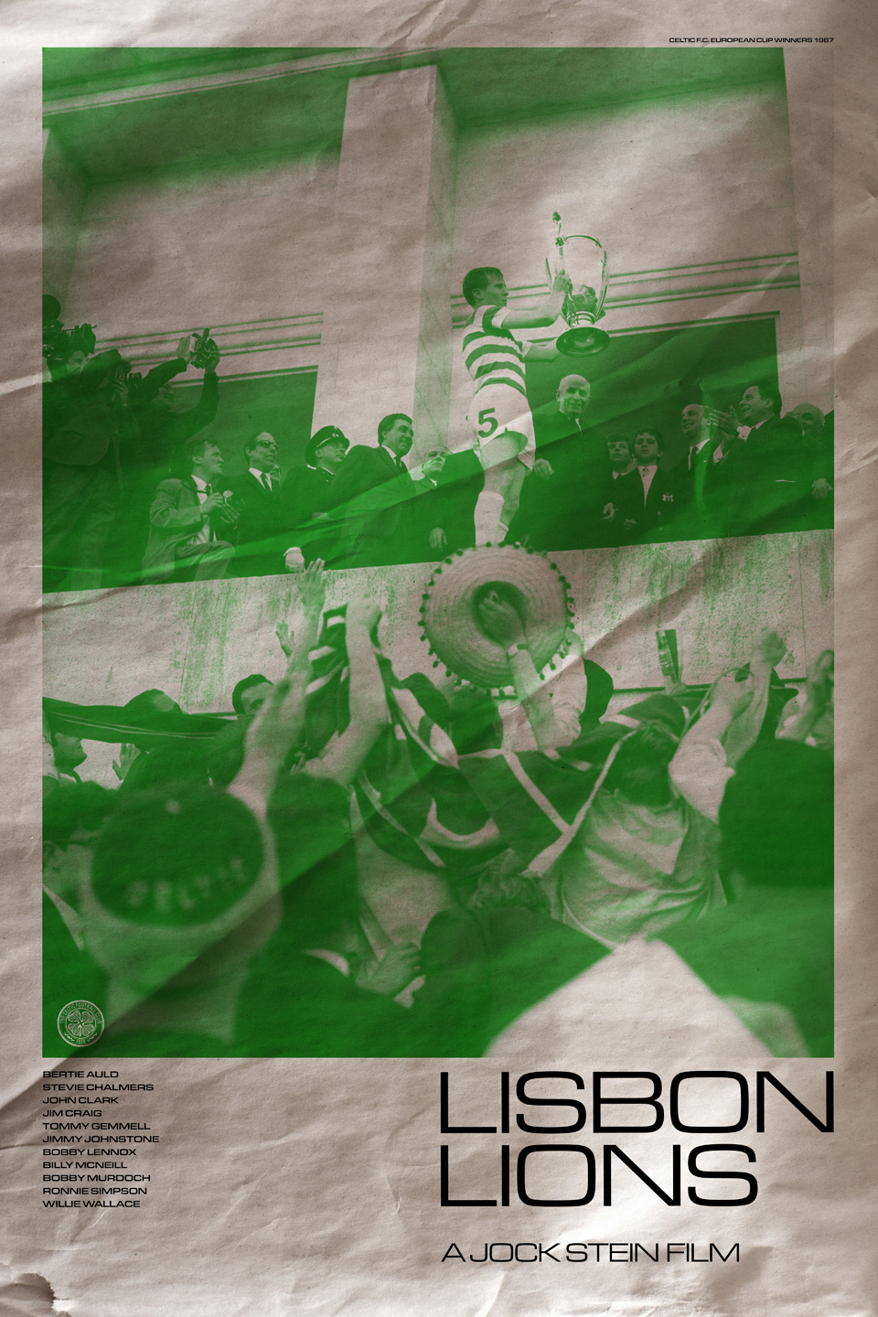
Lisbon Lions (1967)
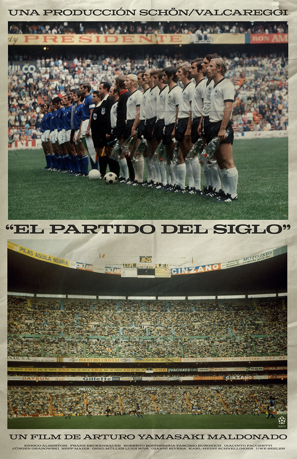
El Partido del Siglo (1970)
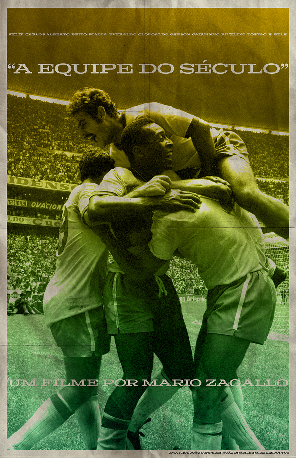
A Equipe do Século (1970)
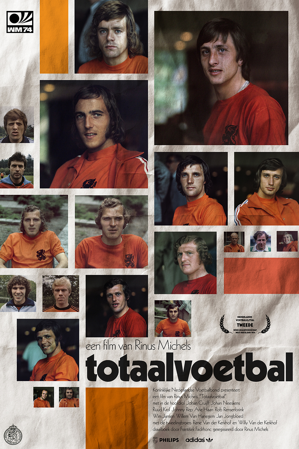
Totaalvoetbal (1974)
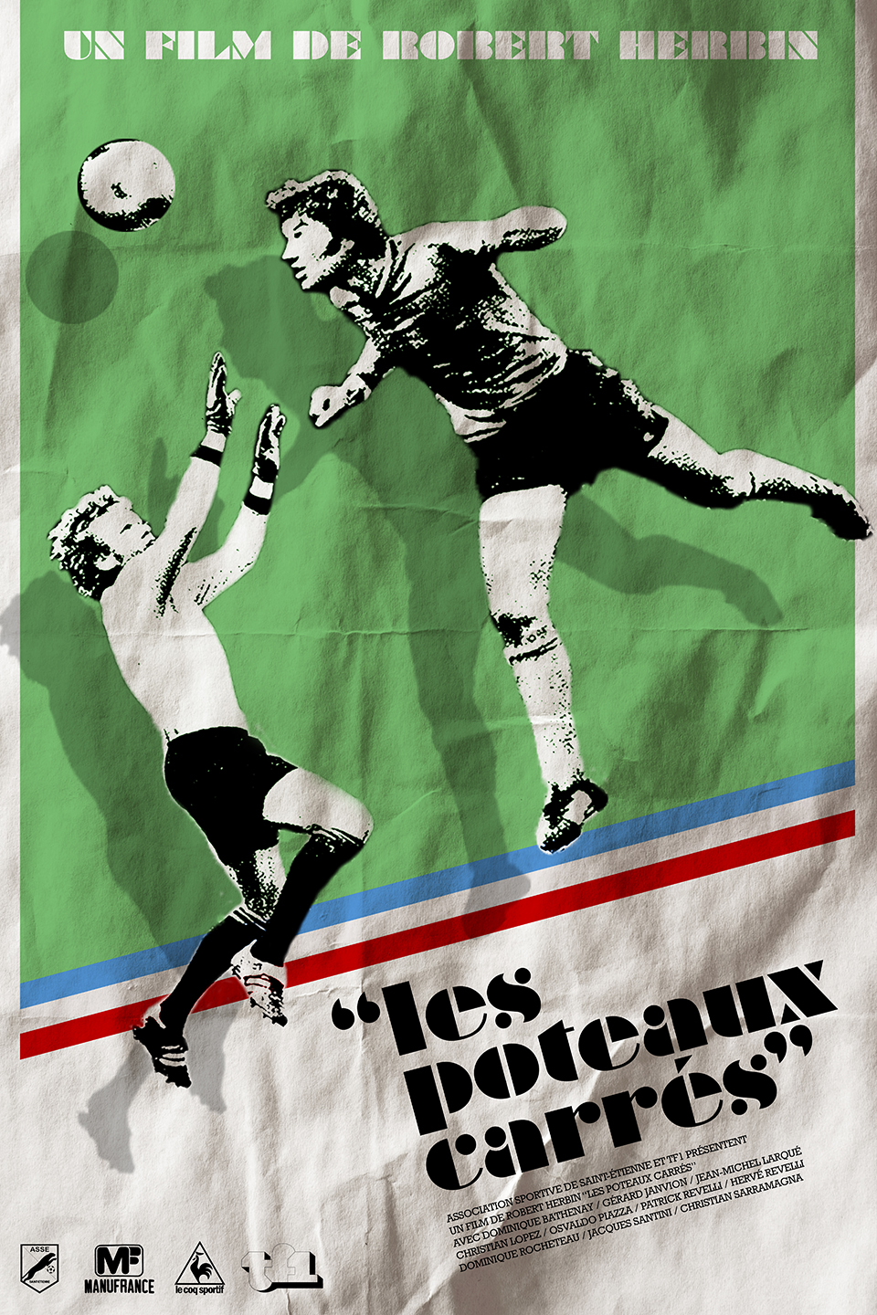
Les Poteaux Carrés (1976)
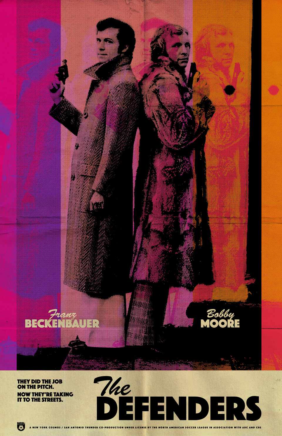
The Defenders (1977)
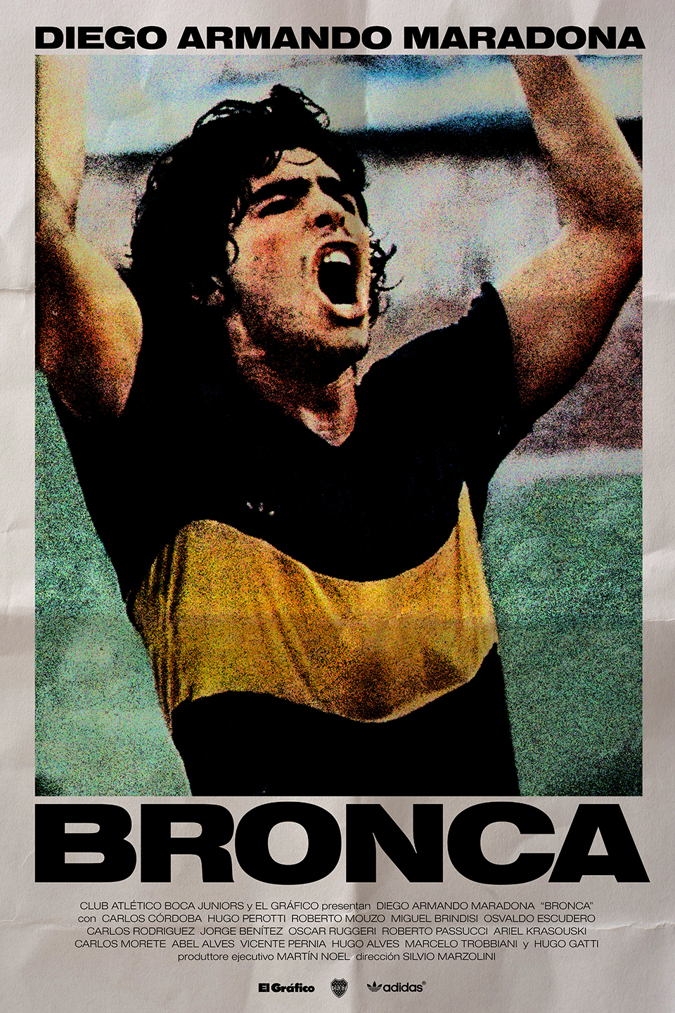
Bronca (1981)
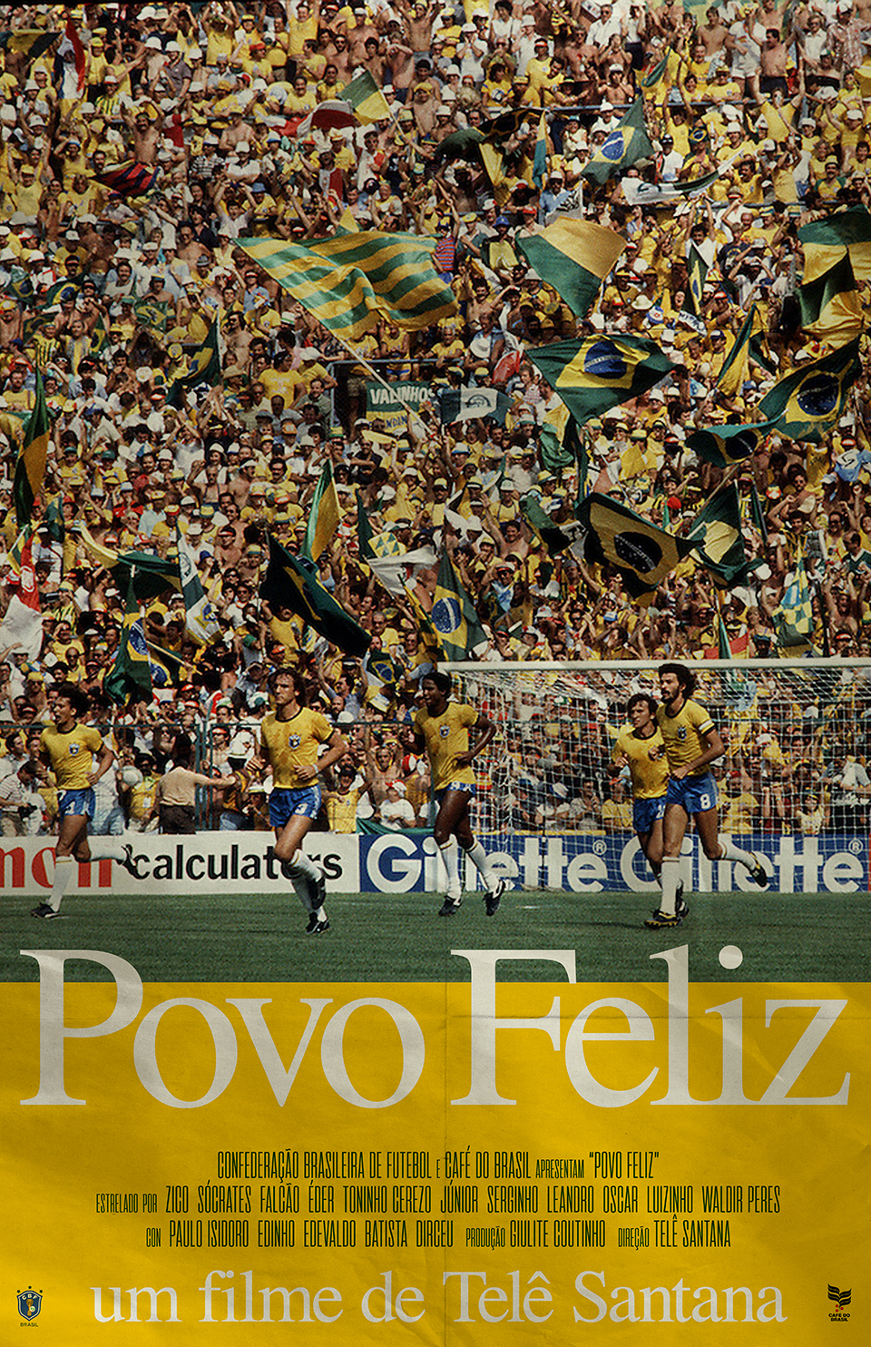
Povo Feliz (1982)
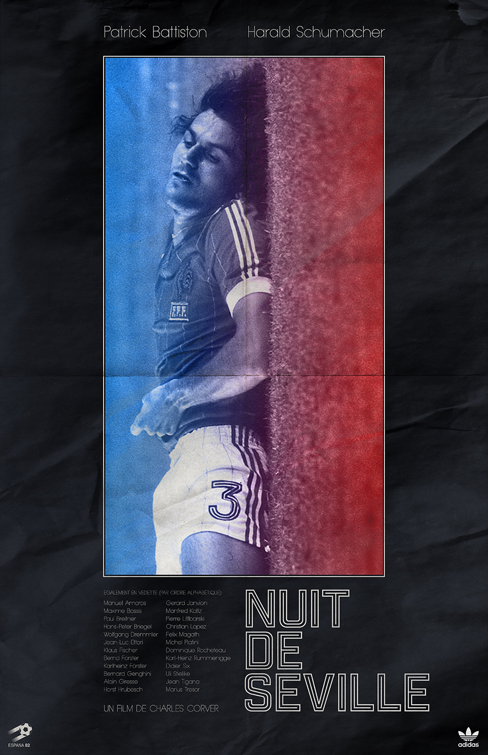
Nuit de Seville (1982)
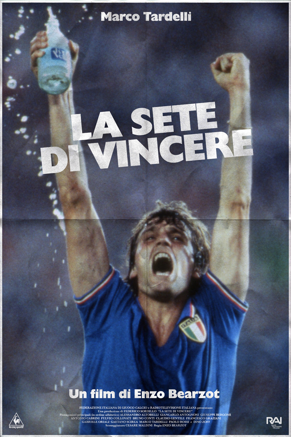
La Sete di Vincere (1982)
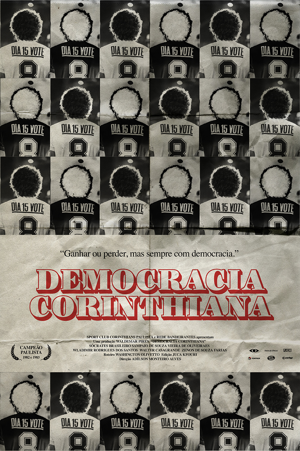
Democracia Corinthiana (1983)
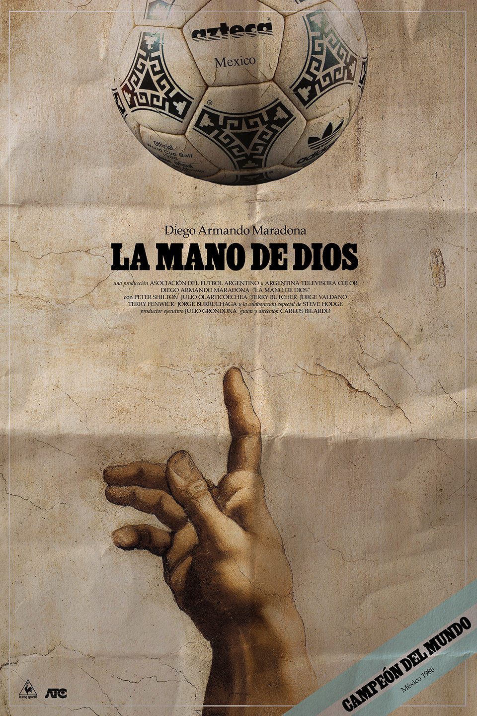
La Mano de Dios (1986)
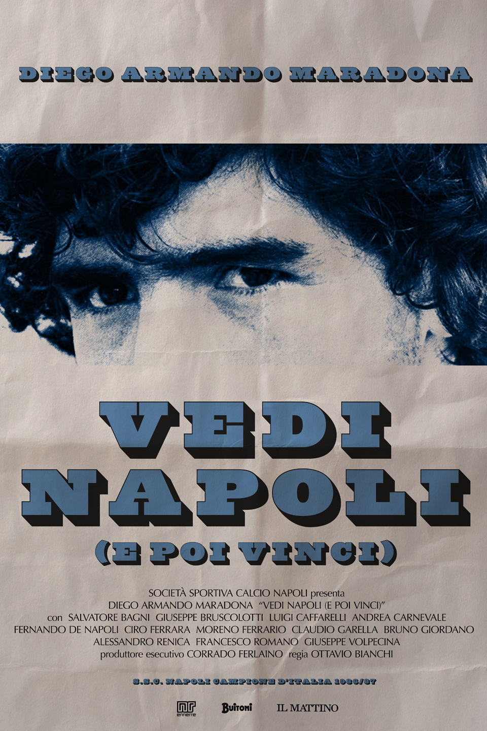
Vedi Napoli e Poi Vinci (1987)
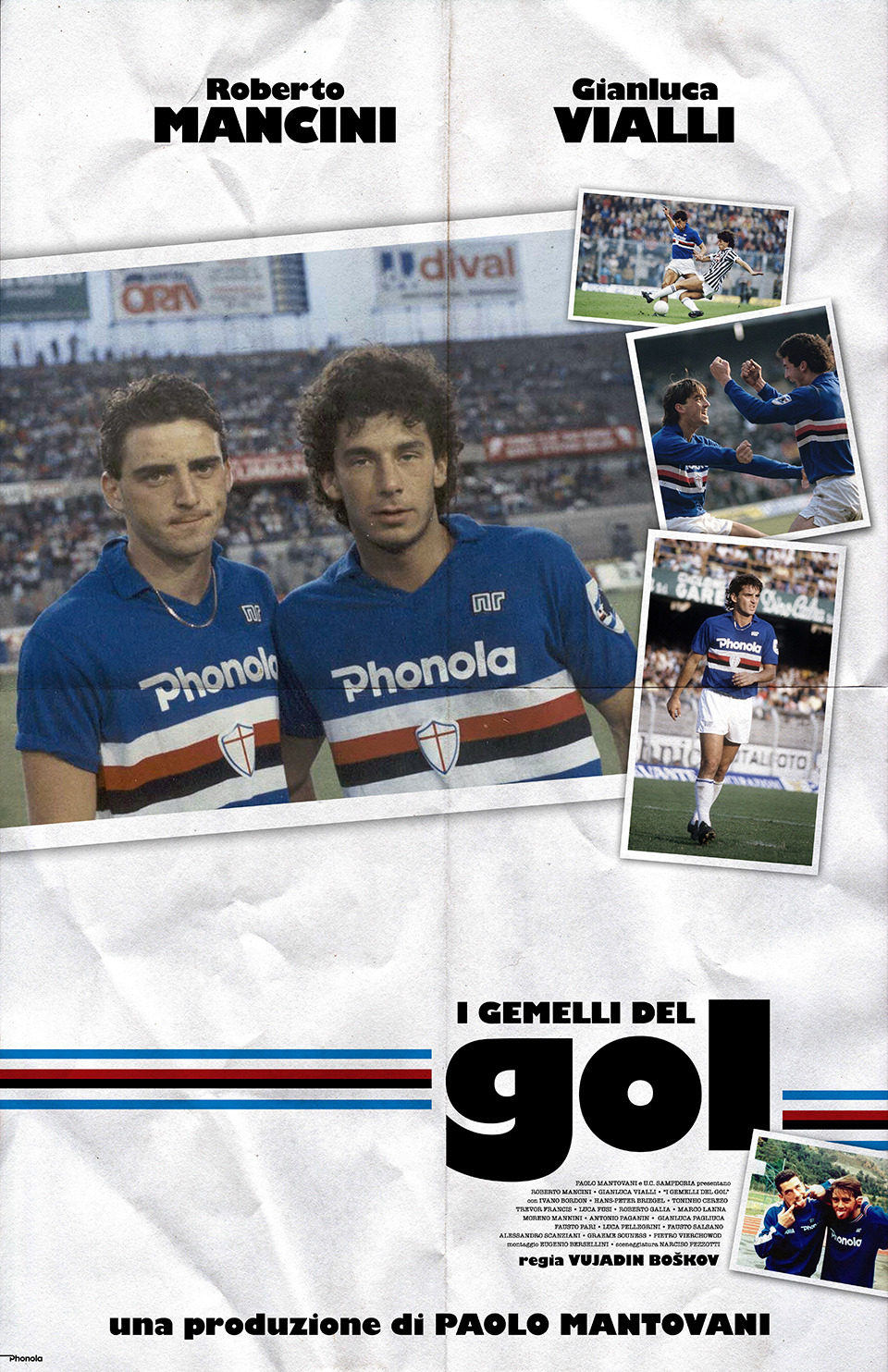
I Gemelli del Gol (1988)
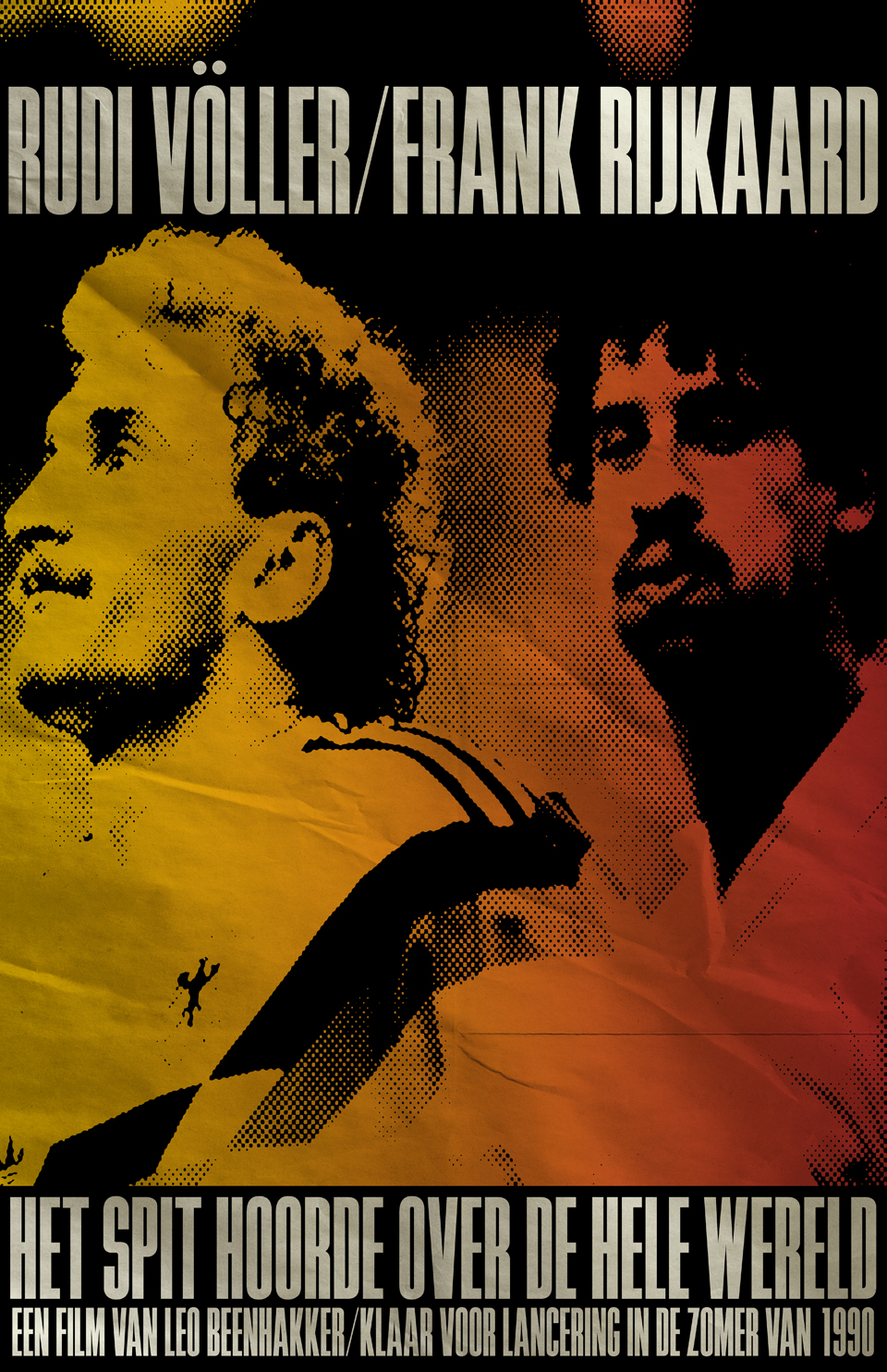
The Spit Heard Around the World (1990)
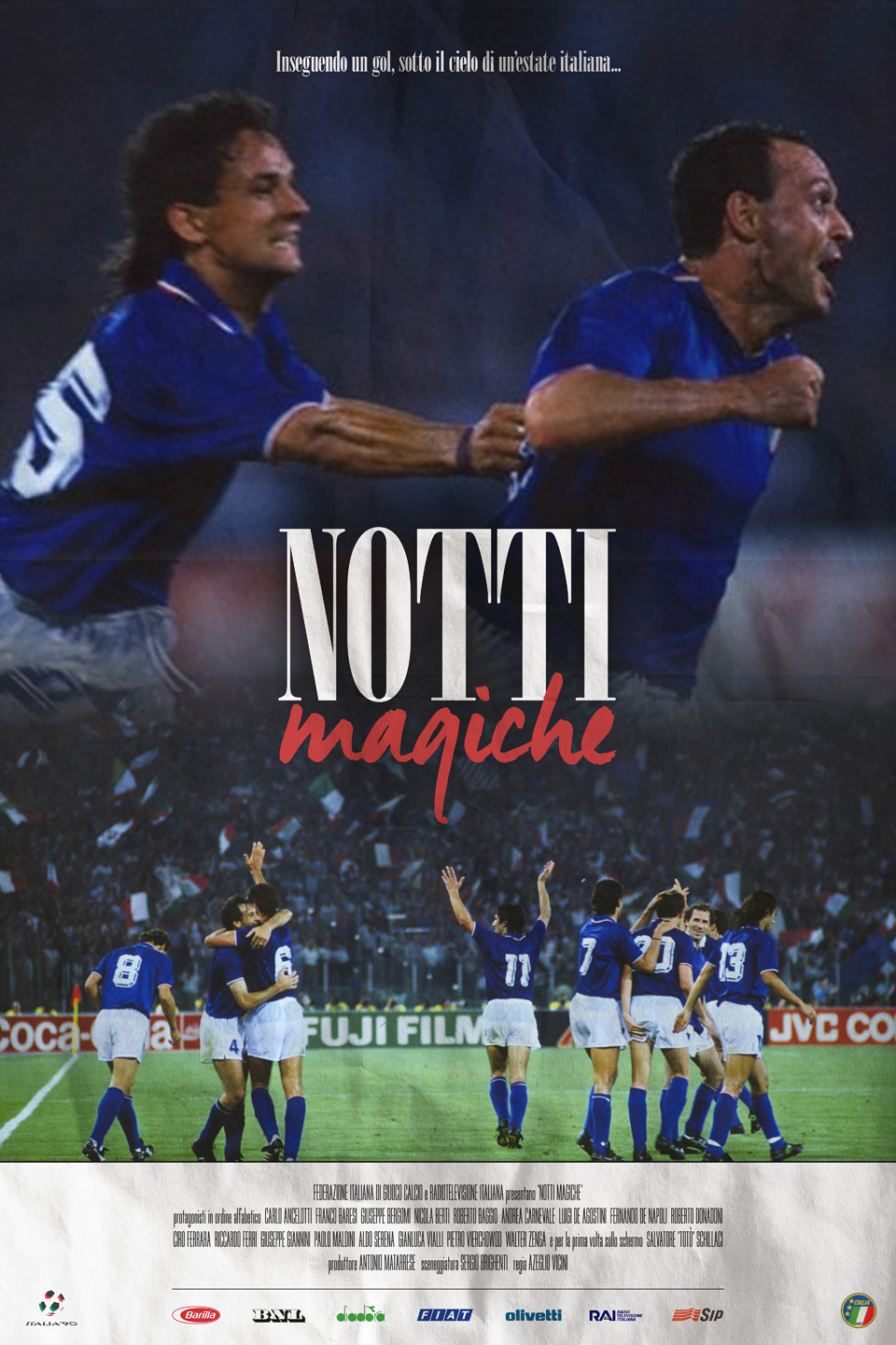
Notti Magiche (1990)
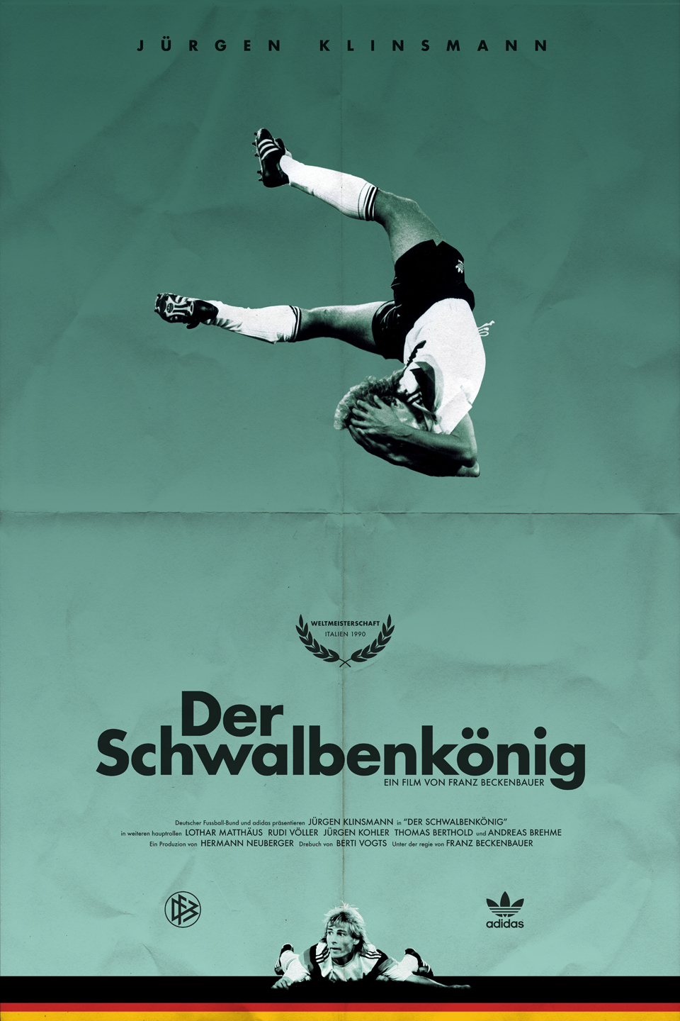
Der Schwalbenkönig (1990)
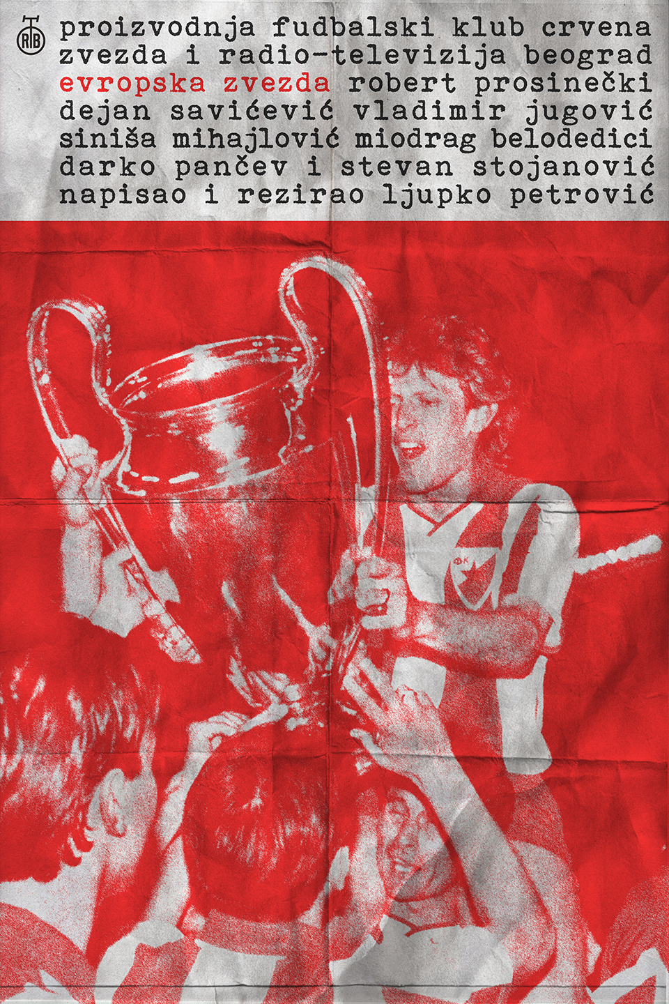
Evropska Zvezda (1991)
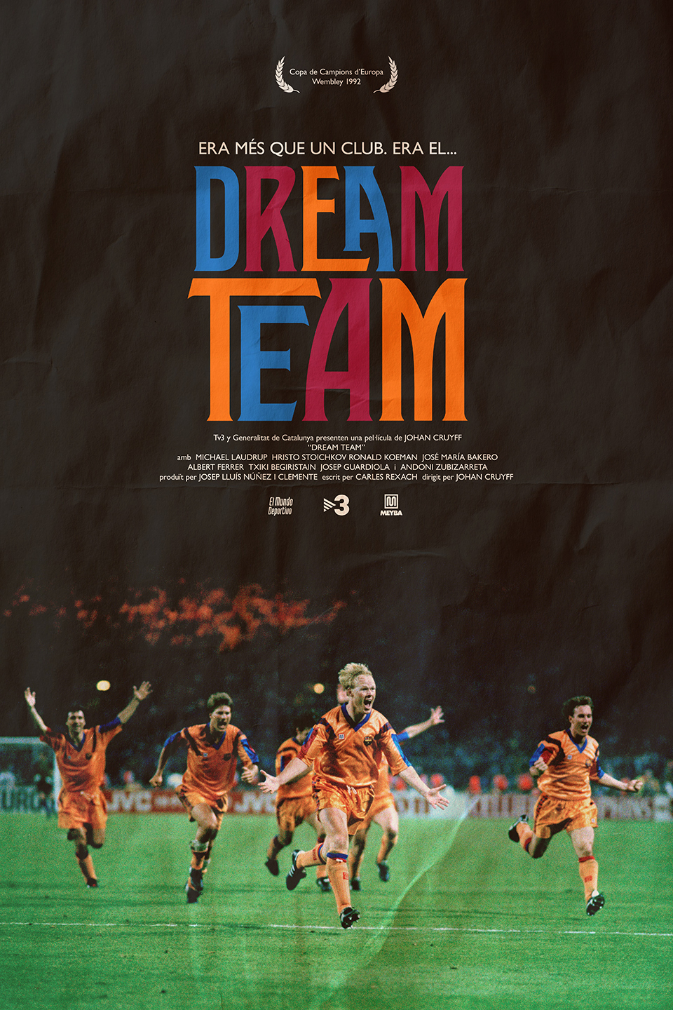
Dream Team (1992)
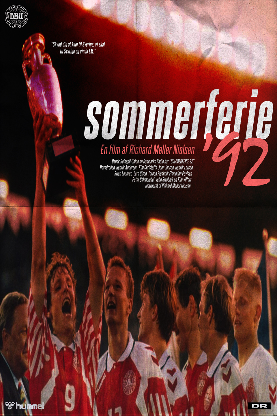
Sommerferie ’92 (1992)
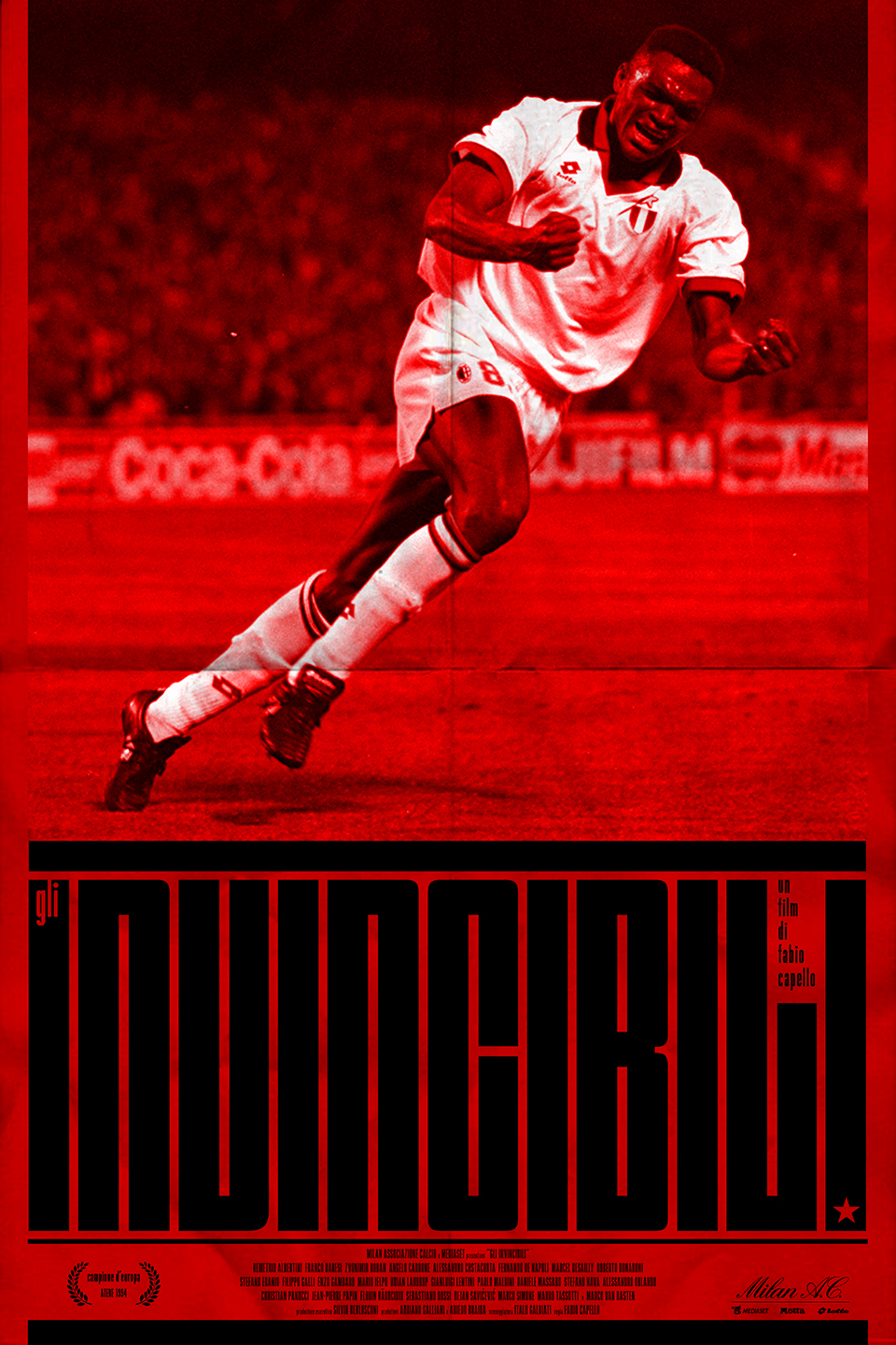
Gli Invincibili (1994)
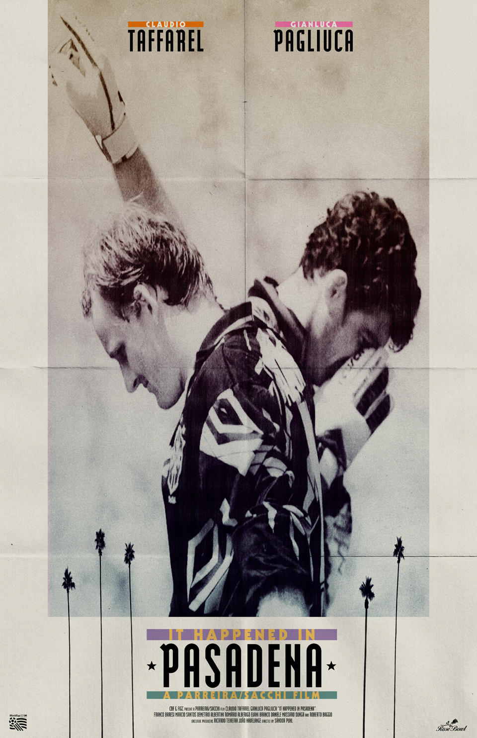
It Happened in Pasadena (1994)
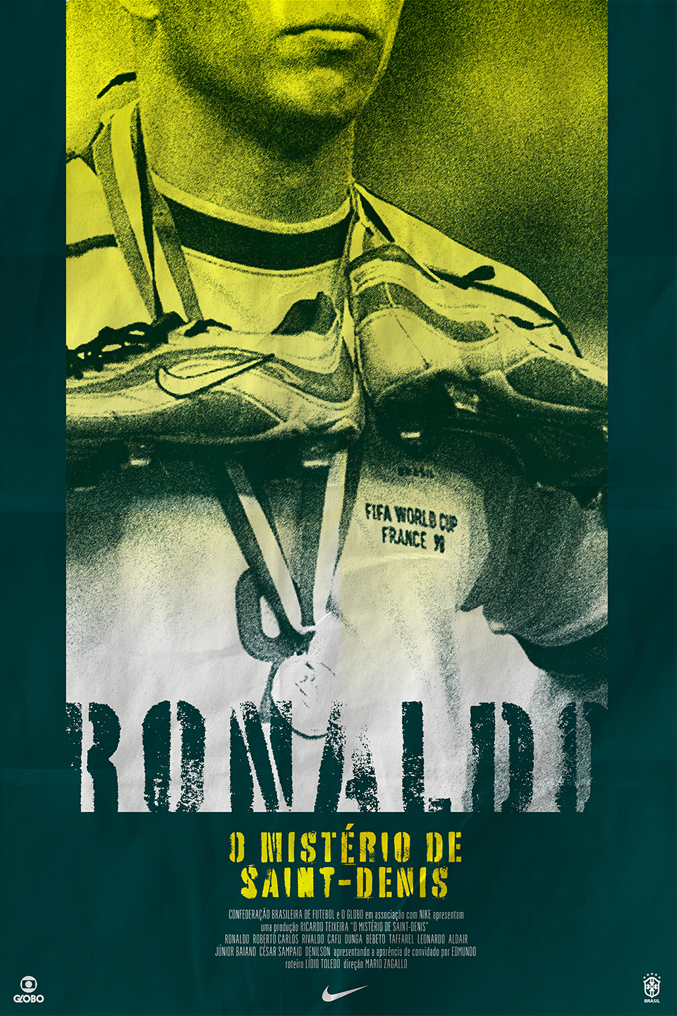
O Mistério de Saint-Denis (1998)
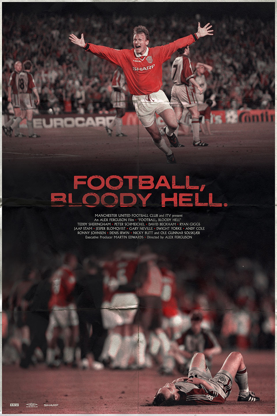
Football, Bloody Hell (1999)
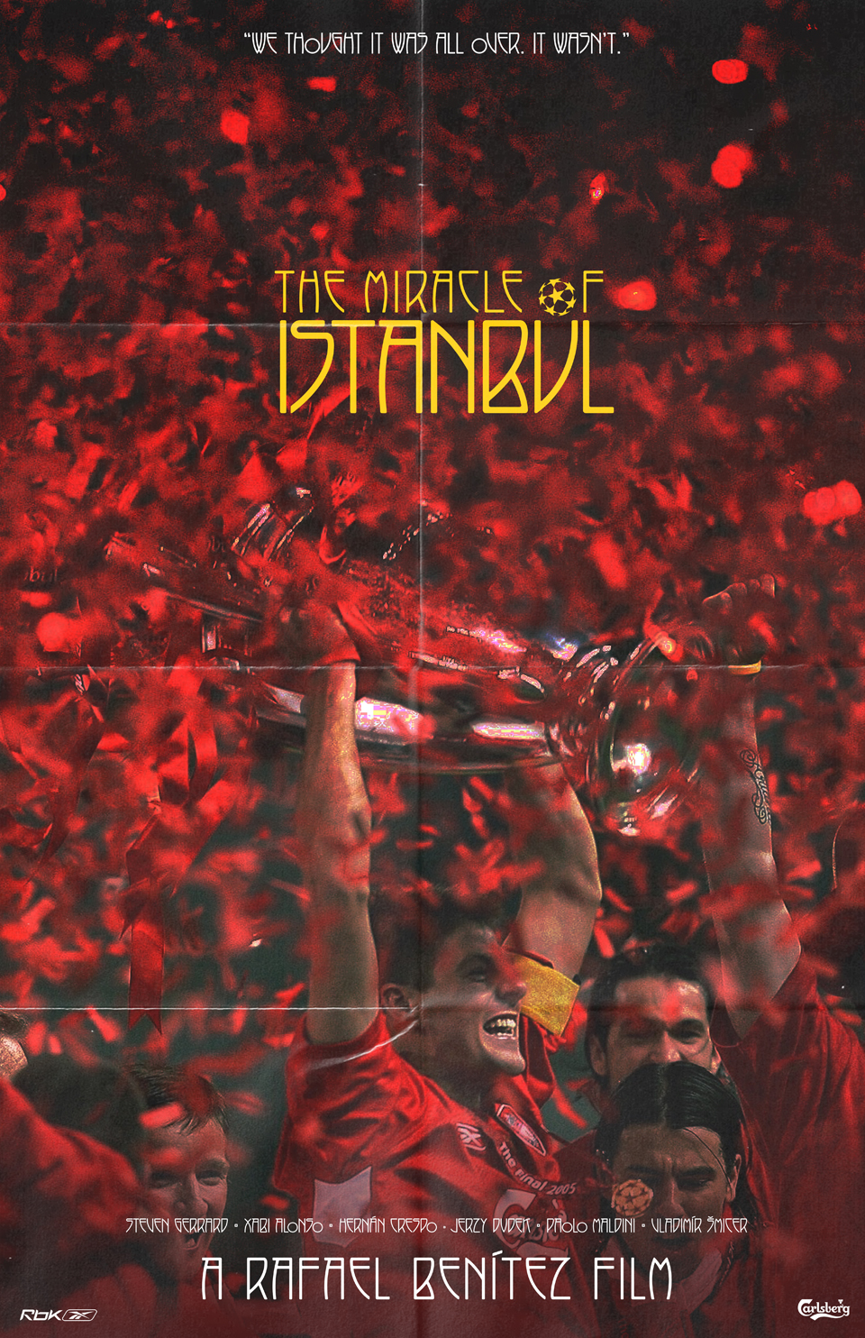
The Miracle of Istanbul (2005)
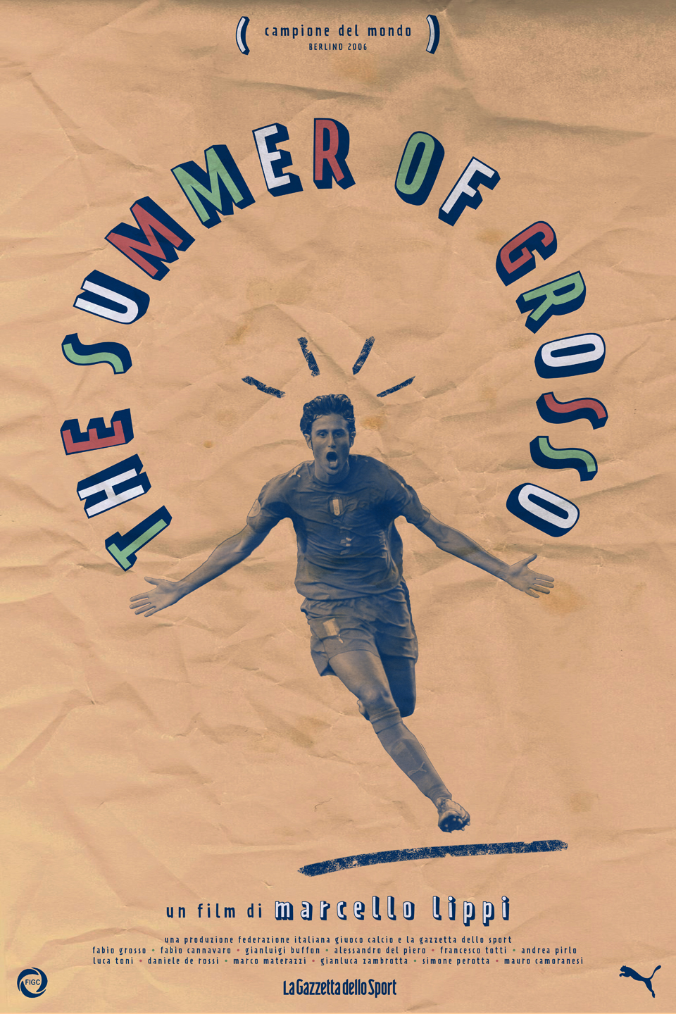
The Summer of Grosso (2006)
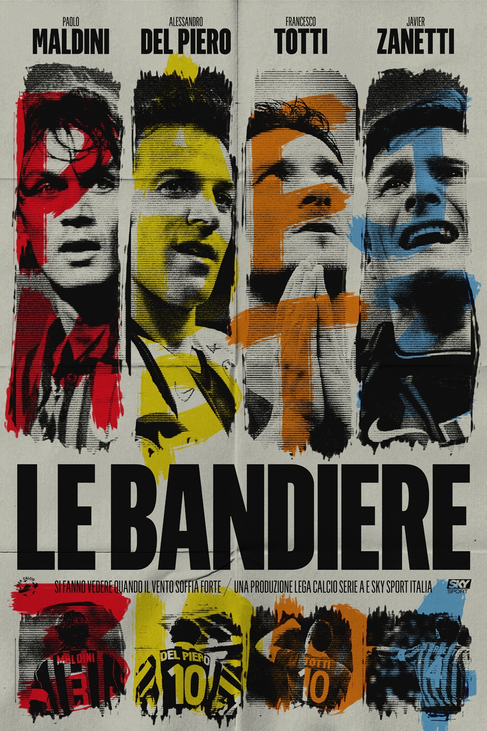
Le Bandiere (2011)
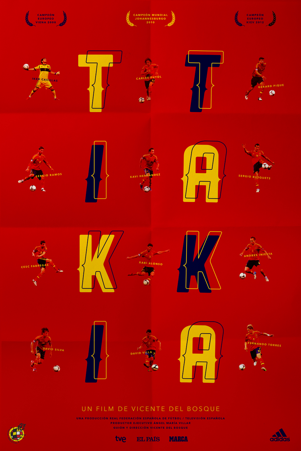
Tiki Taka (2012)
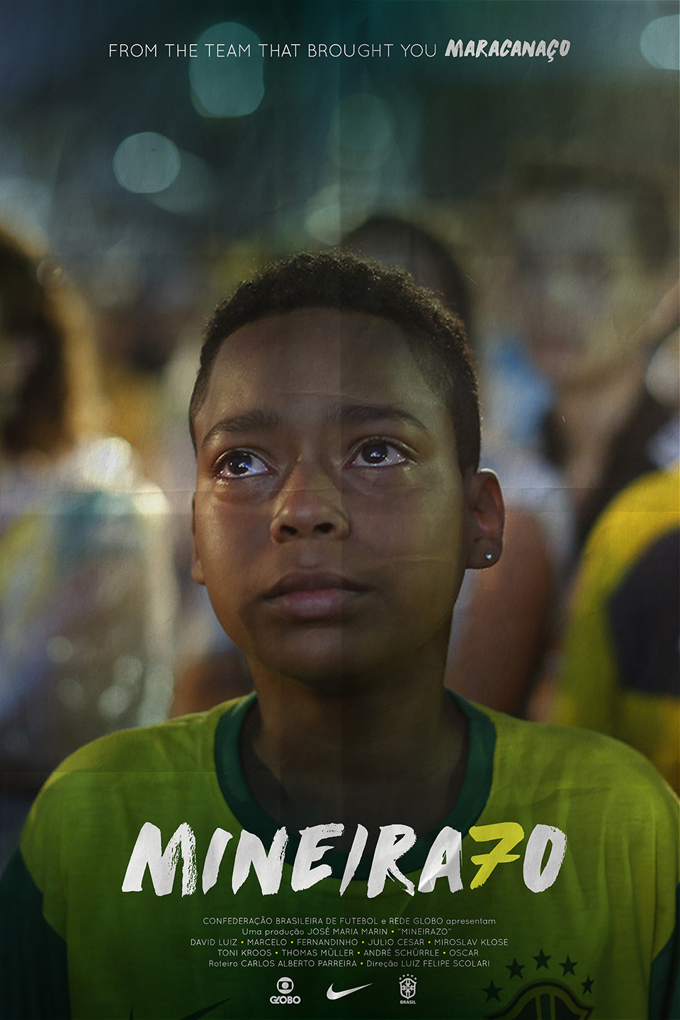
Mineirazo (2014)
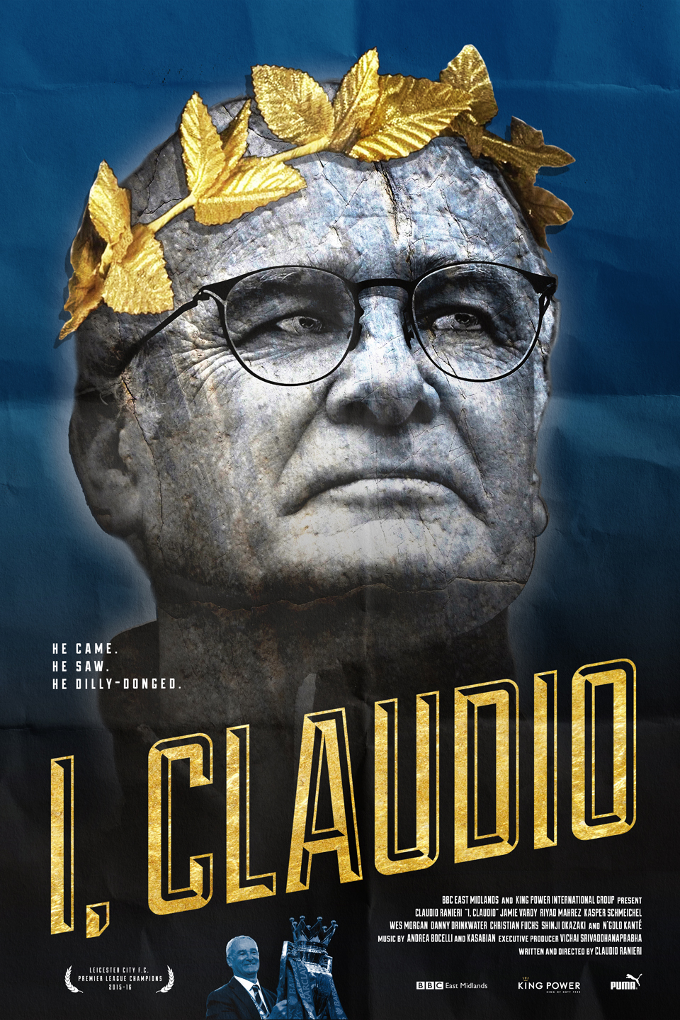
I, Claudio (2016)
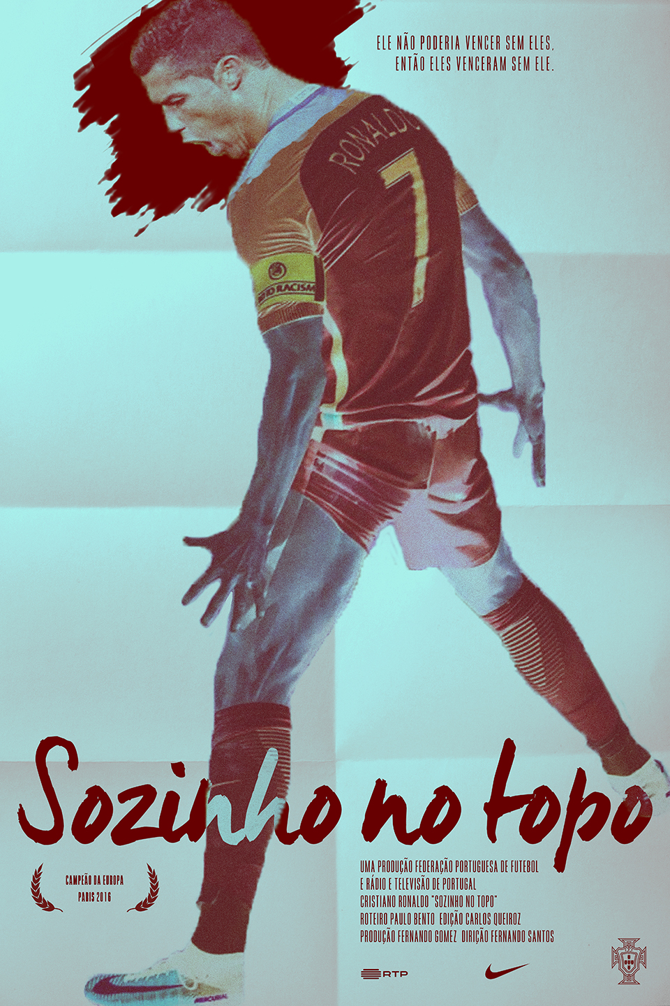
Sozinho No Topo (2016)

I originally devised this project in 2014 as a reaction to Manhattan’s rapidly changing retail landscape. It was both a fun design exercise that would also serve as a commentary on the unchecked corporate invasion on a city that once prided itself on its refusal to embrace suburban values. I recently updated the artwork to reflect the updated branding of some of the brands originally featured.
The Huffington Post
Fast Company blog Co.Create article by Joe Berkowitz
Fast Company Co.Design article by Dan Nosowitz
Dashburst article and interview by Lauren Mobertz
Design Taxi
Under Consideration blog Brand New
Mediabistro blog Stock Logos
Feel Desain
Mexican design blog, Paredro (en español)
PSFK
Downtown blog Bowery Boogie
Animal New York
Notes on New York
Killahbeez
Trend Hunter: Part 1 / Part 2
Show America
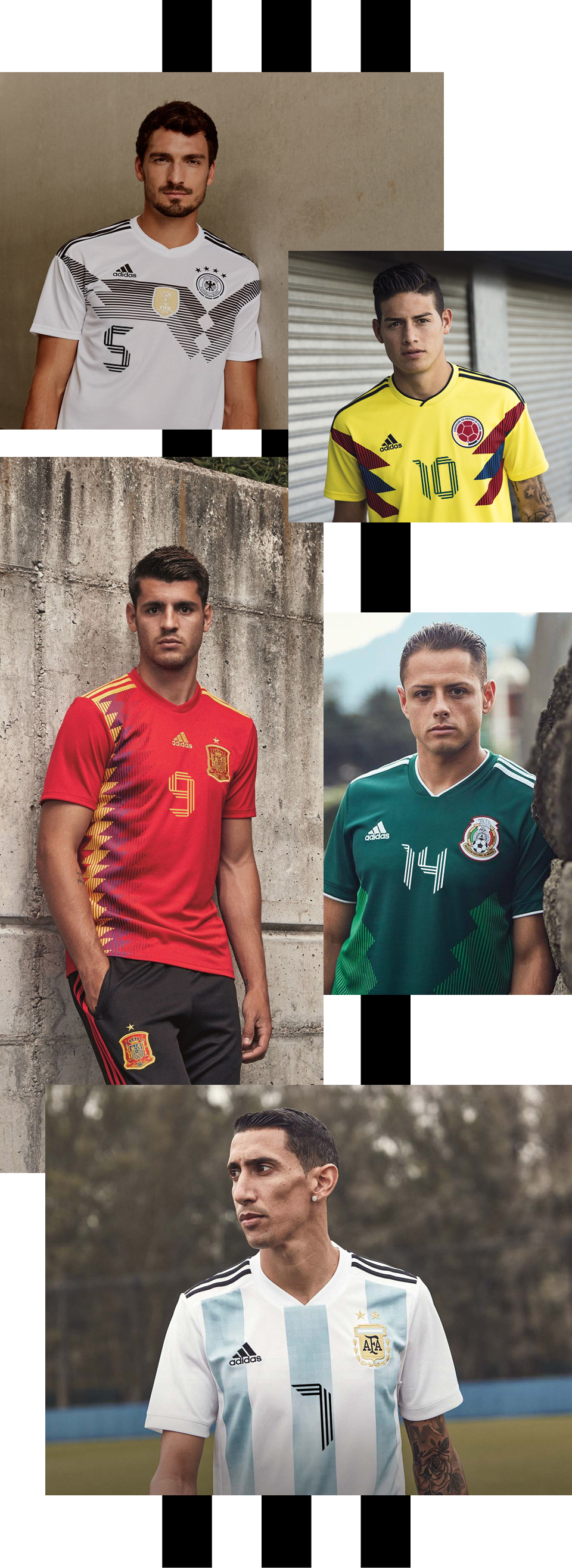
I was compelled to create a numerical typeface for adidas after being disappointed by some of the recent designs the German sportswear giant has used on national teams’ football shirts. Adidas pioneered the use of bold number designs for football jerseys, but recently these have failed to match the iconic graphic impact of those used in the past. Since 2000 all nations competing in international tournaments wearing adidas kits have used matching number designs, which means a brand new font every two years.
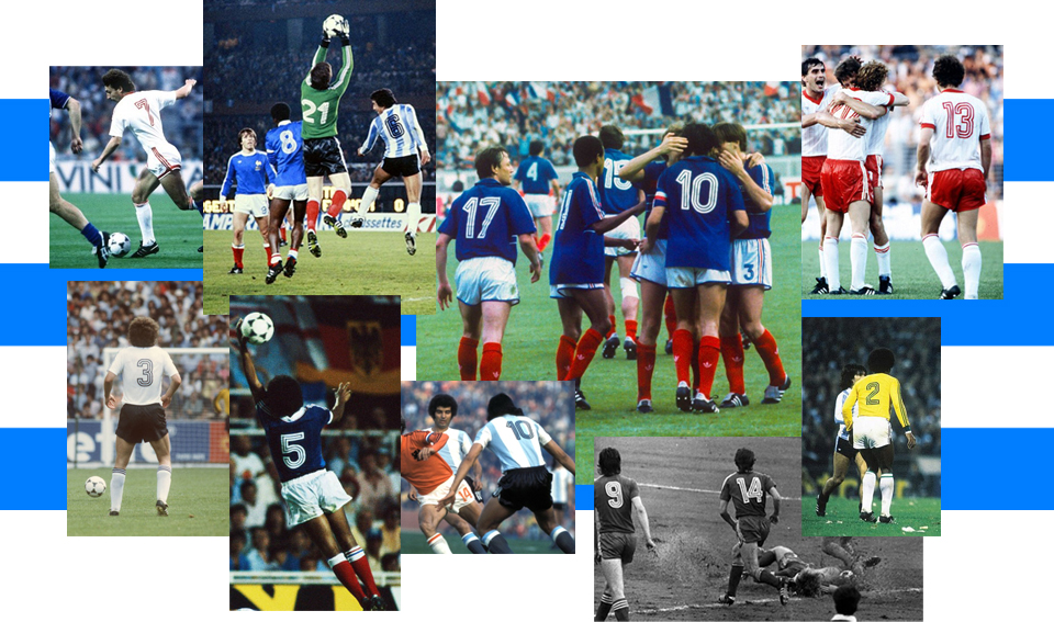
Clearly, Die Drei Streifen typeface is inspired by adidas’ “Three Stripes” motif, which has frequently been featured on its shoes and clothing since 1949. In fact this design is not the first time the company’s has looked to its trademark branding for this purpose — in the 1970s and 1980s many teams wore numbers incorporating three stripes, but the style has not been seen since the early nineties. Die Drei Striefen is a fresh and modern update on adidas’ rich sporting heritage at a time when soccer design is becoming increasingly influenced by external cultural forces.

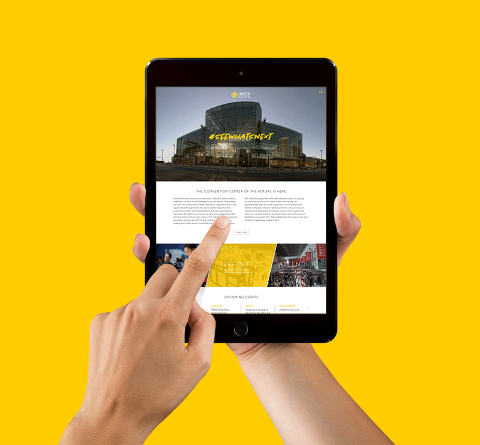
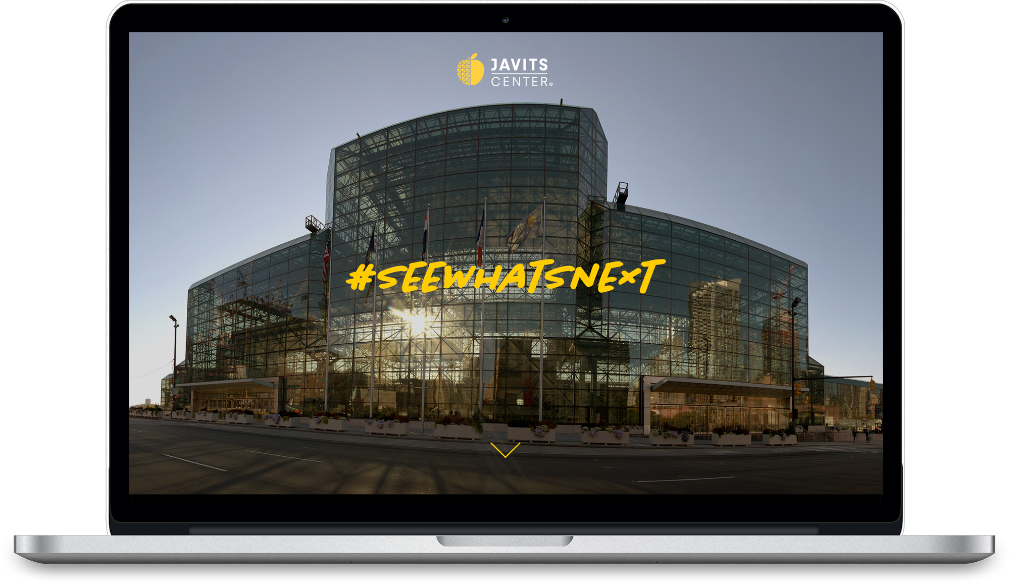
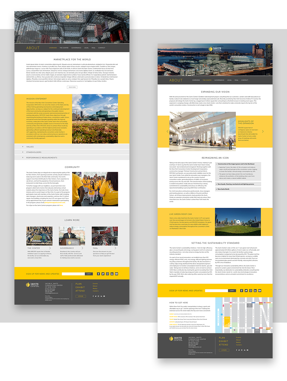
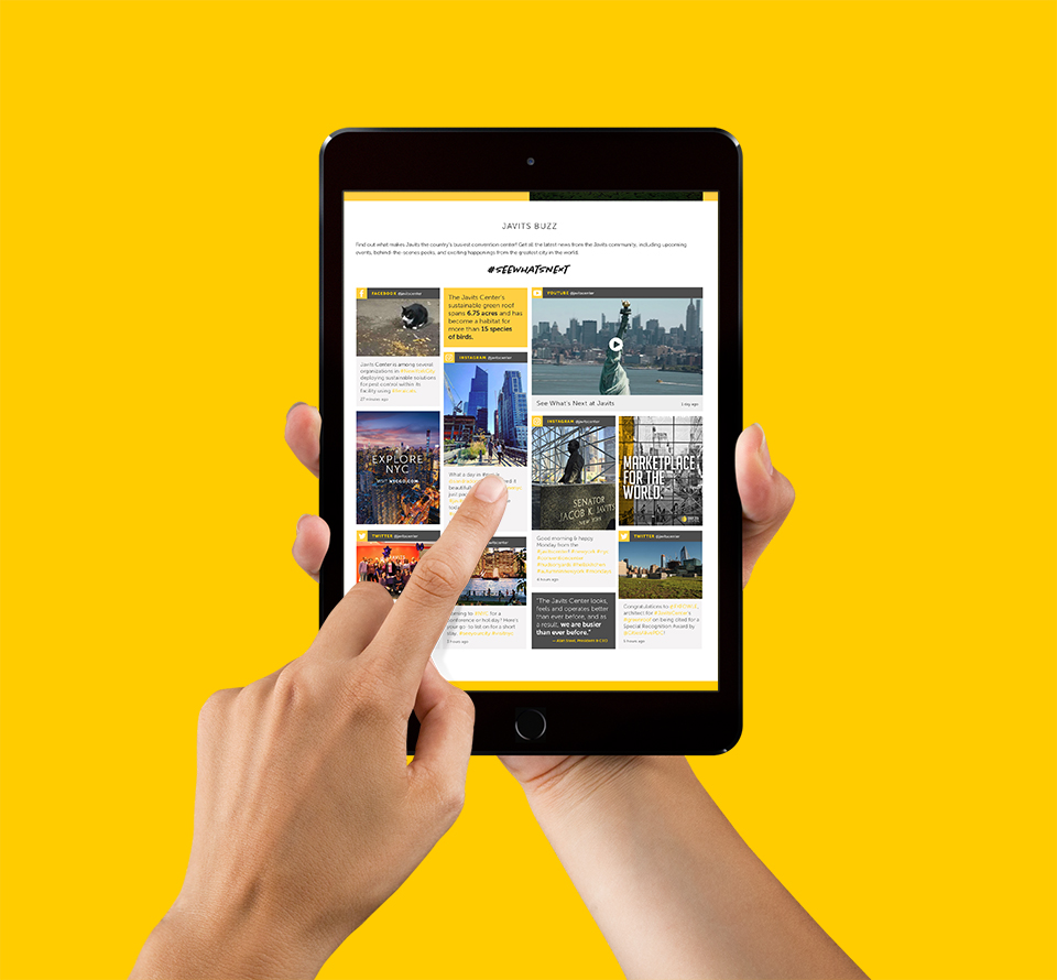
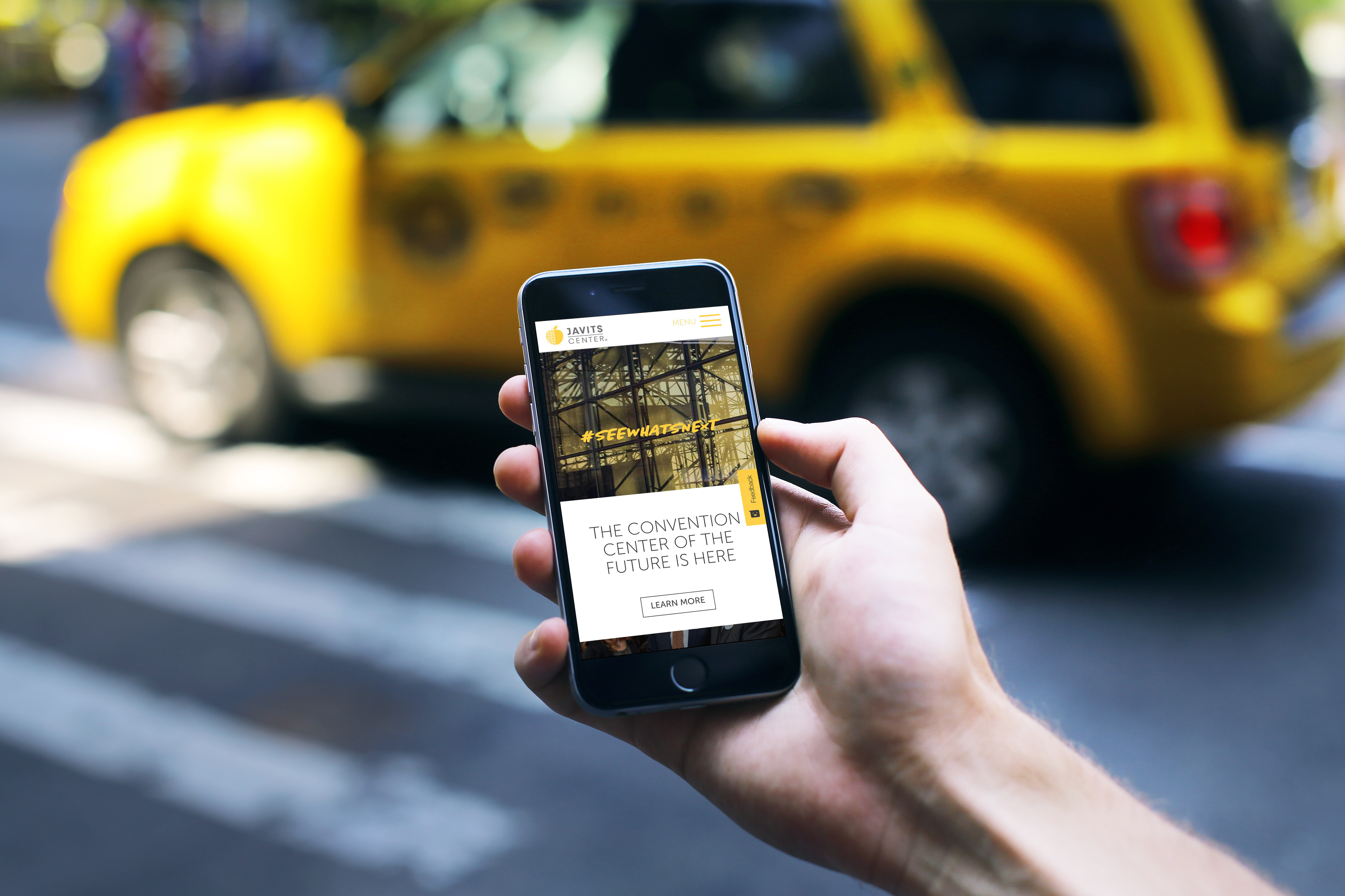
As it entered 2017, New York’s Javits Center required an online presence to match its status as the country’s busiest convention center. At Reitdesign I led the redesign of Javits Center’s website, giving emphasis to the user experience, as well as its sustainability efforts, social media activity and upcoming $1.5 billion expansion. An excess of content on the previous Javits site had resulted in it feeling both bloated and confusing; the new site’s clean interface and intuitive navigation allows for exhibitors and attendees to plan their experience more easily. The site also features an interactive calendar of events and live web cam streaming from its pioneering green roof. Visit javitscenter.com for the full experience.
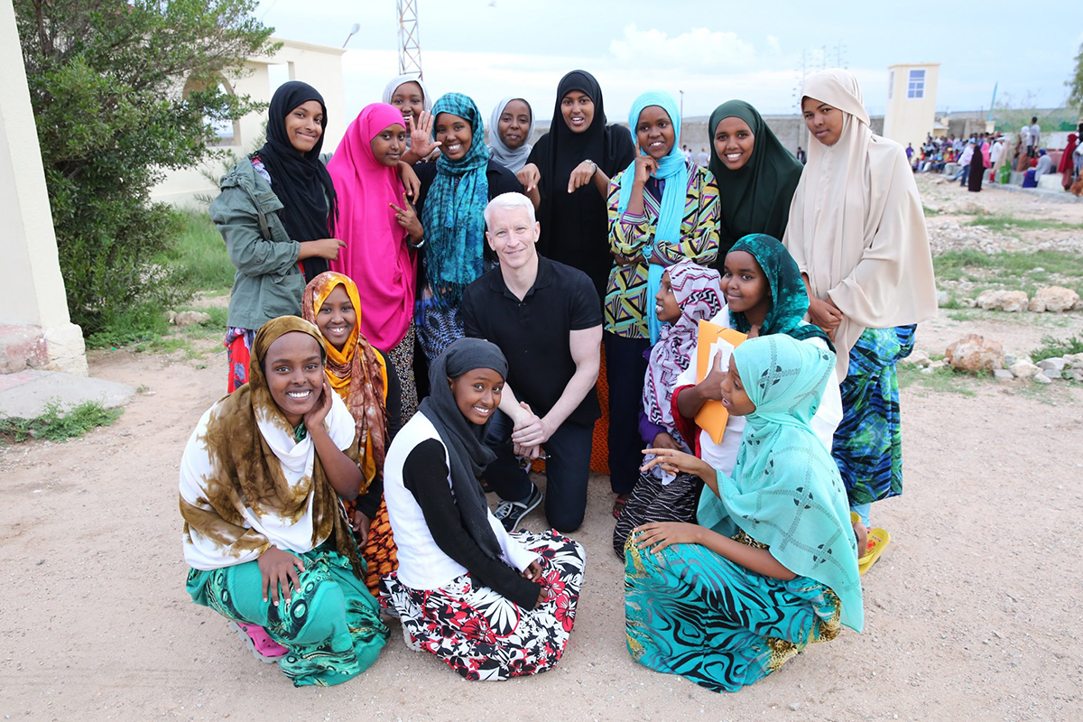
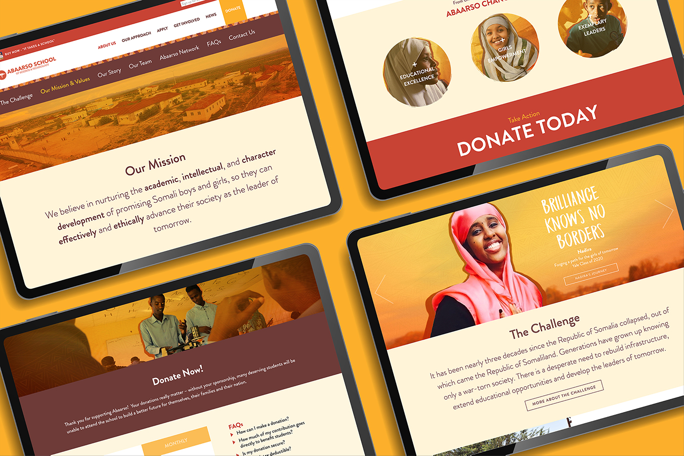
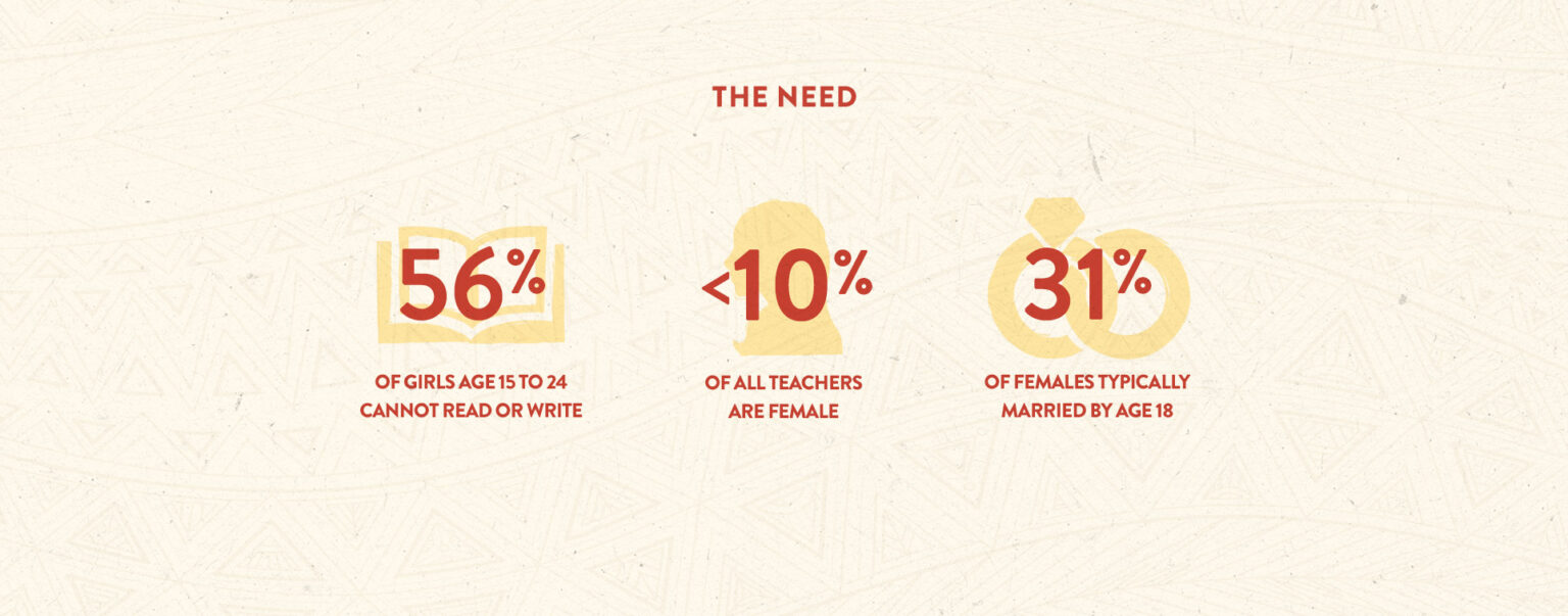
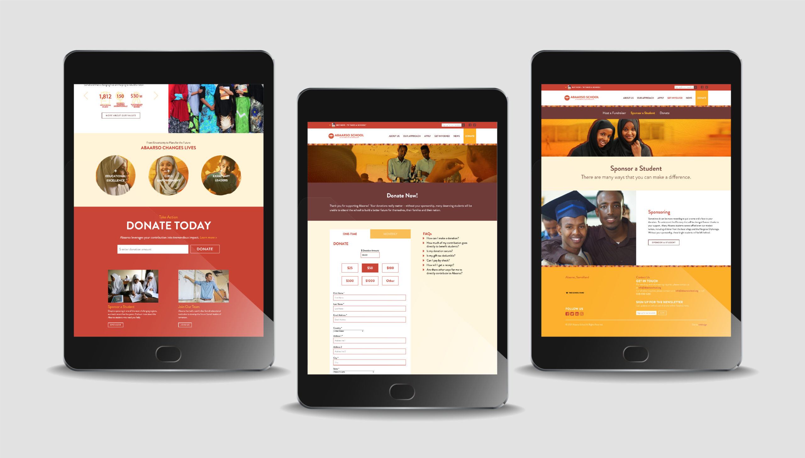
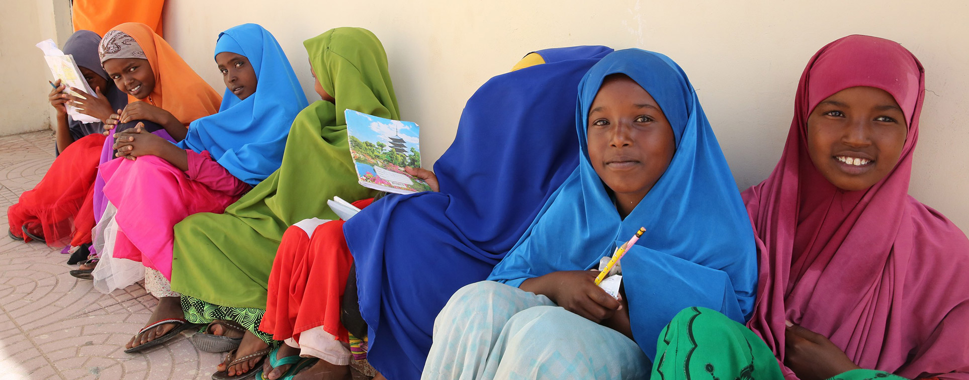
In 2013, the Abaarso School was launched against all odds in a remote location in Somaliland to prepare the future leaders of a state devastated by a brutal civil war. An American accredited 7th-12th grade leadership boarding school, at Abaarso young students became the first Somalilanders in thirty years to earn places at top U.S. universities, including Harvard, Yale, MIT, Brown, Columbia, Dartmouth, and Cornell. In total, more than 350 alumni have earned scholarships totaling $55 million. Abaarso School has been featured on CBS’s 60 Minutes and in publications such as The New York Times, The Wall Street Journal and Forbes. As Art Director at Reitdesign, I was tasked with redesigning the school’s existing site to better reflect its location, students and extraordinary mission.
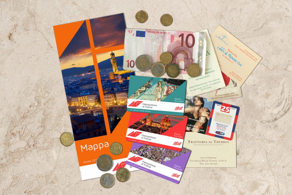

When I first visited Florence, in the summer of 1988, I was surprised to find that the city’s most famous square, Piazza della Signoria, had been reduced to little more than a gigantic hole in the ground. The purpose of this excavation was to unearth some of the myriad relics that lay below the surface of the piazza, but the project had become open-ended when archeologists discovered Roman baths, three churches, plus towers, streets, walls and cemeteries hidden beneath the city, all dating back centuries. Eventually a perspex floor was laid over their findings allowing pedestrians the chance to gaze into this forgotten world. The fact that such endless historical bounty sits just feet below one of the world’s most visited cities is a major reason why Florence remains the only major Italian city without a modern metro.
Years later, while living in Florence, I often recalled my first visit and sometimes wondered what was below the streets I now walked on daily. Which in turn led me to often ponder how different Florence might have been had it gone ahead with any of the several suggestions for an underground rail network put forward over the years. In 2010 Florence restored its tram service which had been closed down since 1958. The first line opened connects the suburb of Scandicci with the city’s main railway station, Stazione Santa Maria Novella. Work has since begun (belatedly) on one of three more projected lines, parts of which may be underground, leading some residents to opine that a genuine metro would have been a smarter long-term solution.
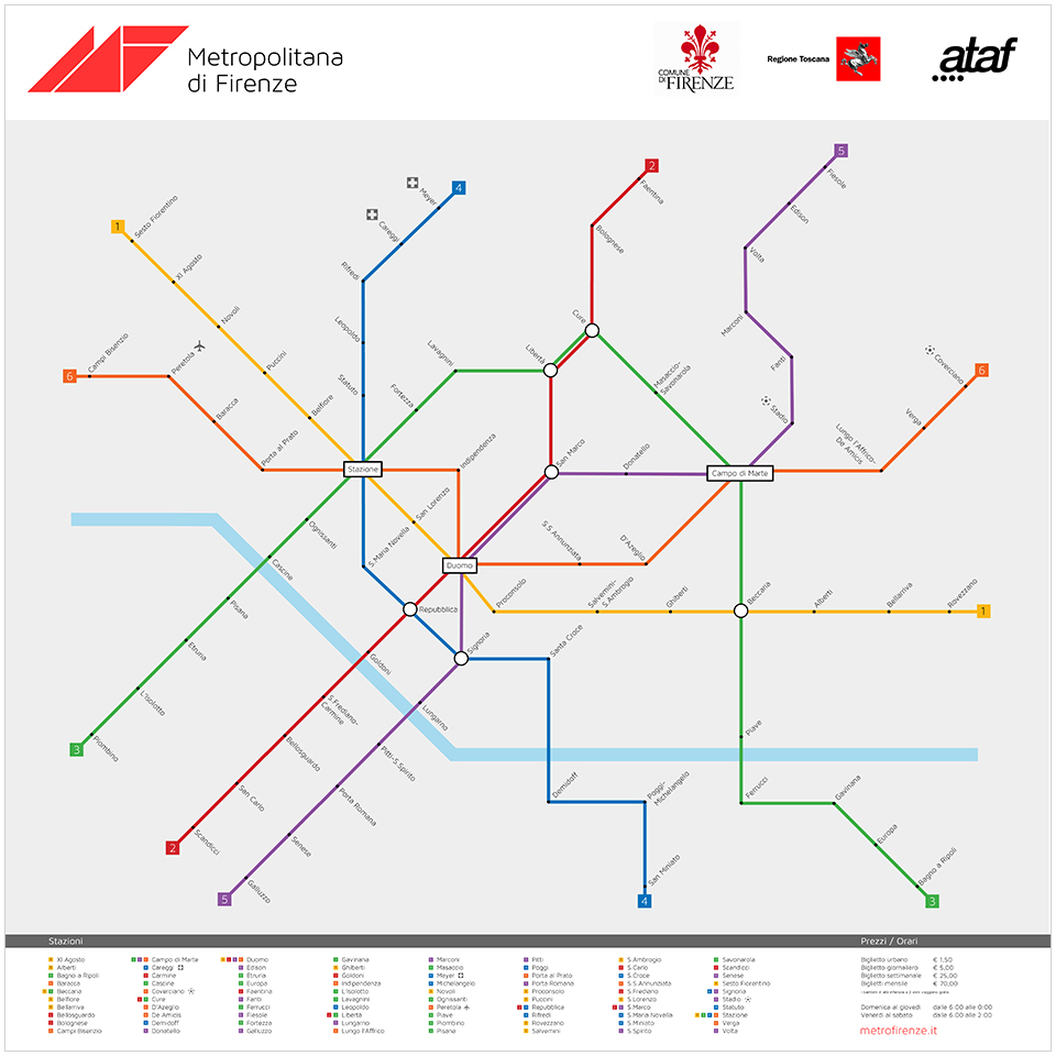
With this in mind, I finally decided to create my own hypothetical Metropolitana di Firenze, a project that has taken the best part of a year and forced me to branch outside the safe confines of the aesthetics of design and into the complex realm of public transport and urban planning. The first and most daunting task was to plot the network itself, something that posed a considerable challenge, and I soon realized how an inside knowledge of the working city is essential in order to even begin such an undertaking. I began by listing the city’s major points and drawing a rough map from memory, imagining the most useful locations for stations and the distances between them. The hardest part was plotting the actual train routes, deciding where they should start and finish without doubling up on other lines. Since Florence’s centro storico is relatively compact, I made sure each line connected an area of the city’s outskirts with its center; the same lines frequently interconnect with one another allowing passengers the flexibility to divert their own route. In my enthusiasm to cater to all residents in every part of town, I was ultimately able to service the whole city more than adequately with six lines, although Milan (3), Rome (2) and Naples (2) seem to get by with half as many.
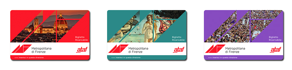
With the possible exception of the London Underground, public transport logos are rarely memorable, which is why I deliberately kept this one fairly low-key. I wanted it to look like something that could have existed for several years without ever being considered for an update. That being said I wanted it to evoke aspects of Italian graphic design. The use of triangular shapes is a subtle nod to the Futurist movement which, in addition to being preoccupied with speed and technological advancement, is inexorably linked to Florence. I also chose a typeface that was clear and modern but not without personality. The logo is echoed throughout all of the metro’s printed collateral, creating a geometric window device which can be updated regularly to feature different images of the city. As is the norm for modern underground networks, tickets are swiped for entry and are available for a single-trip (€1.50), or as daily (€5), weekly (€25) or monthly (€70) cards.
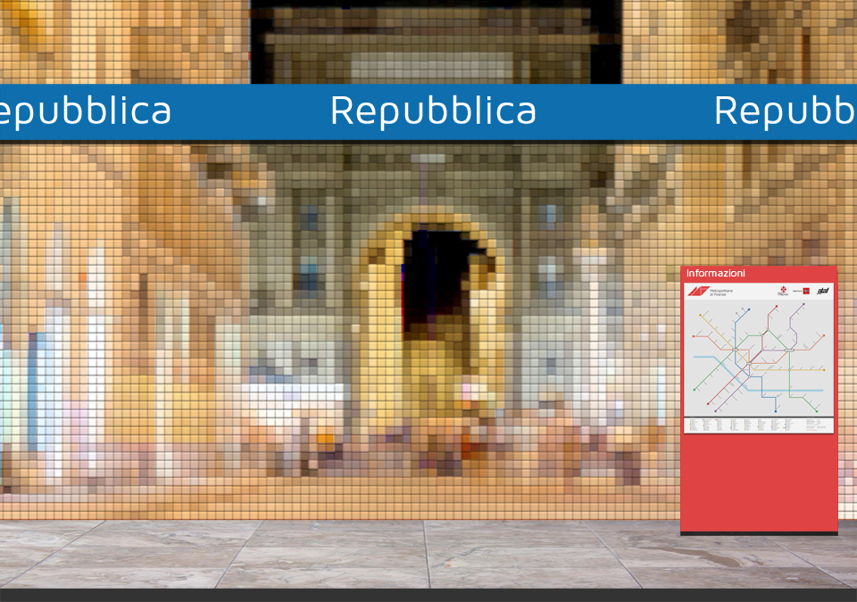
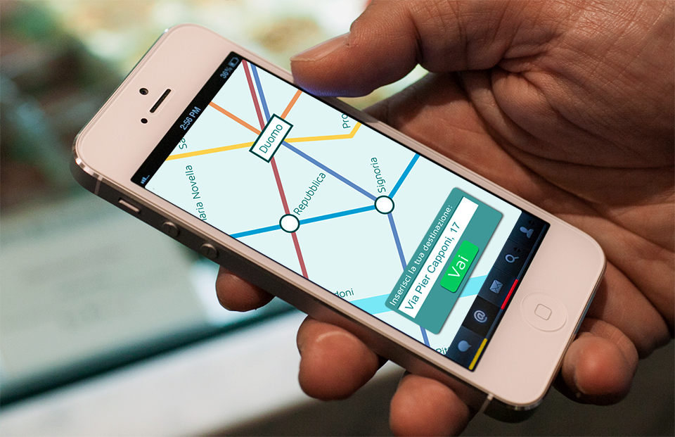
The station platforms are highlighted with color-coded signage corresponding to the relevant line, while large wall-to-wall LCD screens project live footage of the street directly above, creating an ever-changing mural of light. Another twenty-first century innovation is the smartphone app, which allows travelers to plan their journey and learn the quickest route to their final destination. As I mentioned already, this project is solely hypothetical and admittedly unrealistic: the construction work alone for such a dense network would cause decades of disruption to thousands of people daily. I certainly do not expect Matteo Renzi to jump on the idea with any urgency. Rather, it is simply a self-assigned exercise to finally realize a concept that’s been floating around my head for about twenty-five years.
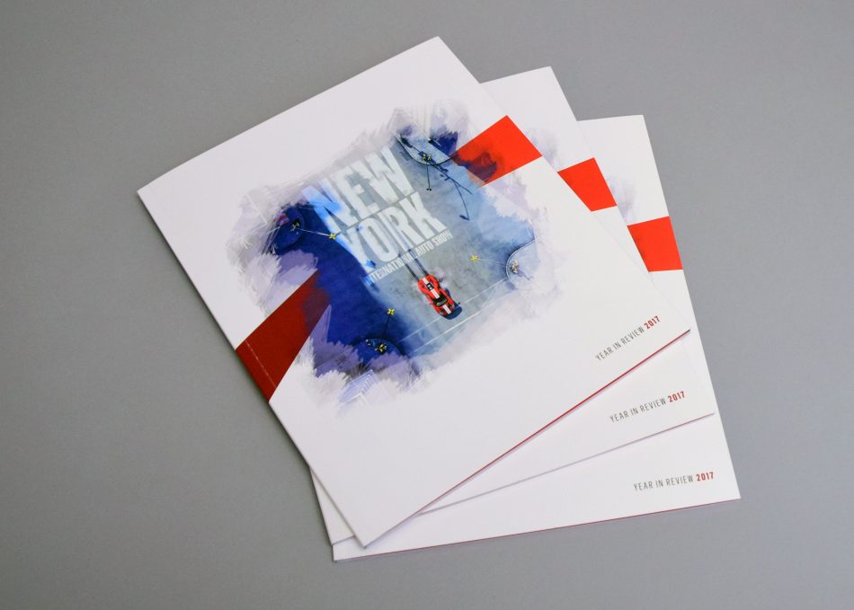
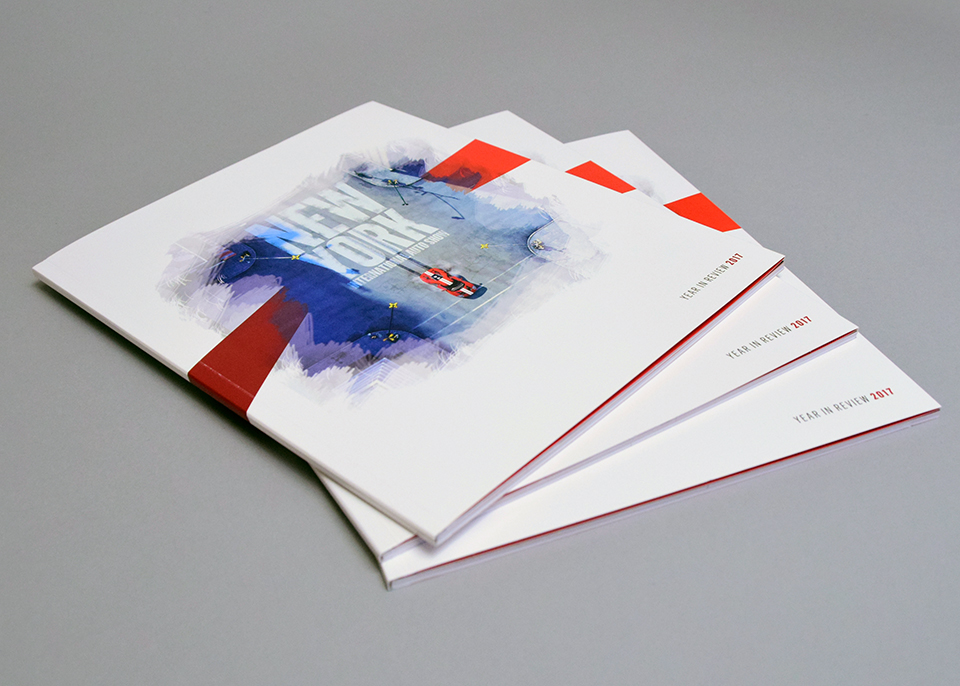
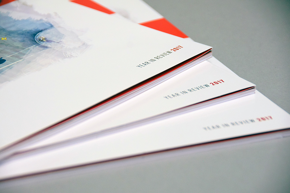
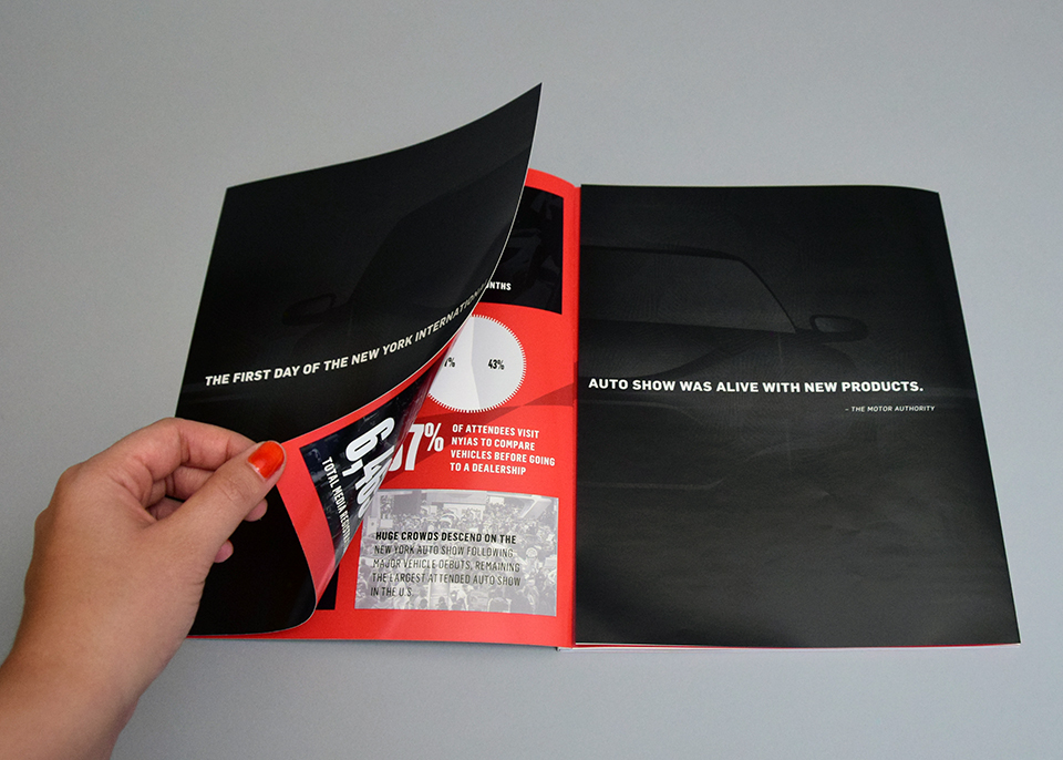
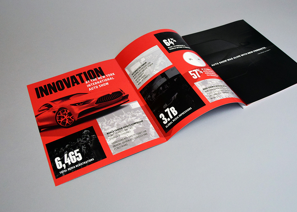
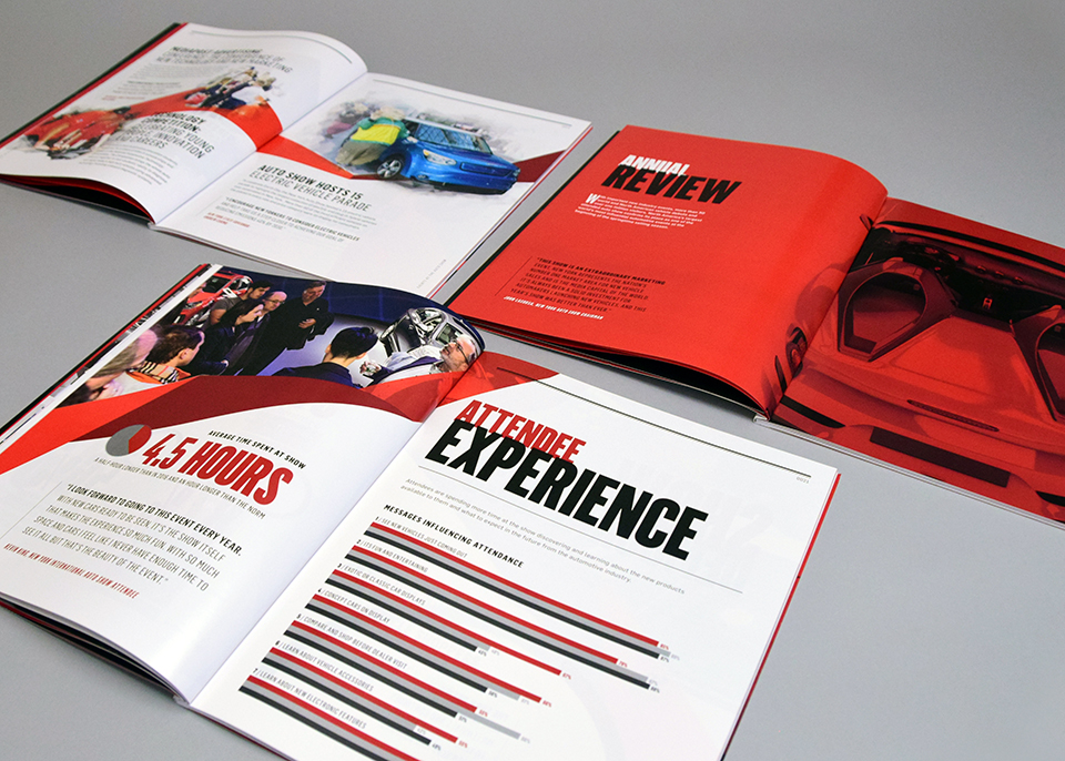
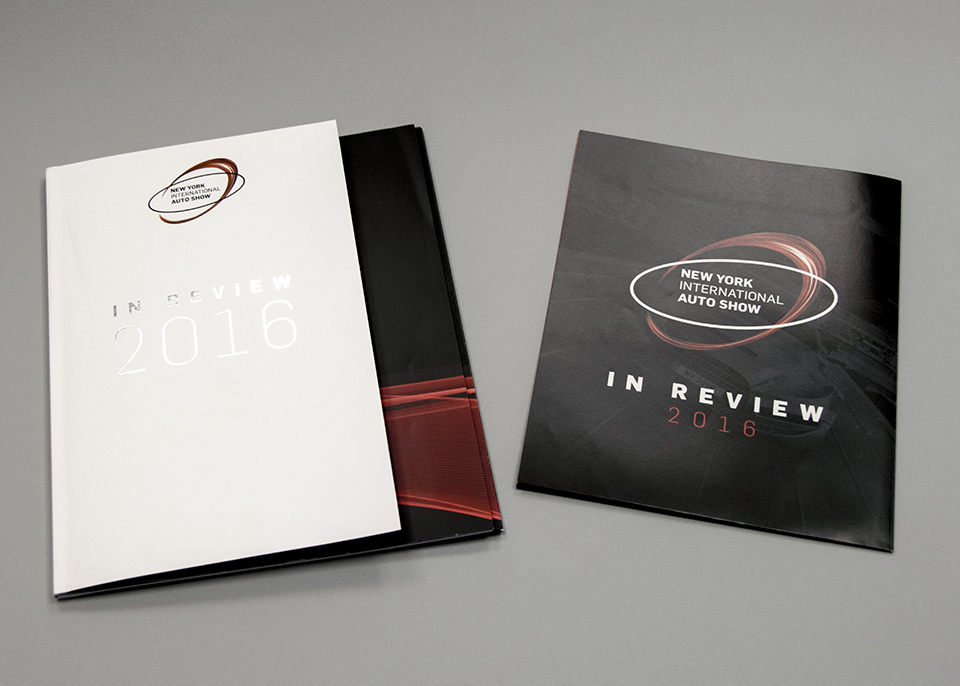
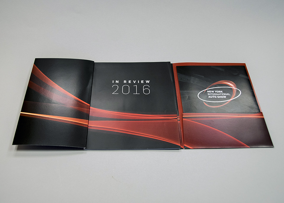
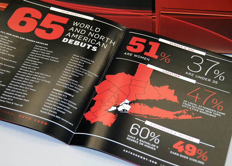
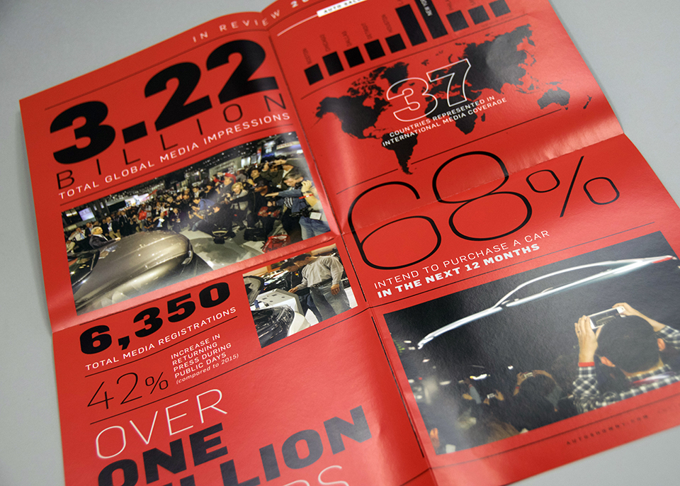
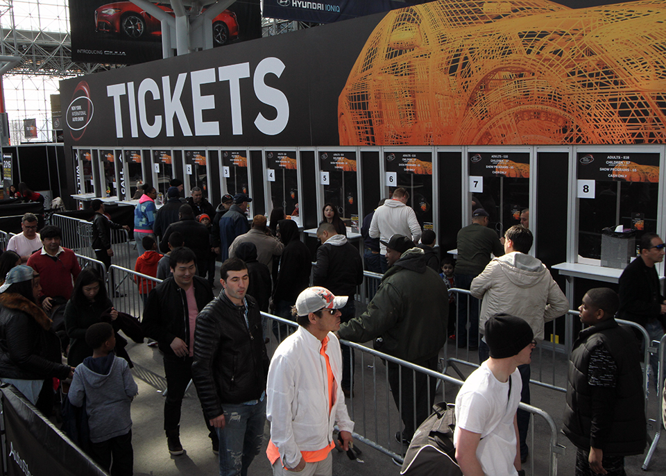
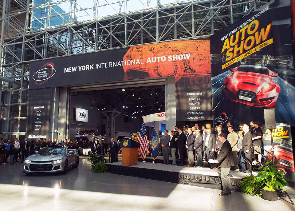
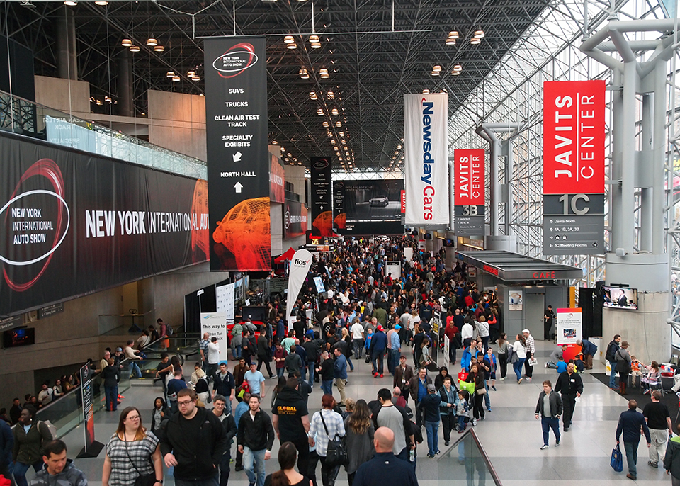
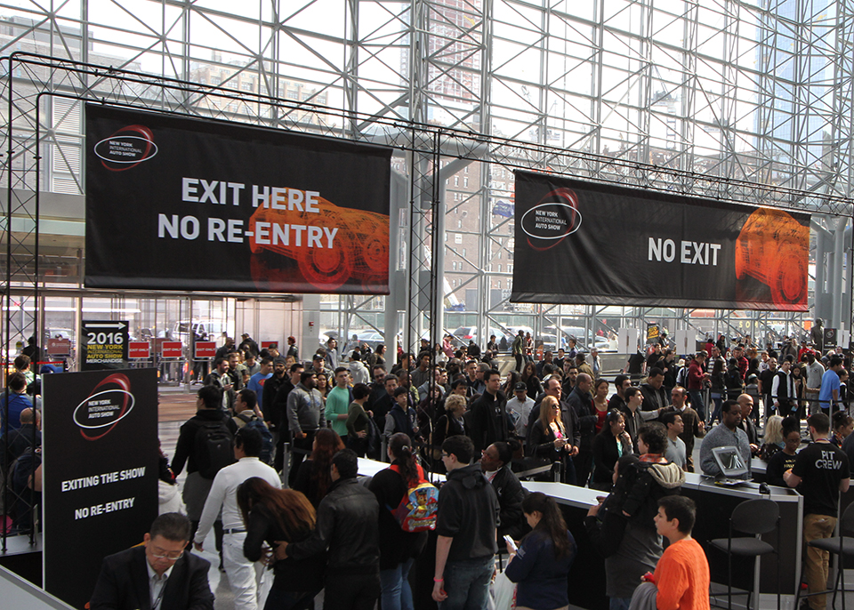
As the country’s longest-running and most prestigious automotive industry exhibition, the New York International Auto Show requires dynamic marketing that conveys the glamour and energy of the event. Following the successful conclusion of each year’s show, I was tasked with conceiving, designing and overseeing the production of NYIAS’ Annual Review. Working closely with the talented team at Reitdesign, I created lavish books packed with stunning photos and impressive statistics geared towards enticing future exhibitors. In addition, I designed the show’s signage and wayfaring system—all 80,000 square feet of it—to help some one million visitors navigate the vast show’s multiple levels.