The return of Fiorentina’s retro logo was welcomed on social media. In Florence, not so much…
Summer is the best time to be a football fan, precisely because there is no football. Instead there’s the prospect of football, the expectation of the season to come. In other words, hope. Yet the football fan is also a romantic sort, whose identity is inexorably wrapped up in the history of the club and defined by its past (for better or worse). So this summer, when the launch of Fiorentina’s new kit for the 2021-22 season provoked consternation among much of the club’s notoriously passionate following, I was amused, but not surprised.
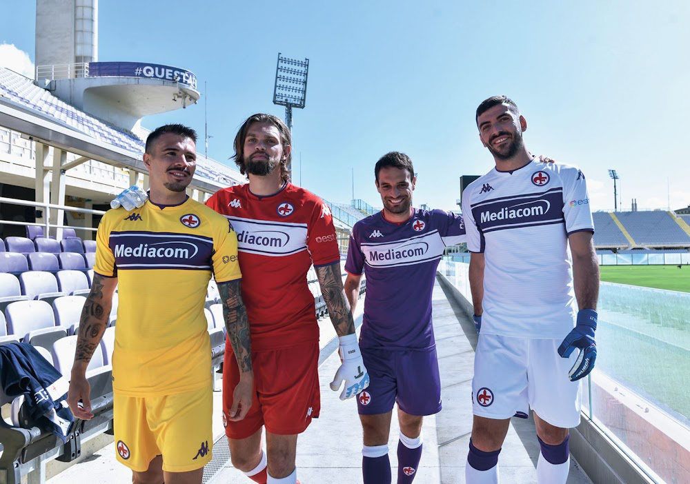
The new shirt takes direct inspiration from those worn by Fiorentina in the mid-eighties, featuring a white horizontal band across the chest and some subtle red trim. It’s the first time the club has made an overt reference to one of its previous kits, and in most eyes the new shirts (there are four of them) are a stylish improvement on last season’s somewhat generic offering. As soon as images of the new kit began circulating around the world, social media became a frenzy as collectors snapped up the shirts without hesitation.
But Viola fans weren’t such an easy sell. The main source of their disapproval was not so much the shirt itself, but the return of the Fiorentina badge from the same period — known these days as “il logo Pontello” for the club president who introduced it — after an absence of thirty years. Perhaps anticipating a strong reaction, kit provider Kappa apparently conducted a survey among Florentines before committing to the old logo. Evidently too few people objected in order to veto the project, but it’s still a surprising move given how unpopular the logo was the first time around, and what it has come to represent for fans in the ensuing years.
After several seasons of depressing football (and results that weren’t much better), I can’t blame Fiorentina for diverting attention from the team while using the marketing of its kit to symbolize a much-needed fresh start. In terms of football kit trends, the decision to dust off an old design is not remarkable. With at least three new kits to devise every season, it’s inevitable that manufacturers should look to clubs’ colourful and storied past for inspiration, and enough time has passed that the eighties are now ripe for a reassessment. Roma reinstated their beloved “lupetto” badge on their away kit in 2016, and continue to use it as a secondary logo. Similarly, in 2018 Milan restored a stylised devil not seen since 1984, and last season Verona resurrected the badge worn when the club won its historic scudetto in 1985. Lazio have gone even further in recent years, sporting brand new kits that are faithful remakes of designs worn in the eighties. Such retro references have been mostly welcomed by fans and football shirt aficionados alike, so why is Fiorentina’s case so controversial?
For some kind of an answer we have to cast our minds back forty-one years, to the summer of 1980. The new decade coincided with new ownership of the club in the form of local businessman Flavio Pontello, who handed the role of club president to his son, Ranieri. The Pontello family had made their fortune in construction, and now hoped to achieve similar success in football, by building a Fiorentina team that could compete with the superpowers of Serie A. Things did not go to plan early on: Fiorentina found themselves second from bottom at the halfway point of the 1980-81 season. The team recovered to finish a respectable fifth, but like most men of ambition Pontello wanted more. He envisioned a Fiorentina that could challenge for top honours, but rather than reinforce the squad with big name players like Platini or Zico, he decided there was another factor that could help the club make that leap: the team’s kit.
And so in the summer of 1981 the club unveiled a brand new strip that took everyone by surprise. Fiorentina had worn white shorts for most of their history, but the updated uniform was all-purple, with the unprecedented addition of red trim on the collar, cuffs, and socks. In keeping with sportswear developments the kit itself was made of a shiny, silky material, though perhaps the quirkiest feature was the white circle inside which red numbers were printed on the back of the shirt. But the biggest innovation was on the front, which was dominated by an oversized new logo. Out went Fiorentina’s traditional kite-shaped badge, in its place a stylised hybrid of a giglio (the flower symbol of both city and club) and a letter F. It might be argued that the new logo’s unavoidability — boldly emblazoned across the entire body to the extent that the club’s first ever sponsor, J.D. Farrow’s, practically went unnoticed — did not help endear it to the public. Certainly Fiorentina’s loyal fans weren’t convinced, likening the design to a medieval halberd. Even fashion designer and Florentine nobleman Emilio Pucci weighed in, calling the new logo “a failure.”
The new branding may have been unpopular, but Fiorentina were not the only Italian club to refresh its look in this period. Prior to the late seventies such matters were of minor significance: kits changed infrequently and most team shirts didn’t feature club badges or visible sponsors. It was graphic designer Piero Gratton’s groundbreaking work for Roma — including the famous “lupetto” logo launched in 1978 — that initiated a new approach to marketing in Serie A. Soon other top clubs followed by unveiling similarly minimalist branding that owed more to corporate marketing directions than any football tradition.
Public opinion aside, the new kit did not harm Fiorentina’s performance on the pitch. Despite losing their captain, Giancarlo Antognoni, for several months following a dramatic collision with Genoa’s goalkeeper, the team were tied on points with Juventus with one match each to play. But on the final Sunday of the campaign Fiorentina could only manage a goalless draw at Cagliari, after Graziani’s goal was controversially ruled out for a foul by Bertoni on the goalkeeper. Meanwhile a questionable penalty (converted by Liam Brady) was enough to earn Juventus a victory at Catanzaro, and their twentieth scudetto. The result was Fiorentina’s best Serie A placement in thirteen years, but the achievement went uncelebrated, and the circumstances of the season’s climax proved a watershed moment in the club’s rivalry with the Turin giants.
Fiorentina stuck with the same kit for the following season, before the design was modified in the summer of 1983. Now produced by Ennerre, the new shirt was made of a knitted acrylic known as “lanetta” (literally, “light wool”) and incorporated a broad horizontal white band (as referenced this season) that extended onto the sleeves. Below this sat the circular badge, reduced in size slightly though still larger than was typical, embroidered in an unusual position around the stomach.
That strip also lasted for a cycle of two seasons, but still success eluded Fiorentina. At this point the club’s kits began to tone down the eccentric design flourishes that had come to define the Pontello era thus far. The 1985-86 shirt removed all traces of red trim and the white band from the sleeves, while the logo now appeared at a standard size on the left chest. Then in 1986 the white stripe disappeared entirely, and Fiorentina went back to sporting a kit resembling something closer to its traditions, despite adopting the inexplicable habit of wearing white socks at home for the next few seasons.
In 1989-90 Fiorentina arrived only twelfth in Serie A (their worst finish since 1978) but enjoyed an impressive run in Europe, reaching the final of the Uefa Cup. Their opponents were old foes Juventus, making it the first of that decade’s three all-Italian finals. The first leg in Turin ended 3-1 to the home side. Fiorentina had played all their home European games in Perugia due to renovations taking place in Florence for the upcoming World Cup. But for the final they were forced by Uefa to switch to a neutral ground after crowd disturbances during the semi-final. The venue chosen was the Stadio Partenio in Avellino, where, as throughout swathes of Italy’s south, Juventus could lay claim to a traditionally strong fanbase. The match ended goalless.
It was Roberto Baggio’s last game for Fiorentina. The disappointment of losing the Uefa Cup final was compounded by the sale of the club’s young star to Juventus for a then-record £8 million. The transfer was confirmed two days after the second leg, prompting irate fans to take to the streets of Florence in protest. Two days of rioting resulted in injuries and property damage to the club’s headquarters, and even disrupted the Italy squad’s World Cup preparations at Coverciano (the national team hastily decamped to another facility outside Rome).
For the Pontello family there was no way back, and in 1990 they ceded ownership of the club to film producer Mario Cecchi Gori. In the summer of 1991 Fiorentina signed a young Argentine forward named Gabriel Batistuta, whose first season in Florence was also the first to use an updated version of the traditional kite-shaped logo. Indeed, by the start of the new decade the graphic logos of the eighties had begun to fall out of favour. Many Italian clubs reverted to modern updates of their traditional crests, which were now undergoing something of a reappraisal, as clubs began to lean into their own history and authenticity as important marketing angles.
But life as a Fiorentina fan in the nineties was hardly smooth sailing: the club was unexpectedly relegated in 1993 but bounced back quickly, and by the end of the decade was competing in the Champions League. But the financial irregularities of Cecchi Gori’s son Vittorio ultimately led to Fiorentina’s bankruptcy — and dissolution — in 2002. Under the ownership of the Della Valle brothers the club re-established itself in Serie C1, before eventually buying back the Fiorentina name and kite-shaped badge, which has remained on the shirt ever since. Until this season.
I first visited Florence in 1988 and for a long time had a giant poster on my wall of the 1990-91 squad — the last season the Pontello-era logo was used. I never questioned it, but for years it has been seen by Florentines to represent a decade of disappointment and bitter frustrations, starting with the “stolen” 1982 scudetto and culminating in the one-two blow of a Uefa Cup final defeat and the departure of Baggio in 1990. Some have accused Fiorentina owner Rocco Commisso of lacking a basic understanding of the club’s history. Two days after the new kit’s release, tifosi from the Curva Fiesole (home to Fiorentina’s most fervent support) unveiled an enormous banner near the stadium that denounced the return of the logo and demanded show more respect towards the club’s fans. Of course such attitudes are prevalent only among supporters of a certain age — most fans under forty will have little first-hand recollection of the Pontello era.
But was that era even that bad? Undoubtedly, Fiorentina’s squads in the eighties boasted some rare talents and in any other league (or with better luck) might have achieved more, but as already documented, the thirty years since have been nothing short of an emotional rollercoaster for the city and anyone who follows the club, punctuated by memorable highs and stressful new lows.
Another important motive for the less-than-beloved logo’s return is its need to function in a rapidly changing world. Both Juventus and Inter have devised all-new brands in recent seasons, supposedly designed to serve them better on digital platforms and in global emerging markets. Had Fiorentina taken the same approach, I imagine the results would have been similarly poorly received. The kite-shaped logo is an awkward fit for social media; at least the circular Pontello logo is more visible when reduced to 32 square pixels. But given the speed with which new ideas are discarded I can’t see it lasting for another full decade.
Once the 2021-22 Serie A season got going the initial fuss surrounding the logo subsided, in part thanks to Fiorentina’s promising start under new coach Vincenzo Italiano. More recently, the issue has been relegated to the backburner in the wake of Dušan Vlahović’s protracted contract negotiation saga. If the Serbian striker leaves the club (as looks likely) and the team’s good form dries up the logo might once again become a talking point. Instead I’m hoping Fiorentina can keep their good run going, and in the process perhaps even create positive associations surrounding its (new) old logo. It’s easy for fans to dwell on what went before. But the next match is always an opportunity for history, and minds, to be changed.
A version of this article originally appeared in KitMag.