Italy’s new badge and football’s design direction
The new year may only be a few days old, but Italy’s football federation, the Federazione Italia Giuoco Calcio (FIGC), has already revealed its new logo. In fact, it’s launched two: the federation’s new logo appeared back in October, but the latest reveal is of significant greater interest since it will be worn by the Italian national team on its shirts. “We’re ready for the future,” claimed FIGC president Gabriele Gravina at the brand launch, perhaps not speaking for everyone.
This is not the first time the Azzurri have altered their badge. When Italy won consecutive World Cups in 1934 and 1938, they wore the arms of Savoy on their blue shirts. Following the birth of the Italian Republic in a 1946 referendum, a simple shield design was adopted, incorporating the colors of the Italian flag (without a coat of arms) beneath the word “ITALIA.” This design remained essentially unchanged for over thirty years, but the new logo is the fifth complete overhaul since 1984, more than any other major national team in the same period.
Italy’s previous logo was only launched in 2017, towards the end of the doomed qualification campaign for the 2018 World Cup. According to then FIGC president Carlo Tavecchio, it had apparently been in the works for three years. So it’s especially surprising that it would be ditched after just five years, considering that the job itself must have been assigned even sooner than that (assuming the work wasn’t knocked out during the World Cup).
The project itself was entrusted to Independent Ideas, a creative agency owned by Gianni Agnelli’s grandson, Lapo Elkann. With offices in Turin and Milan, the company’s clients include some of the biggest international Italian brands, such as Fiat, Ferrari and Gucci, though their work is more typically campaign-driven. One can only assume that Elkann’s connections in football had something to do with securing the job, but to the FIGC’s credit at least it wasn’t outsourced abroad (unlike the recent rebrand of Inter).
![]()
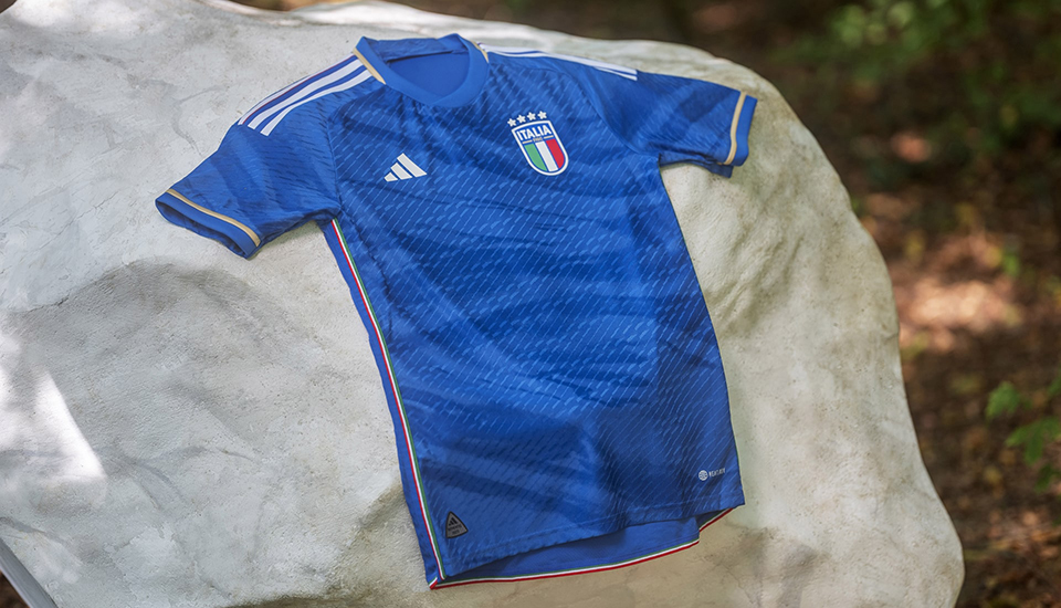
The new logo was revealed on January 3rd: strong reactions were as immediate as they were predictable. The democratic nature of social media deems that seemingly any person with eyes and an iPhone can be a graphic design critic. Some online observers have likened Italy’s new badge to the kind you’d find on a cheap knock-off jersey at your local market. While I’m inclined to agree, I shall first attempt an objective review.
Let’s start with the shape itself, which, like Italy’s last two crests, is ostensibly a continuation of Italy’s traditional shield. But where previous designs’ two sides met to form an elegant point, the new shape has a continuous sagging curve, like a semi-circle that’s been tacked on the bottom of a rectangle. The effect is a bulbous logo that appears too tall.
This issue is further compounded by the gently arched top, an odd choice considering that “ITALIA” sits on a straight line. The type appears centered between the logo’s thick borders, but no optical adjustment has been made to account for the extra negative space in the top-right area created by the final letter A, resulting in a logo that feels unbalanced. As for the type itself, the last two Italy logos employed elegant typefaces that subtly recalled aspects of Italian history and design. This new, condensed bold font is neither sophisticated enough to continue these important legacies, nor distinctive enough to justify its selection.
Italy’s colours — the tricolore of its flag and famous azzurro of its national team — are well established, but the new design still manages to misuse them. The type, outline and stars are all rendered in white, further cheapening the overall aesthetic. The familiar gold is reserved for the “FIGC” letters, though their clumsy inclusion frankly looks like an afterthought. Several colourways of the badge have been released, presumably for use on home, away and third shirts, as well as other graphic purposes. By simply inverting the blue and white but not the tricolore, the away version ends up with a central white panel of a different width due to an invisible separation.
Everything about the new badge, especially the outer border, feels too chunky, which only accentuates the issues already mentioned. None of the details seem considered, resulting in a logo that is poorly executed, and utterly devoid of the style and elegance associated with the country in question or the illustrious traditions of its national team. This restyling strips “La Nazionale” of any authority or historical grandeur, in a moment when it could certainly use them as inspiration to rebuild.
Whatever your thoughts on the new logo, this project is definitely representative of a modern desire for football teams to embark on thorough reappraisals of their brand identities, an undertaking more typically associated with large corporations. Moreover, it’s also the latest example of a micro-trend in Italy for teams to make radical visual departure from their classic look. In recent years Juventus, Inter and Fiorentina have gone through major rebrands. In each case, the new logo was poorly received (by football followers and graphic designers alike), but the clubs persisted nevertheless.
Football fans have a deeper connection to their team than they do to, say, their chosen brand of dishwasher tablets or preferred food delivery app. It should go without saying that a football team’s identity should be updated with caution and respect. But the long-term supporter is perhaps no longer the target demographic. As clubs look to expand their reach in emerging markets, existing, local fans matter less and less, and how the logo will look on a team’s shirt is today, sadly, of secondary concern.
In 2023, a football club or national team requires a thorough brand identity for myriad digital communication purposes. But this also means that a football team’s crest must function in new marketing contexts and therefore satisfy more people, some of whose interests may lie outside football. Anyone who’s worked in the corporate world knows that when a committee is granted input on a creative process the results are invariably safe, bland, and ultimately ineffective. To perhaps illustrate this point, the new logo has been launched together with a banal slogan, “Created by emotions,” as well as an accompanying “sound identity” — specifically a few seconds of a vaguely operatic chorus mixed over generic club beats. The precise purpose of this hopefully short-lived innovation has yet to be revealed.
Amid the fervour surrounding the new badge’s launch, it’s telling that few have actually questioned the necessity of this project in the first place. Italy may be going through a period of transition on the pitch, but the FIGC’s decision to undergo yet another redesign has the feel of an iconic brand changing its look in a desperate attempt to reverse a temporary dip in sales. Of course, Italy’s failure to qualify for the last two World Cups represents an undeniable dual low-point for the Azzurri. But between those sporting disasters, Mancini’s side also managed to become European Champions, playing the best football of the tournament.
The Italian national team may have its problems right now, but the badge on their shirt has never been one of them.
A version of this article originally appeared on The Culture Division.