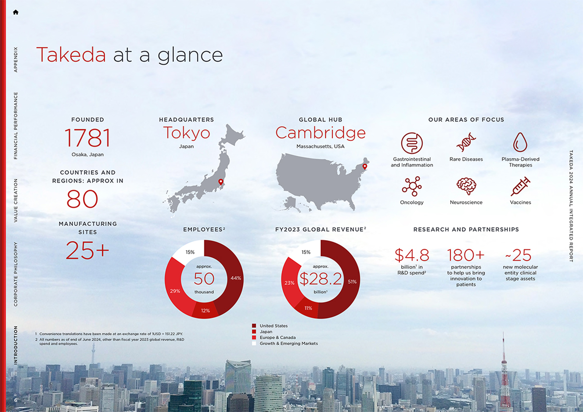
Founded in Osaka in 1781, Takeda is a global Japanese pharmaceutical company — now the third largest company of its kind in Asia. It focuses on oncology, rare diseases, neuroscience, gastroenterology, Plasma-Derived Therapies and vaccines.
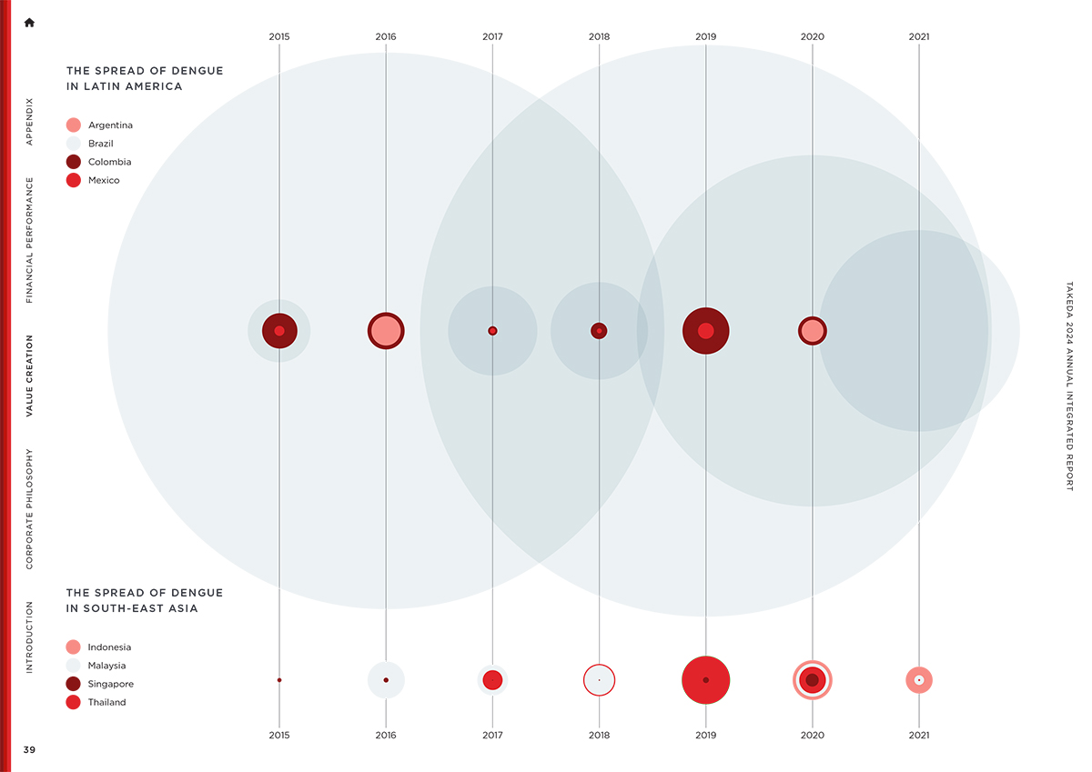
Takeda wanted to articulate its long-term value creation model, much of which concerns PDTs, their dengue vaccine, and leading-edge oncology treatments. The client also wished to bring together diverse global organizations by showing regional impact — so for example here they talk about their work not just in Japan but in Brazil, Austria and the United States. The primary target audience for this report is stakeholders and investors, but another focus was employees, in order to build trust from within but also further differentiate Takeda’s positioning in the industry.
Takeda has an unusual primary color palette in that they have three different shades of red. I was hesitant to use them all together at first but I stumbled upon a triple stripe motif, that served to anchor the navigation menu on the left side of every page. I then expanded this idea into more dynamic, overlapping stripes for the cover and section divider pages.
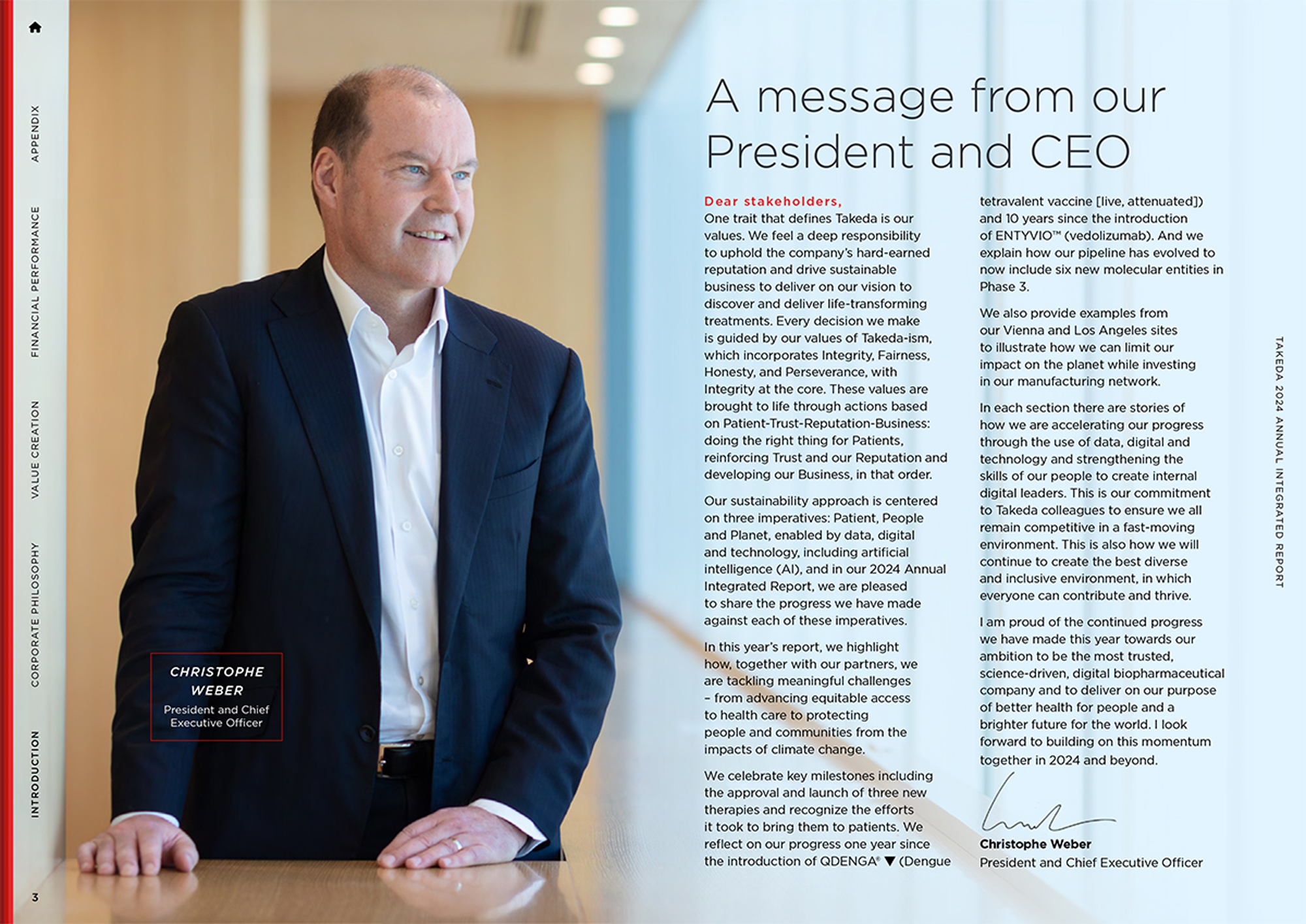
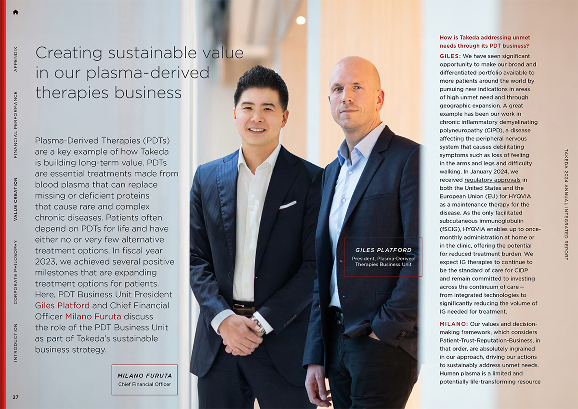
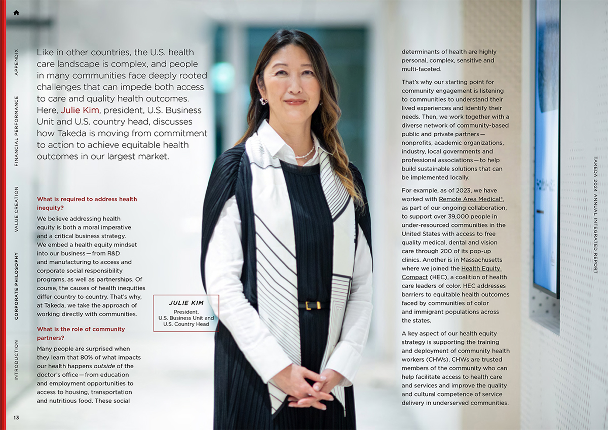
Another aspect that visually strengthened this report was its photography. Takeda conducted a series of new photoshoots in Japan and Brazil and I was able to leverage the beautiful results of those to produce full-page, full-bleed layouts with type overlaid. This not only broke up the repetition of the more text-heavy pages but also provided a certain magazine-like sophistication that the client was specifically striving towards.

