As one of the top ten largest companies in America, McKesson is an industry leader in healthcare with a single company purpose: Advancing Health Outcomes for All. With this mission comes a responsibility towards excellence and transparency in its reporting. In my role as Design Director at Sia/Addison I was tasked with producing McKesson’s progress report for two consecutive fiscal years.
In the second year the client asked to be “pushed out of their comfort zone,” in an effort to differentiate themselves within the healthcare/pharmaceutical sector. I devised three distinct concepts and layout approaches (plus a fourth that wasn’t executed) that might satisfy this request.
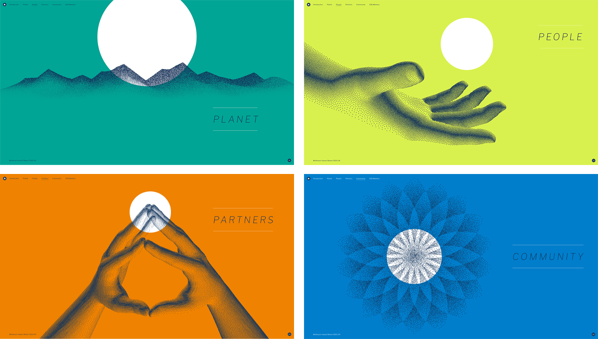
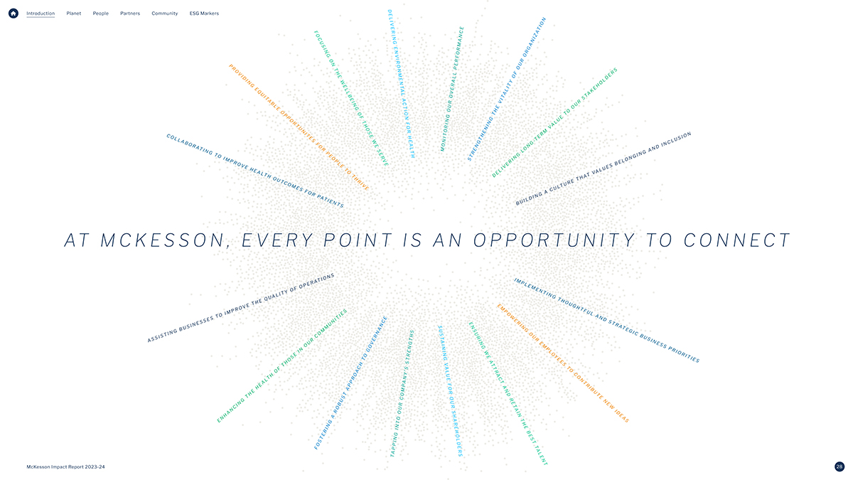
Naturally, each approach maintained certain consistencies. The report was divided into four sections representing McKesson’s impact pillars which were color-coded with McKesson’s vibrant palette. I also harnessed the strongest elements of McKesson’s existing brand assets and found fresh ways in which they could be applied. Regardless of the direction, the goal of the report was to showcase the human impact of the company’s commitment to shape the future of health.
Concept A

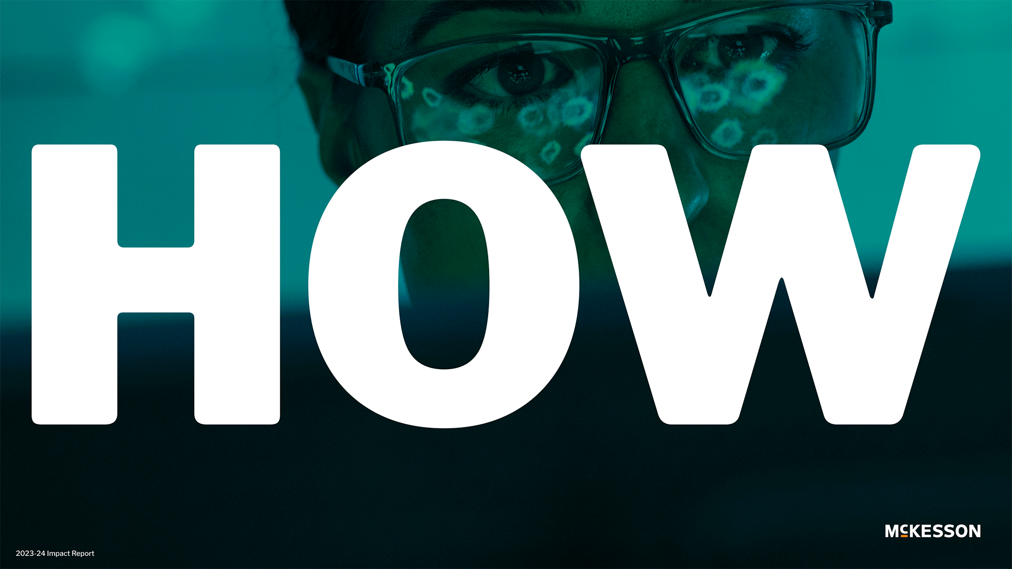
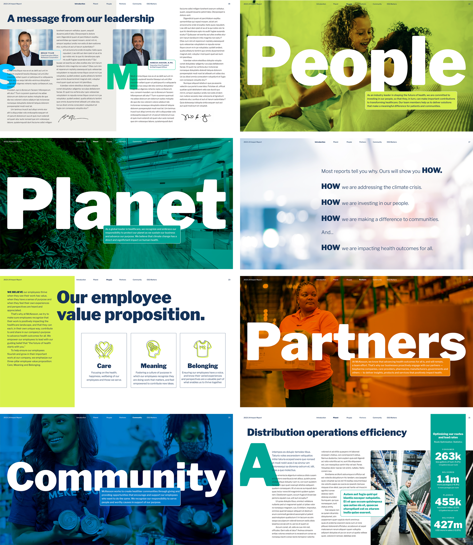
Concept B
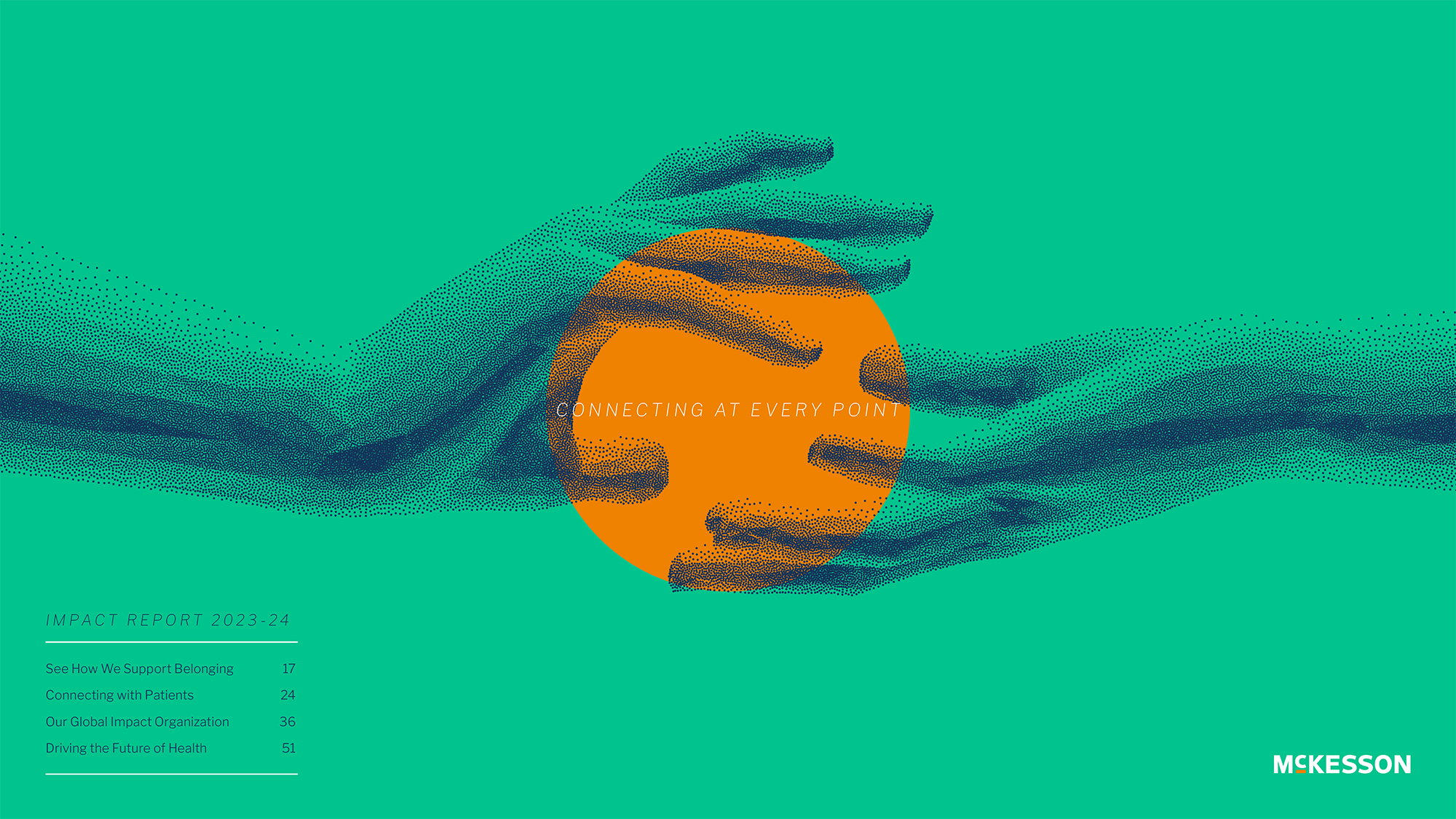
Concept C
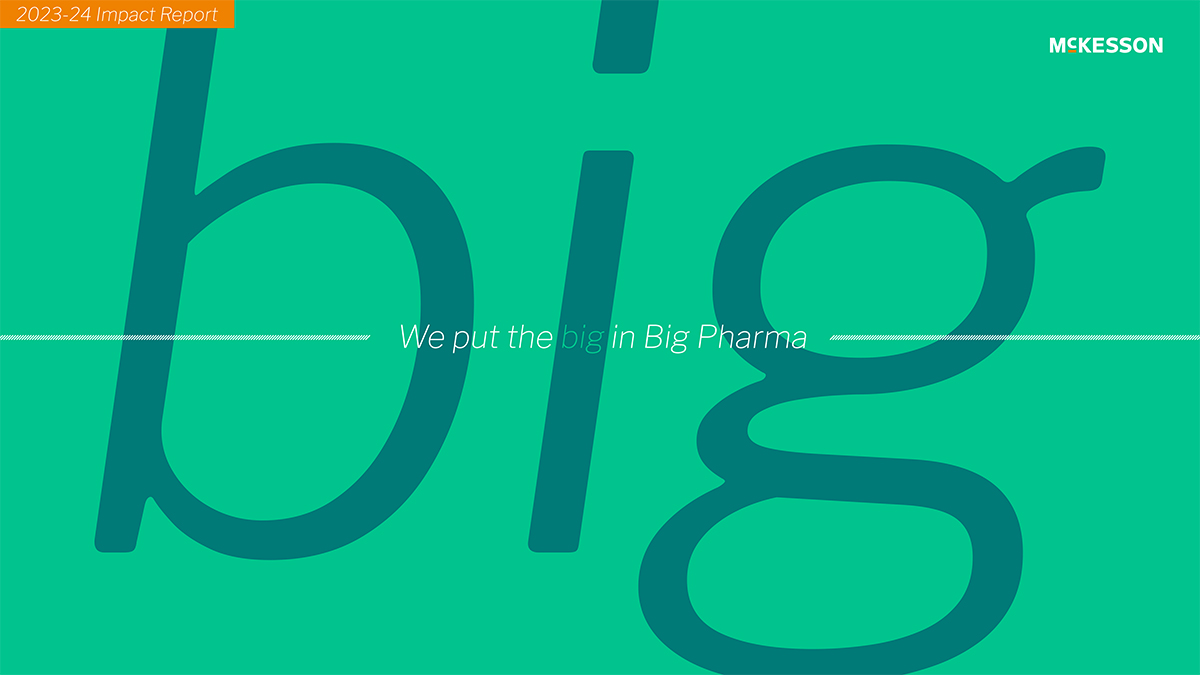
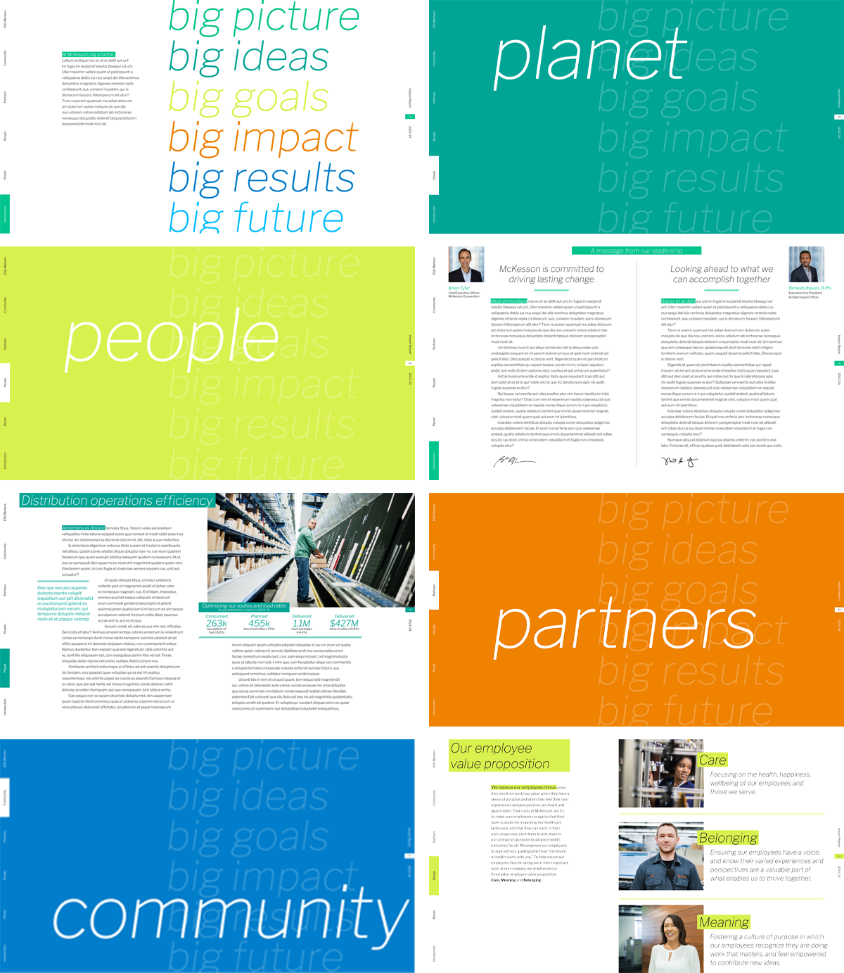
After presenting the initial ideas and honing the layouts, we finally settled on leveraging the word IMPACT as a title of the report, while adapting some of the original elements from the first concept. Despite proposing dozens of cover photos the client remained undecided, eventually reverting to a text-only solution on a plain white background.

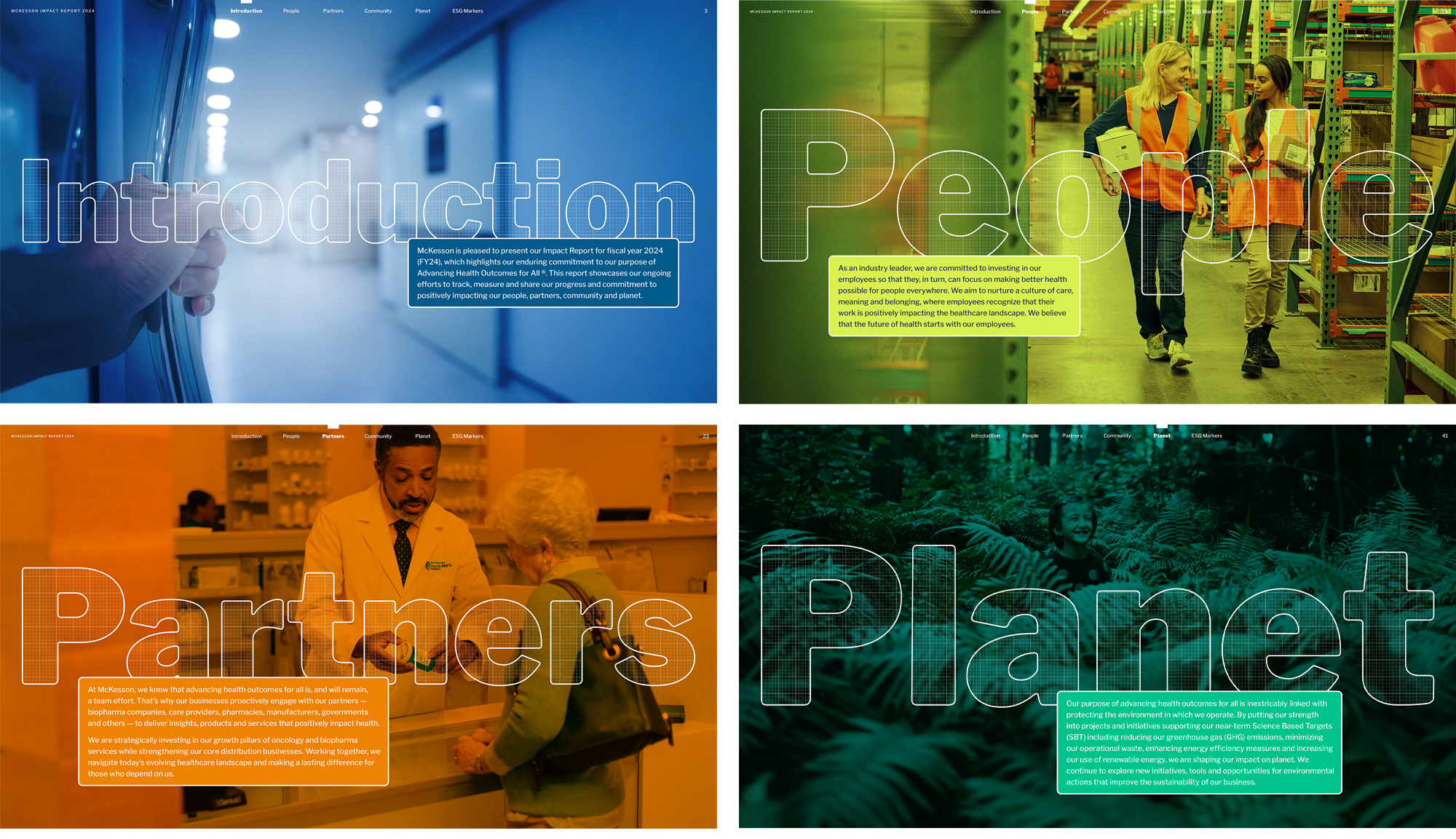
Discover the final Impact Report here.