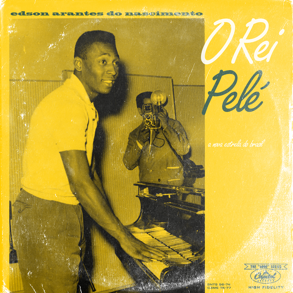
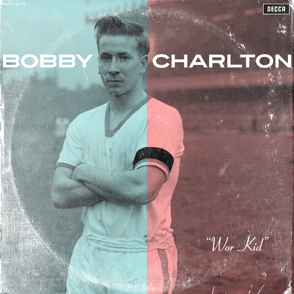
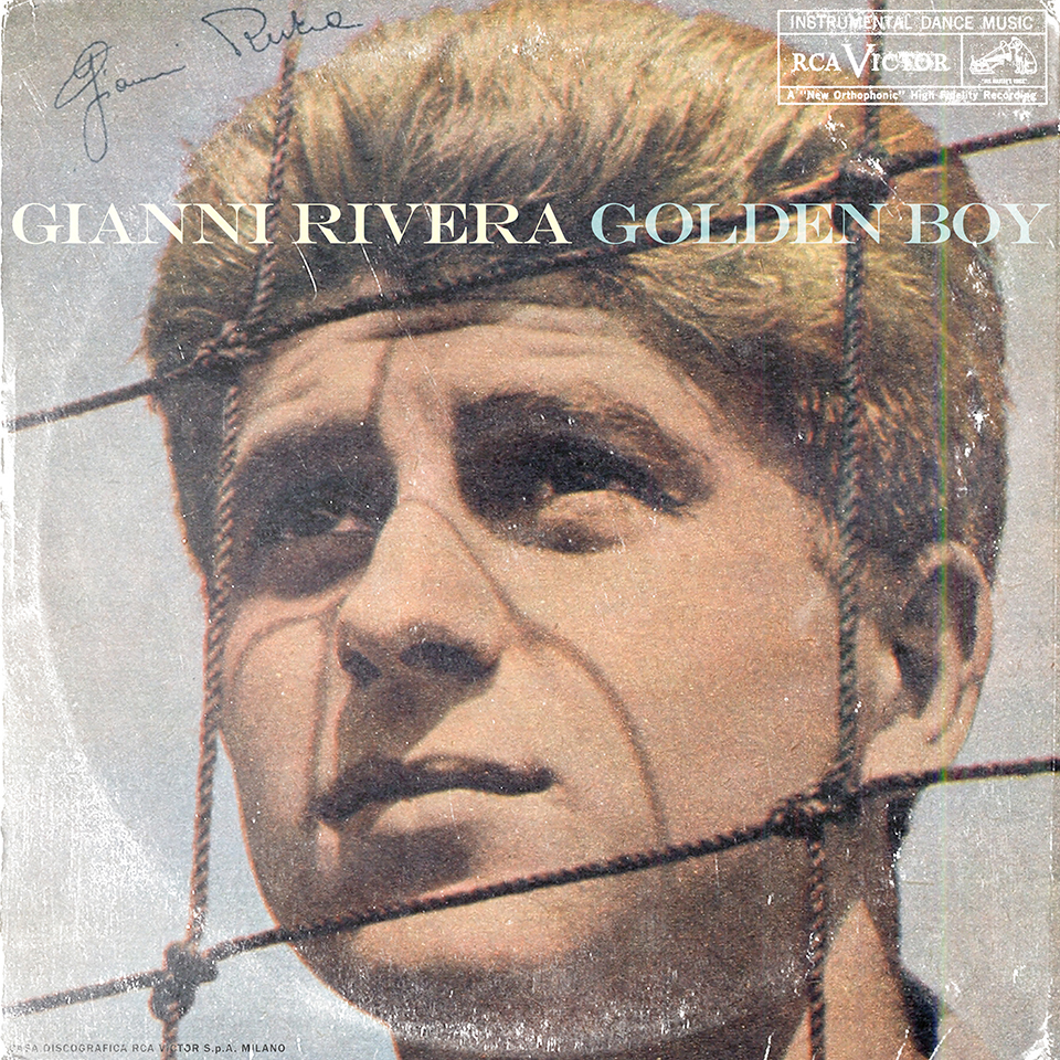
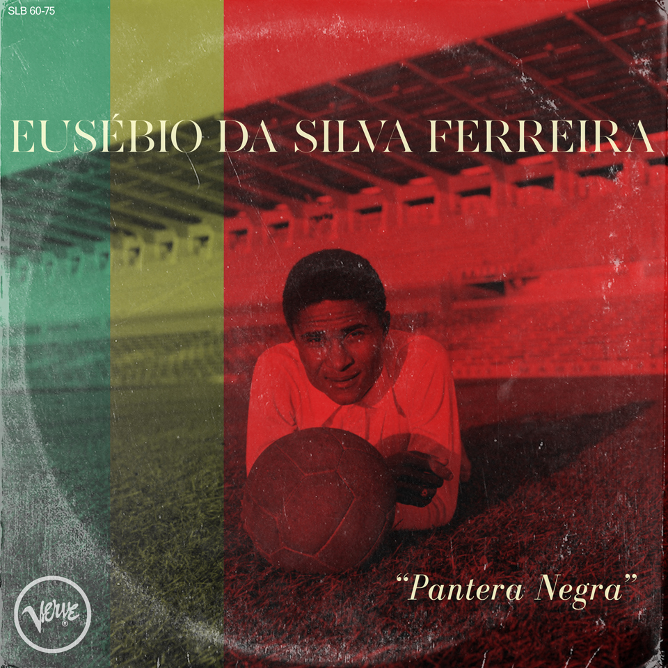
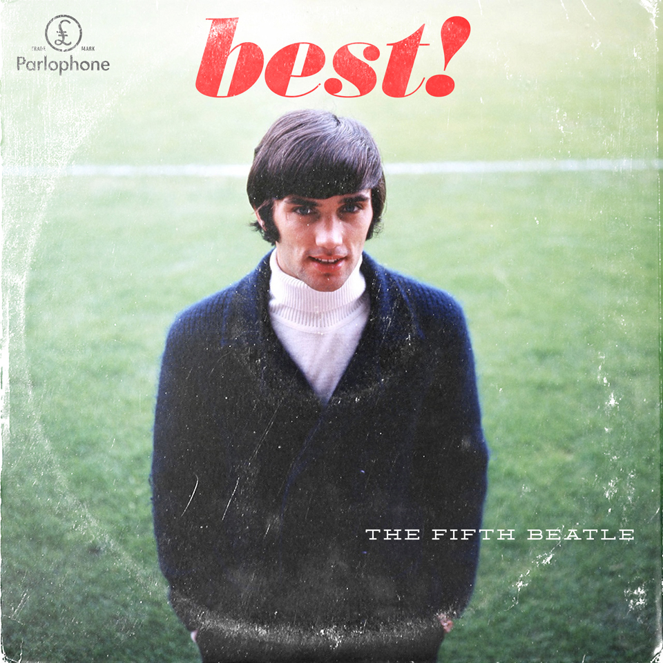
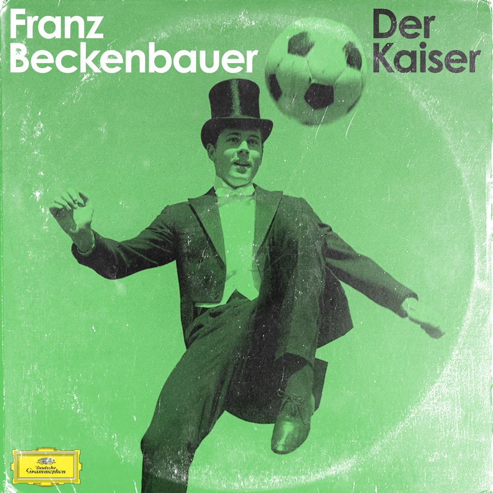
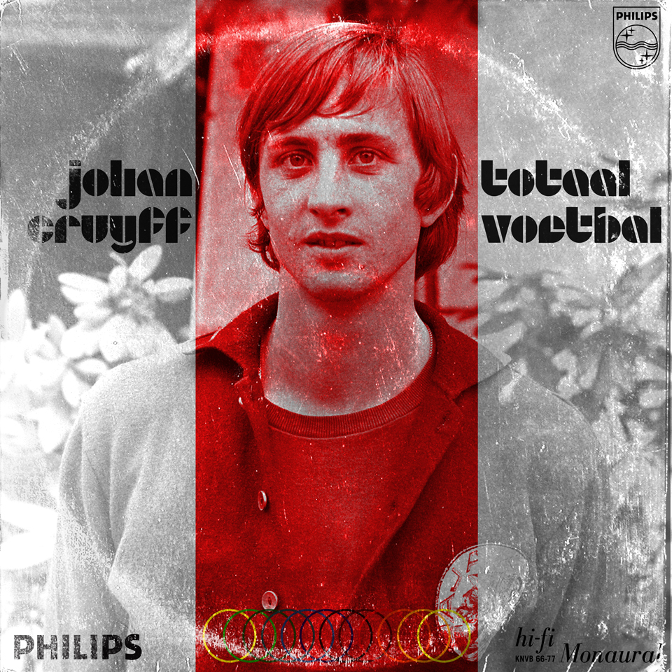
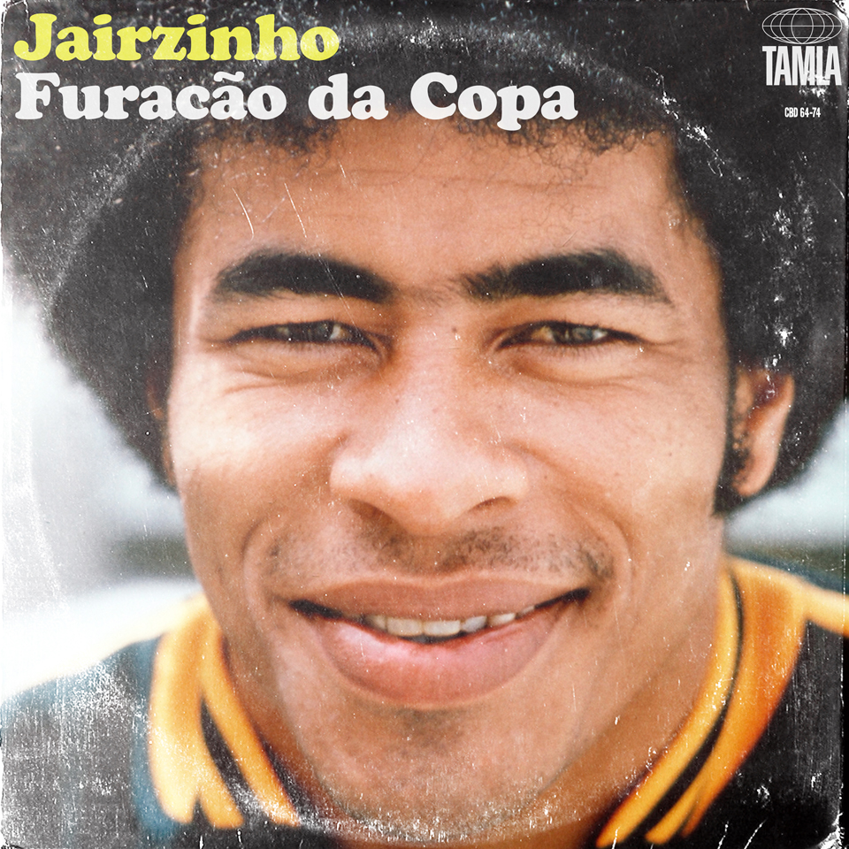
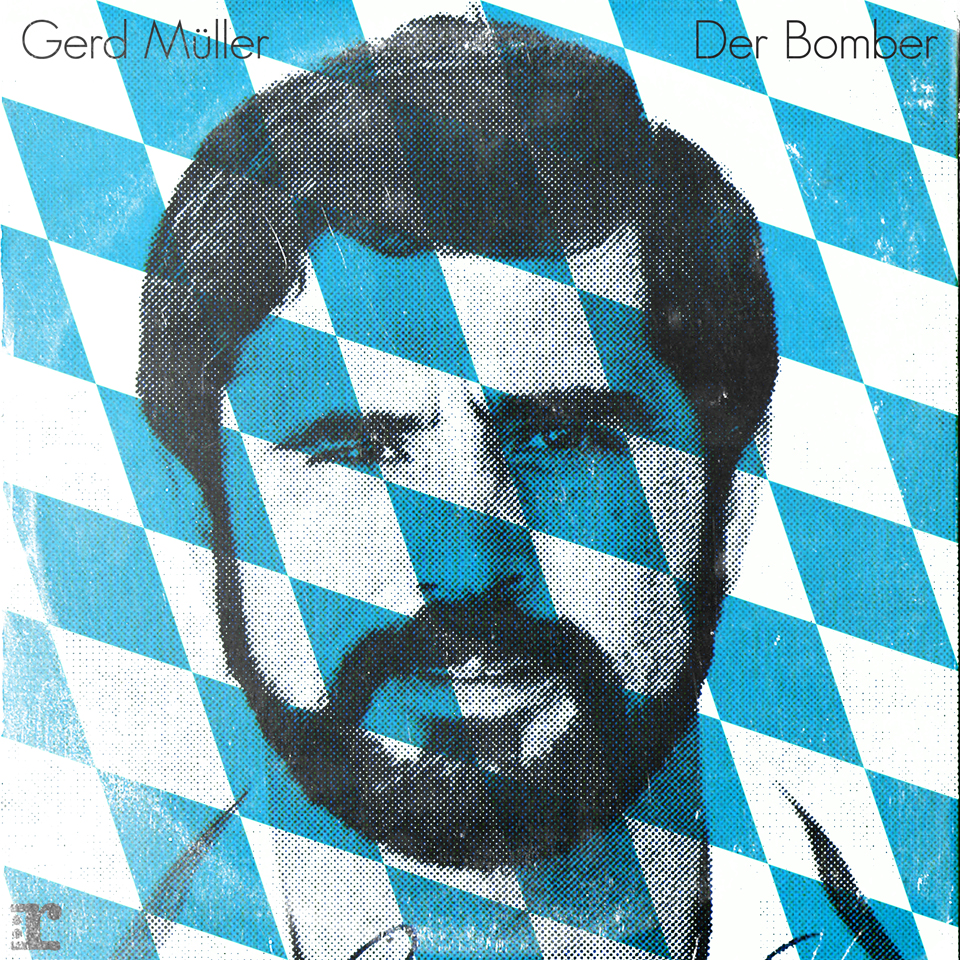
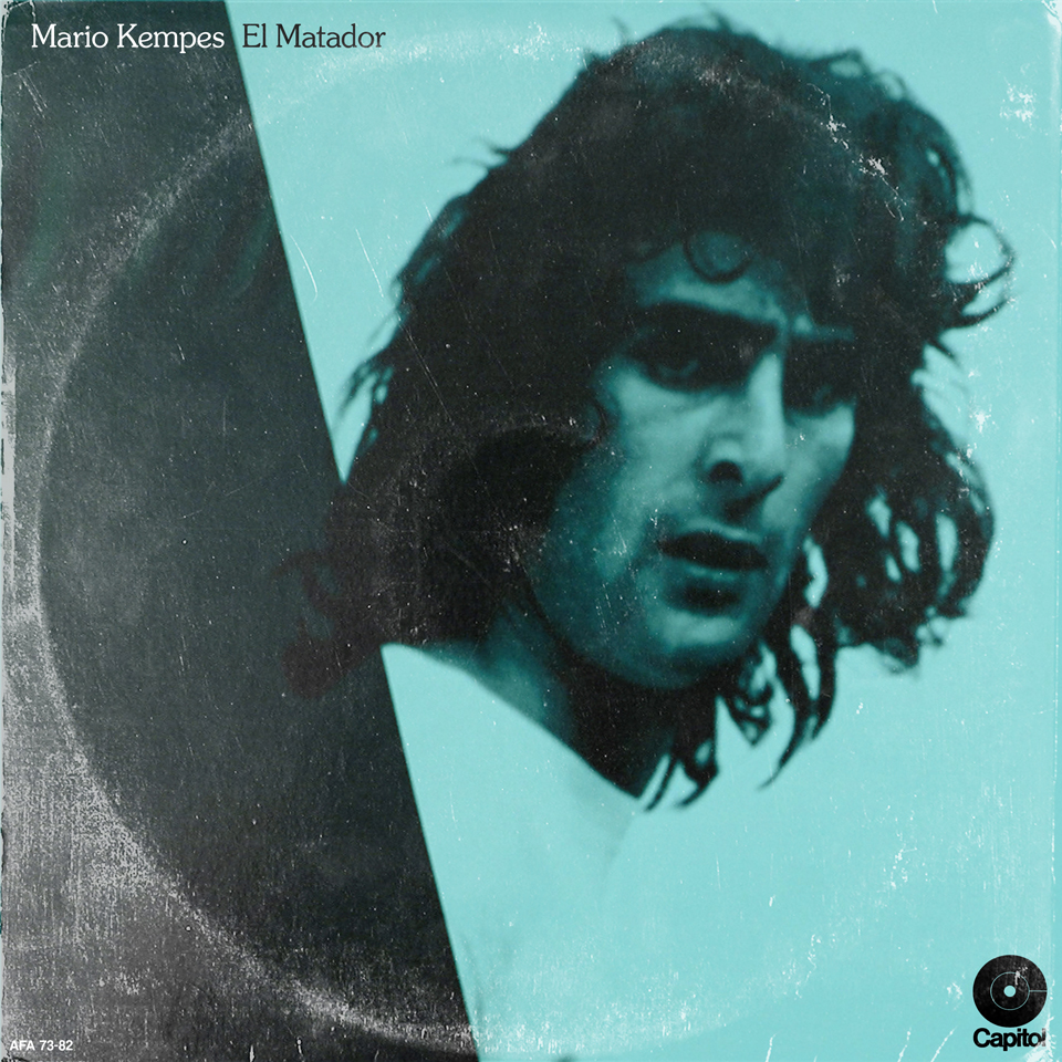
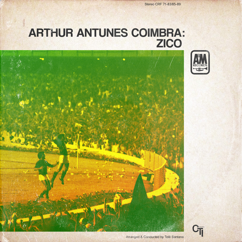
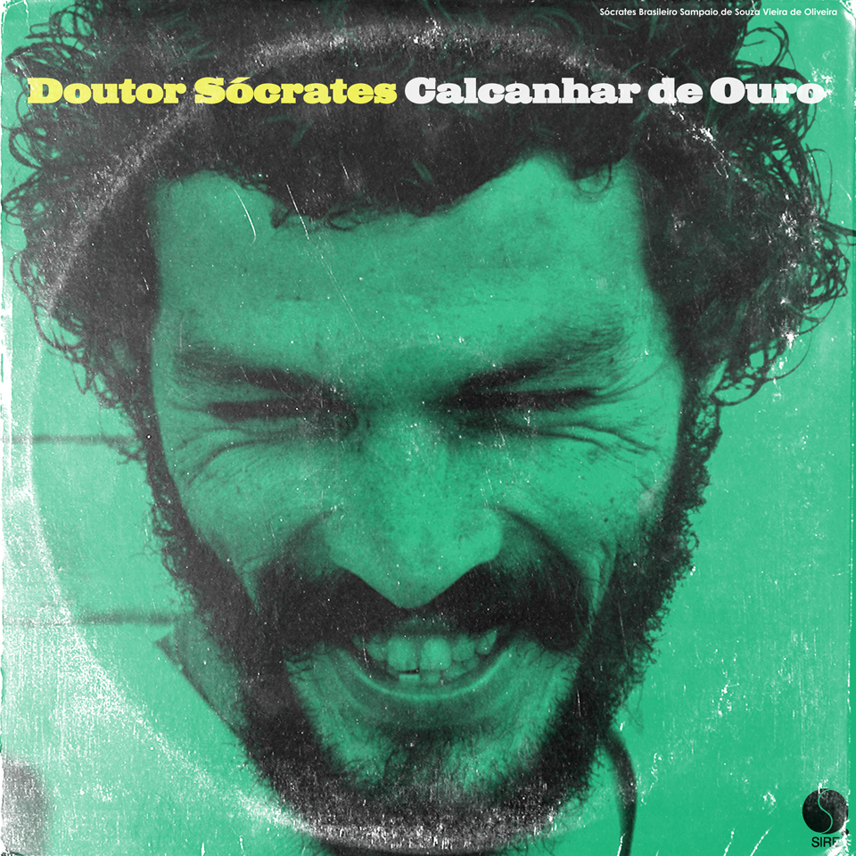
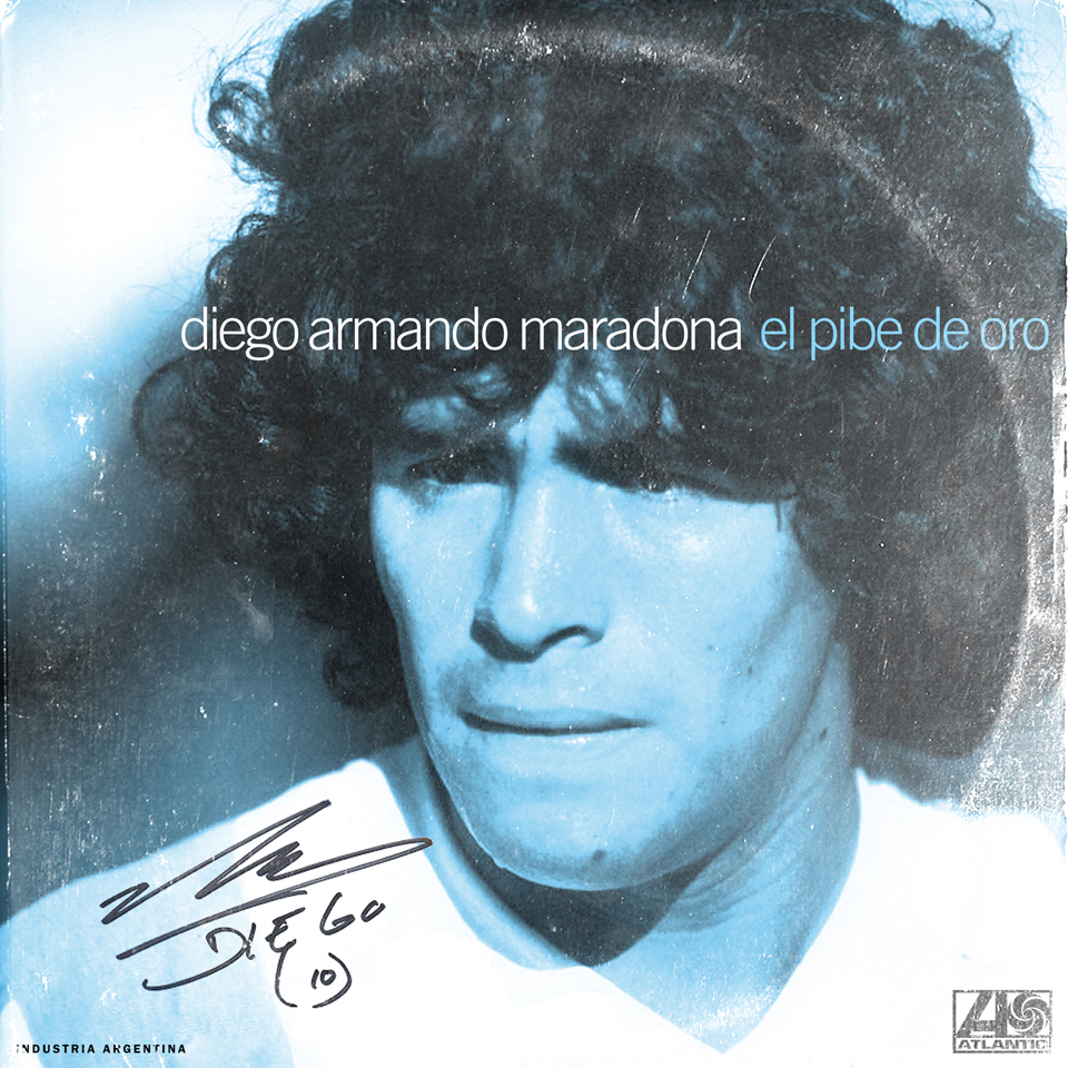
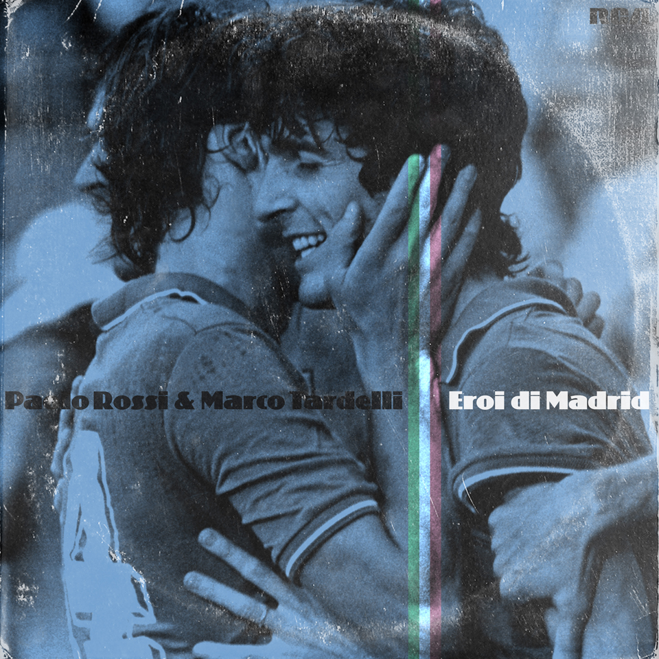
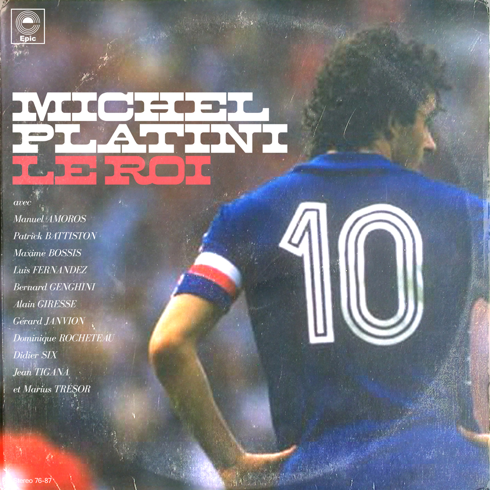
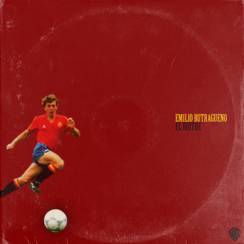
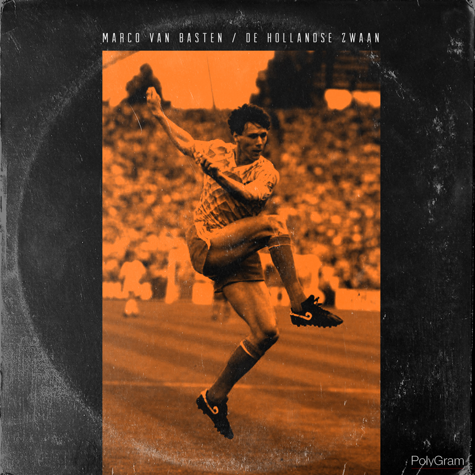
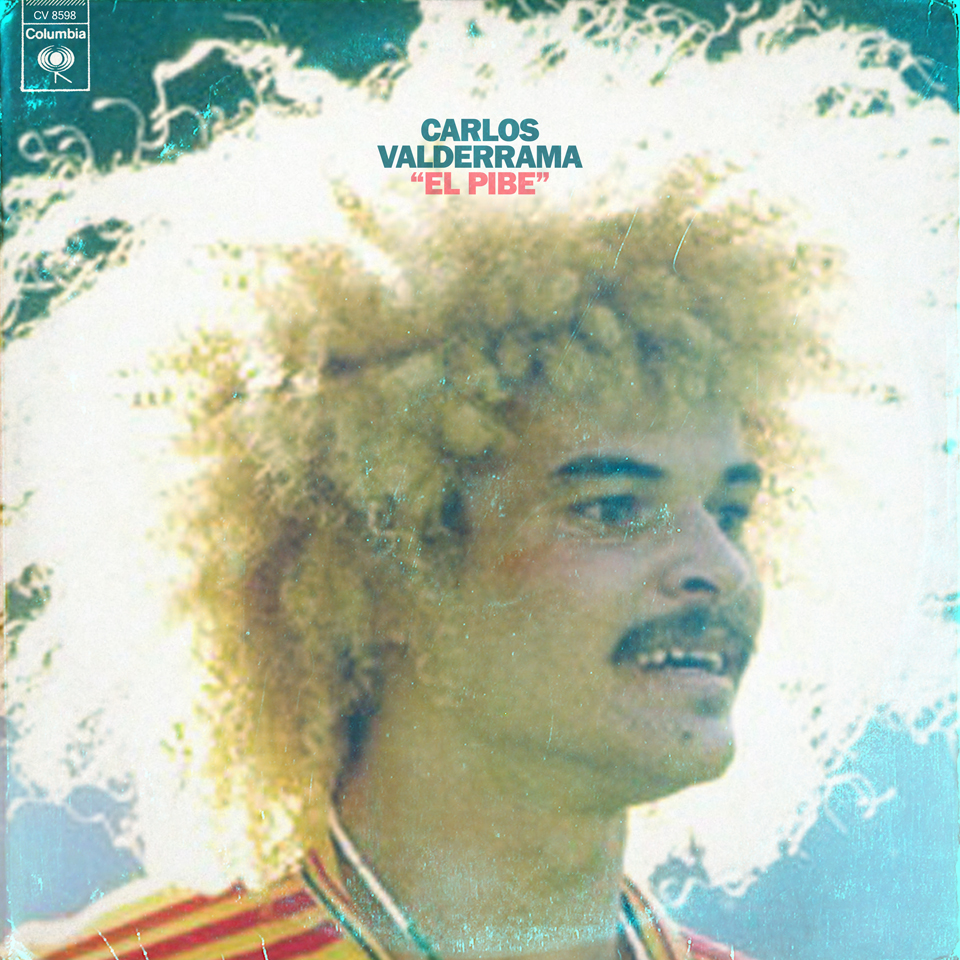
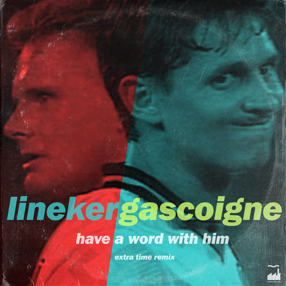
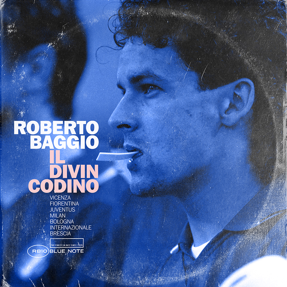
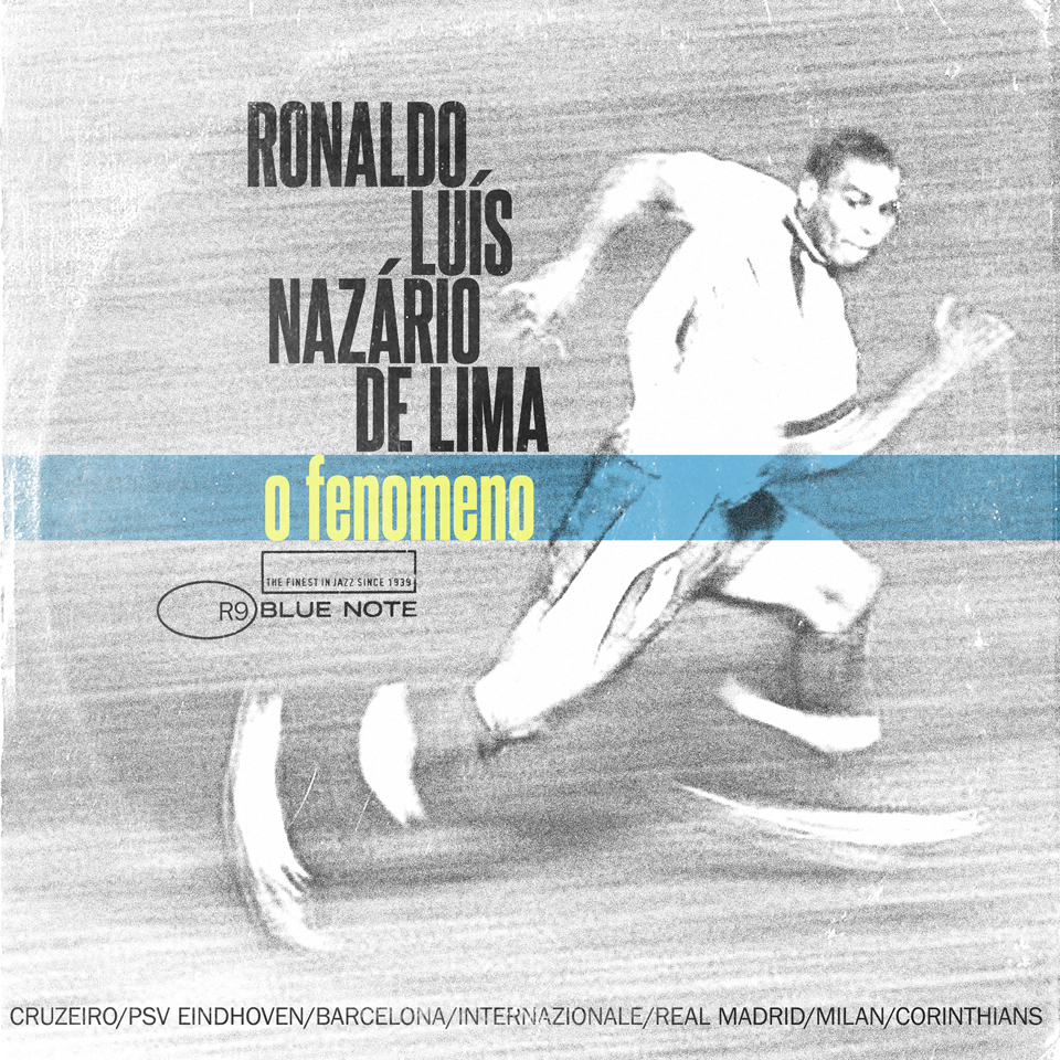
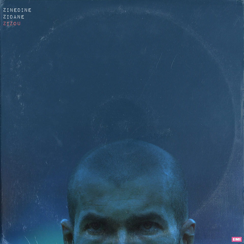
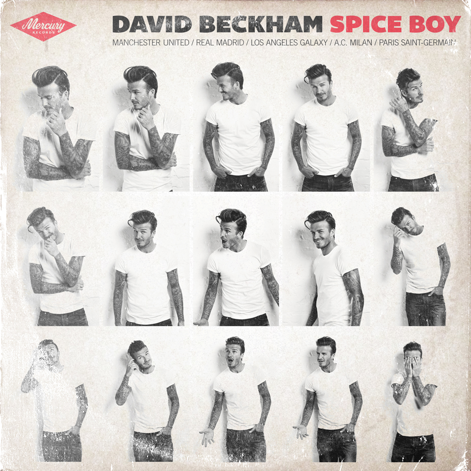
The LPFC project came to me one day as I was walking home from work. The idea to combine two of my biggest interests, football and music, seemed so obvious I was actually surprised it hadn’t occured to me sooner. I started working on it after dinner that evening and I completed it in about two weeks. I’ve always been a keen observer of the nuances of graphic design history: for example, how a typeface choice on a record cover can immediately reveal something about when and where it comes from, and even say something about the music contained on the record. So this project was really a personal exercise to try and evoke a period and place through graphic design, without resorting to easy short-cuts which would render the project a big cliché. I tried to find less-famous images of the most famous players: either shots of them in unusual settings (Pelé at the piano, Beckenbauer in a top hat and tails), or more familiar photos that I could make feel fresh in this design context. So the footballers were really just the subject matter, which helped make the design connections clearer but also allowed for a fun juxtaposition that could be appreciated cross-culturally. A couple of the finished designs directly evoke existing album artwork: Zico’s echoes the covers of Tide and Wave by Antonio Carlos Jobim, while Baggio’s is a twist on Dexter Gordon’s Our Man In Paris. Much to my surprise, and with no extra effort on my part, within a week this project had gone viral. It was featured in dozens of newspapers and magazines and suddenly I was fielding requests for interviews from around the world. Proof that you can’t always predict what’s going to be a hit…