As a leader in sustainable packaging solutions, International Paper required its thorough reporting to serve as a complete sustainability package that communicated both transparency and performance. The brief was to design a suite of five reports that could function as both stand-alone documents and a cohesive set. I devised two distinct concepts for the front covers.
Making use of the brand’s broad yet subtle color palette — centering on earth tones and other hues found in nature — the first of these played with the scale of IP’s elegant logo.
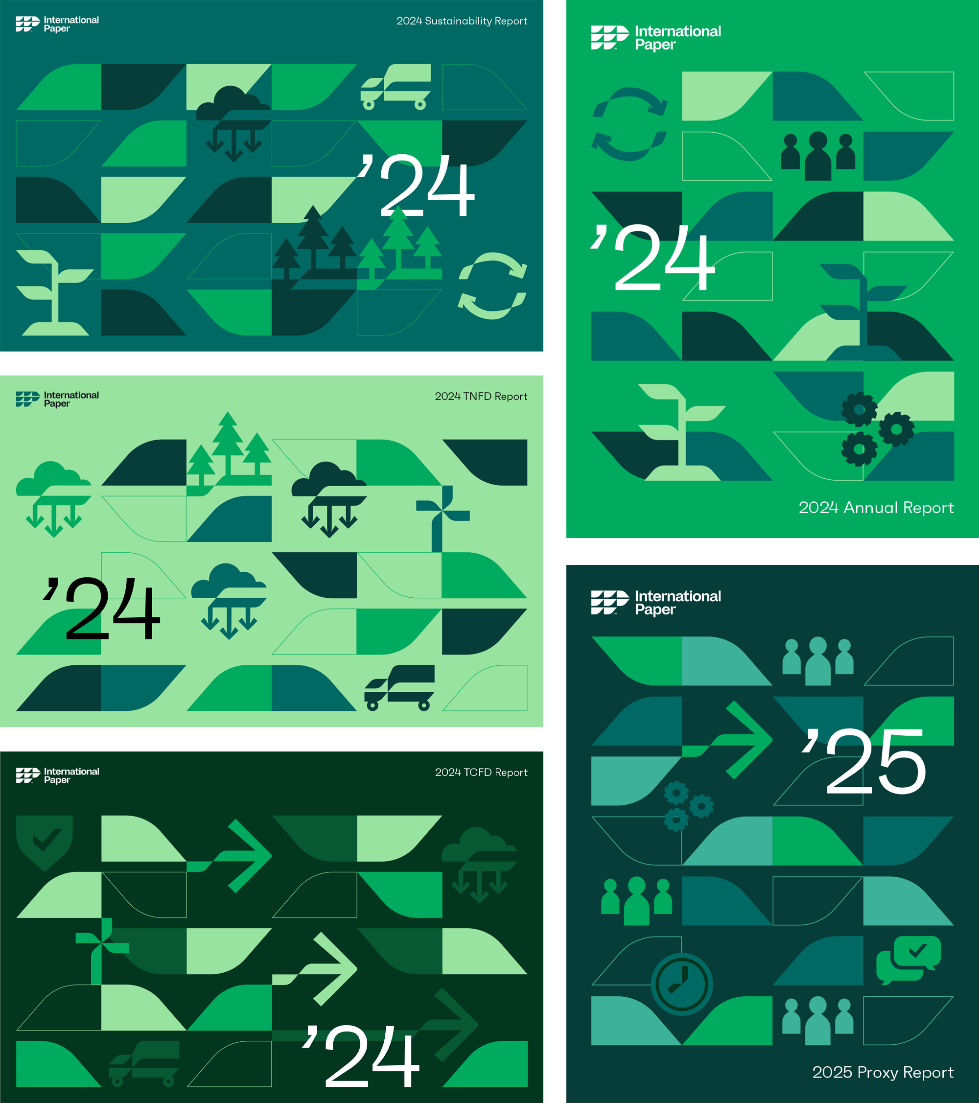
The second concept was more literal, borrowing graphic elements from IP’s existing set of graphic icons.
For the interiors, the flexible “leaf” shape acted as both a brand identifier and a useful graphic device that extended to the reports’ navigation systems.
Check out the complete suite of reports here.