Category: DESIGN

Romanoff Equities


Romanoff Equities is a New York real estate enterprise specializing in commercial and residential properties in Manhattan’s Meatpacking District. The company has been owned and operated by the Romanoff family for more than 80 years, but its marketing materials had not kept pace with the recent transformation of the area. I was tasked with creating a brand new website and redesigning property flyers that served to showcase the retail and office spaces in Romanoff Equities’ portfolio, while also highlighting the variety or vibrancy of the neighborhood. Visit the site here.


AGCO

AGCO Corporation is a leader in global agriculture. Through its range of well-known brands, AGCO delivers agricultural solutions to farmers worldwide through a full line of tractors, combine harvesters, hay and forage equipment, seeding and tillage implements, grain storage and protein production systems, as well as replacement parts. Today AGCO is at the forefront of developing sustainable agricultural practices, a fundamental priority of the organization that deserves to be showcased. I was asked to design a Corporate Sustainability Report for the company that would do just that. The resulting PDF report breaks AGCO’s areas of focus into six color-coded sections, identified by a vertical navigation bar on every page. To learn more about AGCO’s sustainability efforts and to view the complete report, click here.

In August 2022 this project received a Silver Award from Graphis, Inc.


I also designed AGCO’s Annual Report and 10-K, a printed piece to which I extended design elements from the Sustainability Report. To view the full report, click here.

Trattoria Milano

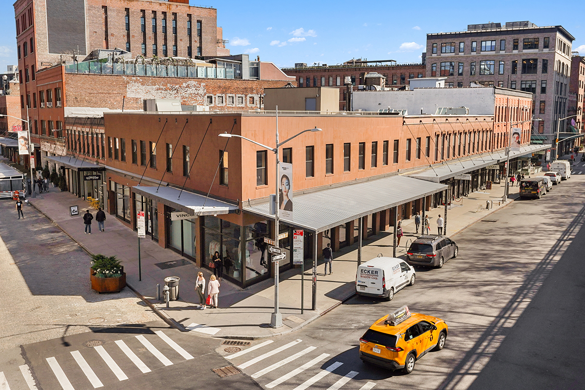
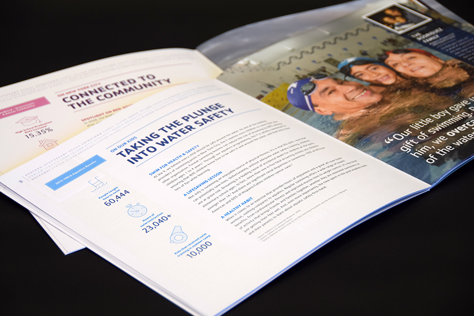
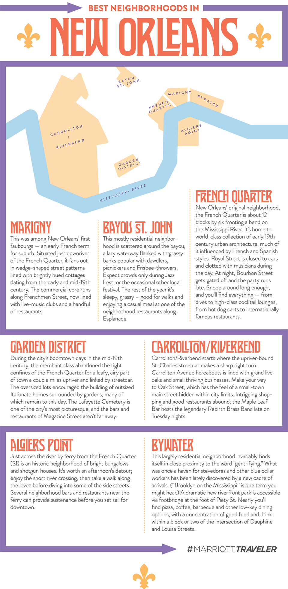
As Head of Creative & Storytelling at Eataly I was tasked with creating the visual identity for Trattoria Milano, the company’s fine dining restaurant at its first Canadian store in Toronto. But this was much more than a standard branding project. Inspired by Milan’s status as postwar capital of design and by the modern eclecticism of the city’s food scene, Trattoria Milano was conceived as a multi-sensory experience, that intended to meld a traditional Milanese menu with art and performance in a single and unique salon space.

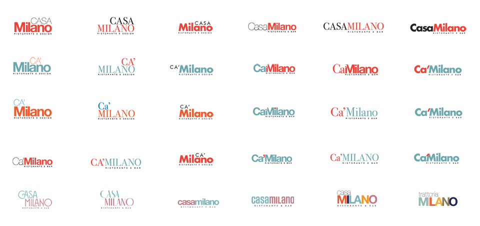
Unsurprisingly given its ambitious scope, the project’s direction — and even its name — were the subject of much debate from the beginning. What started as Casa Milano became the abbreviated Ca’ Milano before reverting to the more conventional Trattoria Milano. I was drawn to classic typefaces such as Bodoni, Futura, Helvetica — as seen frequently in the unmistakeable work of graphic designers Massimo Vignelli and Bob Noorda.


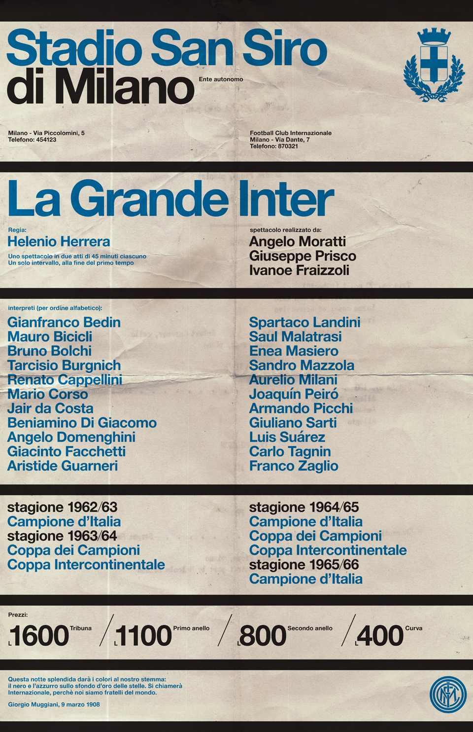
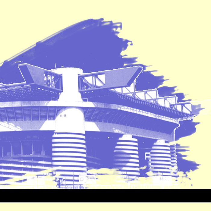
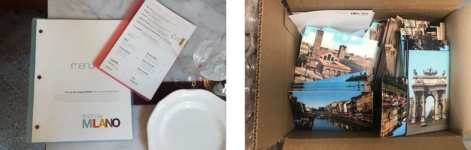
The restaurant’s menu showcased classic Milanese dishes — risotto, cotoletta and ossobuco — and included descriptions in three languages: English, Italian, and Milanese dialect. For the guest check presenters I created a series of postcards with historical photos of Milan’s landmarks, from Piazza Duomo to La Scala, and even the stadium at San Siro!

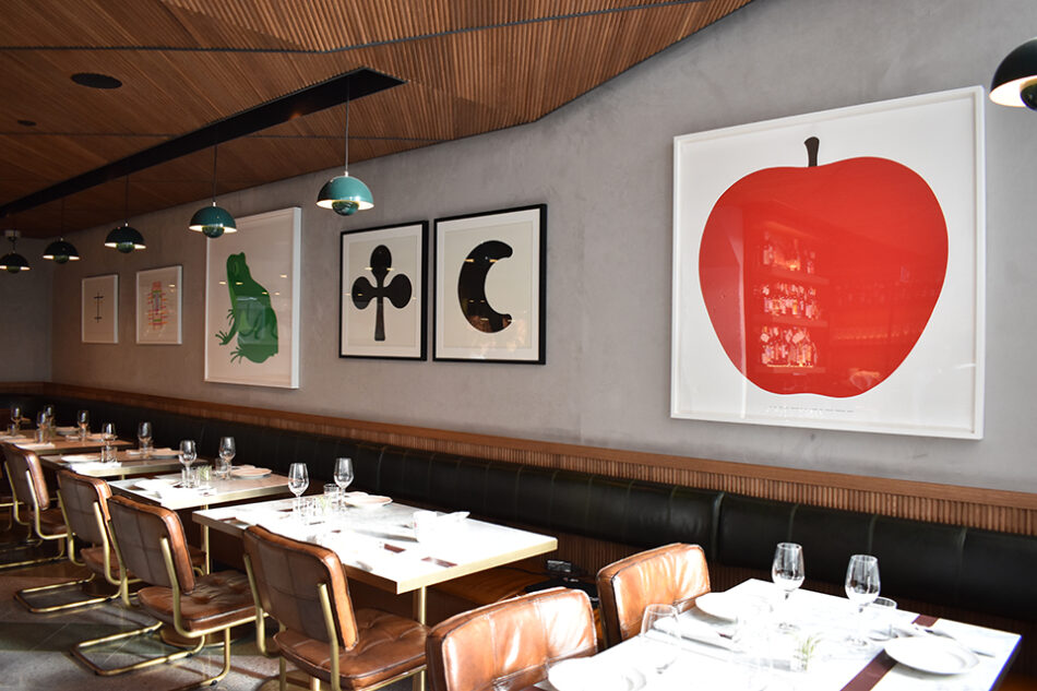
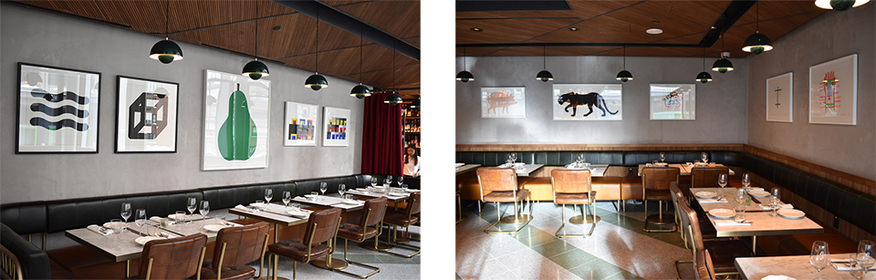
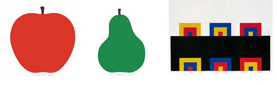
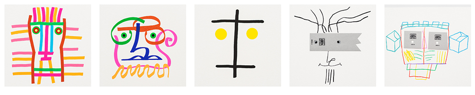
The most challenging aspect of the project — both aesthetically and logistically — was the decor. For the walls I curated a series of prints by Enzo Mari, Bruno Munari, Mimmo Paladino and Olimpia Zagnoli.


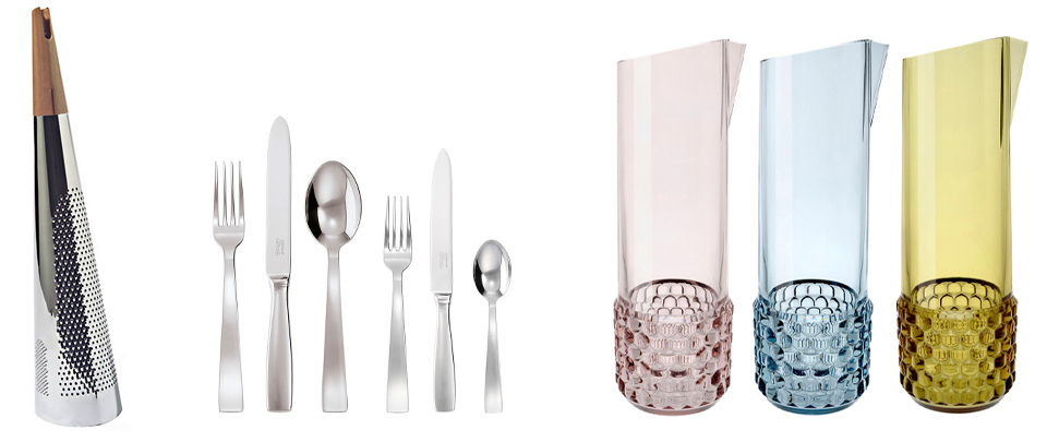
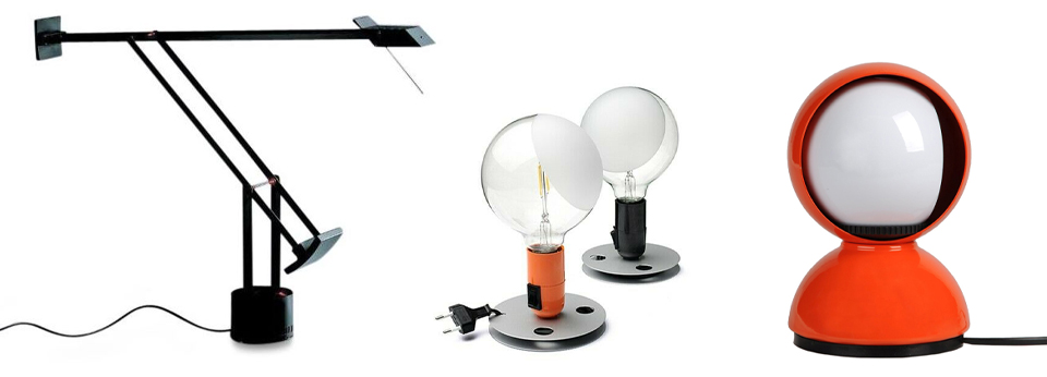
In addition, I obtained a variety of iconic pieces by celebrated Milanese designers — including Gio Ponti, Achille Castiglioni and Richard Sapper — but only provided that they would also provide a function within a working restaurant.


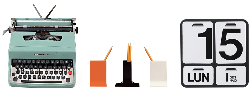
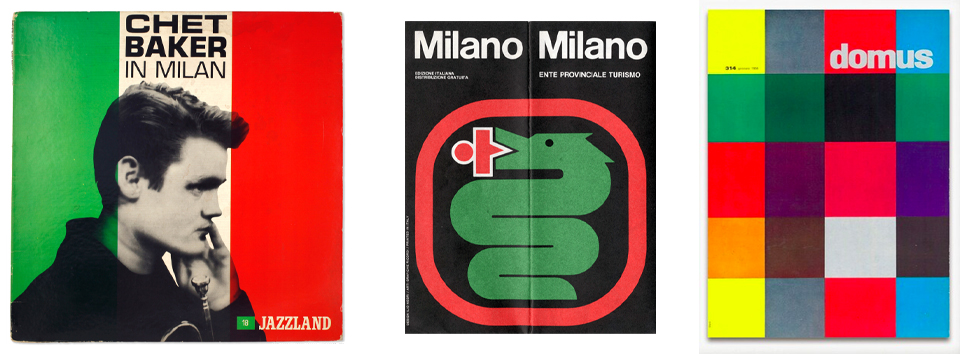
The mid-century vibe was confirmed with used LPs, hefty volumes on design, old issues of Domus, and even vintage brochures from Milan’s tourism board. Of course, the space was incomplete without an original Olivetti Lettera 32 typewriter!


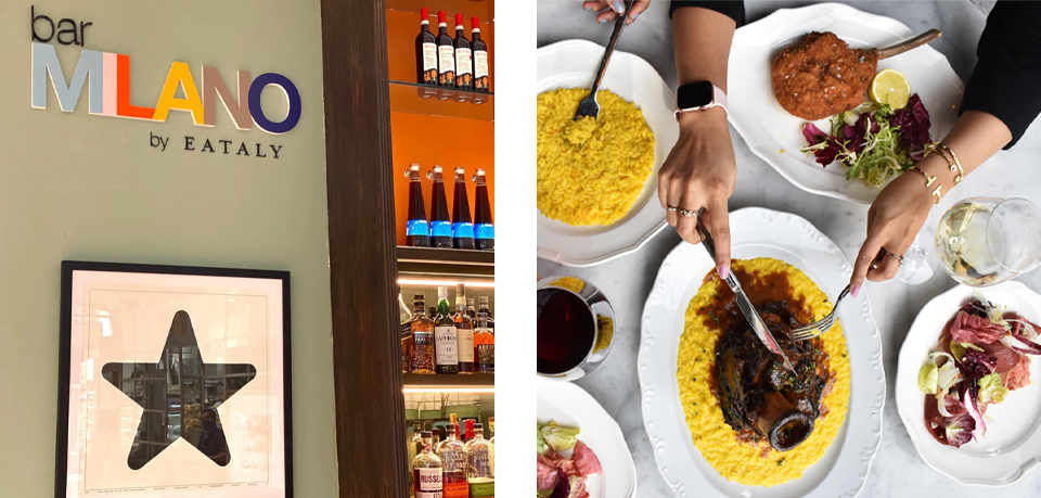
Trattoria Milano proved so successful — both with the Toronto public and internally — that the concept was replicated as “Bar Milano” at Eataly’s flagship location in New York’s Flatiron district.

From Stadio to Studio


La Máquina (1947)


Il Grande Torino (1949)


Maracanaço (1950)


Folha Seca (1958)


El Final de una Época Dorada (1960)


The Battle of Santiago (1962)


La Grande Inter (1965)


Lisbon Lions (1967)


El Partido del Siglo (1970)


A Equipe do Século (1970)


Totaalvoetbal (1974)


Les Poteaux Carrés (1976)


The Defenders (1977)


Bronca (1981)


Povo Feliz (1982)


Nuit de Seville (1982)


La Sete di Vincere (1982)


Democracia Corinthiana (1983)


La Mano de Dios (1986)


Vedi Napoli e Poi Vinci (1987)


I Gemelli del Gol (1988)


The Spit Heard Around the World (1990)


Notti Magiche (1990)


Der Schwalbenkönig (1990)


Evropska Zvezda (1991)


Dream Team (1992)


Sommerferie ’92 (1992)


Gli Invincibili (1994)


It Happened in Pasadena (1994)


O Mistério de Saint-Denis (1998)


Football, Bloody Hell (1999)


The Miracle of Istanbul (2005)


The Summer of Grosso (2006)


Le Bandiere (2011)


Tiki Taka (2012)


Mineirazo (2014)


I, Claudio (2016)


Sozinho No Topo (2016)

Die Drei Streifen for adidas

I was compelled to create a numerical typeface for adidas after being disappointed by some of the recent designs the German sportswear giant has used on national teams’ football shirts. Adidas pioneered the use of bold number designs for football jerseys, but recently these have failed to match the iconic graphic impact of those used in the past. Since 2000 all nations competing in international tournaments wearing adidas kits have used matching number designs, which means a brand new font every two years.

Clearly, Die Drei Streifen typeface is inspired by adidas’ “Three Stripes” motif, which has frequently been featured on its shoes and clothing since 1949. In fact this design is not the first time the company’s has looked to its trademark branding for this purpose — in the 1970s and 1980s many teams wore numbers incorporating three stripes, but the style has not been seen since the early nineties. Die Drei Striefen is a fresh and modern update on adidas’ rich sporting heritage at a time when soccer design is becoming increasingly influenced by external cultural forces.

Javits Center

As it entered 2017, New York’s Javits Center required an online presence to match its status as the country’s busiest convention center. At Reitdesign I led the redesign of Javits Center’s website, giving emphasis to the user experience, as well as its sustainability efforts, social media activity and upcoming $1.5 billion expansion. An excess of content on the previous Javits site had resulted in it feeling both bloated and confusing; the new site’s clean interface and intuitive navigation allows for exhibitors and attendees to plan their experience more easily. The site also features an interactive calendar of events and live web cam streaming from its pioneering green roof. Visit javitscenter.com for the full experience.

New York International Auto Show


As the country’s longest-running and most prestigious automotive industry exhibition, the New York International Auto Show requires dynamic marketing that conveys the glamour and energy of the event. Following the successful conclusion of each year’s show, I was tasked with conceiving, designing and overseeing the production of NYIAS’ Annual Review. Working closely with the talented team at Reitdesign, I created lavish books packed with stunning photos and impressive statistics geared towards enticing future exhibitors. In addition, I designed the show’s signage and wayfaring system—all 80,000 square feet of it—to help some one million visitors navigate the vast show’s multiple levels.


Annual Review 2017


Annual Review 2016


NYIAS Signage


Little Spoons

After eleven years in New York City, my friend and former colleague Amelia Di Marco recently relocated to Denver, where immediately she set about opening her own café, Little Spoons. The spoons in question are an eclectic set of ornate silverware that has been in Amelia’s Italian family for generations — what better way to symbolize her experience of food, wine and travel. Amelia asked me to create a logo her new venture incorporating some of the spoons, which led to business cards, menus and signage. Little Spoons is now open in the Platte Park district of Denver, so next time you’re in Colorado be sure to stop by. In the meantime you can follow the adventures of Little Spoons on Facebook and Instagram.


Taste of Italy – Houston 2017

Taste of Italy is an annual event held in Houston and organized by the Italy-America Chamber of Commerce of Texas (IACC). Now in its third year, Taste of Italy is the largest food and wine fair in the U.S. devoted exclusively to Italian wines and food products, producers, and gastronomic traditions. I was asked to create a new logo in time for the 2017 show, which will be applied to all communication and marketing materials at the event next March.


World F.C.

Since 2013, World F.C. has been creating t-shirts featuring the best graphic design representing the planet’s most popular football teams. I’d been a fan of their work for a while and so I was delighted when they asked me to design a shirt for Fiorentina. Evidently they’d caught wind of my purple allegiance and my tendency to wax rhapsodic on my beloved Viola, as they also asked me to write the blurb to accompany the final product!

Check out both here. Or here.

World F.C.’s “Calcio Collection” featured in 8by8 magazine.

In 2016, as my hometown club Leicester City charged towards an historic Premier League title, it occurred to me that World F.C. should honor the Foxes’ unprecedented feat with a t-shirt. Naturally, as a Leicester fan I was the right man for this job too. You can buy the “Foxes Never Quit” tee here!

The YMCA

In 2015 New York City’s YMCA launched “The Y Effect”, an annual theme that highlighted the Y’s wide-reaching impact in communities across the five boroughs. As Art Director at Reitdesign I oversaw the design of this initiative, including the Annual Report and accompanying website, for which I coordinated and directed photo-shoots, video-shoots and interviews with Y members at different locations throughout the city.

Full-length video screened at the YMCA’s “The Y Effect” event in April 2016:

Visit the Y Effect website here.

Football à la française

I was asked by French publishing house Solar Editions to design the cover for sports journalist Thibaud Leplat’s latest book, Football à la Française. The project delves deep into the history of football in France, discussing the game’s development and just what makes French football French. Given my fascination for le histoire du foot this was just the sort of project I love, allowing me to trawl an endless archive of gallic soccer images, and learn a lot about French football’s rich and often overlooked past. The book cover’s design incorporates a collage of French soccer icons within a hexagonal grid: the pattern is both reminiscent of a goal net but also representative of the shape of France itself, which is sometimes even referred to as l’hexagone.

You can order Football à la Française directly from Solar Editions or Amazon.

Follow Thibaud Leplat on Twitter and WordPress!

Giancarlo Antognoni

I was extremely proud to be invited by the good folks at Mundial to produce artwork for the official Fiorentina 2015-16 kit launch. My illustration of Giancarlo Antognoni was exhibited alongside those of several other Viola legends at an event hosted by the magazine at the Le Coq Sportif flagship store in London’s Covent Garden. Given my purple allegiance I was also more than happy to write a short article on Fiorentina’s legendary captain for the accompanying publication, Viola, produced especially for the occasion.

See more of the event on the official Fiorentina website!

“Just One More Thing…”

Infographic celebrating everyone’s favorite rumpled LAPD detective, Lieutenant Columbo, famously portrayed by the late Peter Falk.

My Columbo obsession began quite innocuously one Sunday evening last August, when I happened to stumble upon the episode “Étude in Black”, starring John Cassavettes and Blythe Danner. It was the first time I’d seen the show since I was a child, but I enjoyed it so much the next day I was excited to discover that the show’s first seven seasons (originally aired on NBC from 1971 to 1978) were available to stream via Netflix. And so naturally I decided to watch every episode in sequence, a marathon task that I finally completed in November.

SPFC: 1935-2015

Artwork celebrating the 80th Anniversary of São Paulo Futebol Clube. The design is based on the familiar bird-like shape that appears throughout the city of São Paulo, most famously on some of its mosaic sidewalks. While a symbol of the city, the silhouette itself is a graphic interpretation of the shape of São Paulo state. The individual tiles depict some of the great players who’ve represented the famous club, while the horizontal red and black stripes are a reference to the team’s home shirt.

Prints, t-shirts and pillows(!) of this design can be purchased here.

“Fashion Rocks” for InStyle

After coming across my LPFC project the lovely folks at InStyle asked me to apply the same concept to some of the fashion world’s most famous designers, to be included as a six-page spread in their upcoming Fashion Rocks supplement. Celebrating the relationship between fashion and music, Fashion Rocks will be mailed to subscribers with the 2014 September issue of InStyle. “Fashion Rocks Live”, a televised concert featuring performances by Jennifer Lopez, Usher, Rita Ora and Duran Duran will take place at the Barclays Center in Brooklyn on September 9, 2014.