A couple of years ago I purchased an original 1974 New York City Transit Authority Subway map, the kind that comes folded to fit into your pocket but when unfurled makes for a beautiful framed addition to one’s home. I won’t tell you what I paid for it, but let’s just say the same amount of money if converted into swipes of my MetroCard could have bought me several trips to Brooklyn and back on the N train. It may seem ridiculous to drop a significant sum of cash on something that was once handed out for free at every subway station, but this particular map has, over the years, earned a special place in the hearts of graphic design fans, cartographers and commuters alike.
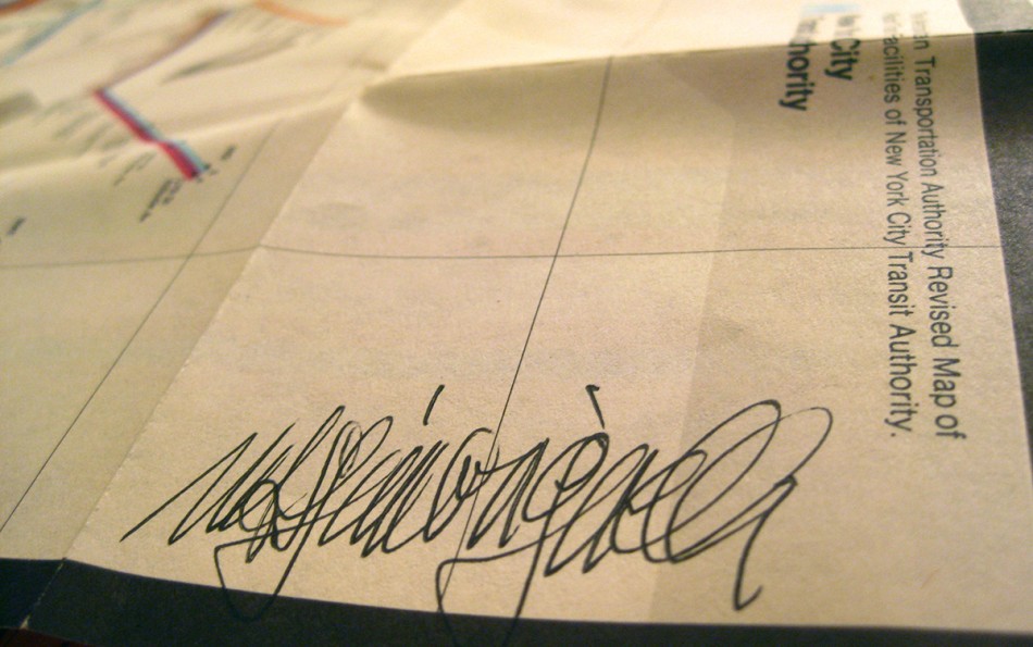
Last night I had the pleasure of meeting the map’s creator, Milanese designer Massimo Vignelli, at the Museum of the City of New York. Vignelli had gathered with other “celebrities” of the subway map world for an exhaustive panel discussion entitled The New York City Subway Map – Form v. Function in the Public Realm. Looking like a doyen of style who’d stumbled into a convention for math professors, Vignelli, now 79, recalled how in the late 1960s, not long after he’d opened his studio in New York, he was approached by the city’s Transit Authority to redesign its subway map, which at the time was in desperate need of a graphic update. Around the same time he also introduced the New York subway’s iconic white on black signage (his original of black on white proved too easy to deface). Vignelli’s new map debuted in 1972, and represented a radical departure from its predecessors, in that it abandoned the timeworn convention that the underground map should echo the geography of the (overground) city.
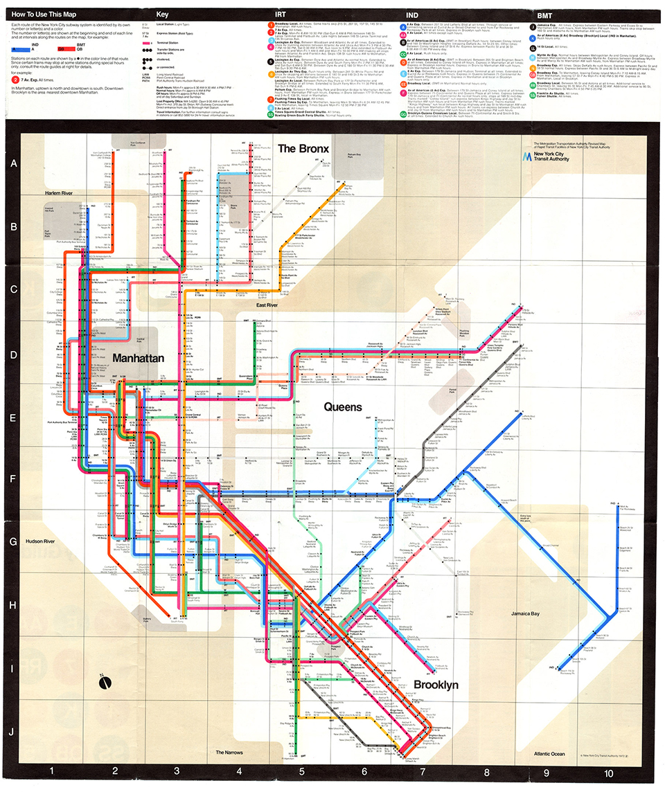
Elaborating, Vignelli went on to explain eloquently the difference between a map and a diagram, and how his design was a functional diagram that did not need to double as a map representing the city streets. As a result, his map is full of peculiarities: the Second Avenue F stop appears East of the First Avenue L stop, the 33rd Street 6 stop is north of the 34th Street EE stop, while Central Park is represented by a truncated grey square. These are “mistakes” that according to Vignelli, matter little. Based on a network of horizontal, vertical and 45-degree diagonal lines, with each IRT, IND and BMT line represented by a different color, Vignelli’s design has, according to its creator, a rare, logical beauty that has never been improved upon.
The MTA has sought for over thirty years to improve upon Vignelli’s map, ever since they ditched his beloved (if at times baffling) concept in 1979. Yet in attempting to merge a street map and a subway diagram, New York’s map has in recent years become an increasingly cluttered mess, incorporating bus transfers, tourist information and all manner of other unnecessary extras which only serve to further confuse the straphanger looking to get from A to B (or to the A or B train). John Tauranac, the man who headed up the map’s redesign post-Vignelli, defended some of his original introductions, including the use of one color for grouped lines, such as the ACE or 123. But with the map’s latest incarnation provoking a chorus of scorn, even he admitted that the design now needs a rethink. Eddie Jabbour agreed, going so far as to produce his own map from scratch. His “KickMap” is a clean, fresh alternative to the existing subway map that he even proposed to the MTA. When they declined his offer he converted the idea into an iPhone app, which has already been downloaded by 350,000 users. But surely we can’t rely on the latest technological advances for such an important element of daily city life. While it’s true that most New Yorkers who navigate the subway frequently do so from memory, occasionally we must venture off our routine routes, at which point that graffiti-covered oversize platform map suddenly proves its essential value.
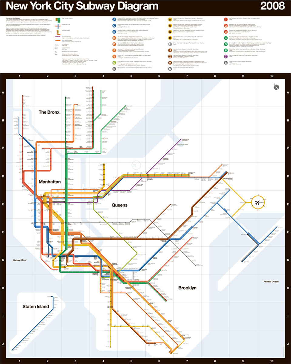
In 2008, Men’s Vogue celebrated Vignelli’s 1972 design with a modern-day update (below), retaining the original map’s abstract elegance while eliminating the abnormalities that caused such confusion. To me it seemed the perfect map for New York City’s subway. The lines and their colors are all recognizable, while Vignelli and his work are currently enjoying a reappraisal. His is the only subway map in the Museum of Modern Art’s permanent collection, while his preferred Helvetica is the only typeface to be the subject of a movie. The 1972 map is as much a part of New York’s transport heritage as Checker Cabs.
The reintroduction of a Vignelli-inspired map would provide graphic consistency between the map itself and the subway’s omnipresent signage, which has remained virtually unchanged for over thirty years. Since working with the MTA, Vignelli has been hired to produce similar identities for the subway systems in Washington, D.C. and Milan, as well as for Ferrovie dello Stato, Italy’s national rail network. It strikes me as the last place to embrace function over form, so why does New York, the city where Vignelli made his international name, seem reluctant to reward him with the recognition he deserves?